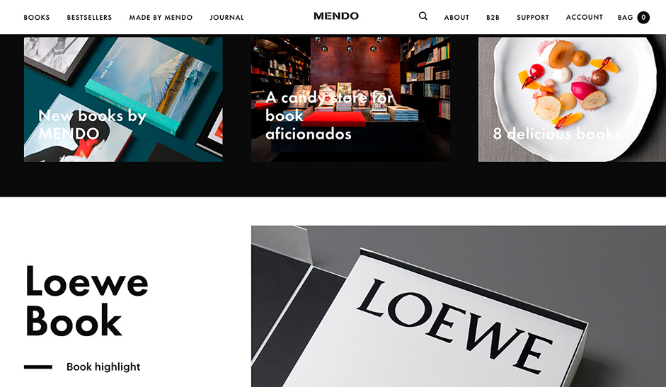
Mendo sells the most beautiful books in the world: we wanted the site to be one great stage for their books. It’s a unique experience to buy a book in the physical Mendo store, and we wanted to match that feeling online.
Mendo isn’t just a book shop – they’re curators as well. If you’re in the store, you feel that they handpicked every book themselves. And if you have a question they give you the very best possible service. That’s something we translated into the site with a custom search function and a smart algorithm for book suggestions.It’s important to show consumers how big the books are they’re about to purchase. If you click on the button “+ how big is this”, you can compare the book with a pair of glasses, a charger or even a pizza slice. This feature ads a pinch of humour to the high-end platform.

Every book gets its own stage, by giving it a background colour that is extracted from the overall pallet of the book cover. In order to assure the right way of presenting the books, we created a strict guideline, in which the books always have to be shot lying in a 45-degree angle and with the lighting always coming from the same side. Instead of just stacking all the content below each other like you normally see, we really wanted to extend the rich experience of the regular site to mobile devices. We created that desktop experience by not just using 1 column, but also 2 and 2.5 column layouts. Furthermore, we’ve built-in a feature that minimises text blocks. By clicking them, a side panel moves in with more info.

Depth, function and intuitiveness was added to the minimalistic, flat design using animation. The animations for Mendo are based on browsing a book and all come from the right, just like when you flip a page, but without using the cliché animation of turning a page. For the book overview page, Mendo only has to upload a cut-out image of the cover and in the CMS we convert it to a book. By removing a pixel from each corner of the image, we visually round the corners. Furthermore, we add a folding line on the left-hand side, to mimic a book cover. We finish it off by adding shadow and a background colour, and the magic is done. That’s convenience that counts.
Regarding technologies: the server architecture is LAMP stack (Linux Apache MySql PHP). Back-end and front-end technologies include Wordpress, WooComerce and Backbone + Marionette. For web stack, frameworks and tools we used LAMP stack, Backbone + Marionette and a Home made responsive lazy-loading, parallax and animation set.
