Zajno's story kicked off with a small group of talented designers and developers who all shared the same goal: to create a great digital experience. Fast forward to today, and as we gaze in the rearview mirror of our journey, it's crystal clear that the 7-year Journey project is our reflection on the winding road we've traveled.
Our favorite client projects and our own projects, our values, and the principles that we put into our work; we tried to collect all this and express it through the prism of design on our website.
Therefore, when we set out to sum up the studio's 7-year journey in the design world, we did not fully realize how much we would have to learn in the process, honing our storytelling and effective communication skills through functional design. But the work on the site itself turned out to be no less interesting than the seven-year journey itself. So today, we want to talk about the discoveries and challenges that Zajno made in the process of working on this project.
Challenge 1: Filling 3D objects with meaning
From a designer's standpoint, the endeavor involved crafting a distinctive design accentuating the studio's unique attributes. During the drafting process, we realized that the website revolved mostly around 3D objects. 3D is the heart of the 7-year Journey project, so it was important to give them not only a nice shape but also fill them with meaning.
“We've built the 7-year Journey project, inspired by our founder's ideas and initial work, to create a unique design that truly represents our studio and its vision."
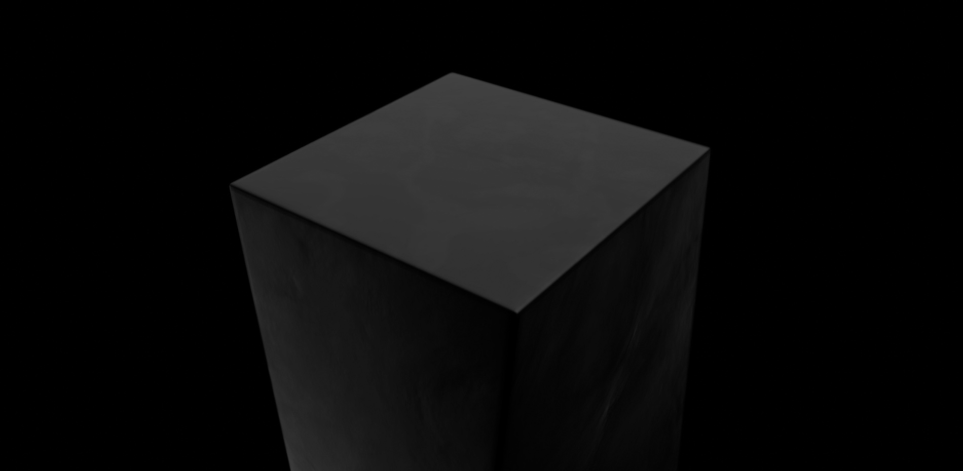
Drawing inspiration from the studio’s creator Sasha Turishchev's initial works, particularly those iconic 3D obelisks that served as the creative impetus. This approach allowed us to not only seek beauty but also establish a profound connection to the artistic origins that informed Zajno’s style from its inception, effectively creating a self-referential benchmark.
Nevertheless, we didn't just draw inspiration from the studio's roots. Working on the 7-year Journey project, we realized the importance of staying attuned to the work of fellow designers and seeking inspiration from various sources, be it movies, games, or art.
Challenge 2: User’s control over animation
The main technical challenge was changing the approach. Initially, the concept was to manage animation progress and scene transitions ourselves. However, when we connected all the scenes together, we understood that it didn't provide the desired experience.
It took control away from users and forced them to wait for animations to finish. So, a deliberate decision was made to completely revise everything and implement full animation control through scrolling.
Challenge 3: Optimization and optimization again
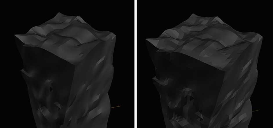
The third challenge involved optimizing animations and models to achieve the highest possible performance on the desktop, given the number of animated scenes and models. Additionally, the goal was to preserve this experience on mobile devices.
This became achievable after arranging the sequence for activating scenes and 3D models, followed by several optimization iterations for the models and their details based on the devices being used.

Challenge 4: Bewitching audio experience
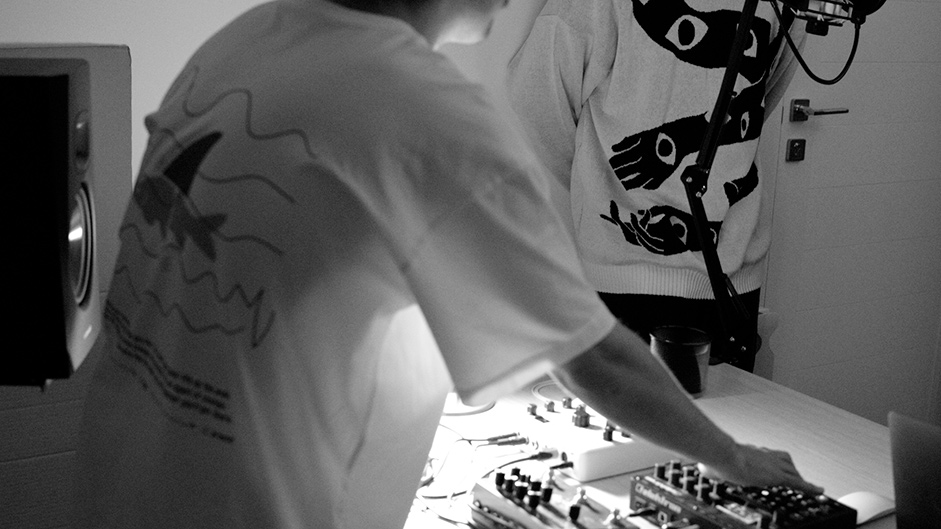
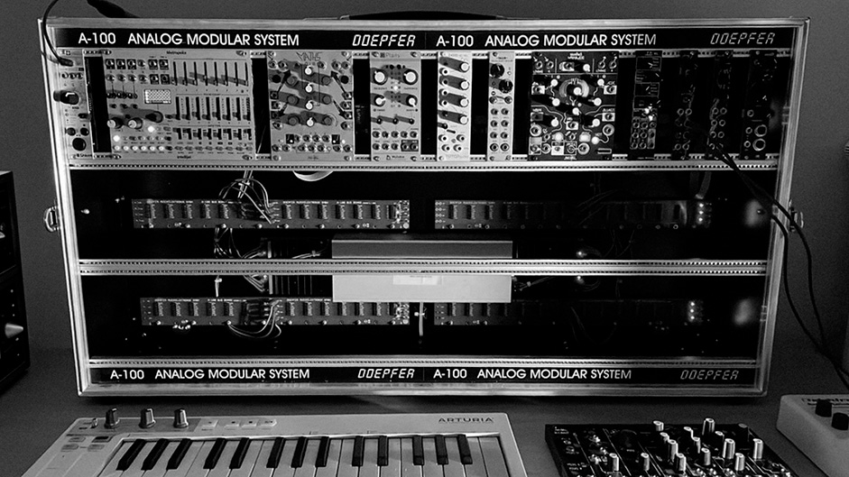
Beyond the visual experience, there was a task to create an immersive audio experience. Due to the abundance of sounds and music, there was a need to streamline the process for the sound designer to select and test sound effects on the site while simplifying integration into development.

To achieve this, a separate library was created, offering an interface on the site with all elements that could have sound effects applied. The sound designer was provided with a list of fields corresponding to these elements, where they could upload their audio tracks and test them on the fly.

And a few more thoughts, conclusions, and tips
- The main and most important advice that we can highlight from the results of working on this project is as follows: stay observant & find inspiration in various aspects of life.
- The key to a successful project is communication within a large team of developers and a basic understanding of what result you are expecting. Communication is sometimes as important as your skills!
- Measure the scope of your creative flight with the margin of time that you have for the project. (Just kidding!)
The Journey website was more than just a creative venture — it was a learning experience that allowed us to expertly weave our story, using every possible tool to captivate our audience. And we can say it with honor: this website has been a testament to our growth.
Technologies
Frontend Frameworks and Libraries: Theatre.js, Three.js, GSAP, Lottie-web, React, MobX, Sass
Backend Technologies: Typescript
Tools: Vite
This project has been developed using React, GSAP, and Three.js with Theatre.js for 3D animations. It's based on our own boilerplate leveraging the Vite bundler.
There were a few versions of how we've managed scenes (pages) transitions. However, we've come up with a solution where we could have all sections on the same pages but still load and render things when necessary. GSAP is a core of the website's animation: we leveraged its SmoothScroller, ScrollTrigger, and Observer plugins – all these helped to build smooth transitions and control the scroll and user experience based on it. Also, all 3D animations and interactions are controlled by GSAP core in pair with Theatre.js – it was pretty easy to couple them.
Company Info
Zajno is a digital design studio that’s all about breaking the mold! We don’t do boring websites or ordinary apps - we specialize in crafting the wildest, most unconventional digital experiences out there.
