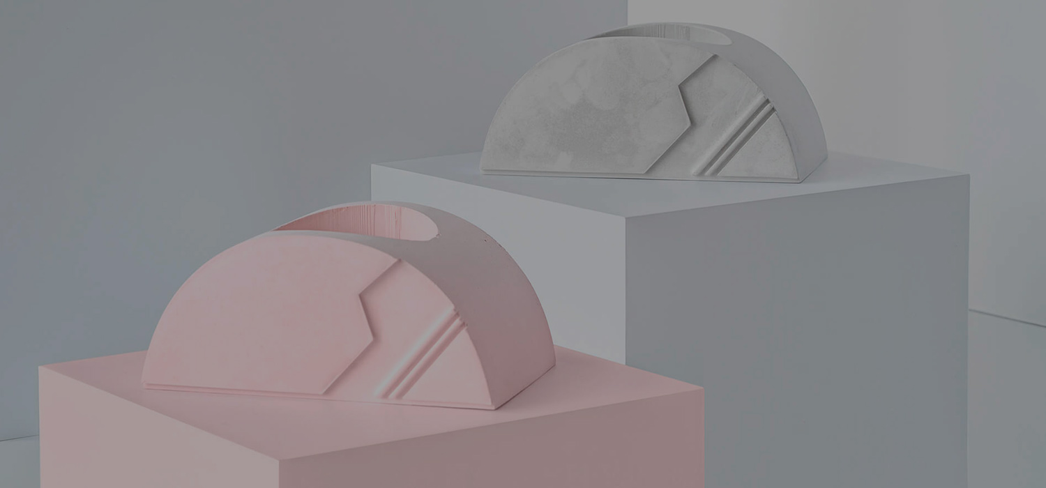
Collage launched a new website to unveil its BRUT collection: A series of functional products with clean design, inspired by the brutalism architectural movement of the 70s.
Locomotive got on-board to freshen up the small e-shop - that already packed a few awards in the past year - with a simple idea: create an environment that will reflect the character of the new collection. The website must act as the main shopping destination for Collage products, but also needed to be a relevant support tool for representation and PR campaigns.

A new flexible theme for a new collection
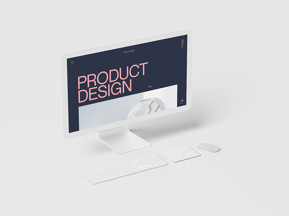
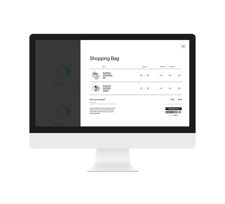
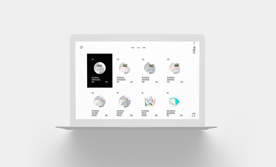
For the occasion, a new theme has been developed with minimalistic aesthetics in mind, in order to refresh Collage’s ecommerce experience for the Spring 2019 launch of the new BRUT collection. Now featuring the best clichés from the new products and a couple of functional upgrades, the new website puts the beautiful accent pieces from Collage at the center of the stage. A new cart system made with Vue.js was also part of the new version, improving drastically the overall buying experience.

It's a flexible theme that is timeless, that will evolve around the essence of each collection of products.
Typography in motion
Collage needed a way to showcase their distributors across Québec. As the market is growing fast for Collage, Locomotive created a tool to update boutiques into the content management system (Charcoal CMS) and an interactive display for the distributor, using typography in motion. A great way to infuse a brutalist vibe into the project to match the essence of the new BRUT collection.

Technologies
As on most of our projects we started things off with our boilerplate: it’s a solid foundation which gives us a nice asynchronous navigation system across pages. Also, we used an early version of locomotive-scroll (it got a lot of improvements since then) which helps us to set up nice animations and to get that overall smooth feeling when browsing the website.
We really focused our animation work on the homepage in order to highlight the new collection. For that purpose, we combined the forces of GSAP suite (mostly TimelineMax & SplitText), locomotive-scroll and linear interpolation (used on product categories hover as well) to get fluid & advanced animations relative to the scroll. The title animation also gives each letter a random movement, allowing a different experience on each visit.

A new cart system in the Charcoal arsenal
Developed with Vue.js, the new cart system is an attachment built to be compatible with the open-source framework Charcoal. It helps to quickly deploy cart capabilities to provide seamless and customizable cart solutions to our clients. A first version has been implemented successfully on Collage’s new ecommerce experience and we’re planning to expand its functions for projects to come.

E-commerce capabilities made possible by Charcoal
As Charcoal CMS is constantly gaining territory into Locomotive’s technical landscape. It becomes a great partner in the development of custom platform involving APi integration or ecommerce capabilities, such as this project.


Website by Locomotive
We are a forward-thinking team of designers and developers driven by passion and fueled by curiosity. With more than a decade of experience, Locomotive has become a leader in digital experiences, web design and branding. That’s not a brag, it’s a promise: to deliver tomorrow’s creative solutions — today.
You can find out more at Locomotive and follow us on Behance, Facebook, Instagram, Twitter or Vimeo.
