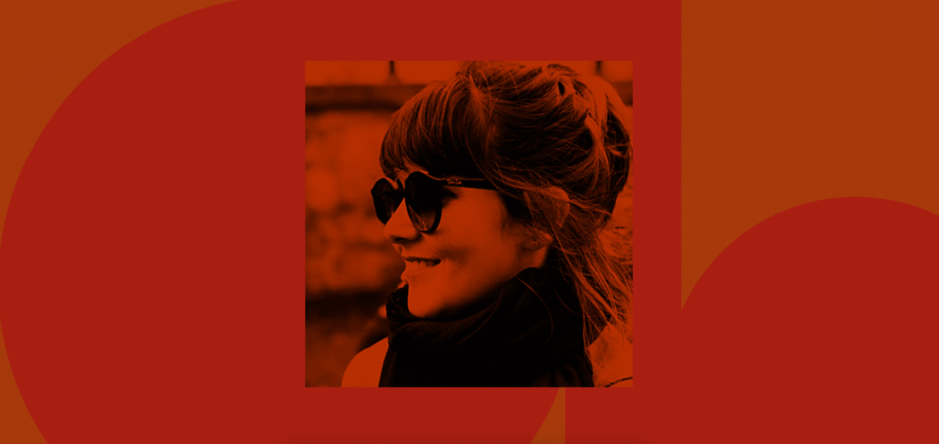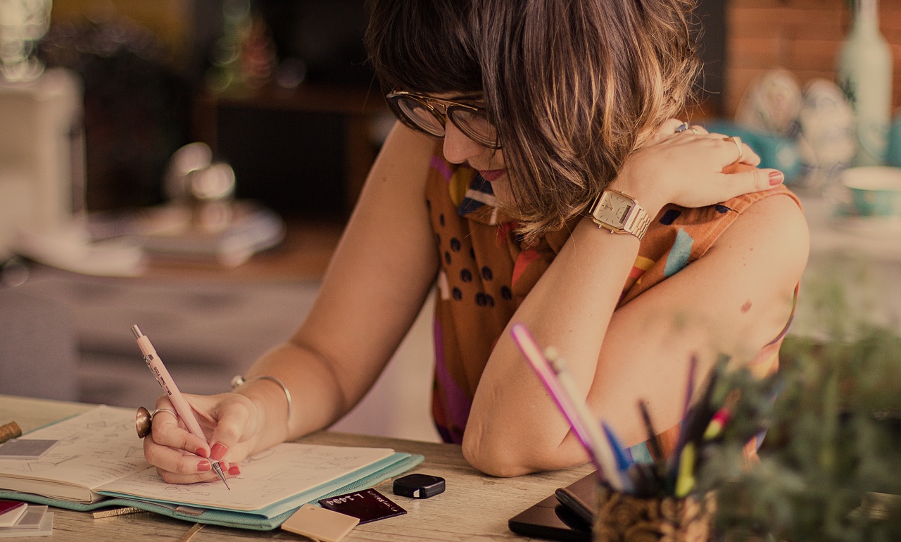
Amanda Braga is a very talented designer, well known for her brand Trocando em Miúdos. Her former company was a Brazilian female fashion icon, featuring a strong feminist attitude and proudly local production team.
After 13 years, she decided that it was time to take a next step and explore herself as a multi-disciplinary designer.

Self-Exploration
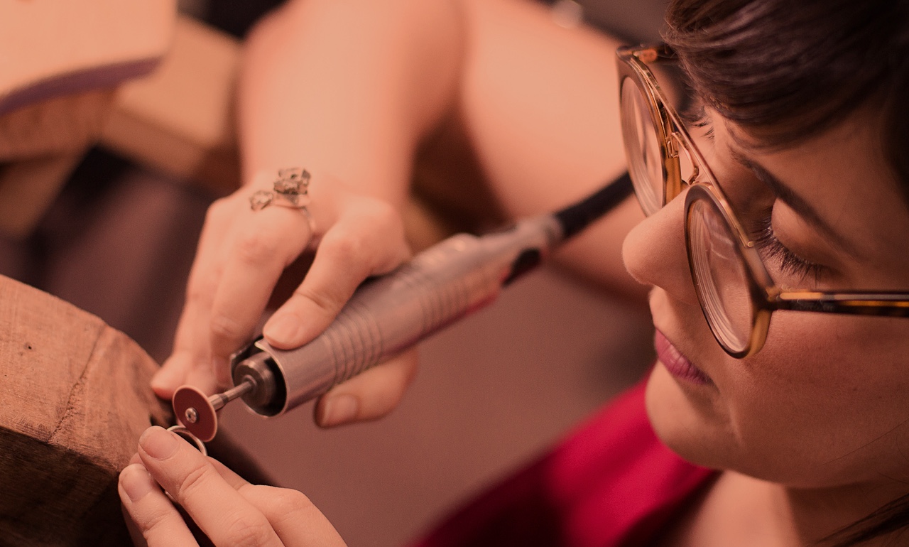
In 2018, Amanda decided to move to the US to explore new paths and creative insights. She has always loved accessories and jewelry. When she was in college, she had the opportunity to do an internship with one of the greatest Brazilian Jewelry Designers: Clementina Duarte. This experience has been always on her radar and during her exploration in 2019, she decided to re-visit her passion: to design fine jewelry with a strong identity. As a quick learner, she started working on her first collection called "experimental", featuring a total of 13 pieces. Her biggest challenge was to start targeting a new audience in the US market. A main piece of this launch strategy was the website development.

The website strategy was to tell her story, show her abilities and capabilities and attract new users to her Instagram profile. As the project budget was really tight, we had to find a creative approach to create a buzz around her exponential target. The main target audience set was creative people who love design and have an open mind for new things. We decided to keep the website simple as a one-page site and invest more time on things that could deliver the "wow effect". By doing something innovative, we would not only create the right identity to match her style, but would have more chances to organically feature her site on creative and design websites.
Amanda Braga
Keep it simple, spend time working on the wow effect.
Creative Approach
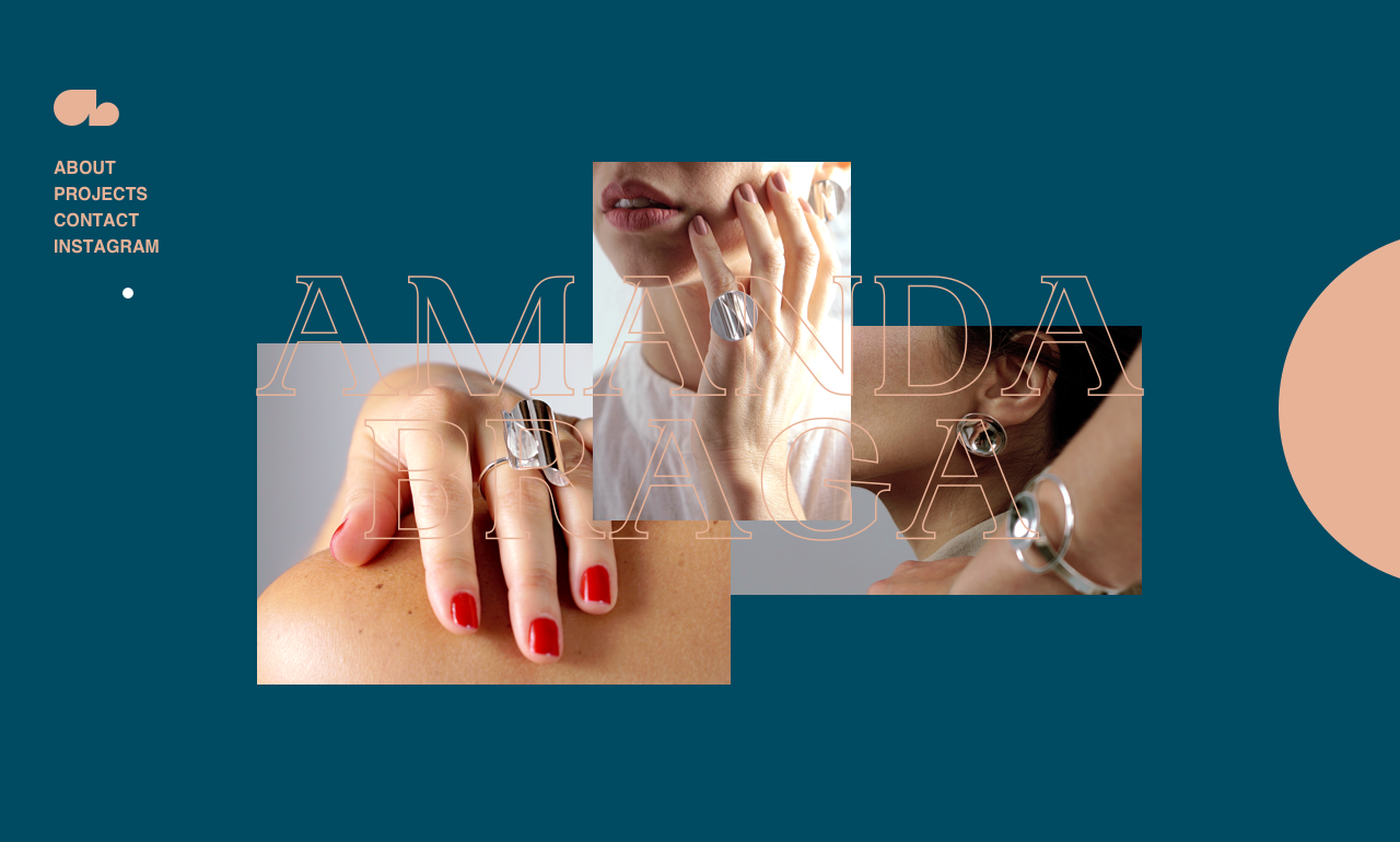
The website consists of 4 different sections: Home, About, Projects and Contact, so we thought of giving different colors to each section. A fun fact: the client also got involved during the design brainstorm. She is well known for her eye for detail and colors, so she helped us to create the color theme. During the UX design phase, we needed to define what would be the wow factors. The first challenge was to present her new collection using a different approach instead of a regular photo gallery. We knew that most of the users wanted to know what they were looking at in the first 5 seconds, so we had the idea to reveal the images on the first user interaction, not only creating a good first impression, but showing what it was all about.

For a One-Page site, scrolling is a big opportunity to visually impact the users, but we wanted to also create a second wow effect to keep the users scrolling and exploring the site. That's when we decided to use the distortion effect and give it a second unexpected effect. Besides that, we took really good care of how the illustrations were presented, adding value to the final result.
Technologies
The project's biggest challenge was to create the scrolling effect and make it work with the UI Design. Our first approach was to use canvas for the scrolling effect. But after several tests, we realized that using Canvas could jeopardize the project's SEO, so we decided to keep it simple by using HTML + Javascript.
- Frontend Frameworks and Libraries: Jquery and Gsap
- Backend Technologies: Php + MySQL
- Tools: Visual Studio Code, Javascript Es6, Sass and Gulp
Company Info
Cappen is an independent award-winning studio with offices in the US and Brazil. We blend innovation, design, and technology to create highly functional digital products that perform.
