As creatives, we’re lucky to have the Leeroy Lab, where we can get a bit crazy and experiment on things that inspire us technically or visually.
As a part of this lab, we wanted to bring storytelling into an immersive 3D experience. It needed to be engaging, but also quick to produce. That’s why we opted for a minimalist environment: a plane in the sky.
ATMOS was born!
Following a path
Telling a story is almost always like walking along a line. That’s why we wanted to visually display a line guiding the user from the start to the end.
We used the Catmull-Rom algorithm to create a smooth spline curve. Since it was created programmatically, we were able to make it a little bit different each time you load the experience.
Using this class also allowed to conveniently position the clouds and text panels all along the curve, no matter how bent it was, and move the camera along it. Once these basic mechanics were in place, it was time to take care of the scenery.
Setting the stage
A sky to gaze at
The sky is actually a sphere, facing inwards, coloured using a shader material.As the user scrolls, the sky sphere moves with the camera so that it never leaves the frame.
The different gradients are obtained by combining an animated Perlin 2D noise with a beautiful sequence of colour palettes created by our design team. We also added a hemisphere light, which changes colour according to the sky gradient. This way, the colour of the plane and clouds always match the sky.
Smooth, bubbly clouds
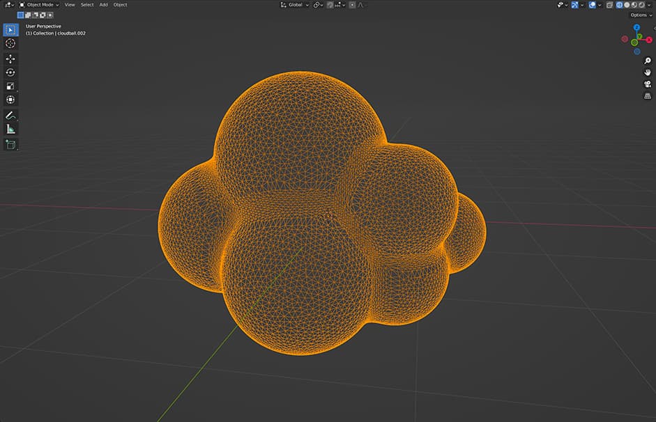
Speaking of the clouds, we wanted to make them as round as possible! Not only the normals, but the silhouette also needed to be super smooth. Using low poly or 2d clouds wasn’t an option to achieve the look we had in mind, so we made two high poly models and then used DRACO compression to lower their file size.

That’s quite a lot of vertices, but since the whole experience was so minimalistic otherwise, we could afford it. Those clouds are not just part of the decor, they basically are the entire decor, so it wasn’t the time to be cheap!
We then duplicated these two models throughout the whole experience while only changing their transform attributes (scale, position, rotation) to trick the user into thinking there were multiple models of clouds.
Adding wind particles
Wind particles are visible when you scroll fast enough. To make them, we used an InstancedMesh. It’s actually always “there”, following the camera position (just like the sky), but we hid it by simply setting its material opacity to 0. This opacity is then updated according to the scroll acceleration.
Displaying text in 3D
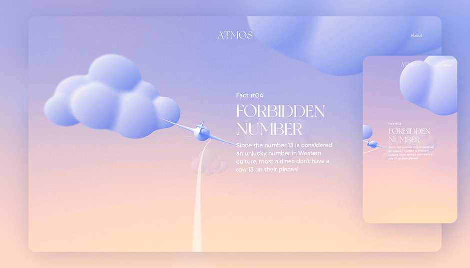
WebGL experiences often use HTML to display text, but we wanted to make it more immersive than just superimposing HTML over a WebGL canvas. So we used Troika to take care of the font rendering.
To make sure text blocks remained visible for all users regardless of their window ratio, we needed to adjust the position and rotation of the camera depending on the user’s screen ratio.

And that’s about it for the scenery!
WebGL experiences usually start with a loader, but we realized Atmos was so lightweight that it didn’t even need one.
Post-processing
A short loading time is nice, but it wasn’t our only priority. We also wanted to keep the experience light on the performance front. So once again, when it came to post-processing, we kept things as light as possible.
Instead of using an actual depth of field blur, we opted for a simple 2D radial blur. It’s way cheaper and helps draw the eye to what’s coming in front of you.
We also added a custom grain shader, as we felt it was essential to achieve the aesthetic we were aiming for. As any post-processing effect, film grain is easy to overdo, so we really made sure to make it subtle.
Transition
You can really go crazy with transitions, but in order to not break the calm and slow pace of the experience, we wanted something smooth and gradual. We ended up with a rather simple transition, achieved by mixing 2 render passes together using a good ol’ Perlin 2D noise.
Conclusion
Making this project was not only fun, it was a humble statement of what we are, love, and aim to accomplish. There will be more coming soon, so stay tuned!
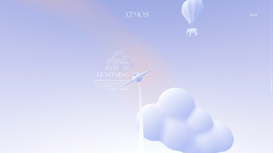
By the way, did you spot the elephant? It’s positioned at one of several pre-defined locations on each load!

Development
This experience was made with the help of Three.js, Blender, GSAP, and virtual-scroll-handler.
- Three.js is the main WebGL framework on the market. But it’s also way more than just a rendering engine, as it also offers a ton of useful features, including a lot of math functions we relied on to make Atmos.
- Blender is a free 3D software which popularity has exploded in recent years. We used it to make the clouds and the plane.
- GSAP is an awesome general purpose animation library.
- virtual-scroll-handler is a custom library we used to handle scroll events without having to actually scroll the DOM.
Company Info
LEEROY is a digital and integrated creative agency that provides a complete expertise in creation, marketing strategy and web development. Constantly on the lookout for new digital, web and artistic trends, LEEROY demonstrates its know-how in the context of its various projects and its Lab, by consistently pushing creativity further while remaining tactical in achieving its client’s objectives.
