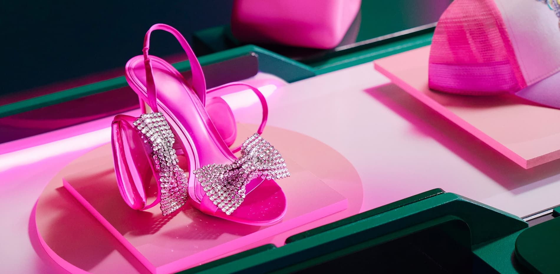
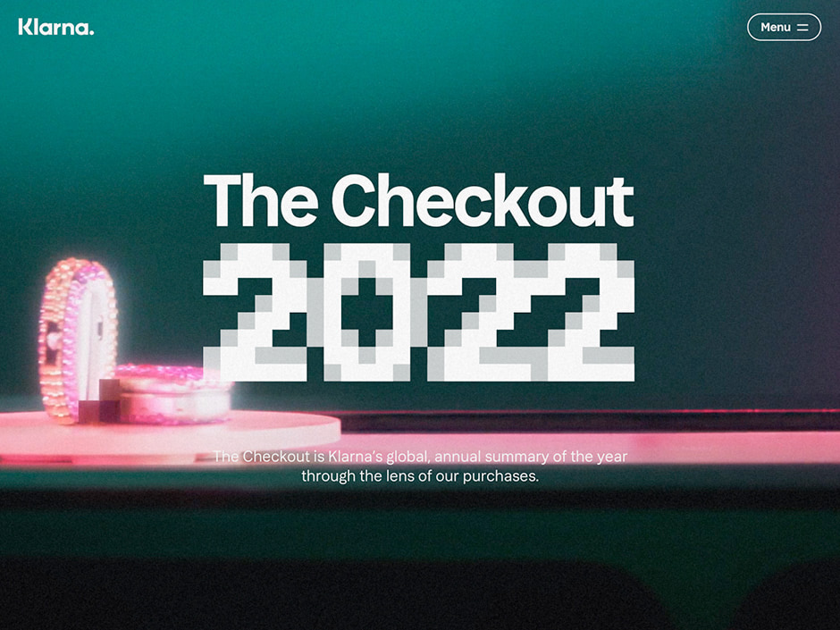
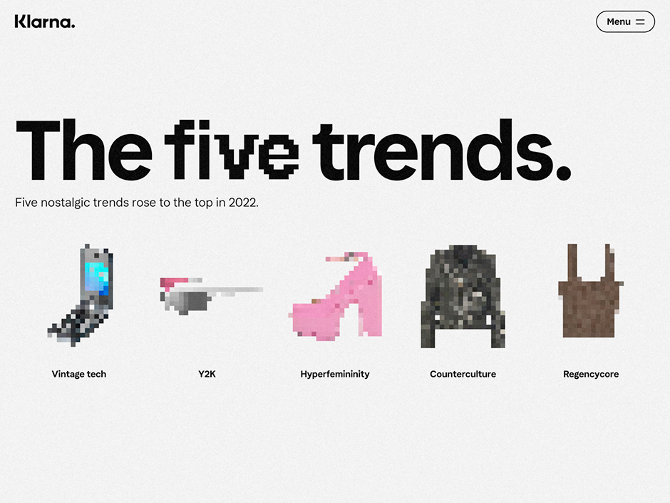
The Checkout is Klarna’s global annual summary of the year through the lens of our purchases. For the 2022 edition, it was clear that the year gave the past a place in the present - velour track pants and wired headphones, numerous cultural icons had a big comeback.
To reveal the trends, Klarna teamed up with NoA Ignite to create a unique take on the classic report format. All wrapped up in a satisfying pixelated yet crisp user experience full of the nostalgic trends and products we loved all year long.
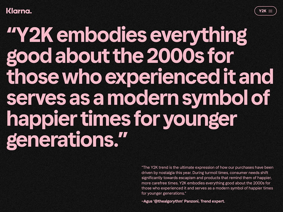
Y2K revival
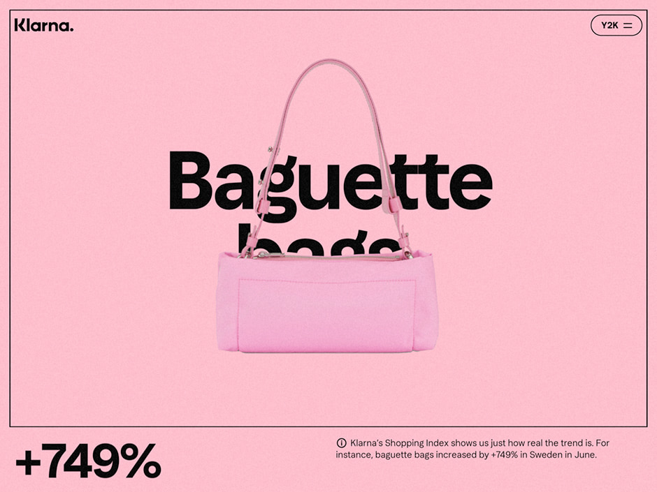
Among the trends, Y2K is probably the most prominent one in 2022 that embodies the need for nostalgia. To reflect this, we designed a user experience that oozes Y2K and early-’00s aesthetics. Klarna pink and blacks are the primary palettes, complemented by pops of colorful yellows, blues, and greens. For the final touch, a pattern of dot pixels, reminiscent of static on an old TV, covers the entire report for a retro texture and finish.
Smoooth scrolling
If you know Klarna, then you know they're all about smoooth shopping, online and offline. Bearing this in mind, we knew that The Checkout 2022 had to be just as smooth in terms of user experience. That's why we designed an intuitive flow that would guide the reader through the different parts of the report, keeping both interest and curiosity high from start to finish.
Since The Checkout 2022's user experience hinges on smooth scrolling and user-triggered animations, it required us to find a solution that would synchronize the user's interactions with the timing of animations. By playing around with a ScrollTimeline polyfill, a plug-in that simulates native browser support, it was possible to attach triggers according to the percentage scrolled. Modules were then created, and animations were added using WAAPI (Web Animations API). Luckily, WAAPI was introduced to iOS in version 13.4 which gave it just enough browser support to make it a viable tool and paved the way for great animation control and performance.
Nostalgic animations
The smoooth scrolling goes hand in hand with interactive animations that appear as the reader flows through the report - activated by hovering or scrolling further down. Both image and text elements are blurred out in a pixelated manner to then transition and appear more clearly.
When starting the design, we knew that we wanted to do a scrollytelling experience. We needed an efficient way of prototyping that could show the stakeholders, developers, and ourselves how the experience would work – a way that also made it easy for us to adjust the design and collaborate with each other.
“Taking inspiration from how you create storyboards for moving pictures, we designed the experience frame by frame which allowed us to have full control of timing and choreography.”
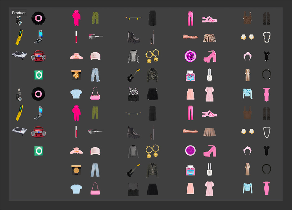
We also had an intensive production period, where we created all the pixelations of the product images using a Figma plugin. Together with the unpixelated product images, and different sizes for different breakpoints, we created and exported a total of 235 SVGs and images.
Perfecting performance
A challenge we needed to address when developing The Checkout 2022 concerned performance. We spent quite some time profiling performance in the Chrome developer tools. This is when we realized that the ScrollTimeline polyfill used in the early stages of the project had to be abandoned due to performance issues. Custom scroll progress components were then created using a combination of scroll event listeners, IntersectionObserver, and requestAnimationFrame. Furthermore, since The Checkout 2022 contains a hefty amount of SVG elements, where each "pixel" of the pixelated art is its own SVG node, the site's performance was at risk of taking a hit.
Needless to say, a website that is endlessly long and contains too many elements is a no-go as far as performance is concerned. Throw in a bunch of animations and the challenge of performance becomes even more crucial to handle. To work around this problem, we found inspiration while watching a YouTube video from the game Tomb Raider which showcased the evolution of graphics throughout the years.
“Pondering the problem of lagging performance and asset management, we thought of how video games use confined virtual spaces such as an elevator to load new assets and erase previous ones. Applying this to The Checkout 2022 meant creating and deleting vast amounts of HTML elements on the fly depending on if the user scrolled them near the viewport or not - decreasing HTML elements from over 20,000 to roughly 3,000. As a result, performance went through the roof.”
In order to ensure a fast TTFB (time to first byte), we leveraged Next.js static site generation capabilities together with hosting on the Vercel platform where you get access to their globally distributed CDN (content delivery network). This ensures the site feels snappy no matter where users are located in the world. Hosting on Vercel also allowed us to iterate quickly as the deploy pipeline is automatically set up. No need to waste precious development time on setting up build checks and other automatic deployment processes.
The technology
Hosting: Vercel Framework: NextJS Frontend Technologies: React, @noaignite/oui, MUI Tools: Vercel’s “Audiences” feature to measure traffic
Company Info
NoA Ignite
We are NoA Ignite. We're on a mission to fight digital boredom by making digital commerce more emotional, joyful, and memorable. Together we gather tech, design, and strategy all under one roof - building a powerhouse for digital growth centered around creating experiences that move people (and the needle). To learn more, visit noaignite.se.
Klarna
Since 2005 Klarna has been on a mission to revolutionize the retail banking industry. With over 150 million global active users and 2 million transactions per day, Klarna is meeting the changing demands of consumers by saving them time and money while helping them be informed and in control. Over 500,000 global retail partners, including H&M, Saks, Sephora, Macys, IKEA, Expedia Group, and Nike have integrated Klarna's innovative technology to deliver a seamless shopping experience online and in-store. Klarna has over 5,000 employees and is active in 45 markets. For more information, visit Klarna.com.
