Sep 6, 2023
Case Study: Crafting a Digital Experience in the Banking Space for PandaPay

We were thrilled to take on the challenge of designing and developing the website for PandaPay, a dynamic fintech startup on a mission to redefine the digital banking landscape.
With a focus on user-centric design and technology, our team embarked on a journey to create a website that not only reflected PandaPay's innovative spirit but also provided a seamless and engaging user experience to showcase their online banking solutions.
Discovery: PandaPay And The Fintech Landscape
Our journey began with an in-depth exploration of PandaPay's brand identity, values, and vision, in order to understand the competitive landscape and identify opportunities for differentiation. Through collaborative workshops and discussions, we gained insights into PandaPay's target audience and their needs, ensuring that every design and functionality decision was driven by user empathy.

Art Direction: A Minimalistic Approach To UI Design
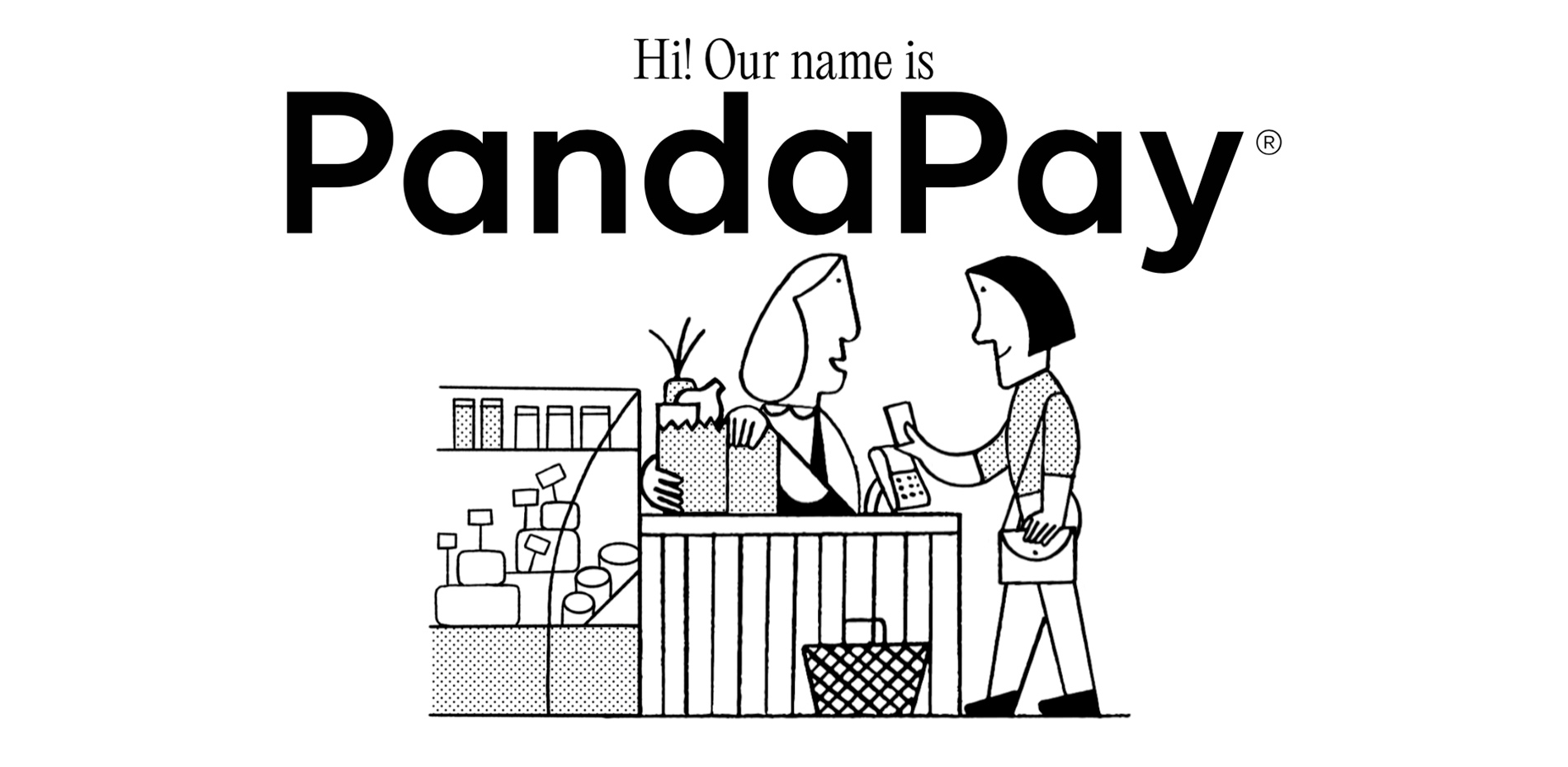
With a clear understanding of PandaPay's goals, we crafted a design strategy that revolved around clean aesthetics, intuitive navigation, and a cohesive brand experience, through a series of crafty animated illustrations—using a series of images loaded progressively—in order to convey the fun and accessible factor of PandaPay’s brand expression.


Our creative team conceptualised a modern and vibrant visual language that aligned seamlessly with PandaPay's innovative spirit. As usual, we ensured that the user interface not only showcased the brand's personality but also facilitated easy access to key information on the product and services offered by Panda Pay.

User-Centric Experience
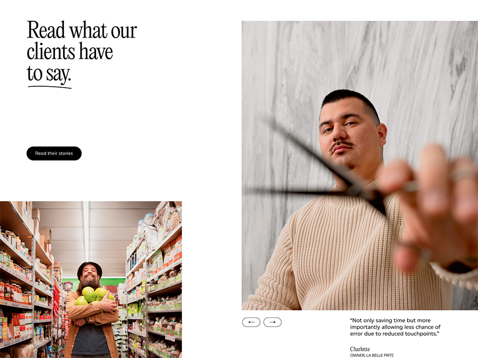
Through thoughtful information architecture, animations and micro-interactions, we organised the website's content to guide users through PandaPay's offerings.
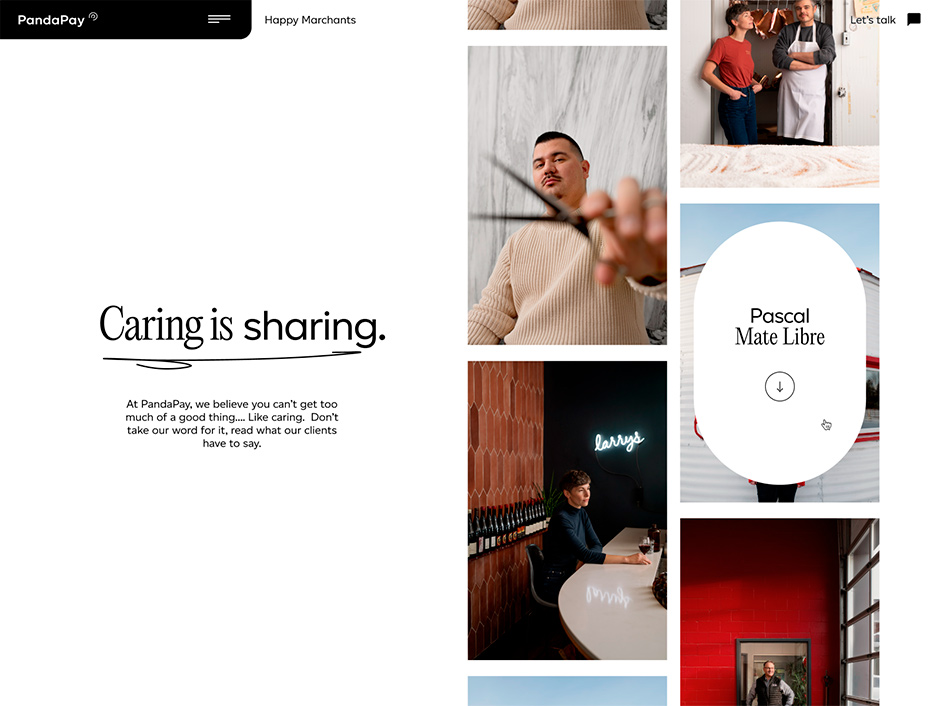
The homepage greeted visitors with a clear value proposition, playing with horizontal scrolling and black and white transitions, while the navigation intuitively directed users to relevant sections such as solutions, features, and contact.

Technologies: Stack & Development
In collaboration with Stereo, we developed the PandaPay website by leveraging proven frontend and backend technologies such as HTML5, CSS3, Barba.js, PHP and WordPress CMS. We ensured that the website was not only visually appealing but also highly functional, performant and responsive across all devices.
Interactive elements, smooth animations, and micro-interactions were implemented to engage users and keep them immersed in the PandaPay journey, using the smooth scroll functions of our Locomotive-Scroll Library. You can check out the latest version of our open-source library, with improved accessibility features, thanks to the Lenis Scroll team at Studio Freight.
A great outcome
The culmination of our collaborative efforts between PandaPay, Stereo and Locomotive was the launch of pandapay.ca; an elegant and functional digital platform that embodies PandaPay's vision for the future of banking. The website showcases the brand's innovation, transparency, and user-friendliness, setting a new benchmark in the fintech industry.
Company Info
Based in Montreal, Quebec, Canada with an international focus, Locomotive does real business in the digital era. With a superstar team of less than 30 humans, this digital-first design agency has been elevating the game of remarkable organisations since 2006, consistently delivering stellar brands and websites while educating and accompanying clients throughout its efficient, transparent process. Celebrating more than 100 awards since 2018—including five consecutive Awwwards Agency of the Year jury votes—Locomotive puts people-first.
