A successful project is always an honest endeavor that addresses the real issues and concerns of any community and offers practical solutions. With such beliefs in mind, we at Zajno gathered to discuss the idea behind our Motion.Ed project — a learning platform about motion design for the design community and anyone eager to be part of it.
The topic of motion design seemed to linger in the air. As a design agency, we found ourselves at times in situations where creating beautiful web animations required a deeper understanding of motion from UI/UX designers. It's not enough to create a beautiful image and hand it over for animation with a casual, "Hey, guys, figure out the rest." Additionally, we often noticed discussions in design communities about the lack of design thinking. That's when we had an insight: "Hey, we're good at this! And we can teach how it's done."
Information Content and Preparation
Our motion design lead played a crucial role in preparing the information content for the site. He collected references, and useful resources. We wanted to go beyond our inspiration and discussions about motion design principles for landing pages; we aimed to make our project comprehensive and complete. We wanted to delve into classical animation and then transition to interface animation.
Although we had to brainstorm on how to make the narrative diverse, once our textual canvas was ready, we moved on to sketches.
First Attempts and Mistakes
We thought about using metaphors—that was our initial idea. Therefore, in the early drafts of Motion.Ed, you can see elements of wires, lightbulbs turning on, and an overall theme of electricity. After all, isn't electricity all about movement?
Users had to connect the wires themselves to progress through the landing page, being active participants in the storytelling process. In the final stage of this animation, they would encounter a switch that needed to be clicked to change the layout view.
“The main idea was to emphasize that animation helps retain attention, engage users, and, most importantly, turn the user into a fully involved participant in the storytelling process"
In the initial drafts, many fascinating ideas were born, such as a page segment with 50 variations of one button!
So, the UI/UX designer prepared storyboards, and they were all completely rejected.
At the last moment, we became worried that the motion theme was not reading well, and the essence of the project was getting lost amidst numerous entertaining interactions.

Then, the decision was made—we needed a kind of "hero," a single element that would capture the user's attention, guide them through the motion debris, and eventually even show an example.
Working on New Concepts
The little ball that appeared in the early drafts took center stage and had its moment of glory. Initially, some illustrations were created where it would travel happily, and the a whole picture started to come together.
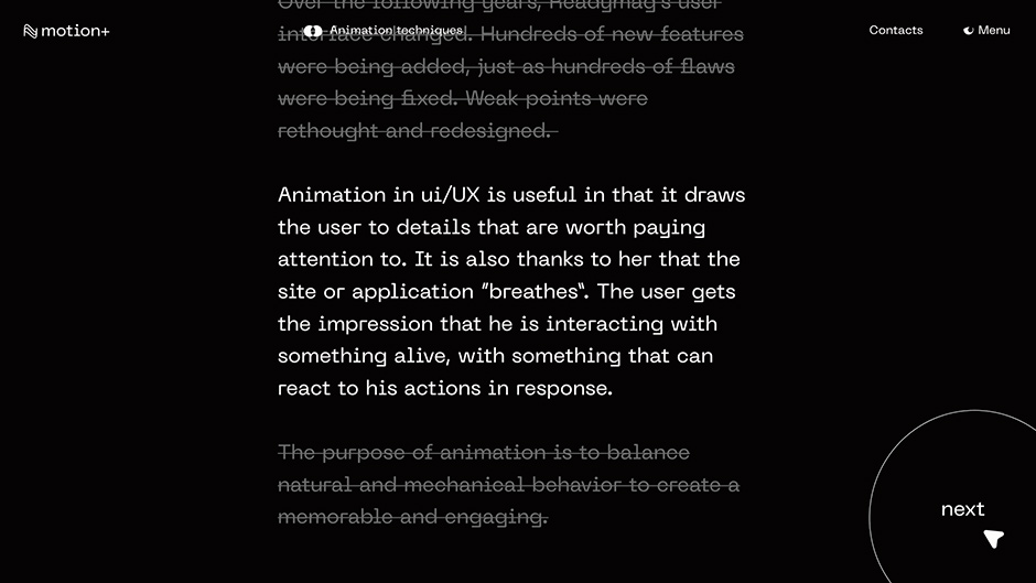
Interestingly, the first character could have been not the ball but… text. We wanted to use different effects to highlight those text blocks the user needed to focus on at that moment.
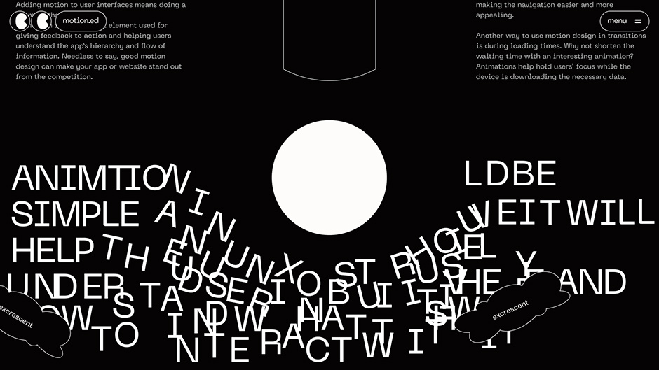
There were even concepts where the ball broke text blocks that were still too early to read :)
Yet, it was the animation of the ball that became the perfect embodiment of the main principles of motion: control the user's attention, keep them engaged, highlight the importance, and turn the user into a full-fledged participant in the process.
Adventures in Development
The problem was that we didn't just want to create an incredibly cool website about animation. We also wanted to do it without code to show that it's possible ;)
As you can see, our plans were very ambitious, so we chose Webflow as the platform for development.
However, when the concepts were already in place, we realized that some animations had become very complex, and it was impossible to implement them without code. After all, these weren't just interview animations: almost all of them were tied to scrolling, sometimes we could control objects, and sometimes physics was involved.
So, the decision was made to add code to some sections and involve the web development team. Fortunately, Webflow allows the use of third-party libraries (although it wasn't as easy as we would have liked). We actively used GSAP, especially ScrollTrigger and MotionPath.
Since initially only a Webflow developer was supposed to work on the project, perfect synergy between them and the frontend developer was required. They coordinated every detail for each section.
“Working on Motion was interesting not only in terms of animation but also from the perspective of enhancing teamwork."
The final stage was optimization as our entire project was on one page. A lot of work was needed to lighten the load of numerous videos and test the result on different devices (because, in addition to the regular desktop version, everything had to be perfect in the case of responsive web design).
Conclusions
What can we suggest for you if you're planning to undertake such a large and complex animated project on Webflow? Well, first of all, patience; you'll need it 😁 But remember that if you do carry out such a project, it will pay off manifold.
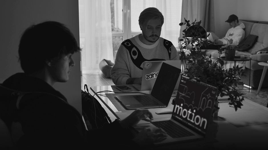
The relevant "touchy" topic for the design community and the effort invested paid off for us. Within the first few weeks, Motion was visited by more than 20,000 people! Since the launch of this project in early summer, almost 100,000 users have viewed it. We also received numerous warm reviews, which were an incredible source of positivity for us. We're glad that our site continues to help people, and we believe that it inspires someone to create amazing animations. That means our goal is definitely achieved.
Technologies
Backend: Webflow-based site
Frontend: HTML5, CSS, SVG, JQuery, GSAP (ScrollTrigger and MotionPath), SoundManager
Company Info
Zajno is a digital design studio that’s all about breaking the mold! We don’t do boring websites or ordinary apps - we specialize in crafting the wildest, most unconventional digital experiences out there.
