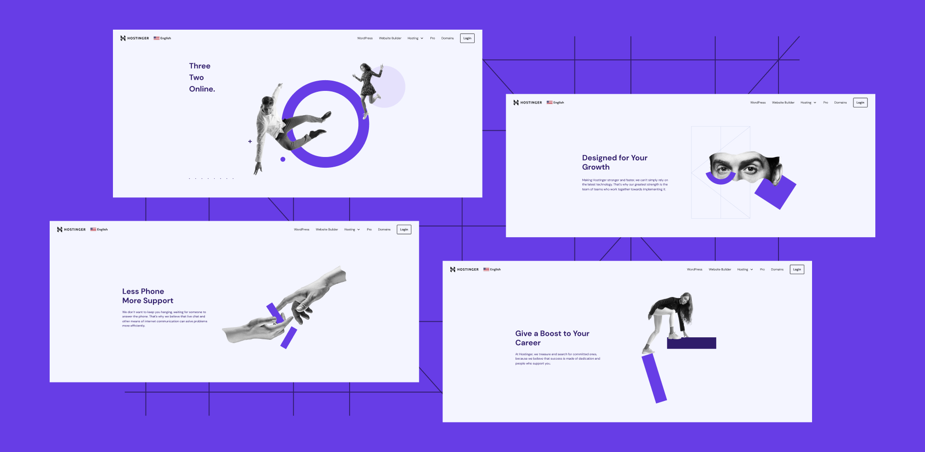
The Creatives Team at Hostinger oversees the brand’s identity and visual storytelling. This article will examine our process of recreating and enhancing the landing pages on the Hostinger website.
Our goal – pages that would communicate the brand’s identity and distinctiveness, be cohesive visually and structurally, and perform well by remaining lightweight for fast loading times and communicating the essential information.
Exhibit A: The Company Pages
Our first targets were the four main company pages – /about, /technology, /career, and /contacts. They were outdated brand and content-wise, and their structure was lacking. It was a growing shame, and we were ready for radical changes.
The state the pages were in meant that we had no idea where to begin. We had mustered a cross-functional multidisciplinary team but hadn’t assigned a Directly Responsible Individual (DRI). It seemed like everyone was going in a different direction.
Several idea-less meetings later, we set up an individual learning day with a subsequent alignment session. A way to proceed started taking shape.
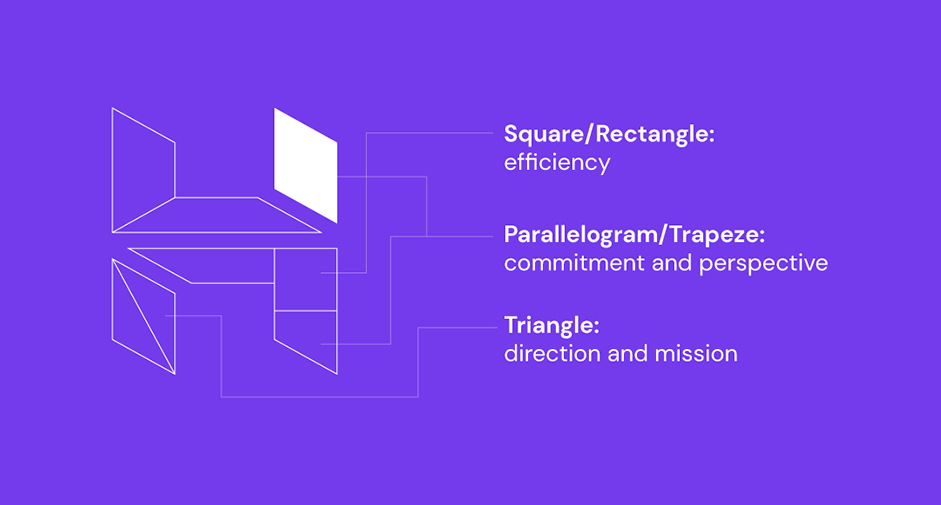
We kicked off the transformation by defining the building blocks of Hostinger’s visual identity. Our logo served as the foundation – we deconstructed it into three basic shapes and took note of what they stand for.
- Rectangle – efficiency.
- Parallelogram – commitment and perspective.
- Triangle – direction and mission.
To the mix, we added:
- Circle – the perfect shape, symbolizing the moment a singularity implodes and transformation takes place.
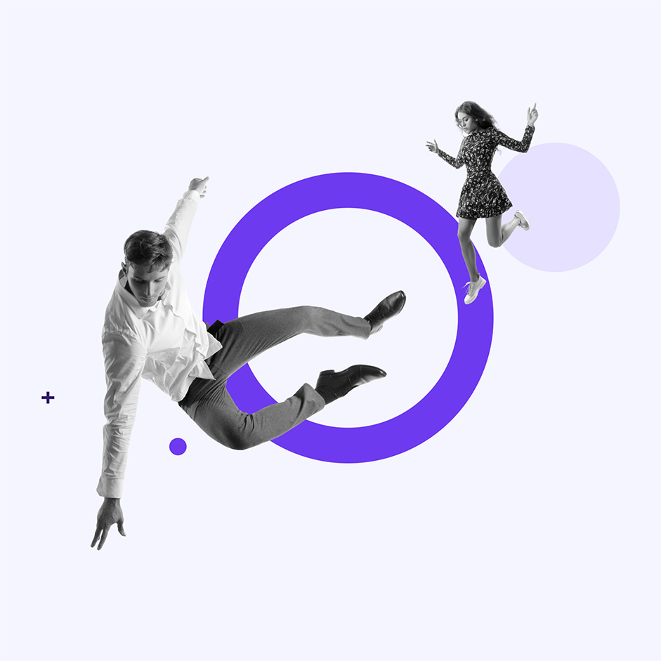
Knowing the ur-morphemes effecting Hostinger’s visual language, we worked out how they would mesh together. For that, we needed a wider concept – an overarching idea to unify the pages’ designs both individually and collectively.
We landed on the backstage as a symbol of efficiency, commitment to online success, and perpetual motion of us pulling ropes behind the scenes for our clients. Backstage, nothing is settled: things are constantly happening, morphing, and evolving around the main subject – the client.
The idea of a backstage prepping for a grand theater display gave life to the structure, illustrations, and copy placement on the company pages.
This was the wireframe we came up with:
- The top – the essence of the page, single-mindedly dedicated to highlighting its purpose. Contains minimal geometry and colors so visitors could easily discover what they were looking for.
- The middle – the core elements of the page, with the copy conveying the necessary information.
- The bottom – the cornucopia of all the relevant extra information.
We were happy with the result but wanted to get an outside opinion on it. It was very important to be aligned on the project as much as possible.
So, we collected extensive feedback to take care of several issues:
- To become absolutely sure that our approach was the right one.
- To allay the doubts of our colleagues who found the rework a bit extreme.
- To gain insights from actual customers and learn how they found the new pages.
Here are some of the questions we asked when QA/feedbacking started:
- Can you understand what is on the screen and why it is there?
- What were your general expectations for the page?
- Does a page structured like this meet your needs?
- When interacting with the page, did you get any impressions about the brand?
We gave the testers free rein over the material while keeping a close eye. We were hoping they’d find the pages beautifully designed and very functional.
Everything came together after reiterating the feedback from these sessions. The new redesigned company pages were performing better right away.
What’s most important, however, is that the redesign process, originally seen as an exercise for the Creatives Team to be artsy, gave birth to the framework used on the rest of the company pages, hWebsites.
In addition to that, it resulted in the foundation of Hostinger’s current visual storytelling approach.
Exhibit B: Product Showcase Visuals
While we were ironing out the kinks in the company pages redesign project described above, we took up another, no less important, task: redoing the style of illustrations for Hostinger’s product pages.
The Company Pages Renewal project had already made waves across most of the landing pages on the website. This meant that the illustrations now matched Hostinger’s visual identity but did not relate to the product.
The problem with the first iteration was playing it too safe, resulting in abstract designs. We needed something to help visitors relate to the product more – a direct approach that would include snippets of the product and UI elements.
With the previously established building blocks of Hostinger’s visual identity, we set out to recreate the visual framework for proper branded product illustrations.
Here are the questions that guided our work:
- What illustrations should we feature on product pages?
- Would they differ in form from illustrations used on company pages?
- How should they relate to a product on its landing page?
The first iteration, illustrations on the WordPress Hosting landing page, looked like something out of an instruction manual – boring and difficult to understand. Keeping all the lines that make up the UI killed all of the page’s potential of being a sales page.
We made improvements. For the second interaction, we:
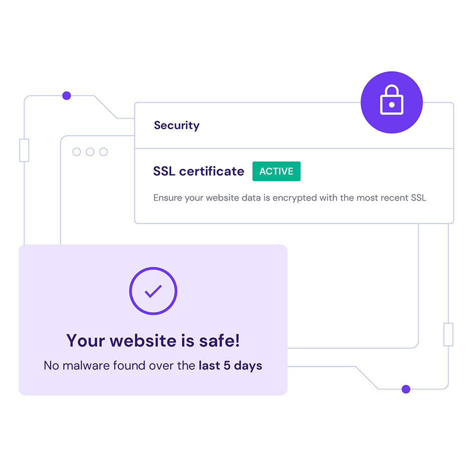
- Simplified the UI depictions as much as possible.
- Got rid of all nonessential elements to showcase simplified products.
- Decided that visual element usage must relate to the product.
Honestly, there was a lot of pushback. Some colleagues felt we should follow industry examples, like Shopify. We maintained the conversation, but our determination to establish Hostinger’s own look did not falter.
Here’s a quick look at our final results:
- Each graphical element is purposeful within the whole.
- Every line is functional.
- Every product illustration implicitly conveys the simplicity of the product.
The approach worked, and Hostinger’s brand is making an impression. Developments on the theme established over the previous two sections can be seen in our other placements and campaigns.
For example, Hostinger Pro, aimed at agencies and professionals, follows the same principles while incorporating sharper, more aggressive elements and colors.
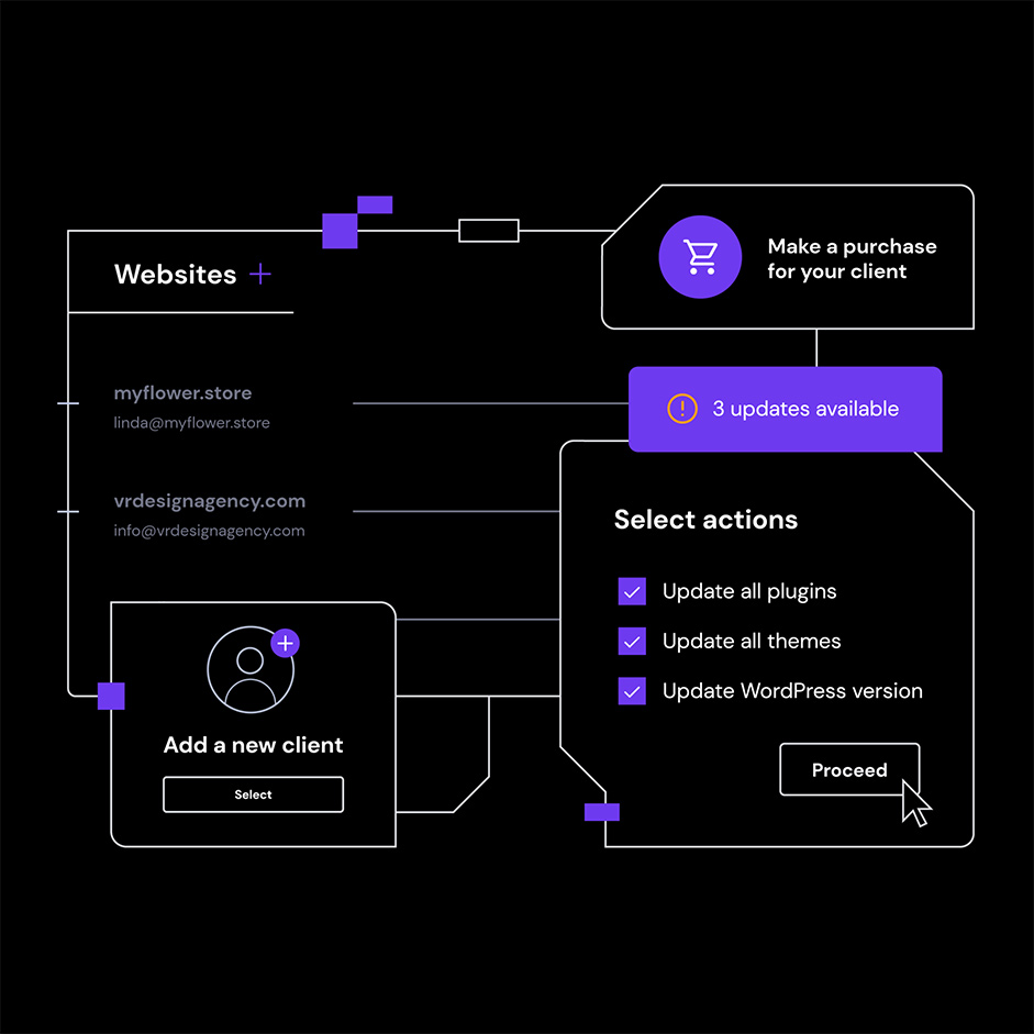
And Hostinger AI Website Builder is what we’ll be discussing next.
Exhibit C: Website Builder
Wholly different products mean different target audiences. That’s why we immediately knew that Hostinger AI Website Builder (HaiWB) should differ from the established visual identity. The first brainstorming sessions resulted in the realization that the subbrand should proudly wear electric green, an inversion of the Hostinger violet.
We’re currently still trying to crack the case of the Builder’s identity wide open.
Here are some of our headscratchers:
- For a product as visual as the HaiWB, we need to figure out the part of the overall brand identity that it could assume without overshadowing the product itself – what’s a healthy balance?
- The visual direction seems at odds with the proposed copy. It’s an issue of a multidirectional approach.
- The narrative is being built around the classic Alice in Wonderland character. Narrowing the metaphor down to a level that aligns with the expectations for the product presentation remains a challenge.
- Building a database of metaphors (visual elements) to complete HaiWB’s visual storytelling library.
The goal – direct, purposeful visual storytelling for a product that makes everyone’s lives easier. And we’re getting there!
Exhibit D: Optimization
Even if you’re not a web hosting company, ensuring your pages load fast is important. If you’ve committed art with your site design, you need to be sure the visitors will be there to see it and not bounce in a few seconds.
Our website serves a global audience based in India, Brazil, the United States, Indonesia, and the rest of the world. Most of them use mobile devices with even slower internet speeds. With this in mind, our pages are made to ensure the best accessibility and responsiveness possible.
That means simple scripting, lightweight site structures (our wireframe hWebsites), optimized images, and so on. When we incorporate visual elements, we make sure they’re as light as they can be so the website can handle loads of traffic and maintain stable and low loading times.
Lottie, for example, is a great solution to have beautiful animations that don’t weigh anything. We used it for a while until settling on RIVE, an even faster solution that results in even less CPU loads.
Above all, user experience is priority number one – it’s what keeps people on your site and even helps them find it – usability is a very important SEO indicator.
And just as you optimize the media on your pages so your next-gen website can really shine, don’t forget to be critical of your workflows, too. Below, you’ll find some work optimization tips that may help your next project go more smoothly and prevent hiccups like we’ve described earlier.
- When handling a project that requires a lot of involvement from people with different skills, go with cross-functional and multidisciplinary team structures. Make sure to align everyone’s expectations right at the beginning.
- Assign someone to be the Directly Responsible Individual (DRI) for such projects. This will help everyone stay on track and lower the chances of people working in several directions at once.
- Define the concept or idea for what you want to accomplish first. It will help you view the rest of the project from the correct angle.
- Be mindful of how much your website designs weigh. There’s a fine line between a visually captivating website and one that loads too slowly, leading to visitors abandoning the site.
