Congratulations to Bonhomme for winning Site of the Month June for the Delassus website. Thank you to everyone who got involved with the votes, the winner of the free Pro Plan in our Directory for Digital Creatives can be found at the end of the article.
Delassus website is the second project Bonhomme has designed for Delassus Group. Our first project was the award winning website Duroc, one of Delassus branch dedicated to small tomato production. Both projects were based on the same idea: create an unexpected brand identity through generous art direction and a playful navigation.
Client
Delassus group is a Moroccan grower of snacking tomatoes, citrus, grapes, avocados and flowers. It manages 3,000 ha and exports up to 1000 000 t/year. It employs 6200 dedicated employees.
Challenges
Delassus is one of those projects where the challenge begins at the first second.
How can you communicate in 2020 about a food production company and capture the attention of its audience?
Our main problem was the content. We wanted to produce a dedicated content reflecting the company activity, but not all the products are available at the same time of the year. Meaning a photoshoot of the products was not possible. Besides, the website architecture provided by the client was really close to the one we made for Duroc, and we had to make something different.
Brand Content
To get around the problem of product seasonality, we thought about a graphic identity that did not involve photography. We contacted Paris Se Quema, a Parisian graphic studio renowned for its expertise in paper cut art.
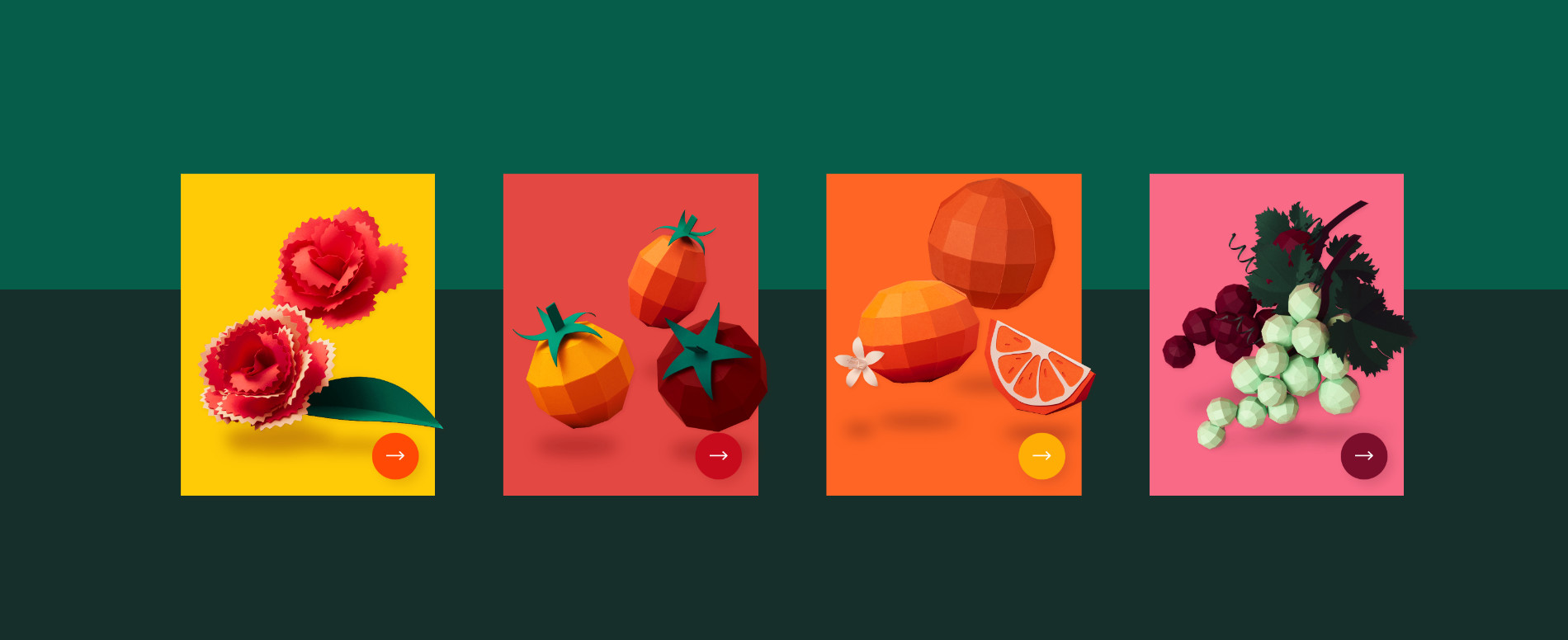
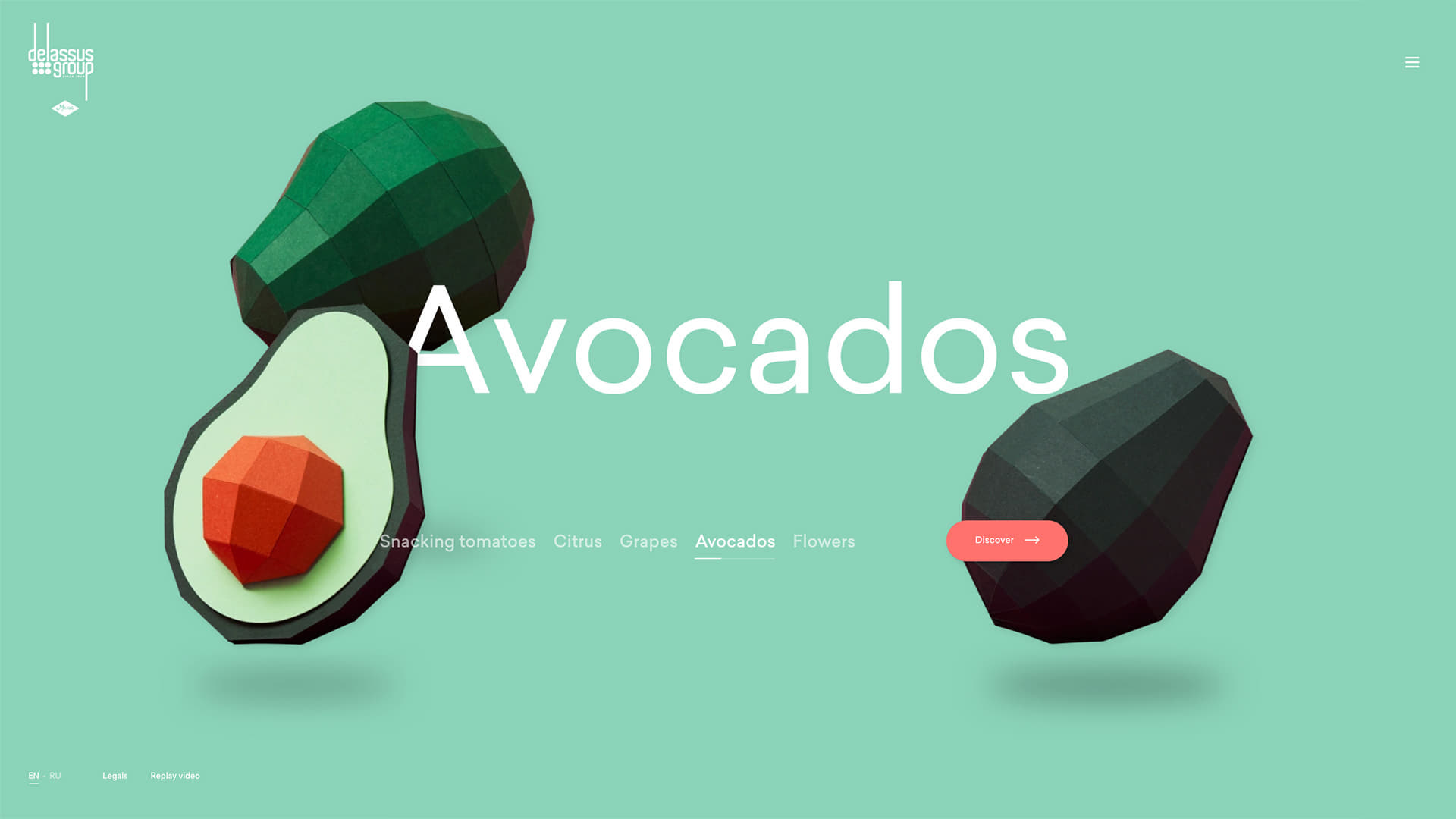
The various productions of the company were represented in a playful way, thanks to a polygonal treatment. Thanks to this artistic approach, we have succeeded in putting all of the group's structures on an equal footing, and creating real uniformity. This approach makes it possible to standardize all activities and create a global brand identity.
A stop motion film was designed to highlight all the specifics of the company
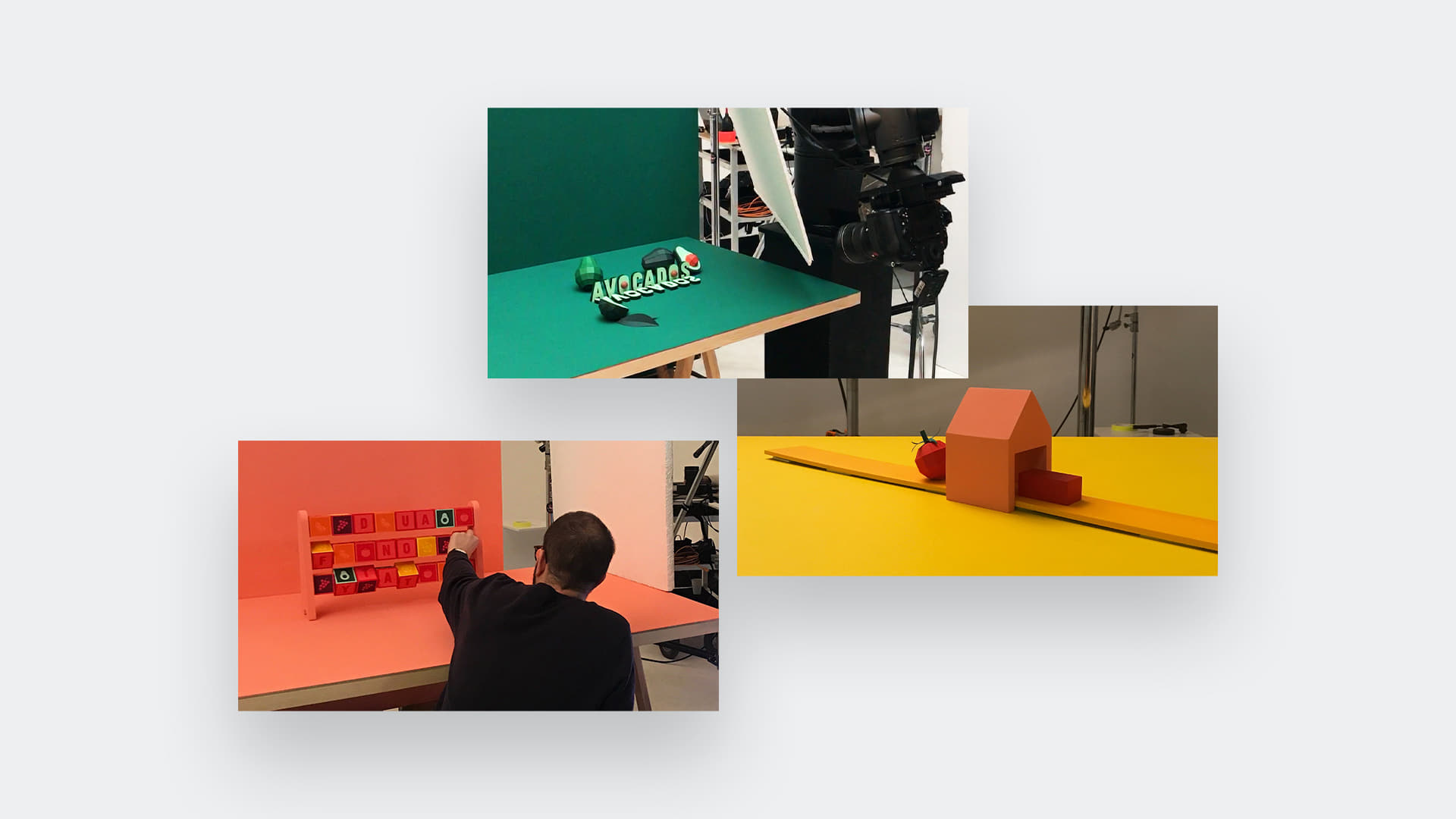
A whole universe, representing a chain of packaging, fields of culture and the products of the structure was imagined and made of paper. A stop motion film was designed to highlight all the specifics of the company. Every fruit has been made by hand, and every scene is composed of hundreds of pictures.
From this movie, we extracted all of the content we needed to give life to the website.
Website
We had great ambitions for the website. It had to be different from the Duroc website while retaining the same original and entertaining character. Unlike Duroc, the Delassus group project features several distinct activities and it is essential that users understand the range of know-how from the first seconds of navigation.
In order to give a playful dimension to this slider we played with several technical tricks
Homepage
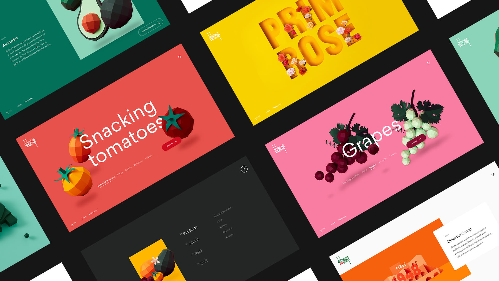
We’ve decided to think of a carousel displaying each activity though a composition of products. Each product is on a colorful background used in its activity page. In order to give a playful dimension to this slider we played with several technical tricks:
- First of all, we’ve build the scene in a way that users can control the camera with their mouse. Products are floating on the screen as if there were no gravity. This idea is underlined by the shadows on the floor. Depending on their cursor position, products move around the screen. Thanks to this parallax, we enhance depth to the scene.
- Secondly, the change of background color is very smooth. It turns from one color to the other by reaching all of the colors between them. There is no separation from one scene to the other.
- Finally, we’ve worked on a font deformation to give a playful aspect to the carousel. By drag and dropping the scene, user see the stretch of one of two letters in each word. Finding the right balance between something too extended or too subtle was not easy.
Delassus - Homepage
Transitions
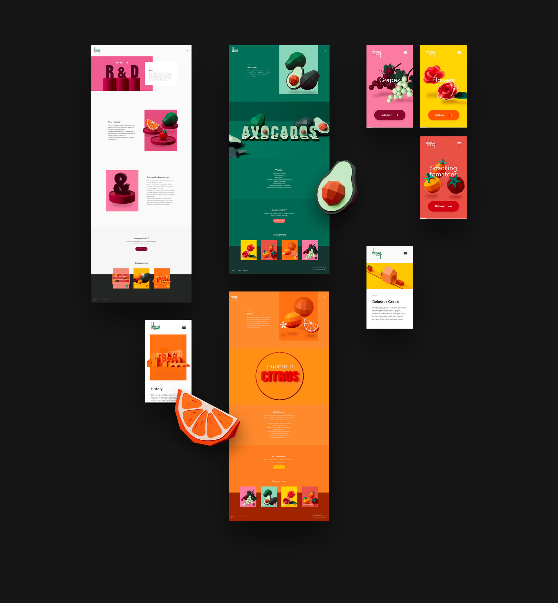
Another specific thing we had in mind while designing the website was to have a fluid experience. We didn’t want any cuts from the homepage to a product page. This how we started to design a product page that has on top the same amount of pictures as it has on the carousel.
Delassus - Interactivity
The product page is revealed with a play on a mask, and the element present on the home page simply slides on a side of the page to give space to content.
Technologies
Home Slider
The management of the slider core is a house code that we use on many of the carousels / sliders that we design for different sites.
The goal here was to have a playful and intuitive navigation, it was necessary to obtain a very fluid rendering of this part. Because of that, our choice fell on Pixi.js, a wonderful library that we had already used several times, notably on Duroc, another site developed for Delassus.
On top of that, we associate different house codes except Hammer.js that we use for drag.
Animations
Apart from the home slider, most of the animations are managed by Gsap3. In addition to Gsap, we use a parallax management library that we have developed in-house.
Core
Except for the routing where we use Router5, all the code is made from scratch. It wasn't necessary here to use a specific framework.
Assets
All the images are hosted by Cloudinary, which allows us to obtain the images in the lightest format and with the necessary dimensions according to the capabilities of the browser and according to the device.
Build
We use Gulp for all the build tasks coupled with Webpack, Babel, Nunjucks, Post CSS and others tools.
Server-side
Nothing specific here, Apache Server, few Symfony tools, Twig and custom code we made.
Company Info
Influenced by art, architecture, object design and applied arts, Bonhomme breaks borders to offer a powerful and global brand experience.
Thanks for all your tweets, the winner of the Pro Plan, which includes a free submission and other perks is @glenncatteeuw, please DM us to collect your prize!
