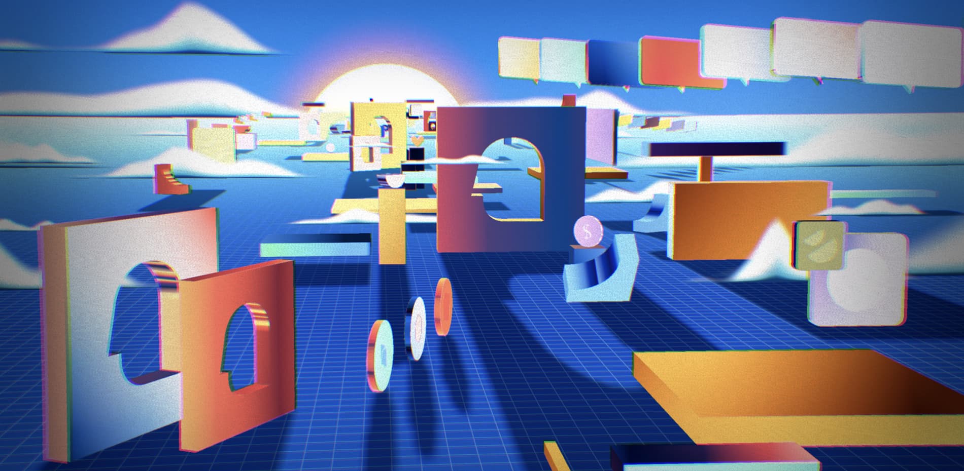
“Let’s put a world in the browser”
DeSo came to us with their mission to disrupt the landscape of social media. An ambition we were happy to bring to life in their new website as we strive to push the boundaries of the web.
While they didn’t have a fortified brand system, the DeSo team did have an incredible suite of narrative motion videos that were done by Ordinary Folk. Without hesitation, we pitched the idea of recreating our versions of them in the browser to properly bring DeSo’s enormous vision to life.
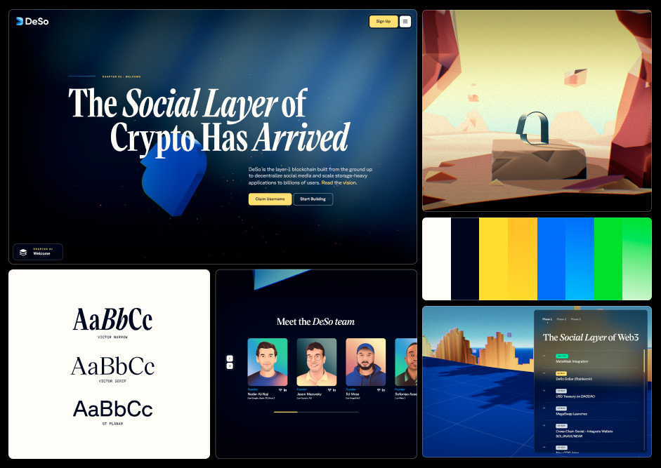
Since they were already working with a well-defined art direction for the illustration system, our first step was to bring the rest of the identity elements up to par. To do so, we focused on establishing a dynamic color and typographic system that would play well within 3D environments.
We focused on establishing a dynamic color and typographic system that would play well within 3D environments.
Due to how saturated the 3D scenes are, we opted for elegance and limited the color system to only a few brand color selections from scenes that already existed. That way there was a measure of consistency between the flat backgrounds, UI and 3D. For our base layer, we chose cream and deep navy for text and backgrounds. To add on top of that, we brought in yellow, blue and green for CTAs, links, and code snippets, each having their own gradient for hover interactions.
We used Victor Narrow Semibold as our main title font because it has charisma and adds to the magical, storybook vibe of the DeSo world. For CTAs and paragraphs, we chose GT Planar for its steady and inventive style. The typefaces are basically opposites, but by pairing them we were able to create a beautiful combination of decoration and functionality.
Web Approach: Scrollytelling
The initial brief was to reskin the landing page the DeSo team had already written content for. While the content was well done, it was a lot of information and limited the amount of detail we could pack into the experience. We arrived at the idea of breaking it down into chapters, as if it was a storybook, allowing us to design the content with narrative-like pacing rather than walloping readers with the feeling of a breathlessly long monologue.
By segmenting the experience into chapters, this gave way to us being able to design each chapter, from start to finish, with as much visual sauce as possible without getting in the way of the content. The idea was to create space for users to marvel at the worlds unraveling before their eyes, while taking in the messaging, from technical to philosophical, of what makes Deso revolutionary. In all, we wound up with seven chapters (or seven little worlds).
From Video to the Browser
From the get-go we were realistic about the fact that we wouldn’t be able to recreate these pre-rendered visuals in the browser 1:1. By bringing in our development team into the process early on, we found a way to bring the 3D illustrations into the browser without overly relying on textures and lighting.
“We found a way to bring the 3D illustrations into the browser without overly relying on textures and lighting.”
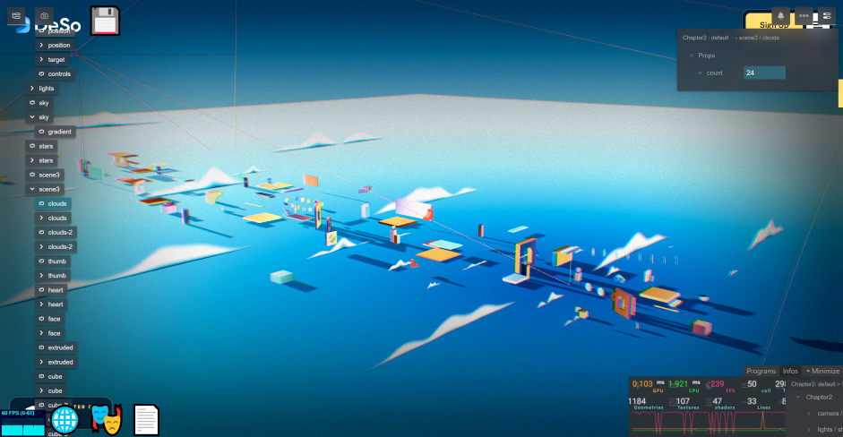
Since most of the scenes are composed of simple geometric shapes and repeating objects, we built the scenes directly in the browser using instances instead of importing complete 3D scenes. Using instance meshes allowed us to create as many objects as we wanted without increasing draw calls, thus improving the overall performance. Building on top of Theatre.js, and by adding gizmos to each object, we were able to have complete freedom in the browser instead of having to move back and forth between a 3D software and the actual production site. For example, the scene below from the second chapter, was built with 11 different objects using instancing and playing around with position, rotation, and scale to create variety.
Up in the Clouds
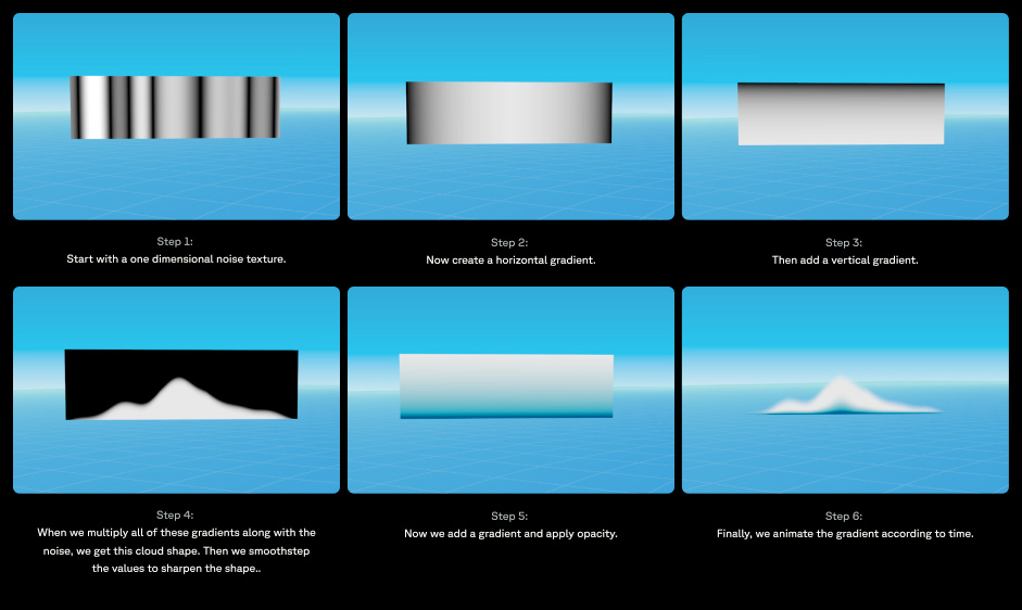
Clouds are something we use in multiple chapters throughout the website. It adds scale and depth to the scenes while also bringing an organic shape to a digital world. Here’s a step-by-step summary of how we created those fluffy clouds:
Gradient City
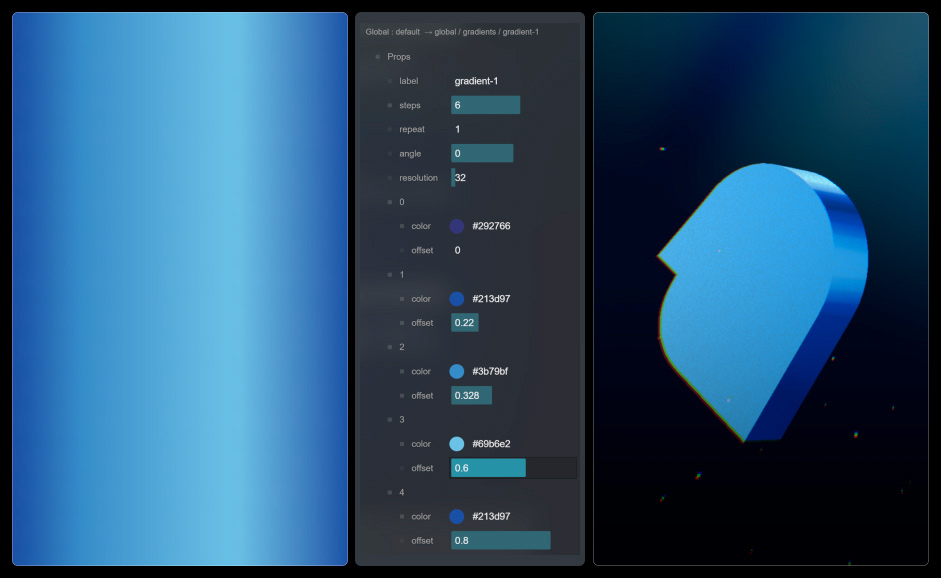
Instead of creating textures and different maps for each object with a different color, we opted to build the gradients directly in the browser. We then applied these gradients as environment maps on the objects, allowing us to create endless combinations of shapes and gradients without sacrificing performance. We used more than 60 gradients and 20 models to generate at least 2,000 objects, and because all of them are instantiated we were able to make the website performant and fast (<5MB of assets) on almost every device including mobile.
Ready? Set? LFG
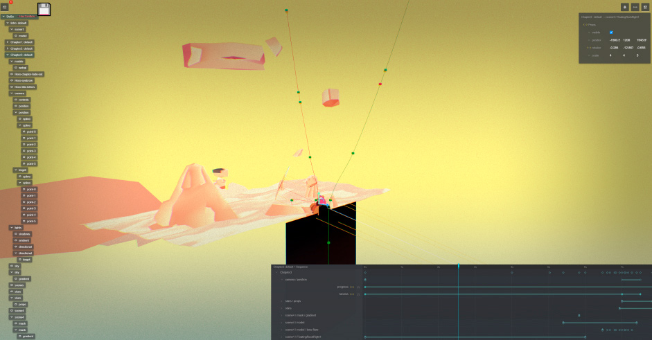
The camera movement was directly built on top of Theatre.js. We created points in space with gizmos so we could move them easily and use them to generate a CatmullRomCurve3. This created both a camera (green spline in the images below) and camera target spline (red spline). A lot of manual tweaking was needed but it allowed us to have complete control of where the camera is looking at all times. This way we were able to hide certain sections that weren’t perfect and shouldn’t be visible to users as you. Next, we animated our camera position and target from 0% to 100%, tying it to the scroll progress. For this, we used a linear animation, since Lenis (our smooth scroll) already takes care of the easing. In the end, the combination of this allowed us to create the cinematic feel we were going for.
Technologies
Frontend Frameworks: Next.js
Backend Technologies: Contentful, Hubspot
Server Architecture: Vercel
Tools: Lenis, r3f, Three.js, Theatre.js, GraphQL, GSAP
Company Info
Studio Freight is an independent creative studio built on principle. We bring together the best thinkers and makers to build new worlds. Stop by our internet headquarters at studiofreight.com.
