Dragonfly is a leading investment fund behind many of the biggest projects in crypto. When we were introduced to Tom Schmidt at Dragonfly (thanks Jeremy), the Studio Freight team was immediately drawn to the possibility of creating an experience not seen anywhere else in the world of Web3.
Luckily, that aligned with the brief — as we were asked to develop a brand and website to represent their position as boundary-pushing thought leaders helping to build the future of Web3.
Identity
From the outset, we knew we needed to bring the heat and experiment with things we’d never done before in order to build a visual system that could demonstrate the technical prowess of the Dragonfly team while still representing their irreverence and research-focused venture approach.
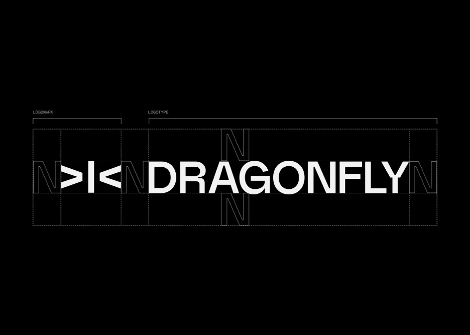
Identity Design
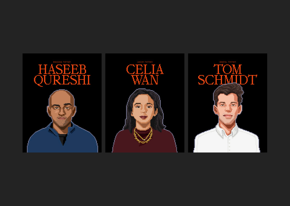
We created a color system with a dark and dramatic vibe with secondary colors, often placed against black backgrounds, that allow CTAs and areas of emphasis to stand out. For type, Non Natural Grotesk and Mondwest are paired to create a simple system with a big attitude that speaks to the technical background of the Dragonfly team. And of course, every Web3 team needs a set of on-chain PFPs so we created custom portraits in a 16-bit style to match the system — all PFPs are minted as a collection on OpenSea.
ASCII Art
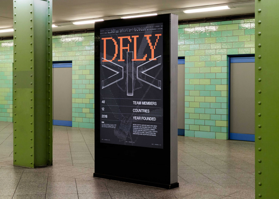
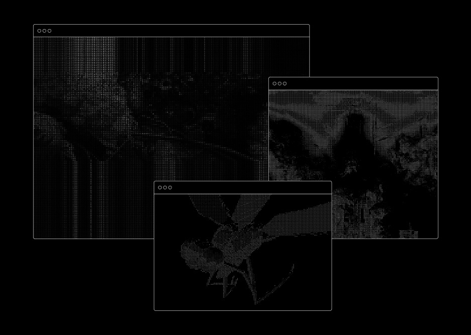
The core system is based on ASCII art (a graphic design technique that uses computers for presentation and consists of pictures pieced together from the characters defined by the ASCII Standard). But we wanted to take it a step further, most online ASCII generators are limited in their abilities and produce static representations of the source imagery leaving little opportunity for post-processing and manipulation. To get around this, we built a custom tool using WebGL shaders which allowed us to use pretty much any file type for image generation and manipulation.
We built a custom tool using WebGL shaders which allowed us to use pretty much any file type for image generation and manipulation.
Website
Approach
This project reinforced how important it is to bring developers into the creative process early because they can contribute in more ways than just writing code. For Dragonfly, our developers added a strong technical influence to the aesthetic that took the web experience to the next level. We worked together to create tools for ASCII image creation and developed an efficient 3D-to-browser pipeline to optimize both performance and visuals, which help make a relatively compact site feel like a living, breathing organism.
Layout
Coming out of the identity design phase, we had a lot of assets we wanted to use for the site experience. However, the UX/IA for the site we planned for wasn’t all that extensive, so we needed to find clever ways to make a concise content outline seem dense and layered.
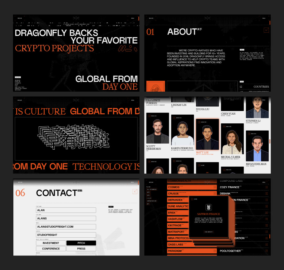
We designed two main variants of the header component to establish a consistent rhythm throughout the experience.
To avoid creating too much chaos, we designed the copy to feel as structured and systematic as possible. As a starting point, we designed two main variants of the header component to establish a consistent rhythm throughout the experience, which allowed us to carve out space for copy without the supporting visuals getting in the way. Then we leveraged the pairing of Non Natural Grotesk and Mondwest to spice up the typographic contrast between headers, body, and detail text.
Navigation
We ultimately arrived at the idea of creating a single-scroll experience to enable the transition and animation ideas we had, but we still needed to let users navigate to specific sections of the site. We designed a quick-draw menu inspired by control panels and, to add to the experience, we made it possible for users to toggle the key-plate colors from the menu.
Experience
As always, we wanted to add some surprise-and-delight moments to the experience. The first highlight is in the portfolio section, where users can click on multiple companies without closing the pop-up modal. And once they’re open you can move the modals around the screen. To close them, you can hold the ‘ESC’ key to close them all at once, rather than clicking one by one. The second highlight is the dragonfly render just above the footer. We placed a piece of the custom GUI we created for our bespoke ASCII in the component for users to stylize the render to their liking.
Development
Setup
We used Satus, our one-size-fits-all starter kit (that includes a basic setup of Next.js with Sass), and custom configurations to cater to our usual needs such as SVG optimization on build time through @svgr/webpack or graphql import support.
Aniso
An early challenge we faced was the ASCII treatment that was so central to the brand identity. We did our research and most of the tools available were a bit flimsy. And what does the Studio Freight team do when a tool doesn’t satisfy our needs? We build one from scratch. That’s what we did with Aniso, an open-source ASCII generator based on Web technologies. Here’s how it works:
First, you can drop any asset, .glb, .jpg, .mp4 and it will do a pixelation pass. Then a grayscale pass to assign values. And lastly, it will translate those values into the characters we’re setting in the GUI: If 0 is white and 1 is black, all the in-between values are different shades of grey, which makes them easy to identify and assign a character to. (An easter egg is that you can drop any asset on the background of the live site and it will process it with the ASCII treatment.)
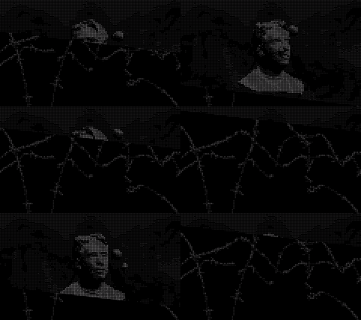
In this case, we knew dealing with multiple canvases was going to be a performance hog, so we hacked our way around using a single one by considering multiple sections, using split composition, and dealing with different scenes at the same time. The approach was to have each section render its own texture only when it was visible in the viewport. Then do a custom post-processing pass to stitch it all together. Tunnel-rat to the rescue! It allowed our devs to work on different components independently from where their children needed to be rendered, making it easy to handle a single canvas.
Lenis
One pagers can be bland. To add more sauce and create a more theatrical effect when revealing new sections, we added a scroll-based ‘fold’ effect using clip-path. The background fades in/out using GSAP Scrolltrigger’s scrub method that gets lerped values from native scroll (thanks to Lenis, our in-house smooth scroll library, which allowed us to bring back all the native browsers’ APIs, keep the WebGL and DOM in sync, and use CSS’s position sticky, which became incredibly useful in horizontally scrollable sections).
Technologies
Frontend Frameworks: Next.js, GSAP, Three.js, react-three-fiber, Lenis
Backend Technologies: GraphQL
Server Architecture: Vercel, Contentful
Tools: tunnel-rat, Aniso
Company Info
Studio Freight is an independent creative studio built on principle. We bring together the best thinkers and makers to build new worlds.
