Concept
We, Femme Fatale Studio were asked to create a brand new portfolio for the cinema production company ‘Easy Tiger’. Easy Tiger is a pretty young company based in Paris but has already won, during its short life, a Cesar prize and a Cannes’ Camera d’Or for the French movie ‘Divines’.
Basically the brief was clear: design a simple, clean and elegant showcase website. But also an especially recognisable and branded ‘Easy Tiger’ website with key values like boldness and modernity.
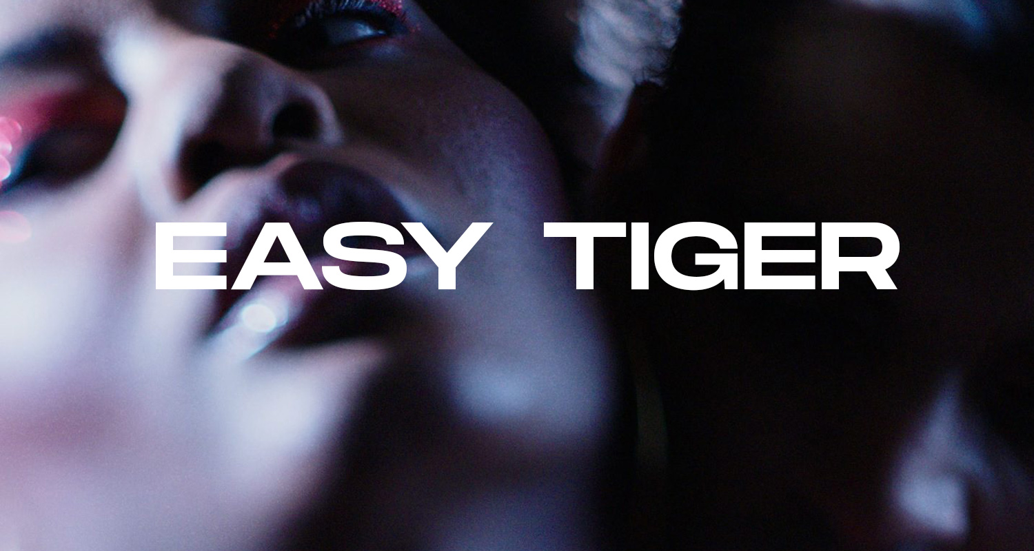
We built the graphic universe around the logo and the pink color: a dark interface with some flashes of pink, and a destructured typography reminiscent of the scratches of a tiger.
Willing to play on the contrasts we chose the addition of a second font, wide and minimal.
Navigation
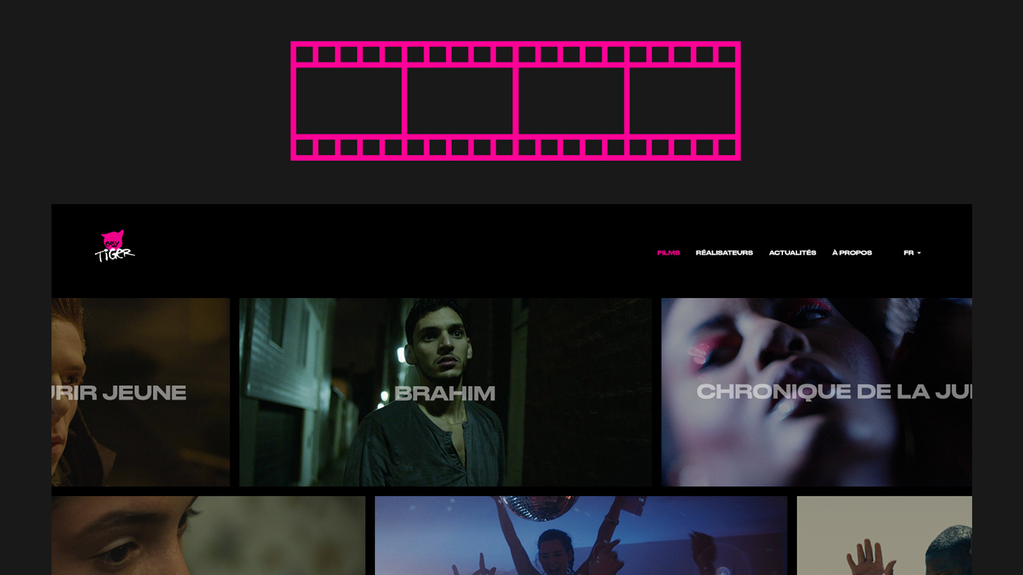
Our will was to get a simple homepage but with an impactful navigation system. For us, navigation and animation are there to help understand the universe of the brand and the story we want to tell. In this context, we imagined and crafted the Homepage and the List of movies as a reference to one of the most iconic cinema symbol: the film.

Insisting on the 21/9 ratio, we created a double column system with an infinite and opposite scroll system. Therefore we manage to get a simple and effective navigation, while telling something about cinema.
The fluid letters animations on the homepage were created from scratch. They were produced from After Effects, then exported in sprites. Since the French and English alphabets contain 26 letters, we’ll let you imagine how many animations we had to produce! It was a long and tedious process but as we say: ‘The Devil is in the details’!
Technologies
We built the Easy Tiger website with React and Express, so that the app could be universal with Server Side Rendering. This enabled us to render any HTML markup on the first server request, while using all the SPA advantages (no page reload, transitions, animations, redux...)
The content is managed with Wordpress as a headless CMS, calling the Wordpress API from our node controllers. We found that the delay was a bit too long for those API calls, so we created a node function that exports the API response to JSON files. So instead of calling the Wordpress API, we can now use those JSON files locally, which is super fast and without any MySQL request.
On the frontend side the main challenge was on the Homepage, a slideshow of masked videos with animated sprites, and a good FPS to maintain. We used React-Konva to deal with the canvas in React, helping us maintaining the states of the components. While the first draft was looking good, performance started to drop on certain browsers. As maintaining the same performance and fluidity in a cross-browser way was impossible, we ended up personalising the components animations and blending props based on the browsers response. And things are not what they seem, mixing real masking and black layers helped us a lot to reduce unnecessary memory consumption.
For updates on our work, follow us on Twitter @HiFemmeFatale.
