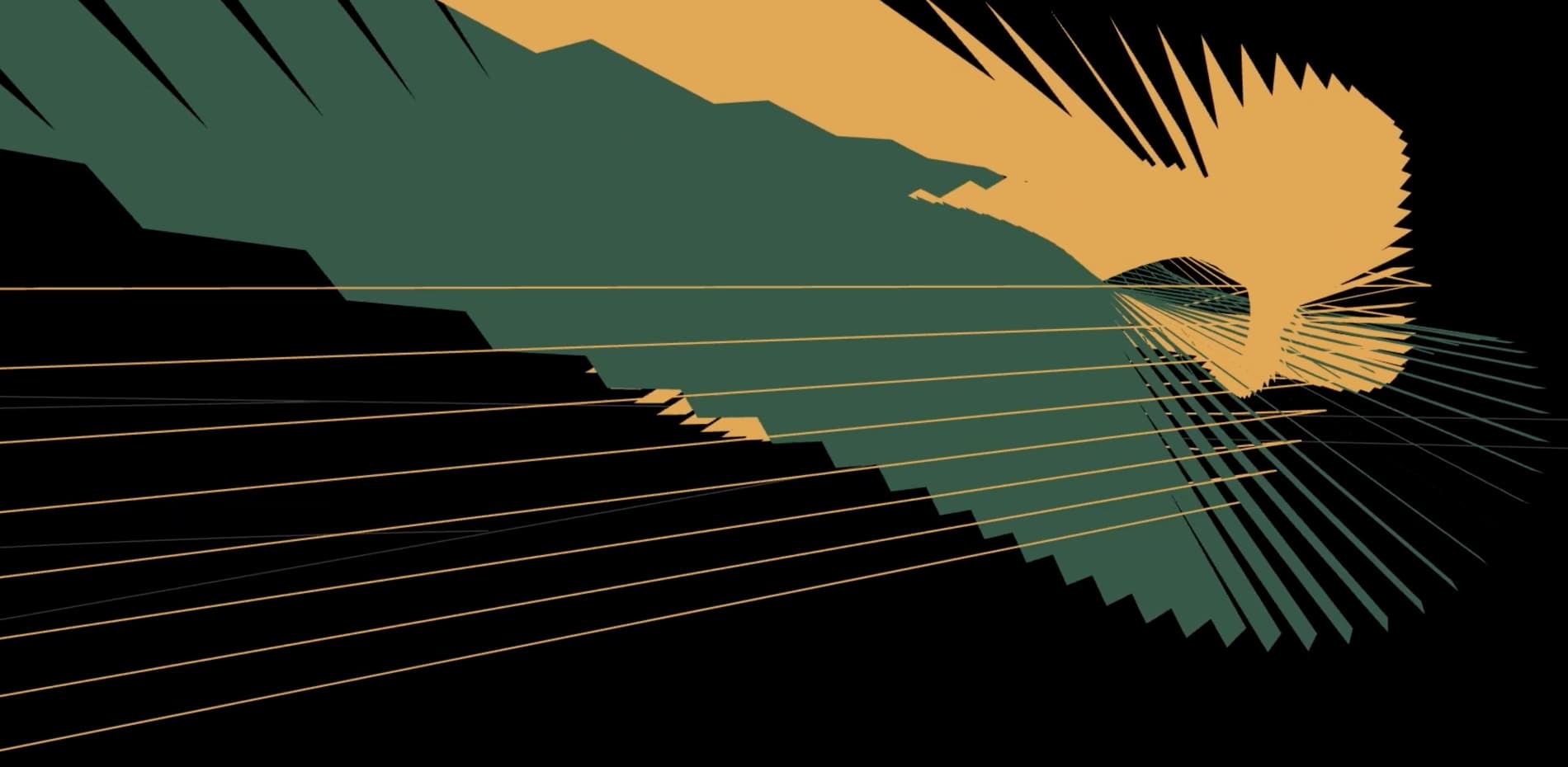
Abstract visualisations of the goals scored in the 2022 World Cup.
In football no other moment is more special than the goal. And for Fever, we wanted to combine our passion for design with our love for the sport, turning every goal into a unique design piece. Just a few weeks before the World Cup, we decided to bring this idea to life.
At the centre of the project we have the trajectory of the ball for each scored goal, drawn in 3D and decorated with abstract elements, creating a unique visualisation for every goal.
The Creation
No labels, no tooltips, no social icons. A minimalist design doesn’t mean bad UX. It’s okay if something isn’t immediately clear. Users are encouraged to explore and discover for themselves.
The website was built without any frameworks, the structure of the website is straightforward, there isn’t much data flowing through the app, so we figured it would be better to keep it simple. Vanilla JavaScript, custom router for the page navigation, Pug for HTML, Sass and a lot of GSAP. We took our time to carefully think about the motion design. We wanted the animations to be slick, fast and dynamic. To guide and encourage the users to explore every match and goals.
Match Sphere
Each match is represented by a sphere, with the first half at the top and the second at the bottom. The goals are plotted along the equator, acting as anchors for inclined cross sections, which are drawn as arcs.
Trajectories
It's a 3D editor where we can draw splines anchor by anchor. The splines are then decorated with styles from a predefined list. Each trajectory can be composed of multiple splines and each spline can have multiple styles, giving us flexibility for a lot of variations.
We had a lot of goals to draw — 198 to be precise, including penalty shoot-outs — so we created a custom tool for the task.
The tool was built with Three.js, using TransformControls to manipulate the anchors. The UI was built with Tweakpane and some custom code to extend the functionality of some base components. For example, in order to select team kit colours, we used a radio grid with tinted buttons. To toggle the visibility of paths or styles, we extended the folder component to include the classic 'eye icon'.
The splines are only visible in edit mode. They act as guidelines for the decorative styles, which are the visible elements. There was a lot of vector maths involved in positioning and rotating different styles. Some required creating sub splines, derived from the main path. That was done by duplicating the base spline, trimming it, offsetting it in a given direction and swirling it around the base spline's axis.
The source code of the editor is shared with the main application, so the difference between edit and view modes are based only on the entry point. This guaranteed parity between the two entities and allowed us to keep evolving both of them in parallel.
The output of the editor is a JSON object describing a goal. It contains the name of the player, the minute the goal was scored, whether it was a penalty or happened during injury time. It also contains the serialised paths and styles, with all their custom properties. The files are on average 3-4 KB, so pretty light and quick to load.
Team Colours
While preparing the designs, we studied all the 32 teams participating in the World Cup. We sampled colours from their home and away kits and also looked for iconography surrounding the teams, such as badges and other symbols embroidered to their jerseys.
These were also used as decorative styles around the ball trajectories, animated with a custom glitch shader.
Technologies
Frontend Frameworks: None
Build System: Parcel
Tools: Three.js, Tweakpane, GSAP, Pug, Sass
Apart from the libraries already mentioned above, it's also worth mentioning alea as a pseudorandom number generator, chroma-js for colour management, glslify for all things GLSL and ways for routing and page transitions.
Company Info
Acervo is a design boutique specialised in crafted interactive projects.
