Flying Papers represents a diverse, vibrant, and global community that is united by their shared interest in cannabis. Whether it's for recreational or medical purposes, or simply to relax and unwind, Flying Papers' products serve as the perfect catalyst for creating memorable experiences for their customers.
Our journey with Flying Papers began when we were tasked with revamping the brand from the ground up. We started by defining their proposition, and – during the branding phase – created and explored several scenarios that would allow us to communicate smoking and cannabis-related products without specifically talking about smoking.

Branding and identity
We had to avoid explicitly showcasing cannabis content due to restrictions on payment providers and social media advertising. Strategically positioning the brand within this market under these conditions was a challenge, but we overcame this by making use of creative storytelling and keeping the website free of any explicit cannabis-related material. This approach proved to be very successful, and a powerful example of what can be achieved through skillful branding and well-crafted strategy.

Introducing Fly
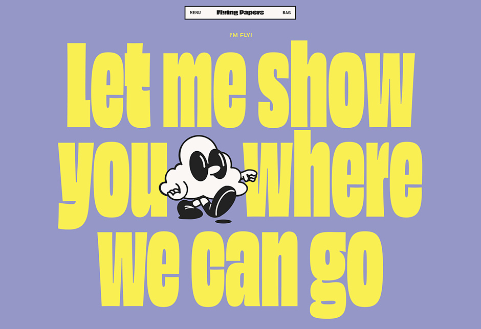
Armed with this new identity, we envisioned a central element called Fly - a curious mascot and laid-back explorer that embodies the brand. His visual shape – a cloud-like, multidimensional figure – was dreamt up by illustrator Ivo Janss. Fly's primary role is to accompany users through their website journey and help them discover the various product categories.
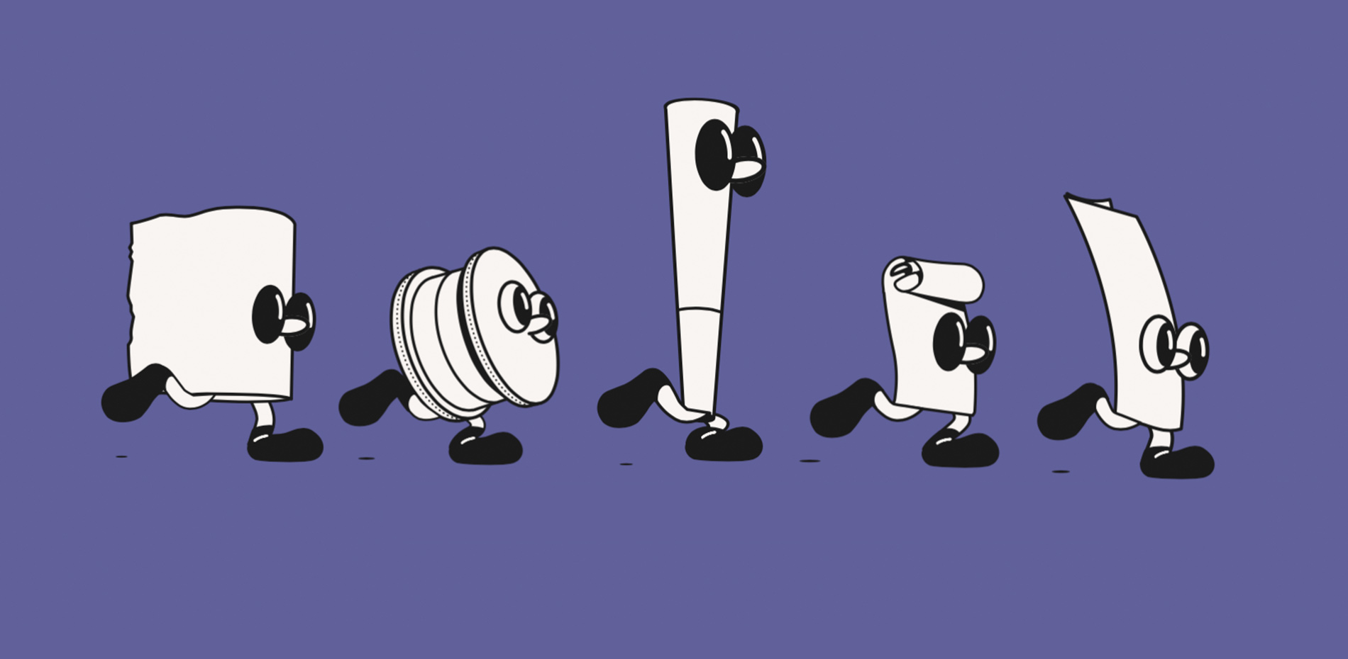
We also gave each product a character of its own. This added another layer to the brand and ensured that Fly would never walk alone.
A collaborative process
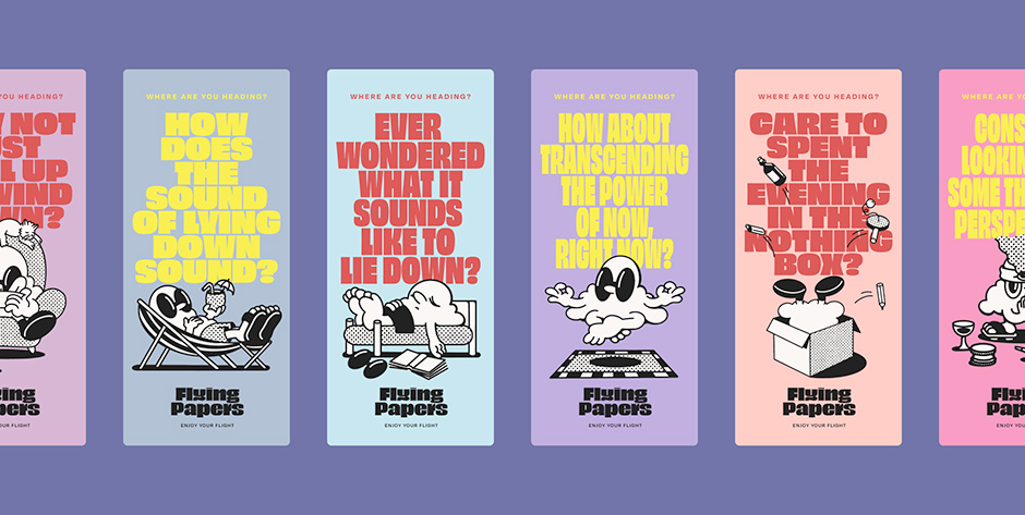
Together with studio Kingdom of Something, we built a set of charming, animated illustrations that helped light up Fly’s story, and bring everything to life. This added a zesty personality to the Flying Papers identity and it made for a constantly moving, vibrant platform, which represents the diverse community that the brand is speaking to.
The use of rich animations presented its own set of challenges, particularly with regard to maintaining site performance.
The use of rich animations presented its own set of challenges, particularly with regard to maintaining site performance. With many layers and unique shapes, they initially slowed down the website. As we continued prototyping, we simplified some of them to ensure smooth performance while keeping them as close to the original content as possible.
Lottie – a tool originally developed by Airbnb for their initial website, was of great help here to ensure everything ran as it should.
3D objects
We felt it was important to offer the customer a preview of what the products were going to look like when they received them at home. However, as neither the product photography nor the physical samples were available during the website's development, we innovatively proposed the use of 3D models to represent all products and packaging effectively.
Once again, we enlisted Kingdom of Something to produce these, and they delivered them in a format that was easy to insert into a prototype. The task was to have the objects look semi-realistic in terms of lighting and texture, so we went back and forth to make sure the end result was both good-looking and multi-dimensional.
The boxes even have a somewhat "rough" appearance, featuring subtle imperfections akin to real-life objects
The 3D models ended up looking great – the boxes even have a somewhat "rough" appearance, featuring subtle imperfections akin to real-life objects. Small flaws, slits, and angles contribute to the authentic paper-like feel, rather than merely resembling textured rectangular models. These details significantly enhance the overall experience, while the 3D models' interactive nature amplifies the website's playful character. This engaging quality resembles a game-like atmosphere in terms of user interaction.
Multilingual capabilities
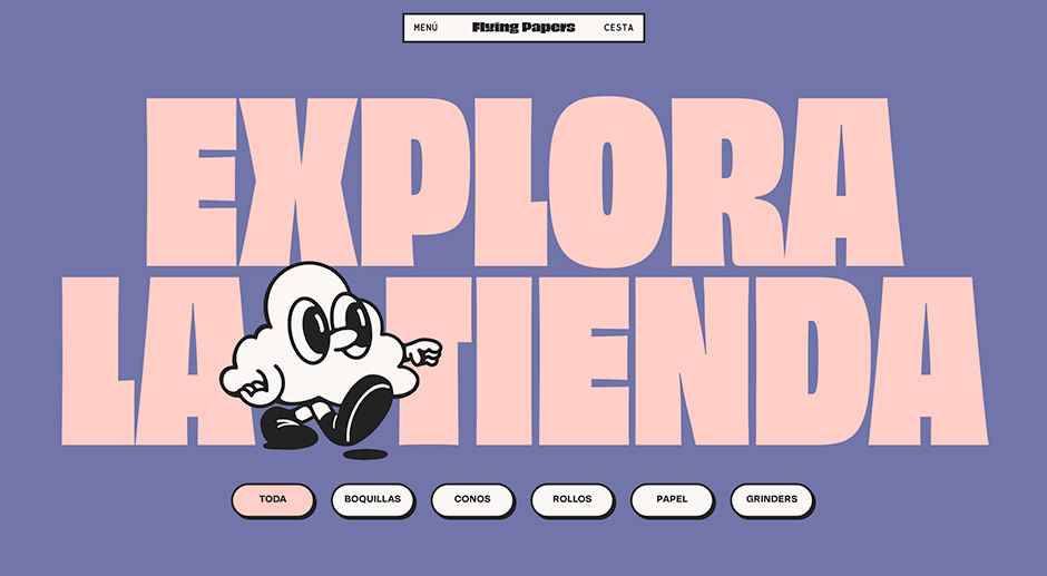
One aspect that is often expected but less discussed is the translation of titles (in Spanish and Portuguese, in Flying Paper’s case) and the challenge of ensuring they fit appropriately within the space allocated. To overcome this challenge, we made some interesting technical choices that allowed for translated titles to be displayed in their original language while still looking visually pleasing and filling the space correctly.
Furthermore, our website allows for language switching, which automatically translates the entire site, including the titles. Despite the fact that some languages have longer words, we've ensured that everything fits together nicely.

Technologies
From a technical standpoint, the main challenge was to seamlessly combine all the different animations, including text, illustrations, 3D models, and characters.
- Next.JS - Javascript framework used to build the general parts of the site (pages/navigation/interactions)
- Lottie - AirBnB Javascript library to turn Adobe After Effects animations into playable sequences on the web
- @react-three/fiber and @react-three/drei - Javascript (React) libraries to render, animate, light and add interactivity to 3d models (.gltf files) on the web
- Framer Motion - Javascript (React) library to animate elements on pages (title animations, scroll animations)
Systems
All systems are connected in a headless fashion. The e-commerce platform, content management system and website are separate entities and are connected through web requests. This allows for building scalable platforms and makes it more feasible to switch out parts as needed.
- Shopify – E-commerce platform solution for managing product prices, cart and checkout.
- StoryBlok – Content management system - All content is managed here - images, texts, translations. StoryBlok is a very dynamic CMS with a visual editor so our clients can edit content on the website and immediately see their changes reflected on the screen.
- Vercel – Hosting platform - This is where the code of the website is on the web. We use Vercel for its great uptime (% of time your website is reachable to customers) and the ability to easily build preview versions of the website.
About Build in Amsterdam
Build in Amsterdam is a branding and development agency specialised in digital flagship stores. We believe our industry is blinded by numbers, while buying decisions are based on emotion. We redefine conversion by building emotional clicks.
