Sonoma is a well-renowned sourdough baking company in Australia, whose founder Andrew Connole has travelled the world in pursuit of making the world’s best bread. And who doesn’t love bread?!
SBS, an Australian television broadcast channel, co-created an 8-part documentary series which follows Sonoma’s fearless leader as he travels to Greece, France, Malta and other history-rich countries to uncover the shared stories of nourishment, companionship, and daily celebration of the world’s most ubiquitous staple.
We were approached to create a site heralding the new series, so we designed a content-rich platform, ‘For the Love of Bread’, showcasing a sneak peek of each episode in full-width video glory. The site also delved into the story behind each destination, to appeal to not just carb-lovers, but anyone interested in cooking, produce, history and keen to travel the world from the comfort of their own homes during Covid lockdown.

Design
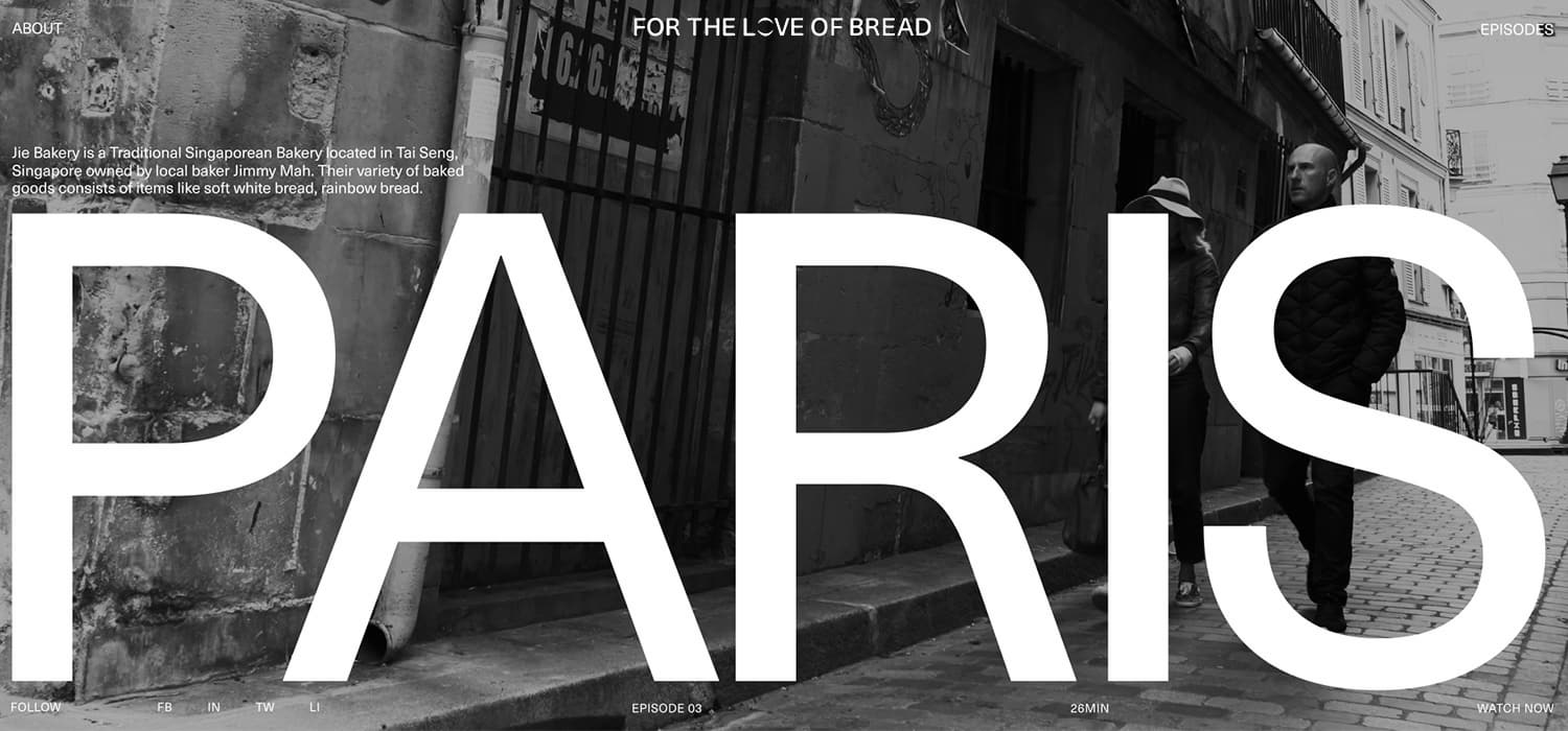
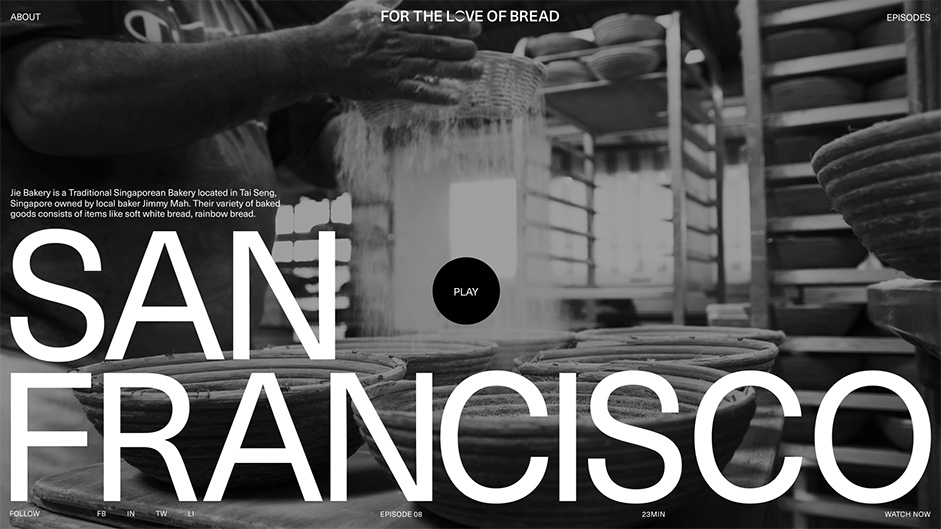
We decided to roll with a monochromatic colour scheme, aligned with Sonoma’s classic branding. This also alluded to the simplicity of the bread itself - good bread does not require any trickery - just honest ingredients and a passion for doing things right. The black and white design also nods to the long history and heritage - hundreds, if not thousands, of years - of the bread’s roots and the cities the documentary journeys to. We used big, towering typography to reflect the powerful and iconic destinations featured - they are as much of the hero as the bread itself.

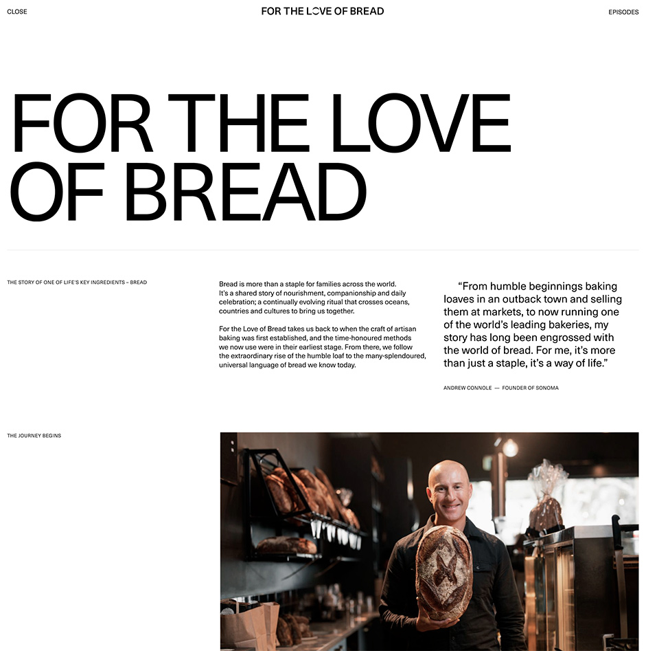
A clean, uncomplicated structure sees the user able to tap easily between the history of Sonoma, the episode list, and the homepage which features snippets of each episode’s gorgeous content and destinations. Smooth transitions between each make the site a joy to play with. A slight glitch upon transition is reminiscent of the RGB interference of TV sets of old, a subtle nod to the medium which the site was created to promote. The big type heroes each location and grabs the viewer’s attention - they’re all magnificent destinations we will hopefully be able to visit again one day soon.
Webpage interactions
Smooth transitions between each episode make the site a joy to play with.
Navigation
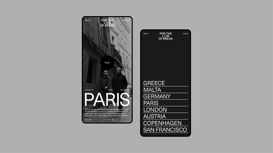
The site is, at its heart, a simple content site, so the navigation reflects this. The user can access all eight episodes from the right-hand side, through an interactive overlay that offers a preview video of each destination. Upon selecting their chosen destination from the menu, we take the preview container and scale it to fill the user’s screen, providing a seamless transition back to the selected episode. Alternatively, viewers can scroll through the homepage to get an insight into each destination and find which tickles their fancy, with the bouncy scroll encouraging them to surface the next episode. An about page tells the history of Andrew Connole and the family-owned Sonoma, serving to explain the genesis of the TV series and his global pursuit of great bread.
Episodes navigation
Challenges
As Sonoma cannot stream the episodes until 12months after the initial airing on SBS TV, we had to find ways to make the site engaging without directing viewers to the full episodes on the site. We managed to strike the balance of engaging through the video trailers with links to watch externally on SBS - creating interest and interaction with the episode menu, and bringing each episode’s synopsis to life with the combination of video and energy through transitions.
We had to find ways to make the site engaging without directing viewers to the full episodes on the site.
We were tightly bound to launch the site prior to the airing of the first episode of ‘For the Love of Bread’ on 7th March, 2021. The episode trailers underwent several revisions and so it really was a race to finalise all assets. Knowing the timings would be tight from the outset of the project, we had planned a simple solution that could be created by one developer and still have time for the extra polish we deem as standard at Nightjar - it’s what creates the best experience for our visitors and also gets projects noticed around the world.
One final hurdle, at the time, some iPhones had an issue playing video onto a WebGLcanvas. It would not throw any errors, but the video would not be displayed in the canvas. Our solution was to detect the iPhone version and use an mp4 for those devices, while using HLS for all other users.

Technologies
Nightjar are always pushing the boundaries and exploring new technologies. For the frontend, we built the site using server side rendered React, and for the backend we used the Sanity CMS. Videos were streamed using Mux, which we synced with Sanity. For animations, we used GSAP and WebGL for the displacement and color shift effect when the user scrolls through the videos.
The infrastructure was hosted on the AWS, and the entire stack was scripted with Cloudformation, to facilitate versioning and source control of the infrastructure.
Company Info
Nightjar is an Experience Design company based in Sydney, working with ambitious businesses around the world.
