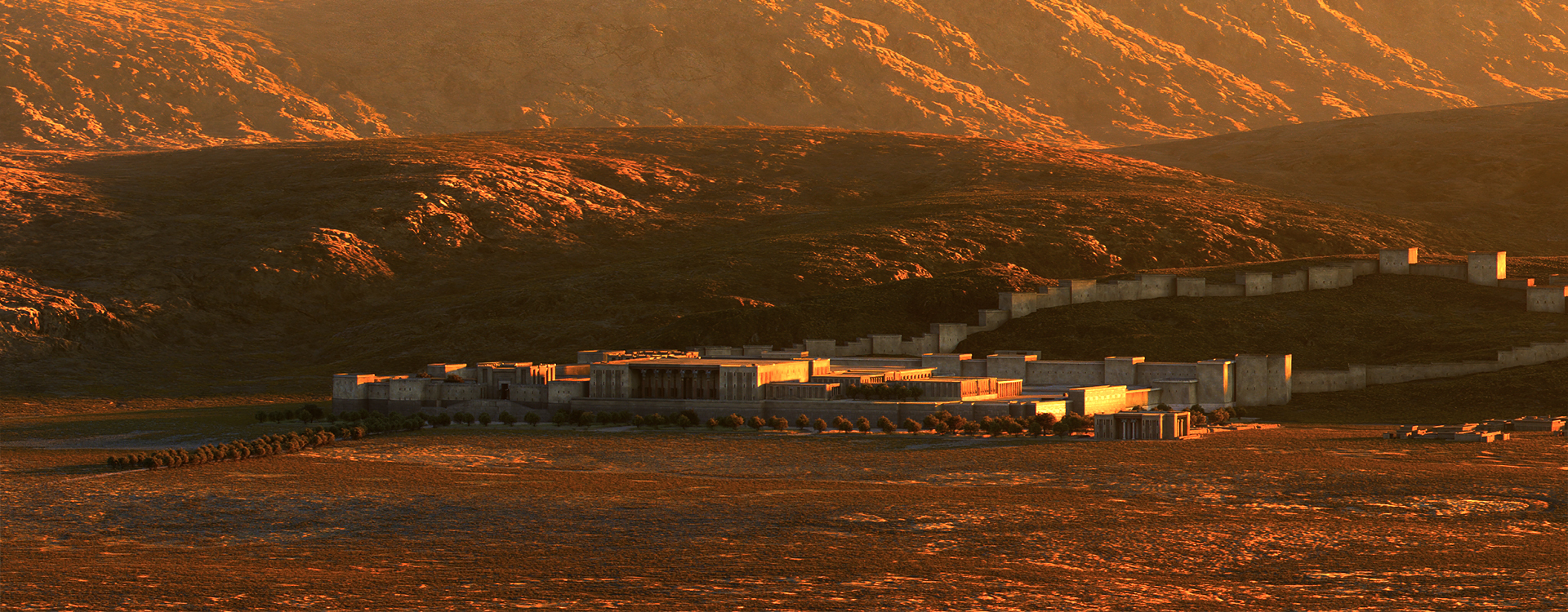
Massive congratulations to Media.Monks for winning Site of the Month June for Persepolis Reimagined. Thanks to everyone who voted, the winner of the Pro Plan is at the end of the article.
The Persian Empire, despite its profound influence, is often overlooked in Western reviews of ancient history. This inspired the Getty Villa Museum to mount a sweeping exhibition of the ancient superpower. To reach an even wider global audience, we created a complementary immersive experience that allows people to visit a historically accurate recreation of the capital of Persia, Persepolis, at the height of its splendor. While our efforts pale in comparison to the epic build of Persepolis, bringing the citadel to life in your browser was an ambitious undertaking that faced us with many interesting challenges.
The Secret to Seamlessness
Crucial to an immersive experience is creating seamless transitions from start to end. From the preloader to the title sequence and into the WebGL initialization, the Persepolis experience is packed with tricks to make this happen.
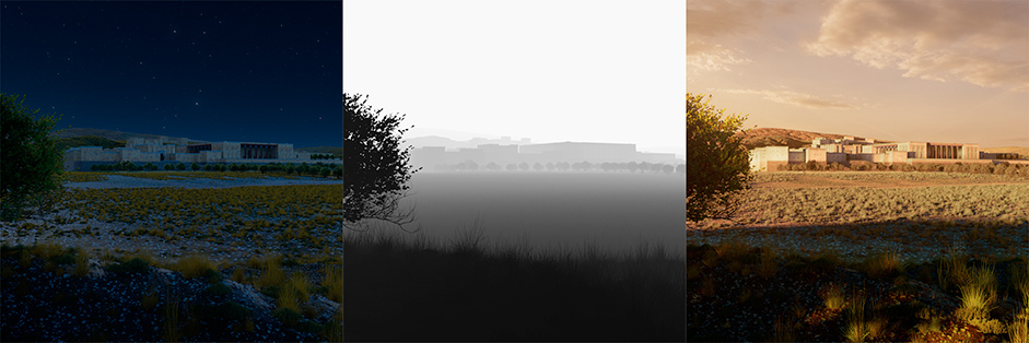
To avoid a simple preloader, we combine two renders of Persepolis in a shader. One is a render at night and a second one is a render at day time. During the preloader, night slowly turns into day. A fog layer slowly recedes into the fields using a depth map. When all assets are loaded, it is day time and all fog is gone. The preloader now matches the first frame of the intro video perfectly, which allows for a seamless transition.
When the preloader is done, we’re able to scroll down and reveal the rest of the city as we fly towards the Gate of All Nations.
There, we implemented a seamless transition between rendered video and WebGL. Avoiding an abrupt cut while marrying two different techniques presented us with quite the challenge but a decent amount of prototyping led us to a rewarding solution: applying the classic chroma key technique, using a WebGL shader to blit the video to the screen.
By syncing up the color grading, camera movement, and timing between our real-time 3D and rendered video, we could layer the video on top of the real-time piece and come to the seamless transition as we see it in the end product.
Finally, because the preloader, video, map and the citadel itself are all rendered in WebGL, we could apply the same post effects (vignette, bloom and grain) to all scenes to blend them together and make the experience even more seamless.
Shaping the Citadel and its Surroundings
In our approach to environments, accuracy was the keyword. Working closely with Getty historians and other subject matter experts allowed us to stay as close to reality as possible. We started with one of the few remaining sources of truth: satellite data. We used that data inside a very early release of World Creator, software that gave us more real-time control of the environment than others could.
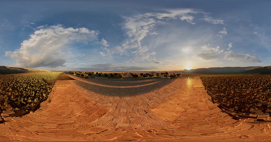
The results were phenomenal and we exported the scene to Isotropix’ Clarisse where we could focus more closely on scene assembly and look development. We used a single project set-up to create one master scene. From there, we created images for WebGL, the 360 dome environment, the map view, and animated shots for film.
This probably comes as no surprise, but the environment was quite heavy — we added incredible detail from different angles, from tons of historical assets and realistic vegetation to countless rocks and pebbles. To put things in perspective: we’re talking about billions of objects.
Keeping Every Detail Accurate
Every object in the scene was created with history in mind. To make sure we selected the right materials, we collaborated with curators at the Getty, and professor Ali Mousavi. Based on their briefing, we were able to make a material style sheet that helped us with filling in each area of the citadel and keeping things consistent throughout the project and the many hands that worked on it.
For many areas we were able to enhance and retopologize previously created models by Persepolis3D. For some we even traced old pictures to get the right lines, extruded them, and improved them with sculpting software. Others, like the big long wall at the entrance, were created from scratch.
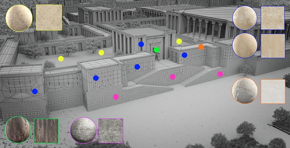
For the creation of the citadel and all of its sculptures, statues and architectural details, we started off with a skeleton model developed by Persepolis3D. We then enhanced, retraced, and retopologized it in collaboration with the Getty’s experts to ensure historical accuracy, and bring Persepolis Reimagined to life.
Luckily, parts of Persepolis are still intact, so that allowed us to draw texture and material details from recently shot reference photography. For the garden and foliage surrounding Persepolis, we had to rely on illustrations of similar gardens from the Persian Empire. We also accounted for small, stone-covered water canals that served as irrigation.
Although Persia is often associated with hot and dry weather conditions, the area around Persepolis is far from a desert. Due to the altitude and surrounding mountains the temperature in Persepolis can go either way. To reflect these weather conditions we've used vegetation around the citadel that is able to stand both the heat and the cold.
Optimizing the Past for the Present with WebGL 2.0
A historically accurate recreation of this scale required the use of cutting-edge technology and many clever optimizations to deliver optimal performance on any device. Once we enter Persepolis, we render a significant amount of geometry onto the screen. With WebGL 2.0 finally available to all major browsers, we could add instancing to our digital toolbelt, which has been introduced with the latest version of this web-API.
To allow for such a large amount of geometry, we had to be clever. First, we minimized the filesize of the geometry by splitting it up into reusable parts that are reassembled in WebGL. To speed up rendering, we used a frustum culling system that prevents the drawing of objects that can’t be seen anyway, and an LOD system was used to reduce the number of triangles drawn to a minimum. For elements such as pillars and sculptures, we used normal maps to still lower the triangle count but retain detail.
Finally, to keep draw calls low, the objects are drawn using a dynamic instancing system. All Objects that share the same mesh and material are drawn in one draw call rather than separately while culling allowed for the number of objects to differ from frame to frame.
Streamlining our workflow with Unity
Next to using the latest web-API’s available to us, Unity’s GUI and tools play a big part in this production. Having the power of its easy to use visual editor at our arsenal simplifies many things, such as authoring scenes.
The scene and camera animation were set up in Unity and exported to our own JSON file format using a custom exporter. The fact that we used Unity to create the scene has several advantages. For example, Unity supports a combination of lightmapping and instancing by default. In addition, we could easily add our own, custom components in the scene and export them, allowing us to provide objects in the scene with additional metadata.
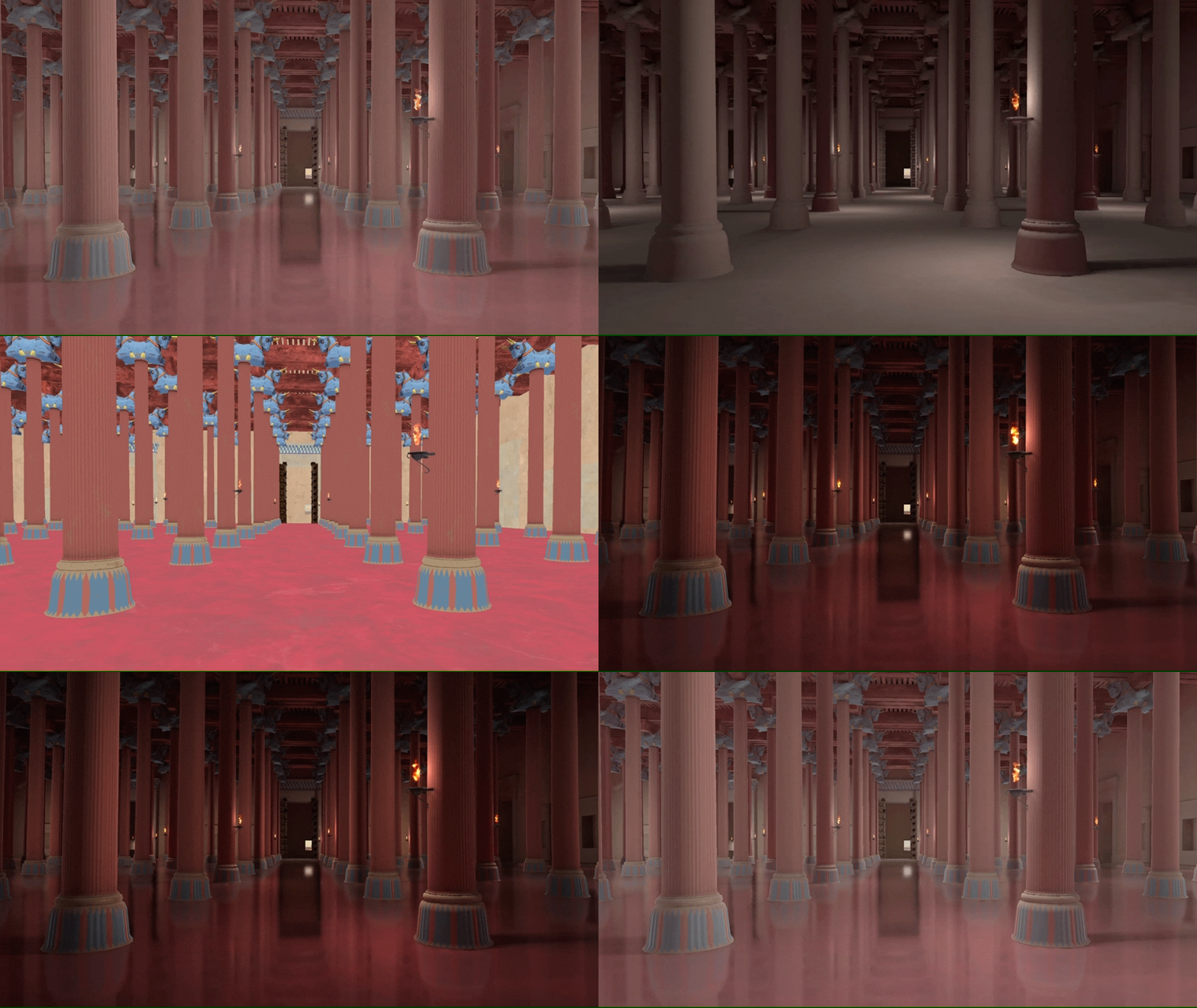
We decided to work with a fixed camera path for this project to optimize the experience further. Having it fixed meant that we were able to manually specify which objects might be visible in the floor’s reflections, saving us the trouble of rendering the entire visible scene twice. Finally, the values of the post-process pipeline are hardcoded in the Unity timeline — like the amount of bloom that is visible — this helped create the high-quality ‘HDR look’ and optimize the settings for each scene specifically.
Sound: an Echo of Ancient Times
Sound is the final element of this intricate assignment. The goal for music and sound design was to enhance, not to overrule. It provides an epic, cinematic weight to the journey while also staying true to traditional expressions found in Middle Eastern culture. Paying special attention to contrast, density, surround elements, and transitions, we managed to enhance the 360 experience inside the dome for the visitors. The use of musical motifs, colors, and dynamic changes helped us to highlight the different locations and paths discovered throughout the narrative.
To highlight leading motifs and ornaments, the score features several authentic instruments such as the kemenche, duduk, ney, daf, tombak, darbuka, and zurna (we understand that you may need to google some of those). These were, once more, selected with the help of historians and specialists to capture the ancient and majestic atmosphere.
For the cinematic feel, the traditional elements were embedded in synthesized sounds created with modern instruments and processing techniques. This resulted in a hybrid palette where authentic instruments, rhythms, and scales from the traditional Persian realm are mixed with contemporary ones for an engaging and immersive experience. Sound design took a subtle but important role with evolving textures, surreal ambiances and field recordings, adding an extra level of detail, depth and life to the web journey.
Technologies
Frontend Frameworks and Libraries: Vue.js, GSAP
Tools: Unity, Maya, Substance Painter, After Effects
Thanks again to everyone who voted, the winner of the year’s Professional Plan in our Directory is @bamojk, please DM us to collect your prize!
