Dec 23, 2024
Case Study: Grégory Lallé Portfolio 2024 — The constant struggle for most developers

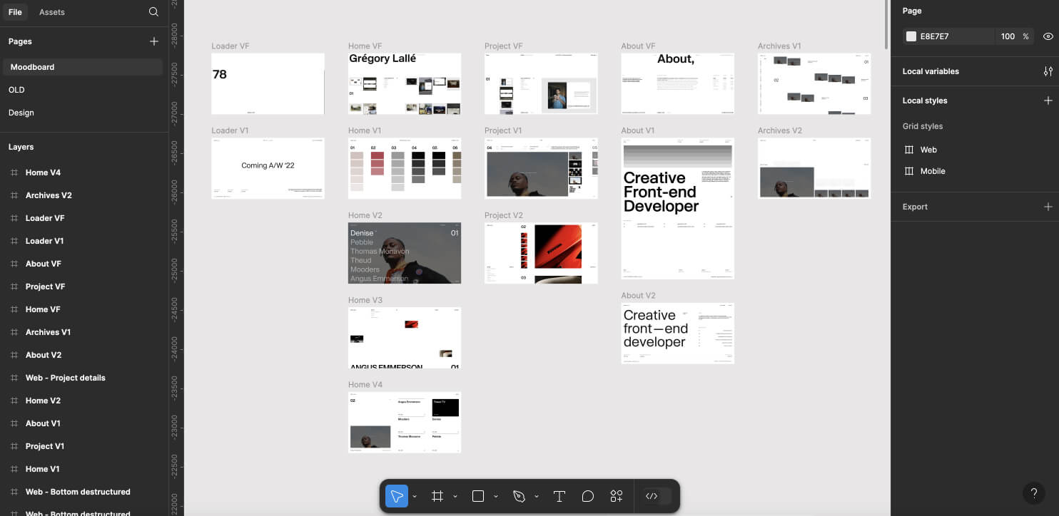
This new portfolio is the result of a close collaboration with Thomas Monavon, initiated in mid-2022. Together, we designed and conceptualized an initial version, which was partially developed.
However, as is often the case for a developer working on his own website, client projects took precedence over it, putting development on hold. This significant delay raised doubts about the original site's relevance and purpose. That's why in early 2024, after several months of interruption and the completion of two projects together between mid-2022 and late 2023, we decided to start working on this portfolio again. This time, we started from scratch with a new strategy, determined to finish this project.

Our strategy
As previously mentioned, this year-long pause disrupted the development of the initial portfolio. The original version featured WebGL-rendered images with unique page transitions for each project, involving complex conditions and logic. However, this break gave our ideas time to evolve, and we decided not to pursue that direction further. Instead, we restarted the project from scratch with a new strategy in mind.
No unnecessary WebGL, no 3D, no “useless” effects—we chose to focus on the essentials. The navigation concept was carefully designed around the projects themselves, highlighting my work rather than the portfolio itself. This results in a simple, minimalist design that blends thoughtful animations with a touch of brutalism.
“No unnecessary WebGL, no 3D, no “useless” effects—we chose to focus on the essentials.”

The navigation concept
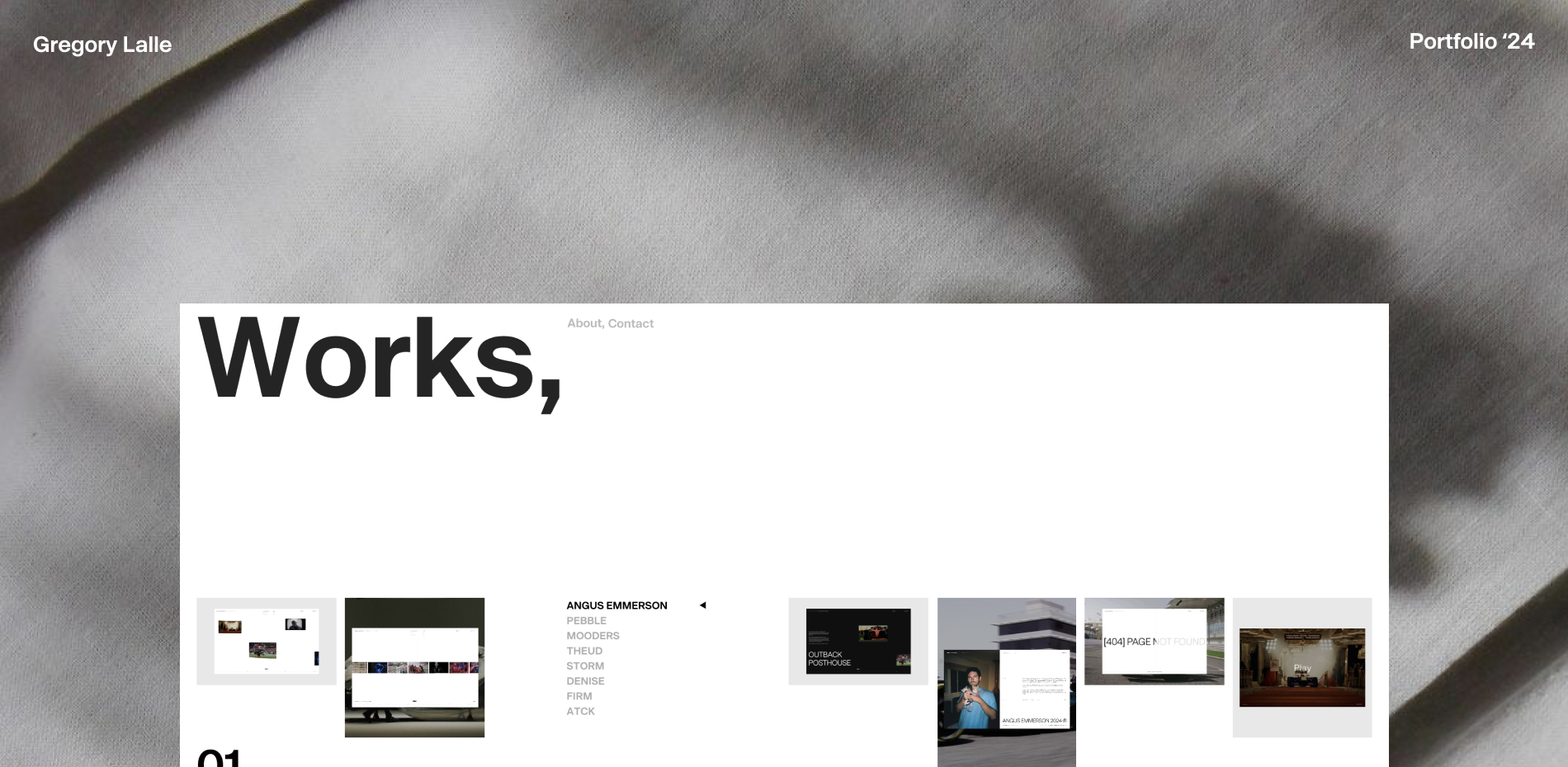
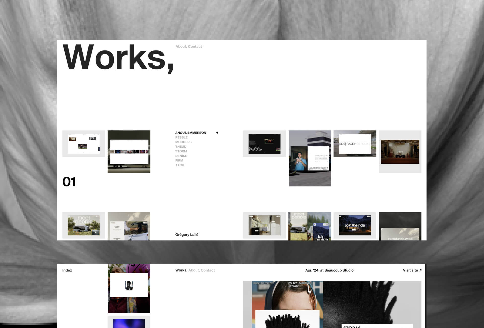
The navigation concept we aimed to implement was straightforward: put my projects at the heart of navigation. To achieve this, we imagined a project list at the center of the homepage, remaining in that position across all other pages. On the homepage, we built a grid surrounding this list, featuring five visuals for each project to provide an immediate and comprehensive view of my work upon landing on the site.
We also chose to include minimal text about the projects, both on the homepage and on the projects focus page, leaving room for the visuals to take center stage.
We wanted to use the “About” page to highlight my clients rather than focusing too much on details about myself. To me, showcasing the clients I collaborate with is just as important as talking about me, as they represent the projects that inspire me and the domains I want to focus my work on.
As mentioned earlier, we aimed for thoughtful animations that would enhance the site’s content. At the start of the project, we planned to organize navigation around the project list, and from there came the idea to transform that list into the presentation text of my clients. This idea, born spontaneously during the development process, led to the current transition between the homepage and the About page.
It also redefined the role of the About page, turning it into a space that presents not only myself but also my clients. We were looking for an animation that was both clever and innovative, and I believe we achieved that with this approach.
All projects, together
Since our navigation concept revolves around the projects, we decided to move away from the traditional portfolio structure with separate pages for each project. Instead, we chose to create a single page that gathers all my work in one place, where every image from all projects is accessible simply by scrolling. This approach provides a comprehensive overview and quick access to all projects on one seamless page.
To further streamline access to the visuals of each projects, we chose a simple opacity animation for the images on the right side, which adds a subtle touch of brutalism to the portfolio.
On the Works page, we implemented a custom sticky effect to create a smoother experience. The element "sticks" to its position with an ease-out easing to add smoothness to the traditional sticky effect. This was achieved by combining sticky and fixed CSS positioning with a translate animation applied to the numbers, powered by GSAP and triggered on scroll using ScrollTrigger. This small detail gives the sticky effect a more polished and natural feel.
Adaptive loader, ensuring consistency with all page layouts
For the loader, we wanted something minimalist yet impactful, while maintaining consistency with the site’s pages. We decided to bring this impactful style with a bold typography and a brutalist type of animation. The goal was to offer a unique experience for each page being loaded and ensure cohesion between the loader’s layout and the page itself. We've therefore chosen to position the loader's digits in relation to certain layout elements, to have the feeling that the loader is building the page.
Simple mobile version, straight to the point
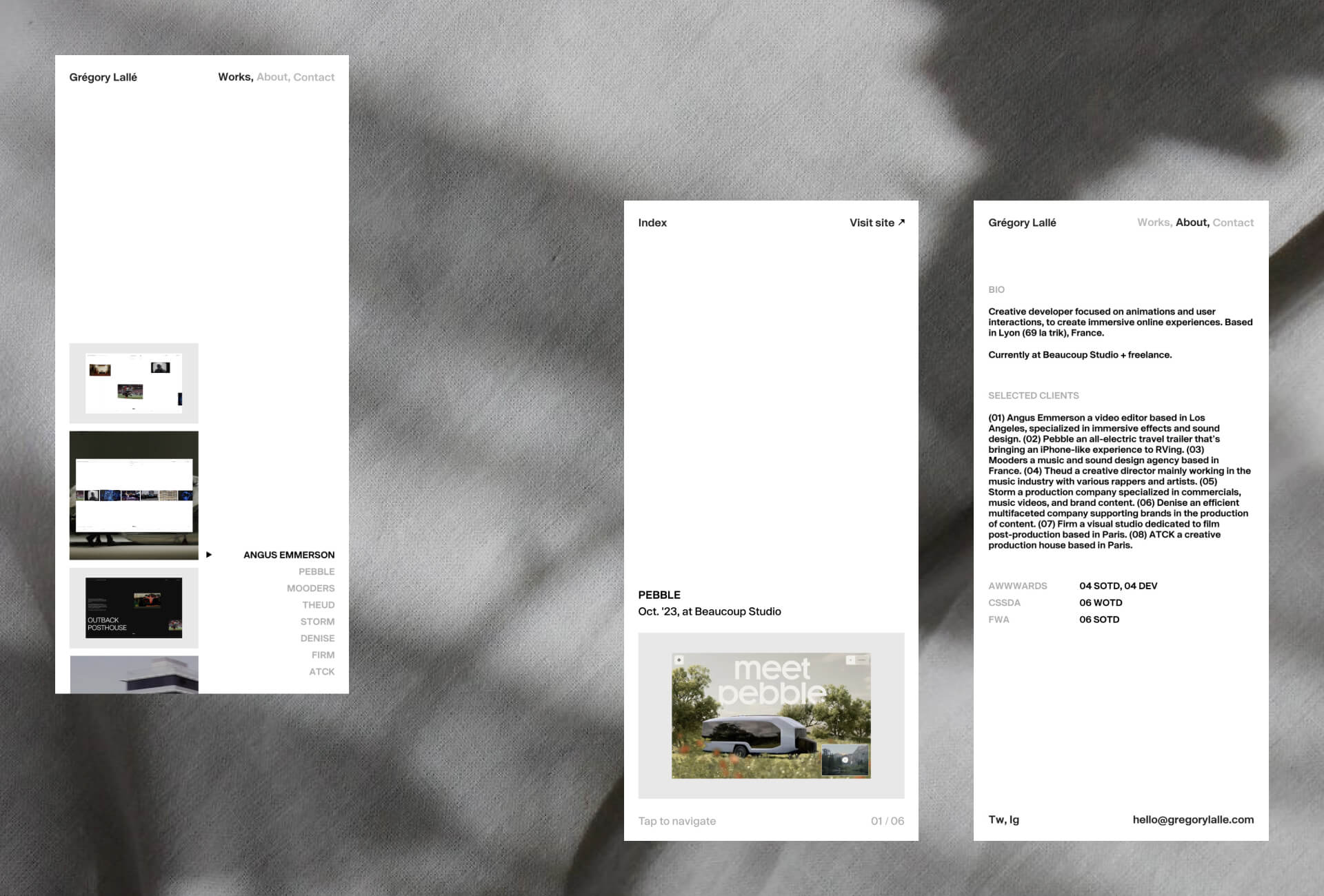
For the mobile version, we aimed for simplicity and efficiency. We kept quick access to all projects on the homepage, reducing the number of visuals displayed per project to improve performance and ensure faster loading times. We also reimagined the focus page as a slider, allowing users to navigate between projects with a simple tap interaction. Our top priorities for the mobile experience were ensuring quick access to project visuals and making the contact information on the "About" page easily accessible via the header navigation.

Design and collaboration
Since our work on this portfolio began about two years ago, we tested many layouts, especially different grid arrangements on the homepage, before finding the right direction. This has led to a close collaboration between designer and developer from the start of the project, as we wanted to strike the perfect balance between a minimalist design that was fast to implement in development and a layout that could display multiple visuals at once.
Our collaborative approach involves bringing the developer into the design process from the very beginning, combining technical expertise with creativity. By involving the developer early in the process, we can think about animations alongside the design, ensuring consistency in the final result. At the same time, we encourage freedom to experiment with animations during the development phase, which can even lead to changes in the design. This synergy between design and development results in outcomes enriched by our best ideas.
In this project, for example, the typography scaling animation in the portfolio navigation was imagined and crafted directly during development. This close collaboration throughout the production process enables us to create projects that are both consistent and innovative.
“By involving the developer early in the process, we can think about animations alongside the design, ensuring consistency in the final result.”
Technologies
The site was built using a custom boilerplate with native PHP templating (MVC architecture) and vanilla Javascript. Page transitions are handled via AJAX using a custom router made in vanilla JavaScript. For the tech stack, we used Tailwind for CSS, GSAP for animations, and Lenis for smooth scrolling. All data is stored in a simple JSON file.
On the design side, Figma was our main tool. We also used After Effect to prototype some animations.
Frontend : Vanilla JavaScript, Tailwind, Lenis scroll, GSAP for animations
Backend technologies : PHP
Content management : A simple JSON file
Design tools : Figma & After Effect
Company Info
We are a developer and designer duo, made up of Grégory Lallé and Thomas Monavon, based in Lyon, France. After studying together at the same university, we reconnected a few years later in the professional world and have been collaborating on various projects since 2021.
Grégory is a creative developer specializing in animations and user interactions to create immersive and cohesive online experiences. Currently working full-time at Beaucoup Studio, he also takes on freelance projects, mainly in collaboration with Thomas.
Thomas Monavon is an independent creative designer and an Awwwards Jury 2024. Loving plants and crafting original web experiences based on motion, creative layouts and minimalism.
Looking to create something unique, collaborate with us or share your vision—don’t hesitate to reach out! Stay tuned on our socials to follow our upcoming projects and highlights!
Grégory Lallé
Twitter / Instagram / LinkedIn / Bluesky / Website
Thomas Monavon
