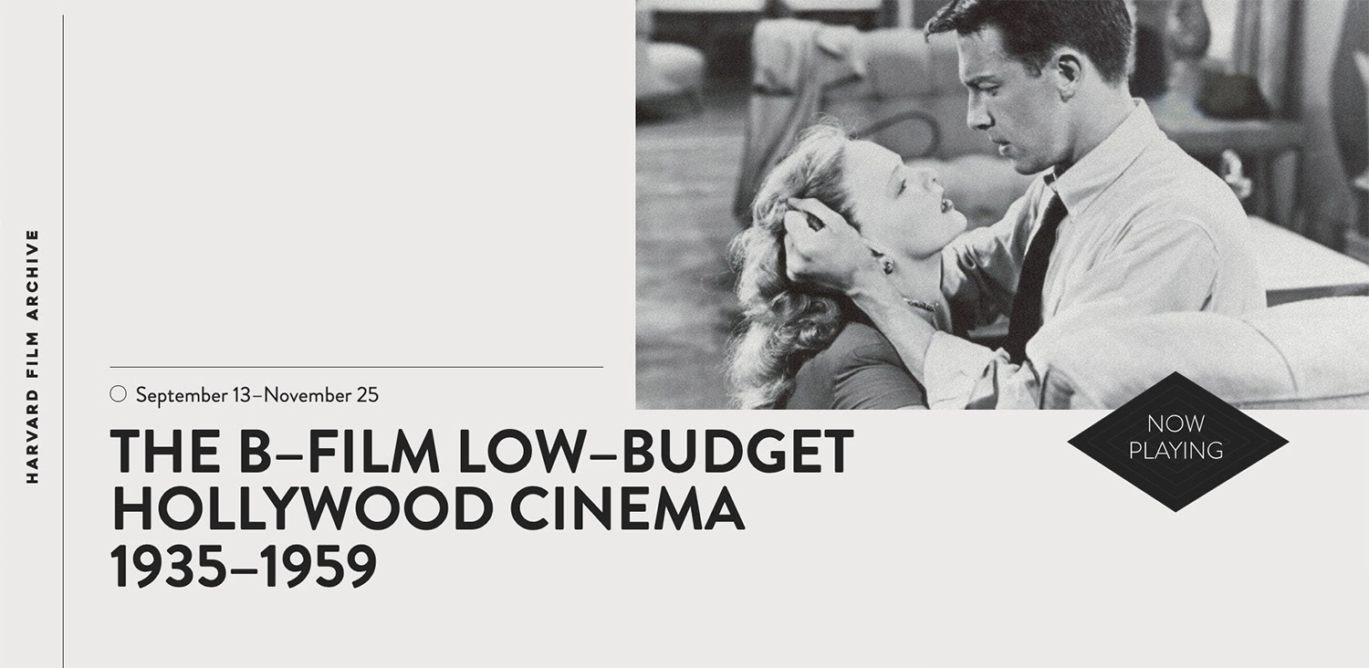
The Harvard Film Archive is an academic institution dedicated to the collection, preservation and exhibition of film. Located in the historic Carpenter Center for the Visual Arts on the Harvard University campus, the HFA cinematheque is renowned for its diverse programming of film, which, due to age, rarity, challenging content or format, is not regularly screened or even available for viewing at all.
At Huncwot we have been creating digital products for various cultural institutions all over the world since we were founded in 2007. However, the history of the Harvard Film Archives website was even longer than ours, something which does not happen very often. Designed and developed in 1999, it was on-line for twenty years without going through any changes.
It had it all - 800px width breakpoint, HTML built with <table> tags, images used as film titles and Macromedia Dreamweaver used as the main building tool.
It had it all - 800px width breakpoint, HTML built with <table> tags, images used as film titles and Macromedia Dreamweaver used as the main building tool. Twenty years for such a great institution, screening several films a week and hosting hundreds of custom film and performance programs, also means a sizable amount of digital data – all it in custom HTML pages.
HTML goes SQL
The schedule was tight, and we didn't have the required time (nor the will power) to retype all of the program data, actor and director’s names, film formats and durations from scratch. Instead, we started analyzing the HTML code in search of a pattern, something that was not an easy task – after all, the previous web page was twenty years in the making from several different editors. Our aim was (as always!) ambitious; to recreate all the data in a detailed database with separate fields for film directors, cast and all the technical data, such as screening and film format, duration, and so on.

We began by writing a scraper and attached a machine-learning code in order to analyze the HTML differences. This worked in the beginning, but it was not enough – the amount of differences in the data meant that we needed some kind of database to distinguish film titles from cast and directors’ names which were sometimes randomly placed in the HTML. Therefore, we wrote another piece of code and connected the system to several open-source film APIs, which allowed us to validate extracted data, including titles, technical specifications and names of the director and cast. While not all of them were fully recognized (HFA sometimes screen films so rare they are not included in any database), we reached a 96 percent success rate and quickly 1179 programs, 6243 films and 7432 screenings were moved to our highly customizable database.
Le Corbusier goes 2019
As it is, the Harvard Film Archive is a very important institution, with its cinema located in the Carpenter Center, the only building on the North American continent designed by famous Swiss-born architect Le Corbusier. As a European company, we have a lot of respect for Le Corbusier and therefore decided to base our creative idea on the building and its unusual modernist facade.
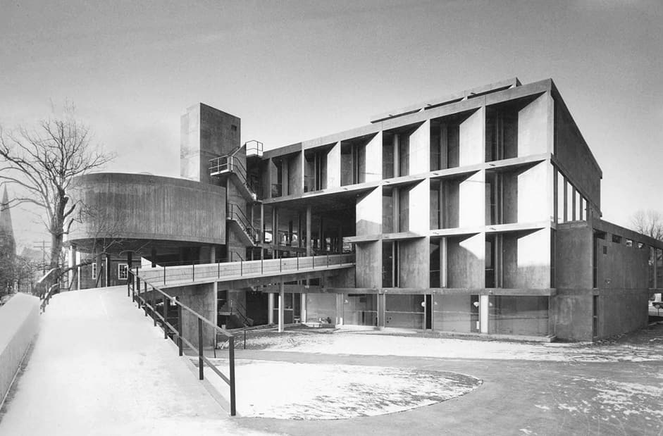
We were also encouraged by Haden Guest, HFA’s director, to include colors from Le Corbusier’s Architectural Polychromy palette.
We tried to keep front-end movements as simple as possible, focusing on micro-animations, <canvas> grain resembling 35mm film stock, and roll-overs imitating film roll. Subsequently, we adapted classic film iconography, such as film strip countdown sections and old-school cinema neons and translated them to the new, Le Corbusier-inspired design.
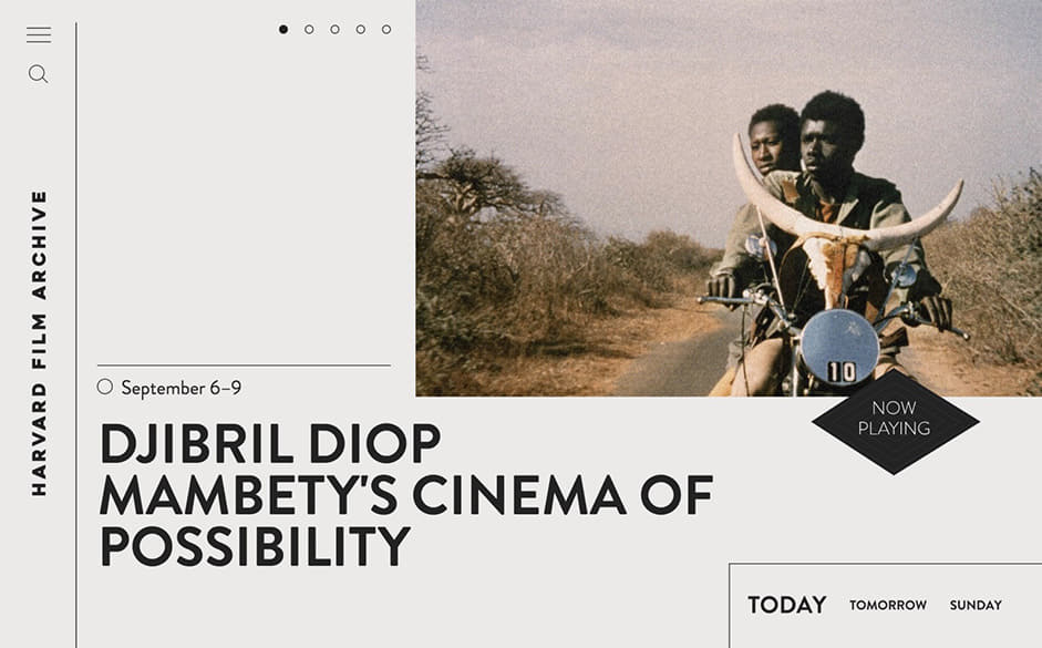
We design a substantial amount of digital products for different institutions of culture, and we are always searching for the ideal art direction, to move the classic (sometimes decades or centuries old) visual identity of an institution to the modern digital world without losing any of its original spirit, and still make the digital product look and feel modern.
Details go 1999
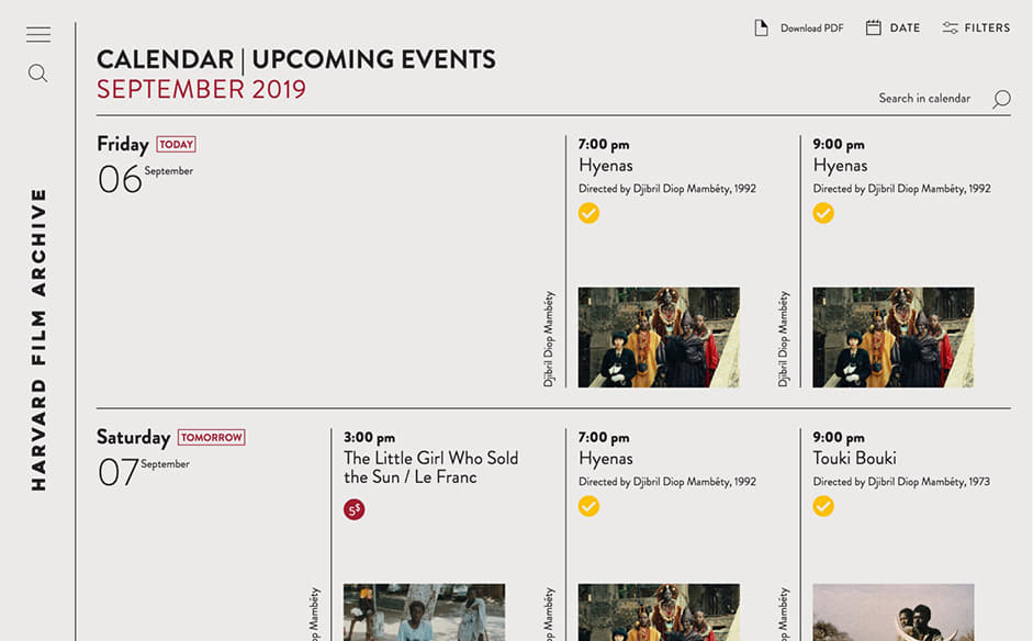
Since HFA’s website has been edited manually for the past two decades and its content has a very personal feeling, we set out to recreate that content as much as possible, even if the data had to be moved those database fields.
We created a custom CMS, which allows HFA’s staff to customize aspects of every screening and program page, including double-bill screenings, short films screenings, single screening programs, etc. We also included many details visible only for film aficionados, like showing images and thumbnails with different aspect ratio for 16mm and older 35mm movies and newer, panoramic formats. We believe that there are too many generic websites out there and always try to include as much of a human touch as possible to every project.
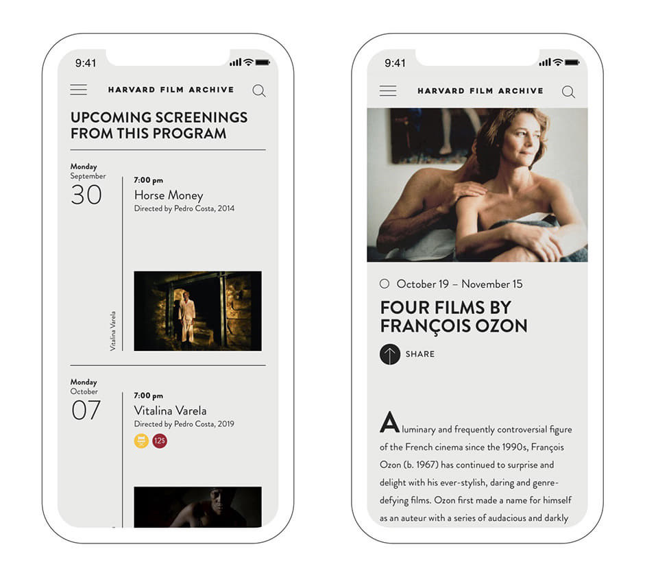
The overall process went smoothly and there was a great amount of help provided by HFA’s staff, with whom we share the same level of attachment to the details. And it looks they liked the final result, or as one of the HFA’s staff put it:
The website looks great. Like I said, I can’t believe I work here!
Contact Huncwot: lukasz@huncwot.com
