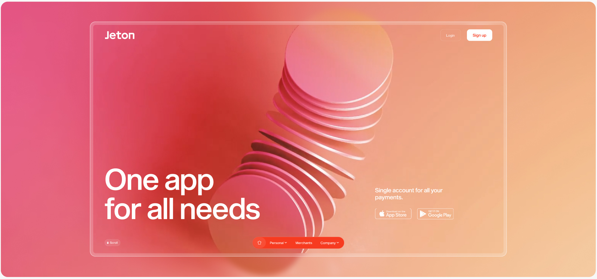
Jeton is a new-generation eWallet designed to simplify the way you pay online and offline, heading from the UK to the world.
London, we heard you like tea—smashing, grab a chair. Historically, a jeton was a tiny token used for counting and transactions. Today, it’s all about digital finance. Jeton makes international money transfers easy, secure, and stress-free. One app, all your money moves.
For the rebrand, we took the coin concept and ran with it—literally. Money never stands still (even if you wish it would), so our new identity revolves around a sleek, disk-shaped element always in motion. It’s in the custom wordmark, the 3D brand universe, and looping animations that give the app and website a fresh, yet minimal, tech-forward edge.
Oh, and all that orange? Non-negotiable. So, we went all in with a deep burnt orange, adding soft pastels for balance. For the first time ever, we almost ditched black from the website’s CSS—contrast checkers, rejoice!
Using 3D not just enhances the experience but also keeps online banking tangible for young e-gaming audiences.
Jeton's brand universe was built on two key elements: the app UI/UX designed to facilitate smooth transactions and a 3D realm featuring coin-shaped metaphors that abstractly represent the essence of money transactions.
The 3D brand assets followed two pathways: the main abstract headers and real-use case store scenarios that integrate the payment flow. Both are essential for engaging users and enhancing the product's storyscrolling. All crafted on the good old 3D Studio Max—no Spline, sorry about that.
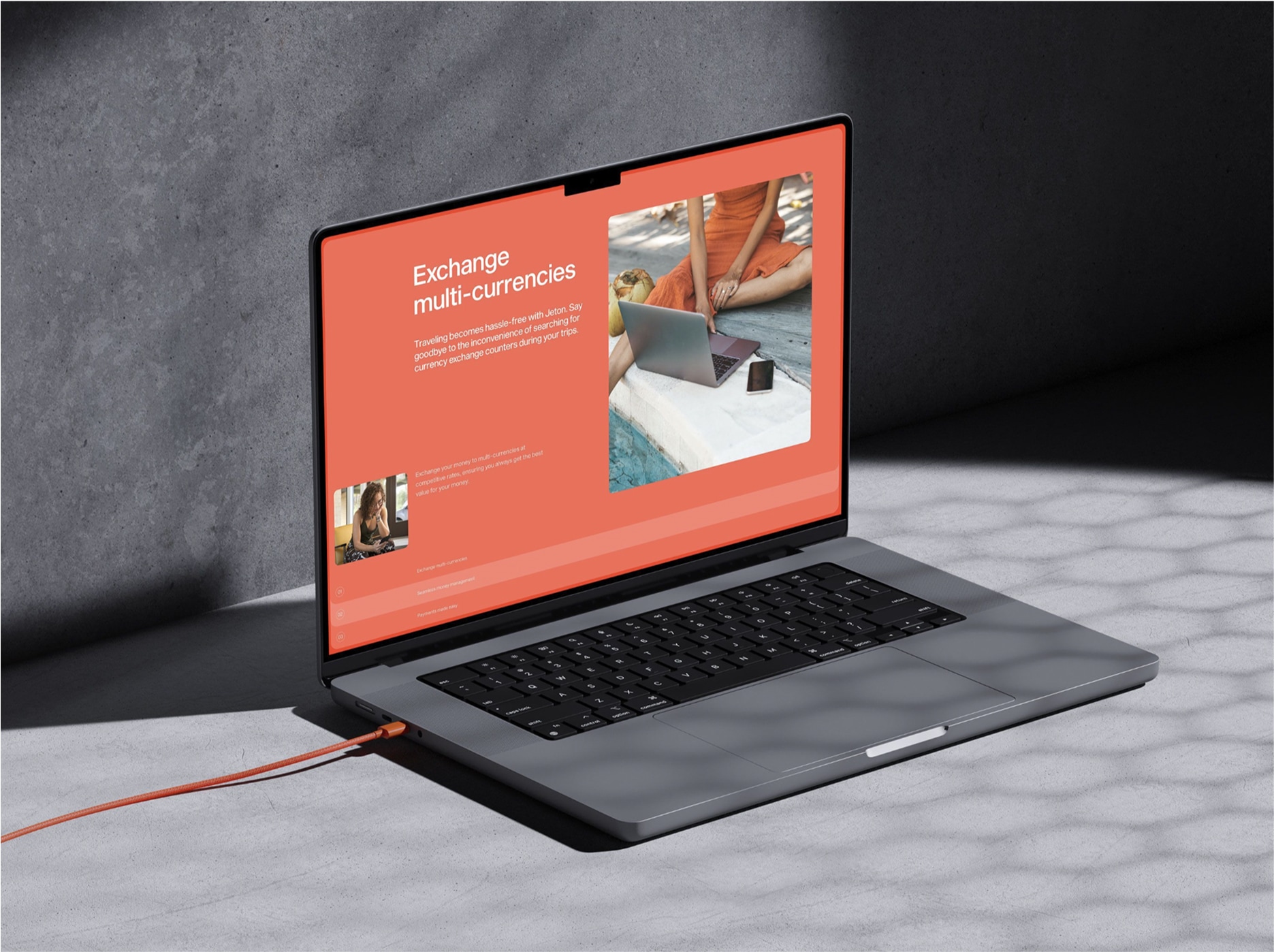
Jeton uses visual storytelling to keep you engaged—blending clear, impactful keywords with compelling visuals that make everything easy to grasp and inviting to try.
The Website
The narrative revolves around unifying all finances: one app for all needs. As users scroll, they effortlessly discover all the features and functionalities available, with minimal interaction required and without overwhelming autoplay animations. Striking this balance is a challenge, but the result is a beautifully streamlined experience (emotional scroll ahead!).
If you're familiar with our scrolling experiences, you know we love to experiment with our design system—especially with tabs! This time, we had a blast incorporating flags within a circular shape. No special instructions are needed; just use your mouse and explore! Don't forget to check out the fiat conversion calculator—let's make our analytics matter!
Rive me down Scotty
Some clients say they don’t like too many animations—we get that. But when you need to show that Jeton works on desktop, mobile, and as a physical card, you can write it out… or you can grab your next user’s attention with a crisp animation that says it all. This one? A Rive animation, smoothly indexed to the scroll, leaving a sharp retina imprint of the website.
If you use Rive frequently, you know there’s plenty of room for improvement. Rive Team, please improve the documentation and error messages—before GTA6. We also used Matter.js for the flags animation and GSAP for others, simply because they’re easier to work with compared to Rive. It’s all about finding the right balance when animating.
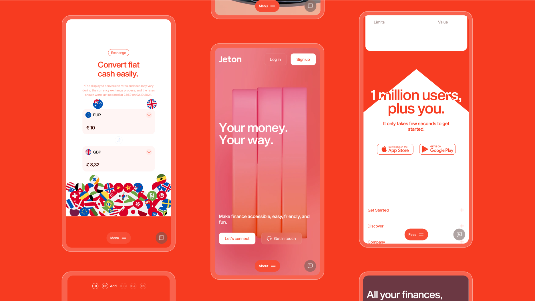
1 million users—plus you! The website had to handle 19 languages, from Korean to Thai, keeping someone very busy with Sanity (our headless CMS of choice)
Polyglot paradise
Here are some Japanese screenshots to illustrate the highlight above. Of course, we had to fly to Tokyo to keep it authentic—no fake screenshots here. やあ、ジェトン!
But wait, did we mention we also built both an app and a web app using the same design language? Brands need to own every touchpoint!
At some point in the rebranding process, you have to break the bad news to the product manager: “The brand looks great, right? But the product needs UI/UX polishing to shine on the website.” Understandably, this can trigger some frustration, as it impacts the product roadmap. But when you have the right people on board—those who get why it’s necessary—you earn extra design karma points.
We delivered a fresh design system and brand universe for Jeton's app and web applications, ensuring that the website hero accurately reflects the app experience, eliminating any surprises for users who try it later. Each main section of the app features a custom 3D loop that reinforces actions while steering clear of the sameness that plagues many apps. The coherence of the design system breathes new life consistency into the product.
Jeton's flagship pieces are now complete, ready for their amazing team to evolve even further!
Technologies
We used Vue/Nuxt.js as the framework, Sanity as the headless CMS, and Vercel for hosting. Lenis smooth scrolling and a mix of GSAP, Rive and Matter.js handled all the moving pixels.
About Bürocratik
We're a fearless digital studio crafting memorable brands and websites. This year, we celebrate our blazing 18th 🥳 anniversary of digital excellence and unrivaled hotness (ahem).
Credits
Branding, Design & Development: Made by Büro in Porto & Coimbra, Portugal. Drop by for a beer if you’re around!