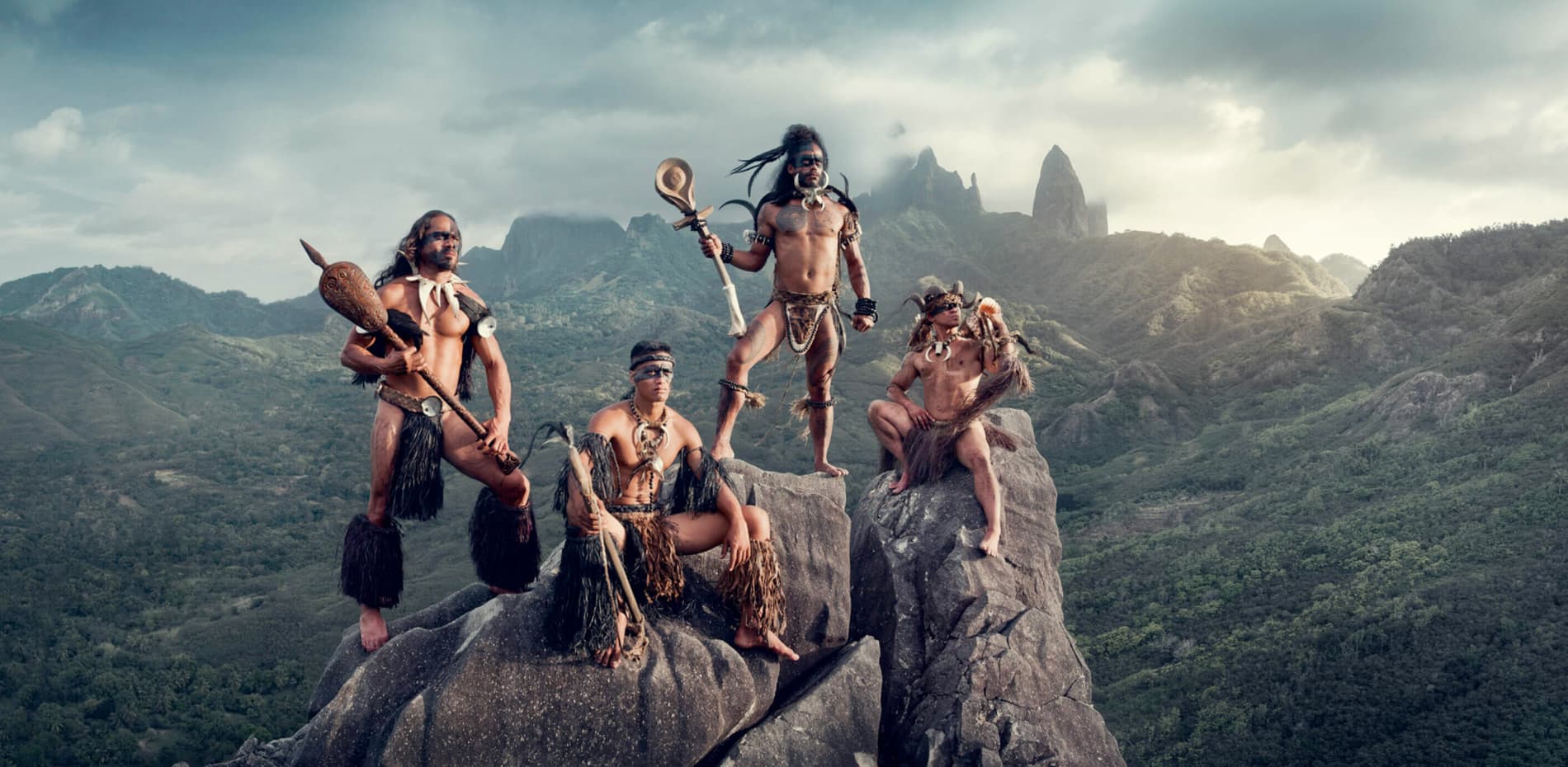
Take a deep dive into the development of the Jimmy Nelson experience.
Jimmy Nelson has been on an uncharted quest to portray the world's last undiscovered indigenous communities. His artistic documentation ignites pride for indigenous people and empowers future generations all over the world. Creating a digital platform that does justice to the extraordinary content was no easy task.
There were 3 key objectives that we had to work towards
- Inspire visitors with Indigenous cultures and the work of Jimmy Nelson.
- Activate the brand and the organisation behind it: the foundation, studio, news, exhibitions and events.
- Sell Jimmy Nelson books and art with a best-in-class online shop.

Conceptualization & process
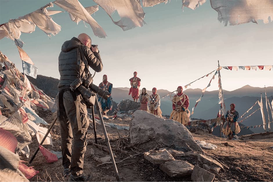
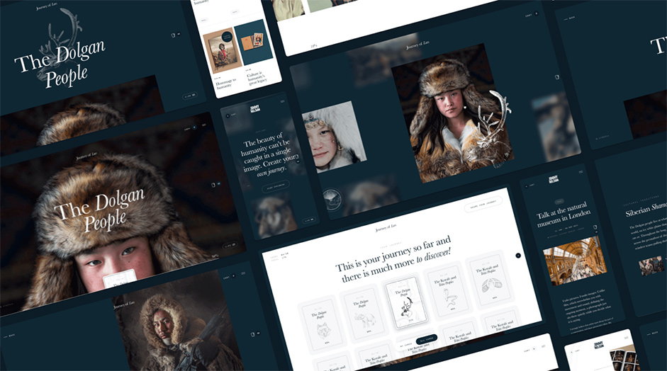
Jimmy Nelson, his team, and Lama Lama were in close collaboration from start to finish. From the first conceptualization of the experience to the last edit of the voice-over. The breadth and depth of Jimmy’s work is immense, with many exhibitions, talks, features, books and videos. During brainstorms with the team, we decided that it would be fascinating for visitors to make their own journey into the universe of Jimmy Nelson. Which is why we created a navigation that isn’t linear but rather an open world to discover. We called it the Compass.
We created a navigation that isn’t linear, but rather an open world to discover. We called it the Compass.
The mechanics of the Jimmy Nelson Compass
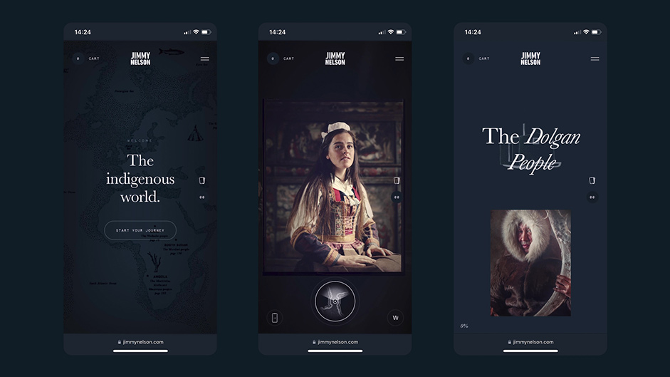
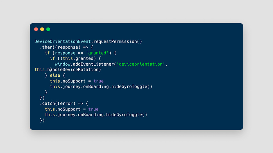
The most direct connection between the concept and a device that is used to visit the website is the gyroscope on mobile. A compass helps users understand their orientation in the virtual space. By showing the direction that the user is facing, they can better understand where they are in relation to the experience and art works around them. By allowing users to interact with the compass, such as by rotating, they can directly feel like they are in control.
When a device supports DeviceOrientation the movement of the device is passed to the camera in the Three.js scene. Using the gyroscope is optional for the user and switching between this mode and the more straightforward ‘drag’ mode can be done while exploring, all supported by clear mini tutorials to guarantee a user-friendly experience.
Positional audio as a personal tour guide
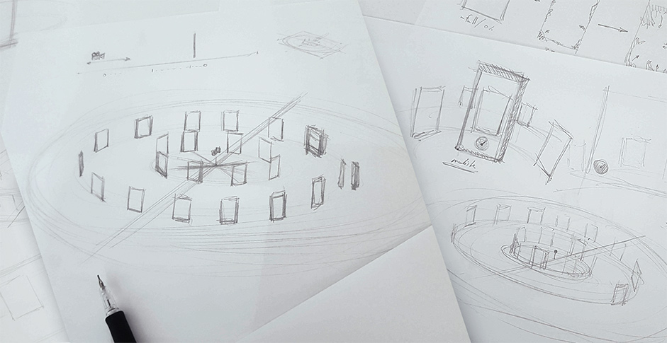
To make an audio tour come alive during the users’ exploration, we’ve made use of different layers of audio. Just like 3D graphics, 3D audio helps create a more immersive experience for the user. By placing sounds in different positions in the virtual space, users feel like they are actually present in the environment, which enhances the overall experience. 3D audio is used to provide directional cues to users.
By placing sounds in different positions and adjusting the volume and frequency, users are guided towards certain points of interest or provided with important information.
There are general ambience sounds that can be heard from every position within the experience. Voice-overs are triggered based on the position and give insights to the user. And there is positional audio via PositionalAudio objects from Three.js. Based on the distance between the Camera (user) and the PositionalAudio the volume of the sound gets adjusted.
Design as a bridge between the on and offline world
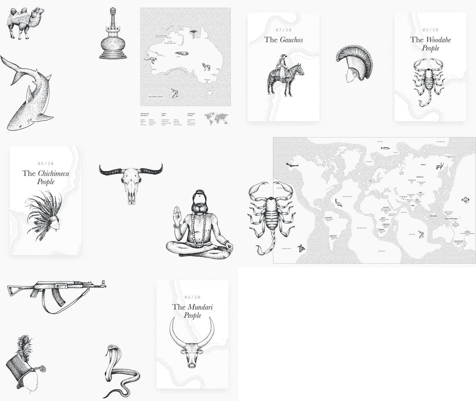
We wanted to craft the platform to form a bridge between the on and offline world. A cool dark background and elegant serif typography was used to resemble an exhibition-like environment. Illustrations were incorporated to spark the imagination and gamify the user journey. Each community has their own chapter, capturing their culture in stories, music, photography, video, and even behind the scenes content. For each chapter we created its own illustrated card for visitors to collect and share.
Bringing the 3d environment to life
We wanted to enhance the mysterious ambiance of the 3d space. This is where shaders and textures come into play. To keep things light, we wrote several custom shaders that determine the appearance of these space-creating elements. The sky consists of two elements; the vignette and the floating particles.
By animating the floating particles in response to user input, such as mouse movements, users can feel like they have a more active role in the virtual space. The vignette functions to further heighten engagement. Through strengthening the focus, a more centred visual experience is created. Both the floating particles and vignette are made with custom written shaders.
Apart from this, also the background, the smoke in between, and the hide & reveals of the photos on movement are all via custom written shaders.
We used shaders because they are optimized to run efficiently on various devices, which helps reduce load times and improve overall performance. This is important for creating a smooth user experience and reducing bounce rates. Furthermore, they give the 3D world a natural and immersive feel.
For the ground, we mapped a texture of a map to a plane to give the users a feeling that they were on a real journey.
Seamless shop integration with headless WooCommerce
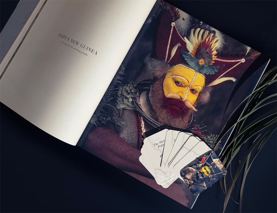
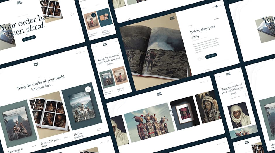
As a strong foundation, we created shop pages within the website that follow expected commerce patterns. With WooCommerce as a basis, we applied design and motion on all elements aligned with the overarching concept. As we already created a headless cart functionality, it was a great opportunity to incorporate shop features within the experience. We mixed several of Jimmy’s books within the journey and as they all have gorgeous covers they blend in very well. The product photography in the shop was custom-made to blend in more into the platform’s look and feel and almost became part of the UI.
Technologies
The website is built on top of WordPress. Our boilerplate lets us kickstart our projects with a modern build flow; the Jimmy Nelson website is still built by webpack where our latest projects are built by Vite.
The experience pages within the website rely heavily on Three.js. In combination with browser API's such as DeviceOrientation, GSAP to tween both animations and volumes of audio and custom written shaders the journey takes you by the hand.
By page caching all pages, the html is served as a static file directly from the filesystem of the server. In this way we guarantee short response times. By making use of Cloudflare for caching on the edge, all media is served from a location nearby the visitor.
Company Info
Lama Lama is a creative digital agency. We deliver digital changes for companies with a conscience and brands with a heart. Together with them we hope to make the world a little better.
Visit our website for more work
Follow us on insta for more stories
