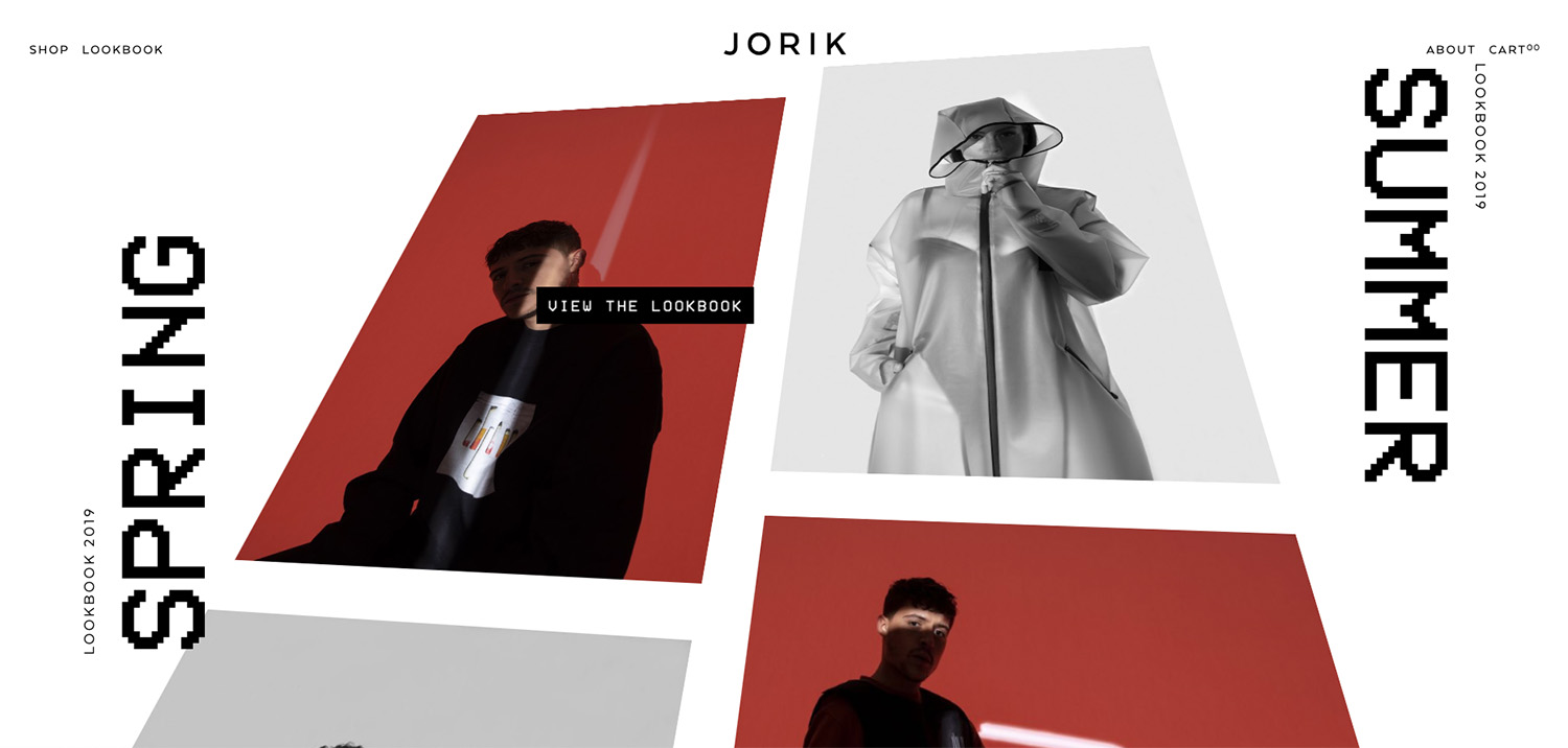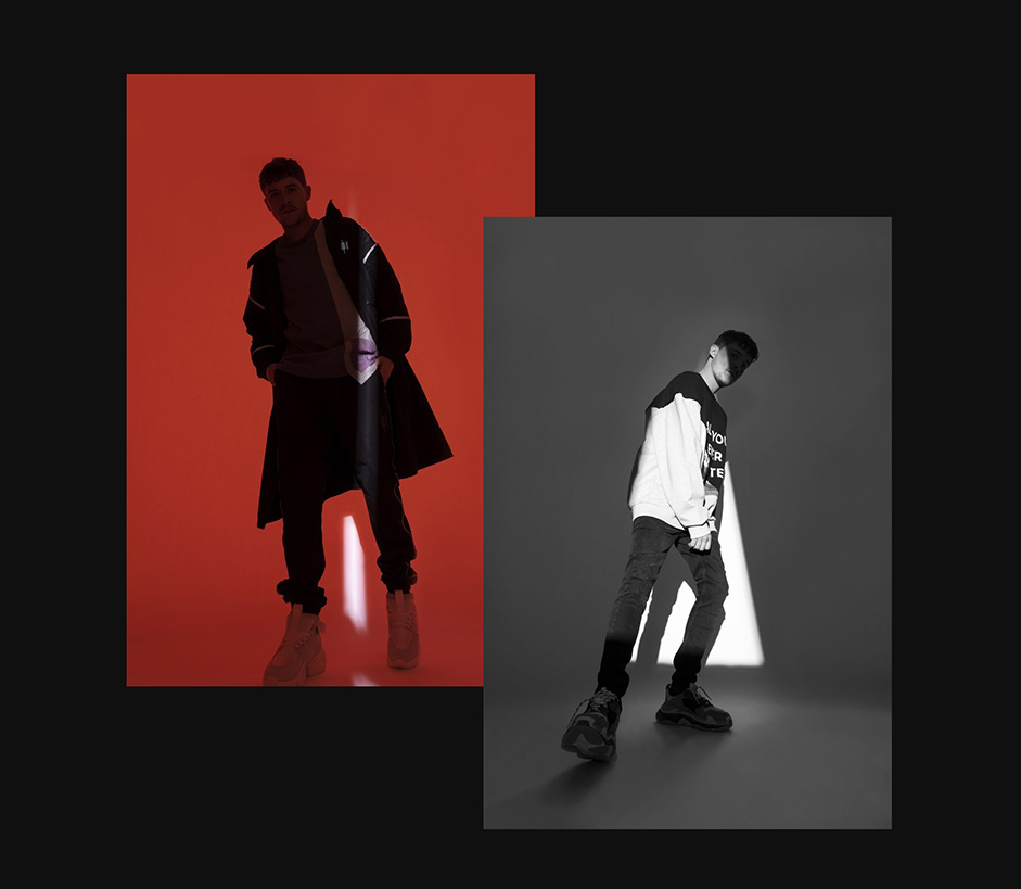
Jorik is the new fashion label launched and designed by the Dutch celebrity power couple Jorik Scholten (aka Lil Kleine) and Jaimie Vaes, and we had the opportunity to create the brand’s website.
The brief for this Digital Flagship Store was to create an online experience that would captivate the user, introducing them not only to the products but to the brand and concept behind it. We were excited by the opportunity because it gave us a license to get creative and produce something out of the ordinary that would stick in the memory.

It also presented us with a great reason to work with Martin Silvestre, which is something we had been wanting to do for some time.
The process was split into two phases - the Art Direction and Design phase, which was overseen by Martin, and the Development phase during which our team implemented Martin’s ideas.
Art Direction + Design
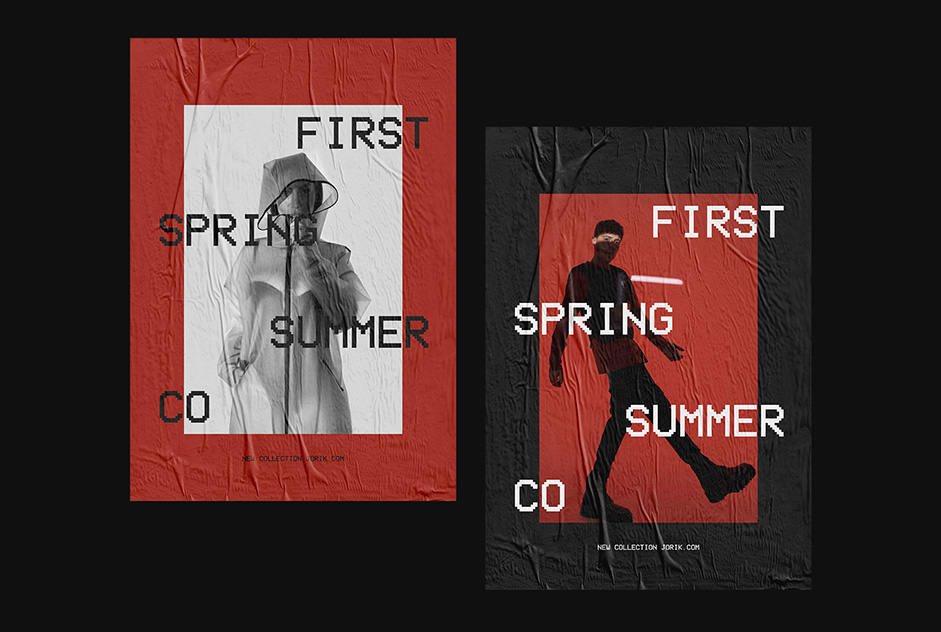
The Art Direction from Martin was inspired by a 90s theme. He wanted to create something that an audience might not expect from a 21st-century rap artist that had just launched his own fashion line, and so designed a retro looking site but with modern day animation.
Pixelated typography, old-school transitions and fake 3-D art are all sources of inspiration for the site, and these blend well with modern day animation to create a super simple but super effective design.
Development
The two key stages of the development process were creating the infinite scroll and keeping a balance between engaging animation and a high site speed - two elements that are crucial for captivating Jorik’s target audience.
The infinite scroll was created by splitting the screen into two columns that work as a mirror image of each other. To achieve this we had to create our own algorithm that would allow content that reaches the bottom of the screen to move back up to the top.
Usually, when scrolling, content that reaches the bottom of the screen becomes unscrollable because it has traveled beyond the limits of the algorithm dictating the content. To change this we had to append the starting part of the content, meaning that it was still scrollable and on the screen looks like it rolls back.
The second column works in exactly the same way but is reversed and thus appears as a mirror image.

Our second key stage of development, maintaining the balance between animation and speed, was borne out of an understanding of the market Jorik is involved with. The brand wants to be on the cutting edge of streetwear fashion and hence needs to captivate an audience that is young and technologically fluent. A lot of traffic comes through Instagram - a high-speed environment in which attention is caught and lost in the time it takes for a post to scroll to the top of a screen - and therefore the site speed has to be monumentally quick. Simultaneously, though, we wanted to create a site different to most by making use of interesting animation that keeps the user engaged.
Site speed and animations do not tend to go hand in hand, so we had to always keep this balance in mind and use some creative techniques to ensure the heavy animations did not weigh down the speed too much.
Creating the home screen animation turned out to be the trickiest part because we wanted to make the small section of text that overlaps onto the central image move in line with the image itself. To achieve this we separated the text into two elements - the section that appears on top of the image and the remainder that appears outside the image.
During this project, we spent a lot of time working with React - both in creating the infinite scroll and the site animations. Swup was also very important for the infinite scroll, and Redux and GSAP both deserve a mention for the site as a whole.
In the end, we were really happy with this project because we were able to again test the limits of Shopify and prove to others (and ourselves!) what is possible with the platform.
