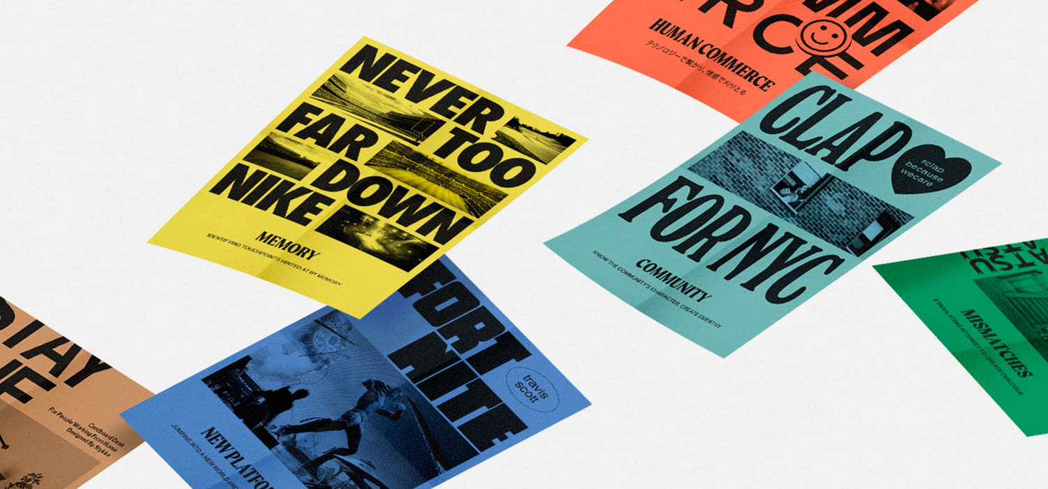
We created LIONS GOOD NEWS 2020 to commemorate the 10th anniversary of The Cannes PR Lions*. The Cannes Lions International Creativity Festival, normally held every June, was canceled in 2020, however, even in the thick of the pandemic, people bravely rose up with the 10 creative cases, listed here, with their relationship to award-winning work of the past 10 years.
*PR department of Cannes Lions
Design points
Representation of the time axis
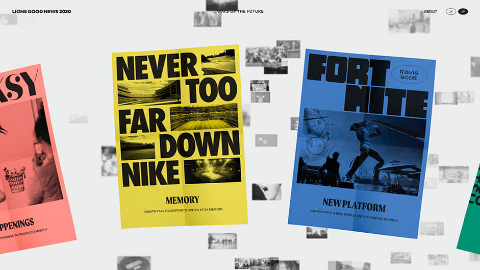
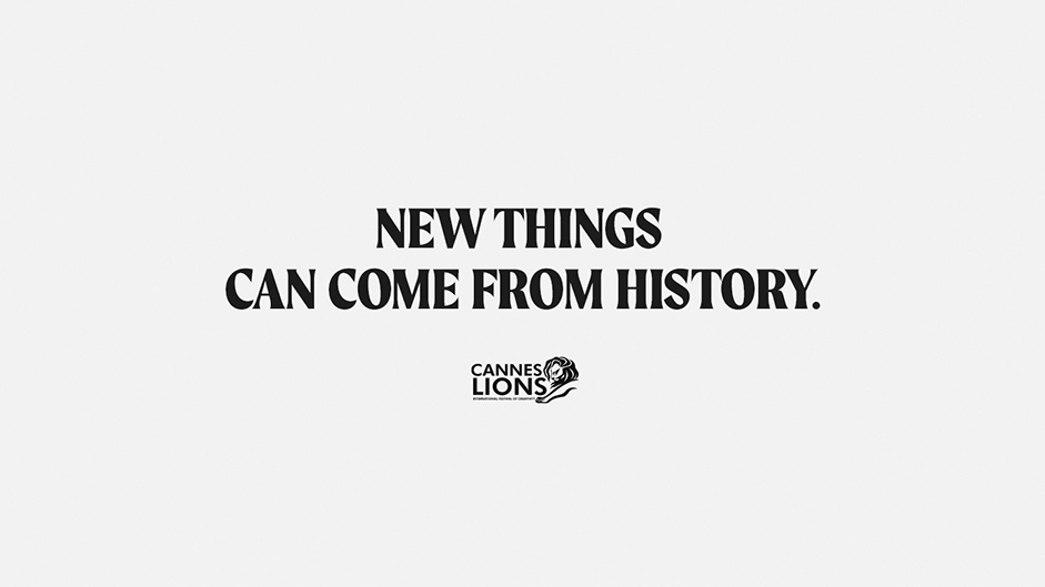
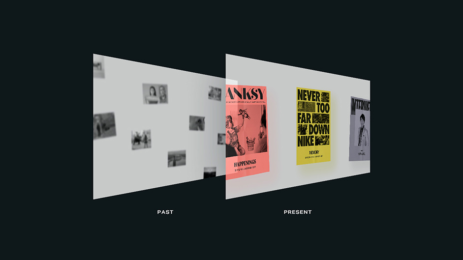
One of the most important things to focus on when designing a website, was to show the key message that truly new things can only come from history. To do this, we expressed how 10 year’s worth of past cases bring context to the present.
First, we looked into how to best express the past and future on the same screen. From a number of proposals, we chose the following two key features.
- By making the tone not fresh and modern, but rather nostalgic, it lets the viewer feel as if they're looking through a timeless bird’s-eye-view.
- Expressing time itself via the visual depth of the information, by utilizing color and monochrome contrasting.
We proceeded by designing each element to give it an overall nostalgic impression. For the typeface, we chose a wonderful serif typeface inspired by 20th century signs called "Moret". The typeface evokes an overall sense of nostalgia and strength, and greatly contributed to the creation of the world view.
The UI of each article was made evocative of a monochrome news paper. In pursuit of a more nostalgic and realistic texture, we carefully added wrinkles and noise to the paper. Then, in the backgrounds of the top page and the past cases section of the article page, monochrome-processed photographs were placed along with animation to drift off into a space with depth.
10 uniqueness
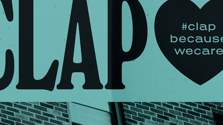
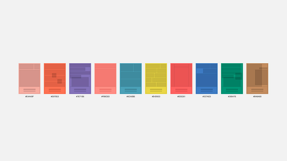
Another big point we focused on was expressing the various cases that were born in the special chaos of 2020, and the uniqueness of the perspective that unravels them.
That's why we decided to create unique key graphics for all 10 articles. With the goal of making each one stand out while maintaining readability, the two designers secured their own colors, typography and layouts while working with a minimal set of rules.
Development
Introduction
- Concept
We made an animation based on the concept of newspaper pages being blown by the wind around a cityscape, and reaching people down below.

Wind - Wind blown effect
The wind blown effect moves the paper left/right in order to give a sense of depth. In addition, it bends and shakes the paper based on the values of velocity and direction.
As seen through the video, there are many parameters that have been carefully tweaked and adjusted until the effect looks natural, and is now open to the public.
- Video of the production process
Home opening animation.
Navigation
- Infinite loop
The 13 newspapers, which serve as the navigation, move left and right, and when one exceeds a certain point, it moves back to the opposite side to produce an infinite loop.
Home opening animation.
- Paper page flutter
Paper flutter is controlled via movement speed of the navigation. Shadow was also calculated and added to improve texture. We used Shader for these effects.
Home opening animation.
Technologies
- 3D WebGL Library : Three.js
- Page Transition : Barba.js - Asynchronous page transition
- Smooth Scroll : Locomotive Scroll
- Animation Tool : TweenLite, Gsap
Creative team
- Producer: Masaya Yamamoto
- Art Director, Designer: Hiroki Miyamoto
- Designer: Masashi Fujiyoshi
- Interactive Developer: Wongeun Heo
- Project Manager: Mana Ohtake
- Creative Director: Reietsu Hashimoto, Dentsu Inc.
- PR Planner: Tadashi Inokuchi, Dentsu Public Relations inc.
- Executive Producer: Daima Kawamura, DLX Inc.
About Us
SHIFTBRAIN is a development and production company that is mainly based in the digital sector.
- Twitter: @SHIFTBRAIN
- Instagram: @shiftbrain_tokyo
