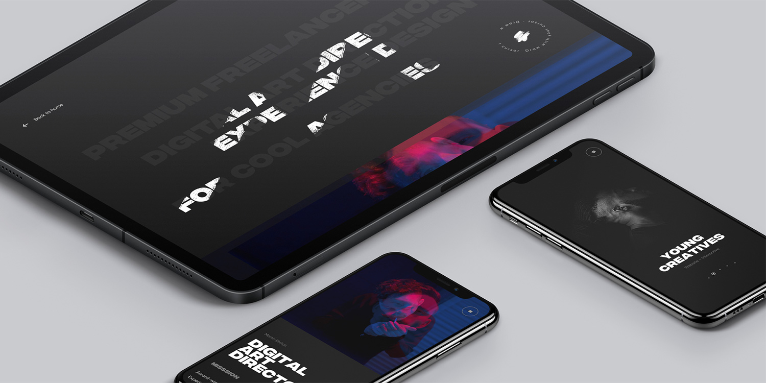
My personal mission is to help ambitious and creative business agency leaders to ship innovative and meaningful digital products they can take pride in. The mission of Martin Ehrlich Portfolio was to communicate this statement to a broad range of leaders of the best international agencies, and show the results of my past accomplishments.
The target audience, as mentioned, consists of different leaders of interactive agencies. That’s why I could afford to design a slightly more fancy and interactive experience than I would do for a classical audience. In my eyes, innovation needs to come with meaning and each specific audience is able to handle a certain amount of innovation.
My personal mission is to help ambitious and creative business agency leaders to ship innovative and meaningful digital products that they can take pride in.

Creative concept & Art direction
The whole concept and art direction of the website is a case study of paradox, a journey from total darkness to completely contrasting light. I wanted to use contrast to capture the users' attention, with discovery through uncertainty and emotion. The user is taken from the dark and mysterious surroundings of the homepage, to the bright, clear case studies, simple with a bare minimum of animations and focused purely on written and visual content, allowing the users to consume it with ease.

The navigation of the whole site is based on a circle of projects. On the homepage, you see just a small part of the big circle focused on one of the projects going endlessly to one direction or the other. Upon entering all the works, it zooms out as you see the full range of the projects.

Analog to digital brushes
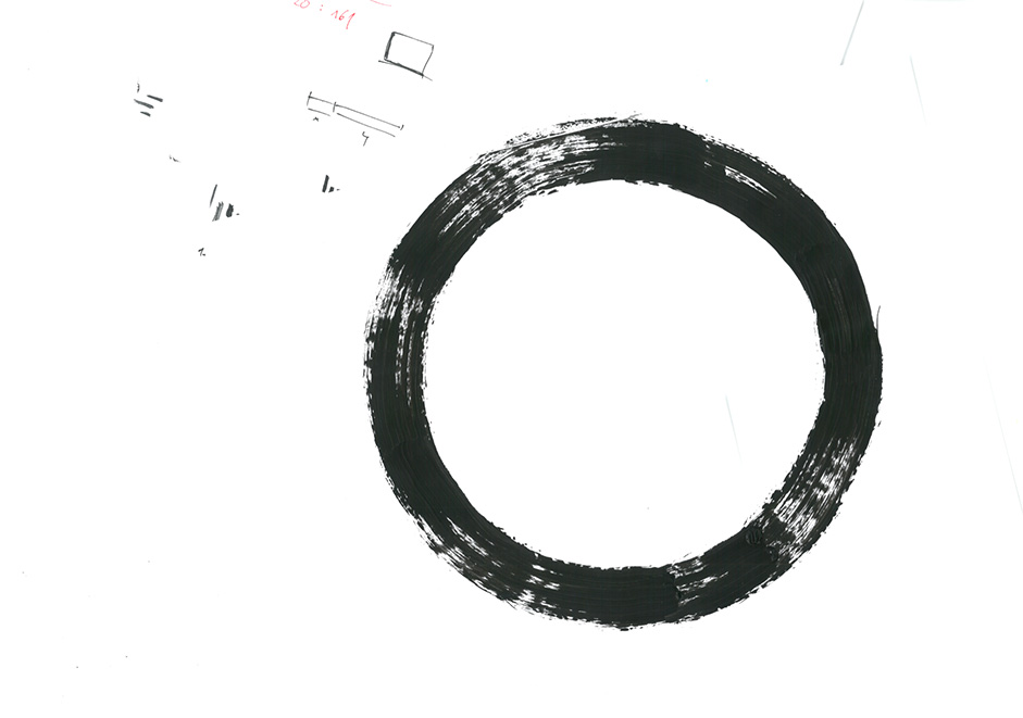
The significant role in Art Direction and an overall feeling and motion of the website is played by brush animations triggered by hovering links to other pages of the portfolio. To achieve a 100% natural and sharp feeling, were first made using analog, with real brush on paper, and then scanned and digitalized in high-res. Animations were made in After Effects and with a lot of hacking and performance optimisation, exported with Bodymovin to JSON files brought to life with Lottie.js.

About page
I’ve designed a playful About page for the visitors to have a bit of fun on the site, so they can consume the content with joy and a bit of excitement. The users are able to play with the main headline of the page and uncover its contents with a brush in their hand. All this is made by an easy trick with canvas 2D and global composite operation to keep it light and to not over engineer stuff. The time invested into the small gamification paid off, as the average time spent on the About page is by far the highest of all the website’s pages. I’ve made the users spend dozens of hours learning about my work philosophy and approach in an unusual and engaging way.
The time invested into the small gamification paid off as average time spent on the about page is far highest of all the website’s pages. I’ve made the users spend dozens of hours learning about my work philosophy and approach in an unusual and engaging way.

Technology
User Interface Library
I (Raoul) am using ReactJS to build the interface and work with the DOM. I like to work with JSX and I needed a component-based library. That’s why I’ve chosen React.
Animations
The timeline based animations are created using the GSAP library made by Greensock. In my opinion it’s the most complex animation library today. They handle so many edge cases and they harmonize weird behaviors across browsers. You just have to focus on creating slick animations. For the seamless page transitions, I created a custom transition library based on states. It’s inspired by React Transition Group and the way VueJS is handling transitions.
Canvas 2D
The Brush effect on the About page and the circular mask animation is made with canvas 2D and the power of global composite operation.
Lottie Web
Martin used After Effect to animate some elements of the website such as the loader or brushes appearing as you hover on the page links. Bodymovin and Lottie.js allowed us to translate those After Effect animations into JSON. It’s very useful when you want to design little interactions which are hard to replicate in code.
Content Menagement
Martin can edit the content of the whole website thanks to Prismic, an API based CMS. Everything is customizable. He can add projects to the infinite wheel on the homepage, build the case study for his projects without my intervention and edit the layout of the pages.
Hosting
With Netlify we have been able to build a continuous development environment very easily. You just have to connect the git repository of your project and you’re good to go. Every time a pull request is merged on my staging branch, Netlify is deploying a version to a specific address, Martin receives an email notification so he’s up to date with all changes.

Challenges & Tough decisions
In autumn 2018, I had a fully functional finished personal website online and running. It just wasn’t fulfilling my expectations in animation, performance and overall smoothness of the experience. I’ve made a tough decision to start the implementation over again. Thanks to that decision I was able to analyze the website, test it and make minor changes leading to better usability and balance. I had to search for a new developer, who’s advanced in creative development and advanced technologies for interactive websites. Luckily, thanks to my friend Marvin, I ran into Raoul Gaillard, an amazing full stack developer and my now dear friend. Together, we’ve crafted an experience that I can be proud of.
Creators
Martin Ehrlich is a Digital Art Director & Experience Designer, Awwwards judge and Premium Freelancer®.
Raoul Gaillard is a freelance creative developer based in Paris.
