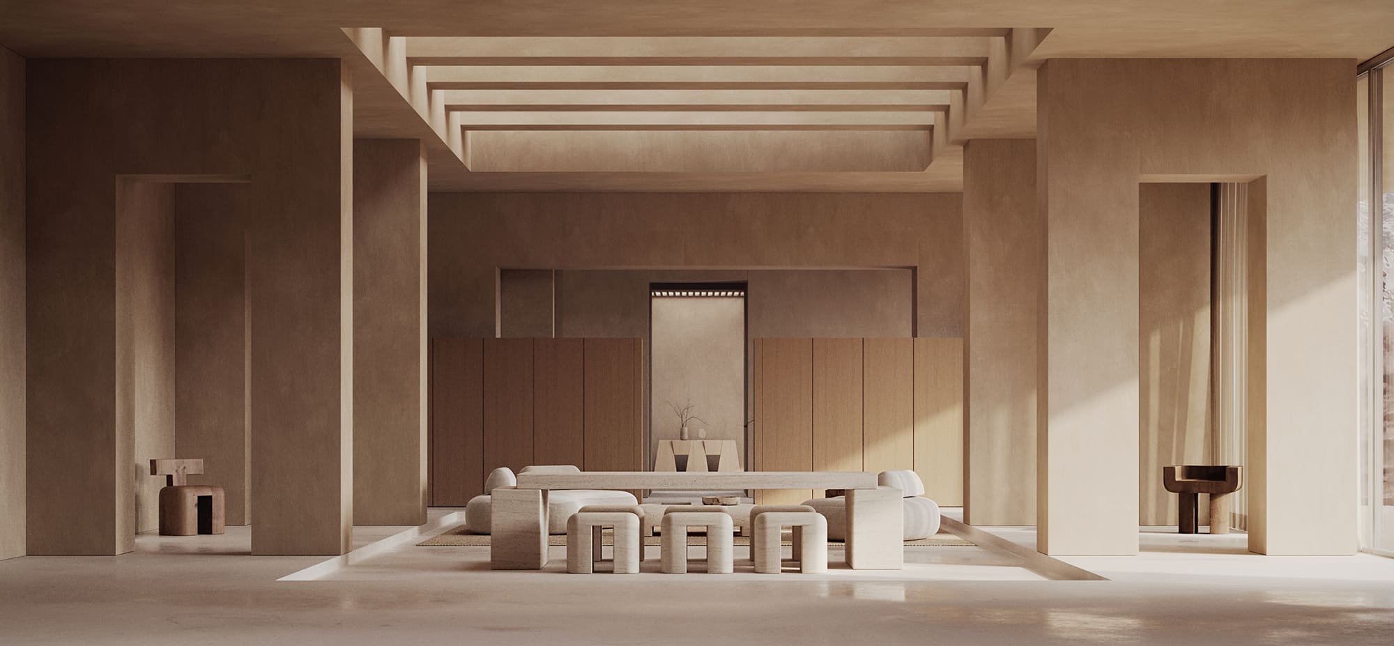
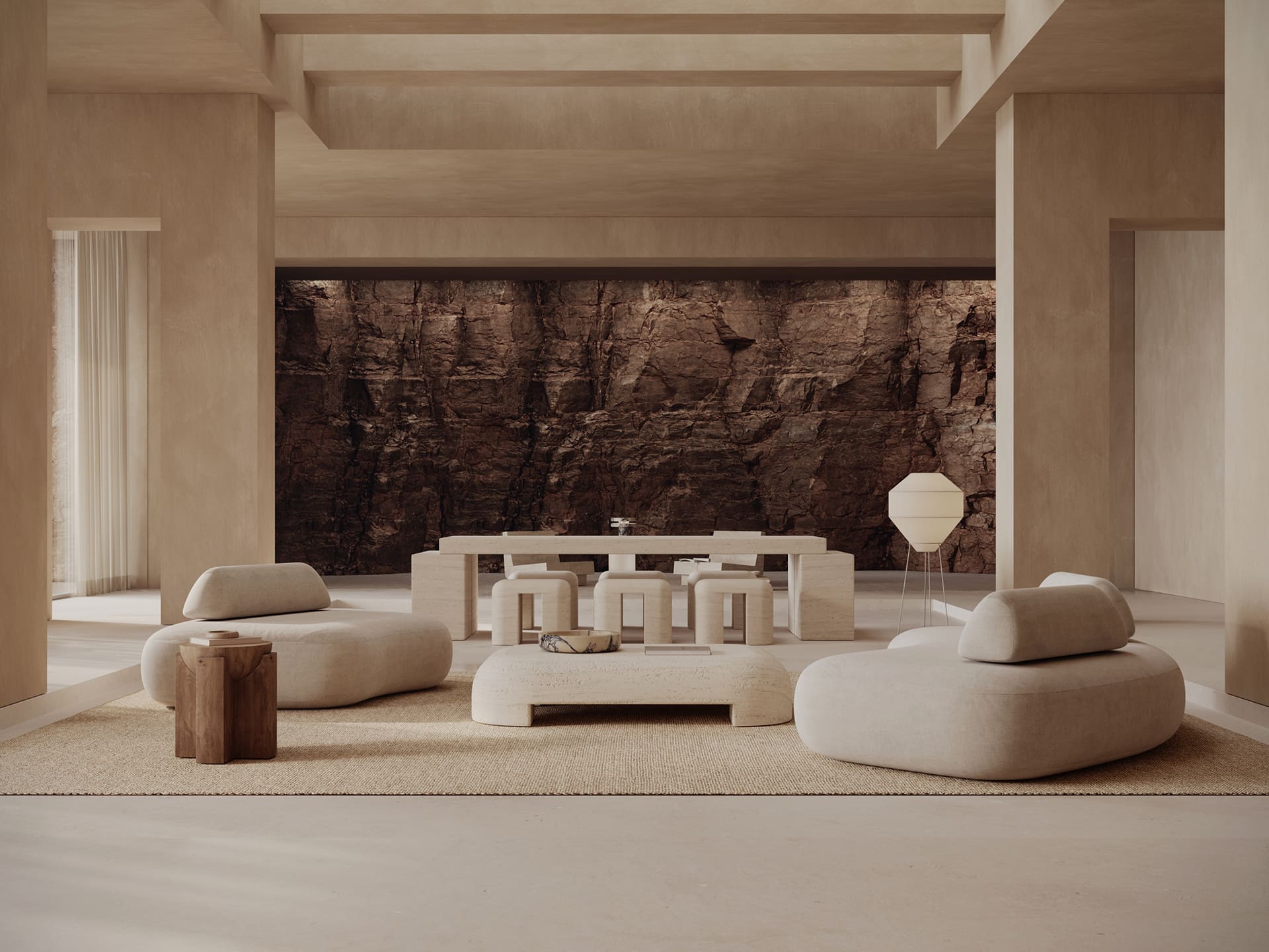
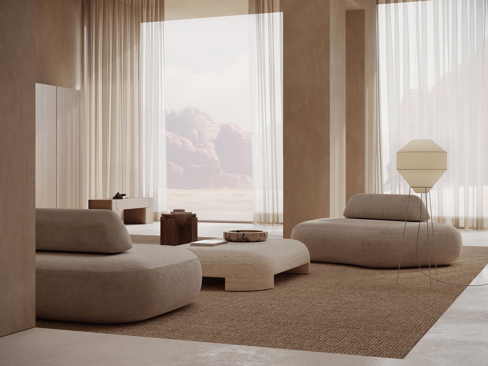
Monolith is a design studio and gallery featuring a collection of monolithic furniture and objects. Each minimalist piece uses purity of lines and heavy proportions to reveal the natural beauty and sophistication of each material.
Using raw materials like volcanic stone and wood, Monolith Studio's sculptural forms blur the line between Furniture and Collectible Design. Collaborating closely with talented craftsmen in Mexico each piece is worked by hand to reveal the beauty in the incredible materials found there.
The Ask
Monolith approached us to create its introductory digital experience for its products that felt more inline with an editorial lookbook. The challenge now was how to create a digital experience that reflected the beauty and detail of each Monolith product and not just be a container but a natural extension of it. So we worked to design and develop an experience that takes cues from classic design languages but also feels uniquely ownable to Monolith. The audience for this is interior designers and gallery owners so form and function had to merge seamlessly here. So we worked to create something that was fast and seamless but at the same time felt expressive and creative to better resonate with the audience.
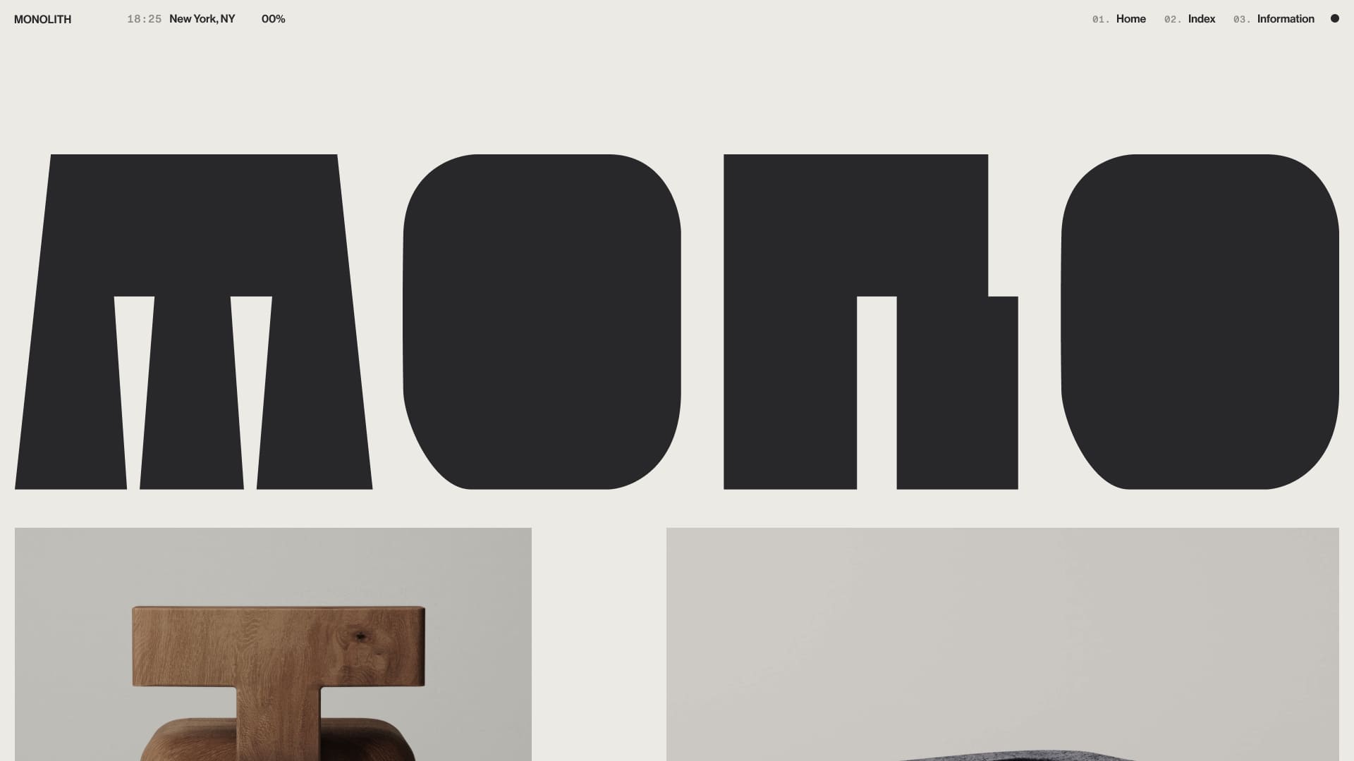
The site's core design style is based on swiss style with some slight influences from brutalism. Wanted to create something that felt like a reflection of the physical pieces from Monolith in terms of something that was minimal in its approach but also bold and geometric in other aspects. That's where we found the two styles merged together so beautifully that the design is both elegant and almost utilitarian at the same time in that nothing is there without purpose.

Form and function had to merge seamlessly
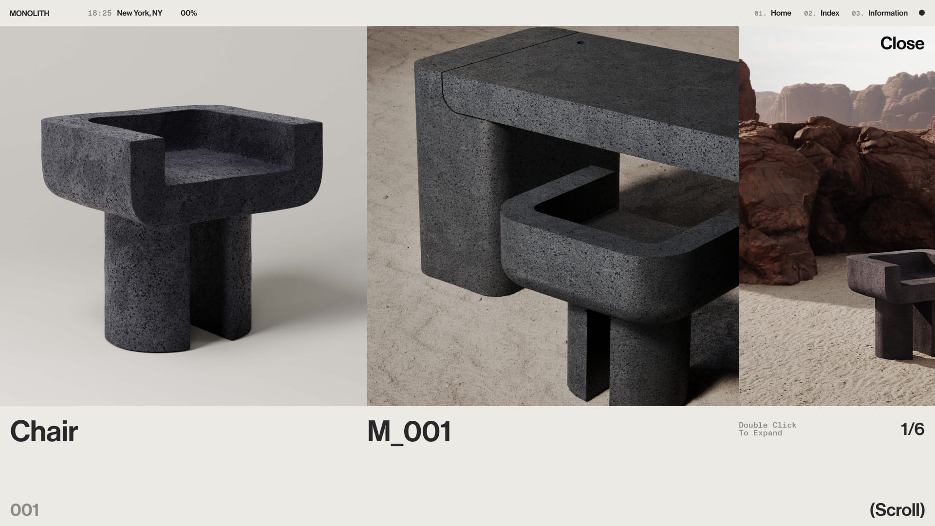
The Details
The detail we are most proud of is the dynamic view changer on the product grid. We wanted to create an ability for the user to view and interact with the product in their own personal preference. The task then was how to have it be seamless and fluid and not with extra layers of loading or page transitions. So we found a middle ground that was both achievable from a technical perspective but also what we wanted to accomplish conceptually. This way we created something that was responsive in real time to the users interaction and allowed them to dynamically change how they view and interact with the product and to navigate alternative views seamlessly.
Technologies
For the Monolith site, the setup wasn’t overly complex, and some might be surprised to learn that we didn’t build it on Shopify—mainly because no direct purchases are made from the website. Instead, we used Next.js as the framework, Sanity as the headless CMS, and Vercel for hosting. Both Sanity and Next.js run on TypeScript for added type safety and scalability.
For those unfamiliar with headless CMS platforms, Sanity is where all the content lives—pages, products, materials, metadata, and more—making it easy to manage and update. On the frontend, we fetch the necessary data from Sanity on a per-page basis to render the site. Since the pages are built at build time, load speeds are lightning-fast (though we did add some smooth page transitions, which might make this less obvious—but hey, that’s the trade-off for a slick, polished experience).
Speaking of animations, GSAP and Framer Motion handle everything on the frontend. Framer Motion is used specifically to override Next.js’s default page transitions, giving us precise entry and exit delays for that seamless “wipe” effect between pages. GSAP, on the other hand, powers all other animations, including ScrollTrigger for elements that animate on entry.
One animation that might catch some attention is the box-transition effect on the /products page. For this, we used GSAP’s incredibly handy Flip plugin, which makes it easy to animate elements between different states. Essentially, all three sliding views (small, medium, and large) have the first 10 or so boxes pre-rendered and are simply shown or hidden based on the active view. Behind the scenes, there’s a separate set of “transition boxes” that move to the active view’s location when switching between views.
And finally, the cherry on top—Lenis smooth scrolling. This library is an absolute must-have for any web project. It seamlessly smooths out the browser’s native scroll and plays beautifully with GSAP animations. Plus, it has some killer features, like infinite scroll (which we used on Monolith’s homepage). It’s easy to implement, plays nicely with existing projects, and just makes everything feel buttery smooth. Can’t recommend it enough.
About CUSP
We’re a global team of specialists, focused on crafting world-class digital solutions for today’s modern creators.
About Nathan Dallaire
Nathan is a creative frontend developer from Toronto. His dream is to live in a van somewhere near a large body of water.
Monolith Credits
Design: CUSP | Website | Instagram | X
Development: Nathan Dallaire | Website