For almost twenty years, Moooi has inspired and seduced the world with sparkling and innovative designs. The venture, founded in 2001, is currently led by Marcel Wanders and Robin Bevers.
Moooi is named after the Dutch word for beautiful – the third ‘o’ in the brand name stands for an extra value in terms of beauty and uniqueness. Moooi doesn’t tell designers what to do, but listens to what designers want to make, trying to realise their dreams. Eclectic and always on the edge of commercial reality and cultural interest.
Introduction
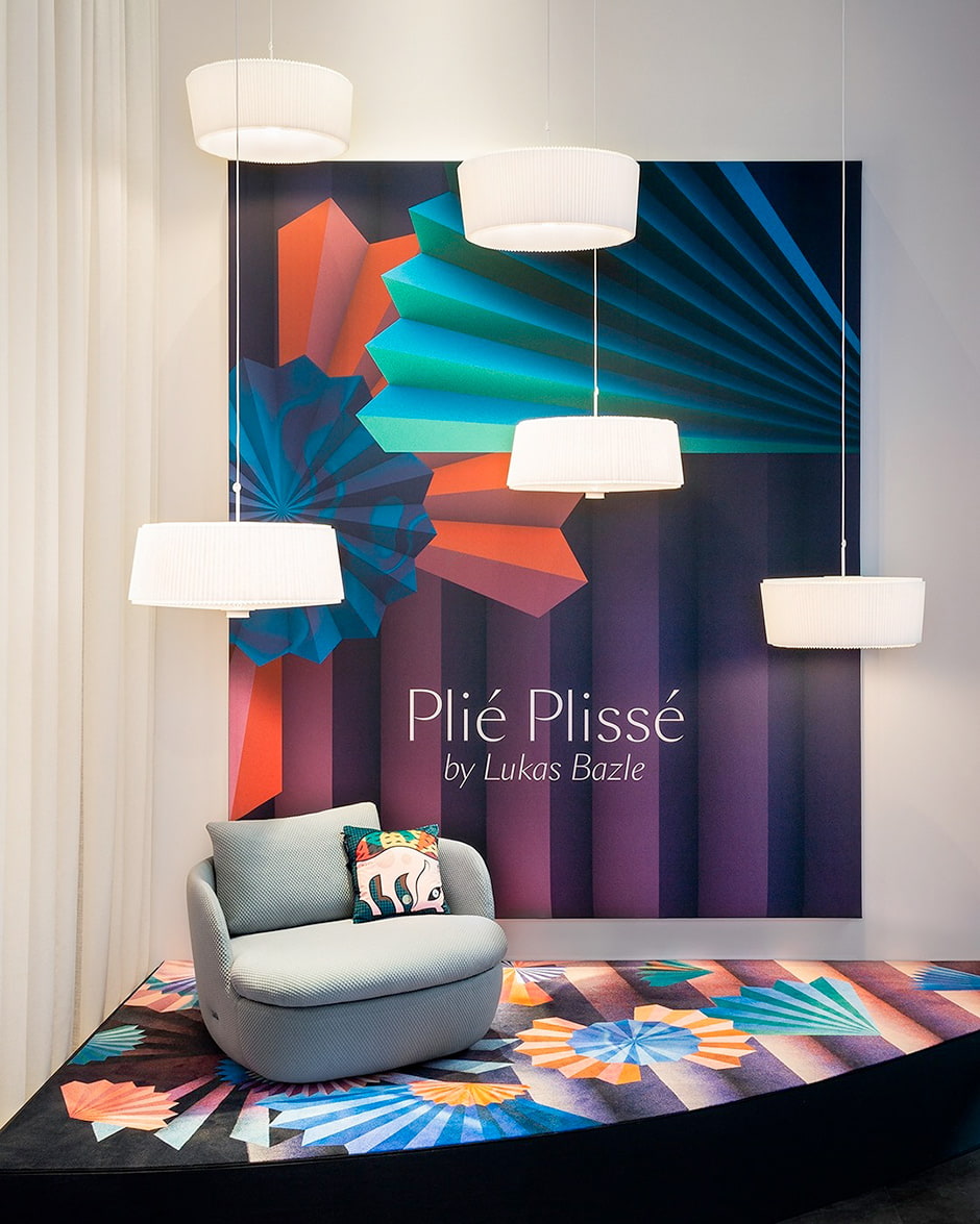
Following the second cancellation of Salone del Mobile, Build in Amsterdam & lifestyle Dutch brand Moooi joined forces again. Some exciting new products: the Plié Plissé Light, by German designer Lukas Bazle, No Screw No Glue, by Dutch designer Joost van Bleiswijk and In the Meadow, by Stockholm-based illustrator Emma Larsson are presented amid Moooi’s archetypal immersive brand experience called Paper Play.
Paper Play is the third chapter of Moooi’s Digital Brand experiences preceded by Beauty Blooms & Defy Gravity.
Objects as protagonists, a theatrical approach
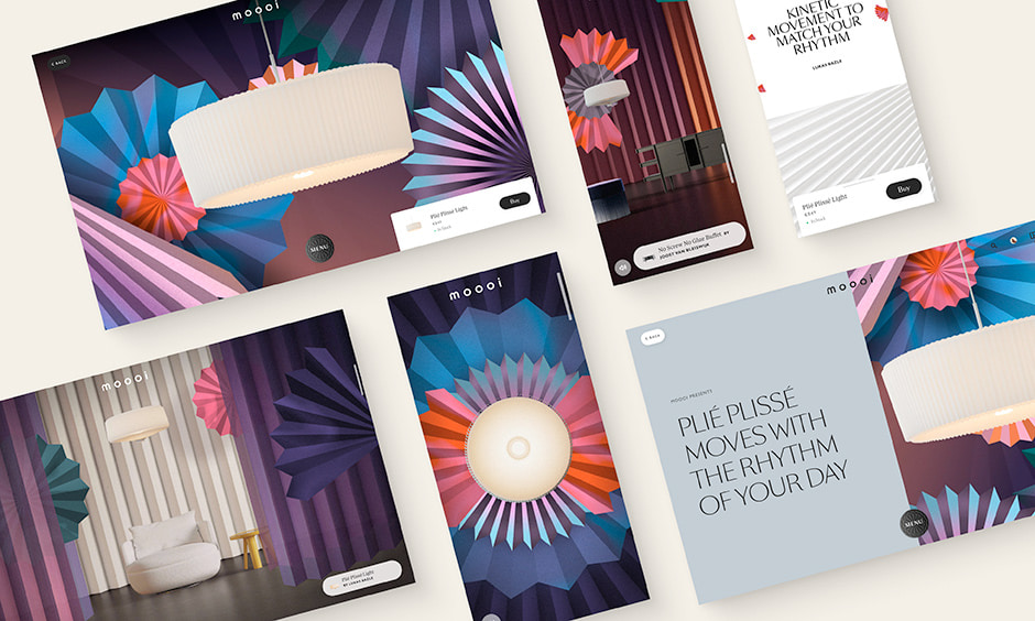
The brand-new products act as the main characters in Paper Play’s spectacle which we divided into different ‘acts’ like a theatre play. We took a scenographic approach while storyboarding the scrolling journey of a user by playing with spotlights, creating transitions with curtains or dramatic fade to black. We chose deliberately to avoid written narration to leave space for soundscapes, vivid visuals and hidden interactions to provoke the imagination instead of guiding it too much.

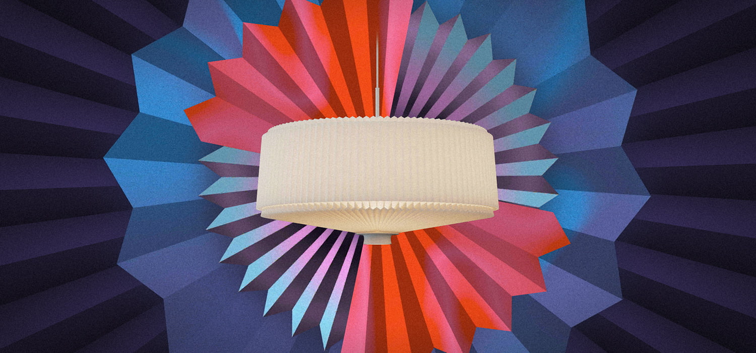
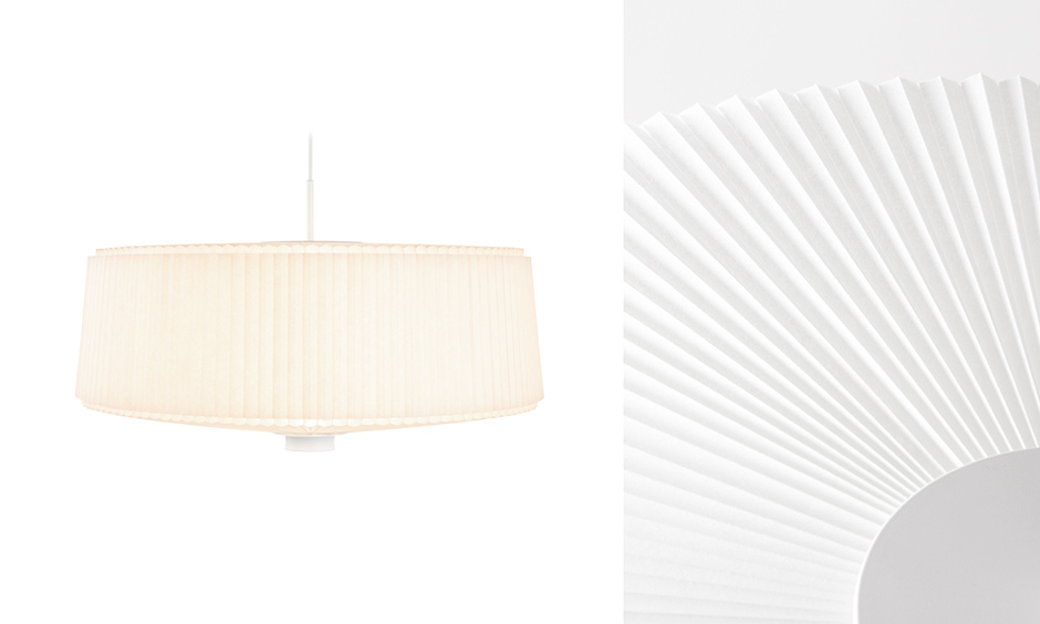
Plié Plissé has an adjustable cellular pleated shade that lets you choose the intensity and direction of the light between diffuse and intense. It was the starting visual inspiration for the experience.
We were instantly drawn to the kinetic nature of the lamp which inspired our very first sketches. We started to populate each set with pleated surfaces & playful fans." — Margot Gabel, Design Lead at BiA
Multi-sensory shopping
If a visitor wishes to know more about a product, the unobtrusive interface will lead them to the Product Detail Page on moooi.com, where the storytelling continues with themed visuals, quotes from the designer, floating fans & inspirational video. This seamless junction between the brand universe & the more ‘shoppable’ realm are very important for us. At BiA we believe that an online (or offline) brand experience should not stop when reaching the Product Detail Page as this is where a potential buyer might still be seeking for inspiration.

A collaborative process
After working with Andres Reisinger for Beauty Blooms & Benoit Challand for Defy Gravity, Moooi collaborated on Paper Play with visual artist Merijn Hos & motion designer Jurrian Hos to create a video showcasing the Plié Plissé light. The Build in Amsterdam team brought some of these graphical elements to the online experience.

Poetic audio design & playful interactions
The beautiful soundscapes you hear on each ‘scene’ of Paper Play were crafted by Dutch audio design studio KLOAQ. As the user scrolls up or down, all sounds blend seamlessly. The sounds were sourced from the actual products, their components and materials. These recordings were the base on which KLOAQ started to sketch and compose music to eventually blend naturally with the individual sounds of each product.
While being a scrolling experience, we wanted visitors to engage with some of the scenes of Paper Play. The Plié Plissé lamp can be switched between its two positions, colourful wheels can be scared away, the spotlight can be turned on the Dandelion Cranes.
Technologies
We are reusing our beloved tech stack from 2020 experience, A life Extraordinary: PixiJS and GSAP.
We worked scene by scene, writing animations and audio transitions in GSAP timelines. The main timelines are linked to a custom scroll that will automatically scroll after a few seconds to take you through the journey. One of the goals was to avoid any static scenes, and the noise shader over the page completes the cinematic feel.
We used many PixiJS features for sounds, animations, filters but also custom shaders for transitions.
Working with a lot of images is always a challenge, so we are continuously improving our assets workflow to automate most of the tasks and optimise the output. In this case, every image is exported in three formats (compressed PNG, WebP and Basis), two ratios and resolutions (desktop and mobile) to cover every case.
Basis Universal super compressed texture is the most efficient format but doesn’t deliver the best looking result in all cases. For example, transparency is not well handled on mobile using PVRTC texture compression (like iOS devices) so we can not stick with one format.
TexturePacker is the best tool to automatically generate sprite sheets from folders of images and export them. It can also be controlled by CLI. Then PixiJS uses the JSON atlases files directly, it is also very useful to animate images sequences.
Finally, the app is integrated in the React Moooi.com e-commerce to connect with the product pages.

About Build in Amsterdam
Build in Amsterdam is a branding and development agency specialised in digital flagship stores. We believe our industry is blinded by numbers, while buying decisions are based on emotion. We redefine conversion by building emotional clicks.
