The NewDay team contacted us with the goal of creating a new website that would reveal their identity and sell their services to the international market. The aim of our team was to suggest a basic concept, to create a new UX/UI design and to visualize metaphoric images for each section of the website.
The visual concept is based on ideas embedded in science fiction films, series, games and other attributes of modern pop culture.

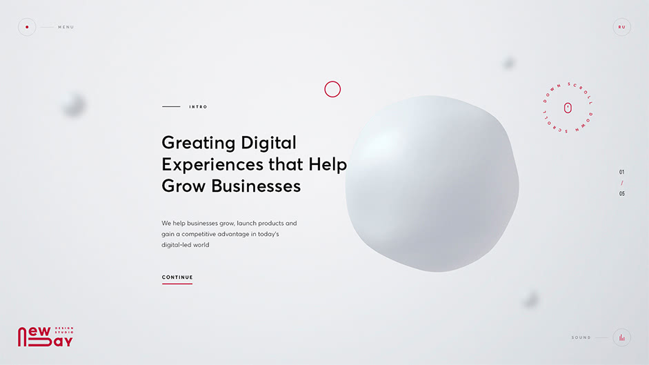
We proposed a suffused, elastic, almost “liquid” material that would be the basis of future images of all the sections. We were eager to build up a striking “intro” for the user to scream “Wow!” right at the first visit. For this, a smooth transition from the liquid to a spherical object was created. All the scenes take place in some volumetric space that symbolizes the digital world, to create a sense of volume, we pictured other objects that seemed to rotate around the main object. This idea was accepted and approved by the client at once. But, the site turned out to be “too fantastic”, so to fix this, we added comic metaphors for each scene.
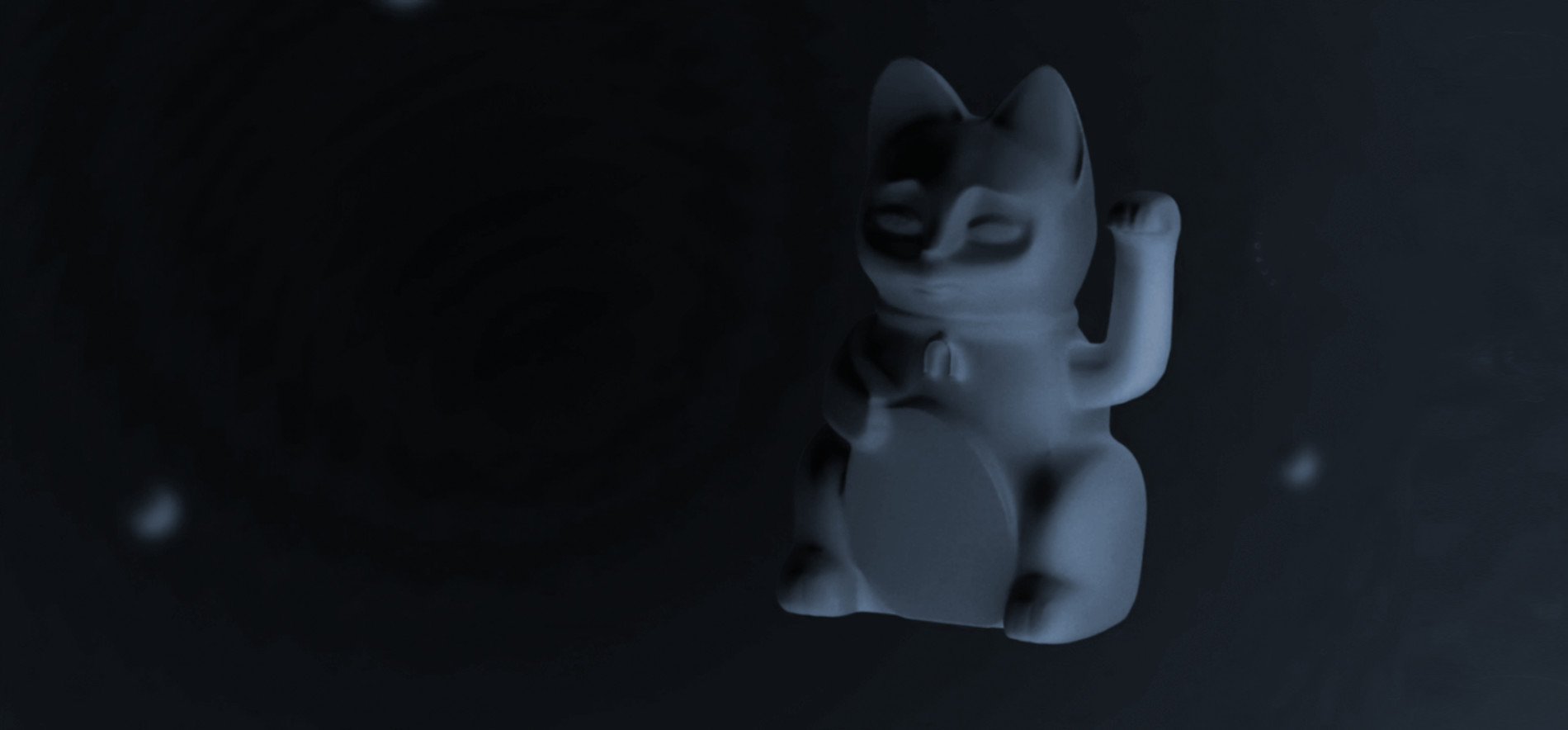
Maneki-neko is a Japanese figure which is often believed to bring money and good luck to the owner. Consequently, the work of the agency will bring luck to their clients. The cracked egg on the ping-pong racket suggests that it is important to choose the right tools to achieve one’s goals. The fashionably spectacled octopus looking into the distance is a symbol of multitasking. It means that the agency is ready to work with different projects, simultaneously keeping an eye on modern tendencies and focusing on the future. The two paper cups connected by a thread reflect the close connection between the agency and their client.
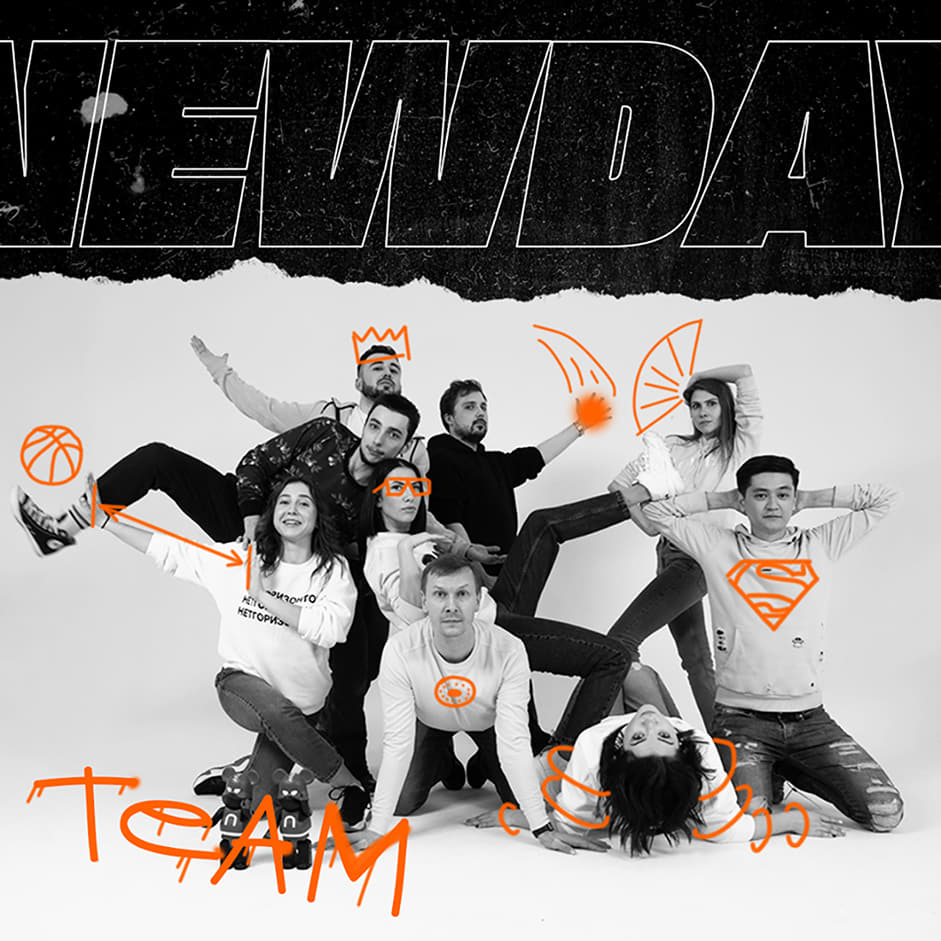
On the team page, we showed the uniqueness of each member. To depict their identity, a row of video clips for each person was filmed.
In each video, the team were asked to show who they really are inside, in a short a time period as possible. Thus, we got a comic and quite diverse page!
When working with the mobile version, our aim was to preserve the emotional mood that was already created on the desktop version. We added some new solutions to our own JavaScript library. We wanted the website to interact with the user.
Technologies
➭ Front-End
Already at the start of the project we understood the importance of changing many aspects of our library. Many solutions were created from scratch. The whole library was shaken, weaknesses were detected and solved, the performance was improved. Some solutions for smooth animation were updated. So, for example, the screen/content slider script has little in common with the past variants. Scrolling techniques were rewritten and improved, attention was paid to the custom cursor and image sliders.
Our knowledge of PIXI.JS was improved and it allowed us to create cool stuff such as the animation of headers or transitions between image slides. By the end of the project, all the concepts were achieved and we ran out of coffee! 😊
➭ Tools
- Vevet – our own library. At the moment we are improving it further and will reveal some stuff in the near future.
- Pixi.js
- Slick
- jQuery
- Gulp
➭ Adaptability and cross-browser compatibility
We performed structured QA tests in the following browsers:
Desktop: Google Chrome, Microsoft Edge, Opera, Safari, Firefox
Tablet: Google Chrome, Safari
Mobile: Google Chrome, Safari
It was interesting adapting the website to various devices and resolutions, because it was necessary to solve, rather than the extra tasks, such as adapting the team page and playing videos with team members. But at the same time, many elements of the site were originally provided in such a way that they can be easily inherited from the desktop version of the site.
The main difficulty was the browser and site compatibility solution. In the most popular browser in the world, it was possible to configure the site to work correctly quite quickly, but we had to tinker with less popular browsers because they do not support some solutions, we decided to cheat a little and implement them a little differently in some browsers.
➭ Back-End
We always do projects from scratch. Of course, we have a library of our technological solutions, which we can partially integrate into projects and reuse, but the projects themselves are always different. Actually, that’s the reason for our job. We are interested in every new project and new tasks. A CMS for the website was developed on the basis of Laravel. We composed it with our existing solutions and the ones that were developed exclusively for this very site.
In our control panel, one can fill any content on the site, both text and photo / video. Indeed, when developing a site, it is important for us to make it not just technological, emotionally attractive, interesting, but also convenient for filling and its further support. The speed of introducing new information without any help of developers is important for our customers, and we can provide them with it.
It was quite an interesting experience of work with an interesting team. There was an unrestrained stream of crazy ideas, a lot of creativity, enthusiasm and positive emotions. We are grateful to the NewDay team for their joint work and good memories.

Company
Advanced Group: We are a team with more than 5 years of experience, which seeks to show creative solutions to complex problems, creating tomorrow's products already today. Now we are already working on new interesting projects. Subscribe to us so you don’t miss anything and follow the news:
