I made this site after my partners and I decided to shut down our design studio, HAWRAF. I hadn’t updated my portfolio for the prior 3 years - everything I was working on was through the studio, so there wasn’t really any need to self-promote.
HAWRAF had garnered a small but dedicated following and I figured that it would be strategic to launch a new portfolio just before we announced that we would be closing the studio to ride whatever splash that made.

I set out to think of a way that I could do something minimalist, or even something “anti”
While I consider myself multi-disciplinary, my core competency is definitely as a developer. As we were prepping to close down the studio, I was in the midst of working on 2 web apps and 1 website, and to say that I was experiencing “website fatigue” would be a major understatement. The thought of adding another involved, slick website to the pile was crushing, so I set out to think of a way that I could do something minimalist, or even something “anti”. “I’m a developer, I don’t need to develop my own website” more or less encapsulates my attitude at the time.
It was 2019 and websites were boring. Portfolio sites were predominantly Squarespaces, and their ilk. Even the ones that weren't, looked like they were trying to be. I quickly dismissed that notion. I needed something different, but just as easy. At the same time, as far as work in this biz goes, I’ve always considered “you get the work you do” words to live by. I was caught in a balancing act. I needed a solution that was relatively fast to implement, but also interesting enough to represent “me”.
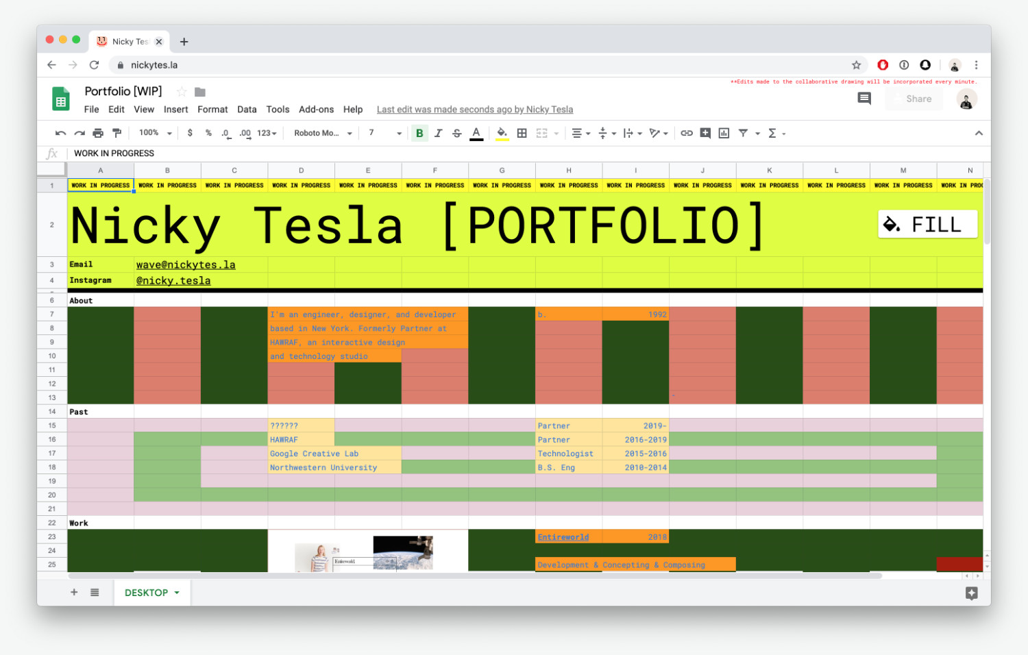
I would take this content wire-framing a step further and actually build my site using Google Sheets
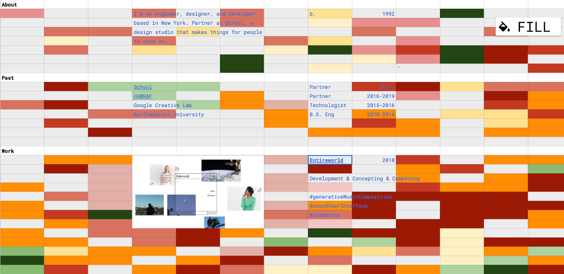
Inspiration struck when one of our clients sent us an email for the content they wanted on their site. They organized the info in a Google Sheet, using the Tabs to separate the content of pages. It was a total “A-ha!” moment. I had found my solution. I would take this content wire-framing a step further and actually build my site using Google Sheets.That part is relatively self-explanatory - I set up a Google Sheet, created a simple column system and plugged in my content, just as easy as I was hoping! However, the site was still missing that special something that would make it my own. Since the sheet is a cell based grid, I figured it lent itself particularly well to pixel-art.
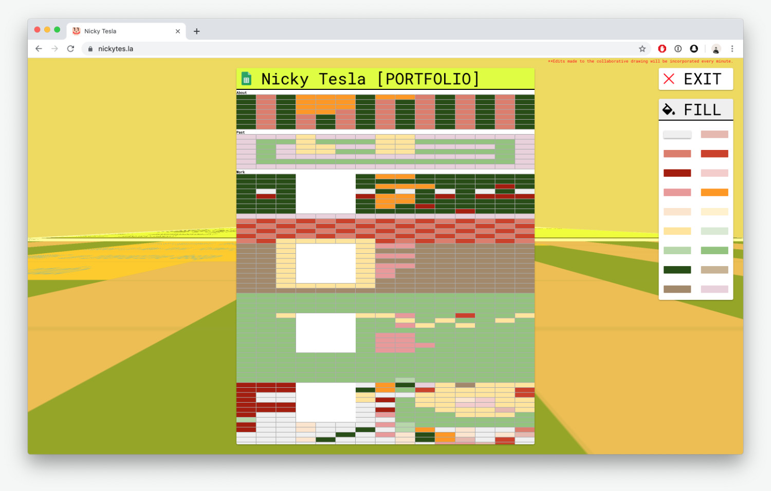
I went forward with this idea and built a little interactive interface version of the spreadsheet that has a 1-to-1 relationship with the actual spreadsheet. This is superimposed on the spreadsheet iFrame when you click the “Fill” button. The interactive interface is meant to be collaborative so all updates you make get sent to other users in real-time. Finally, I created a scheduled macro that pulls the coloring data from the database once per minute (as fast as it can go) and fills in the real spreadsheet cells accordingly.

I’m super happy with the result. It’s really exciting to see how creative people get with patterns or drawings on the site, and it got a solid amount of buzz right as it launched which was really helpful for me. I was able to turn it around in 2 weeks working after-hours, which was another win. That’s the story behind my site!
Technologies
The portfolio layout was created in Google Sheets. It’s pulled into the Netlify hosted site via an iFrame. The accompanying UI is built with React in combination with MobX for state management.
The backend is a Firebase Real-Time-Database, which is consumed by a scheduled macro running on Google Sheets that executes once-per-minute.
Company Info
Nicky is an engineer, designer, developer based in New York. He’s a partner and co-founder of School, a design studio in New York.
