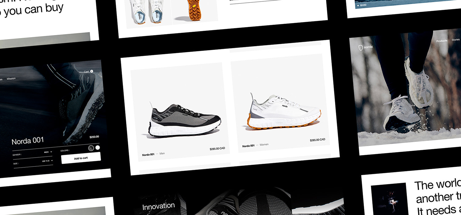
Norda built a team of stubborn, passionate, and talented people to design the best trail running shoe on the planet. Uncompromising on both performance and sustainability, the norda 001 uses the most innovative materials in the world to push runners further than they thought possible.
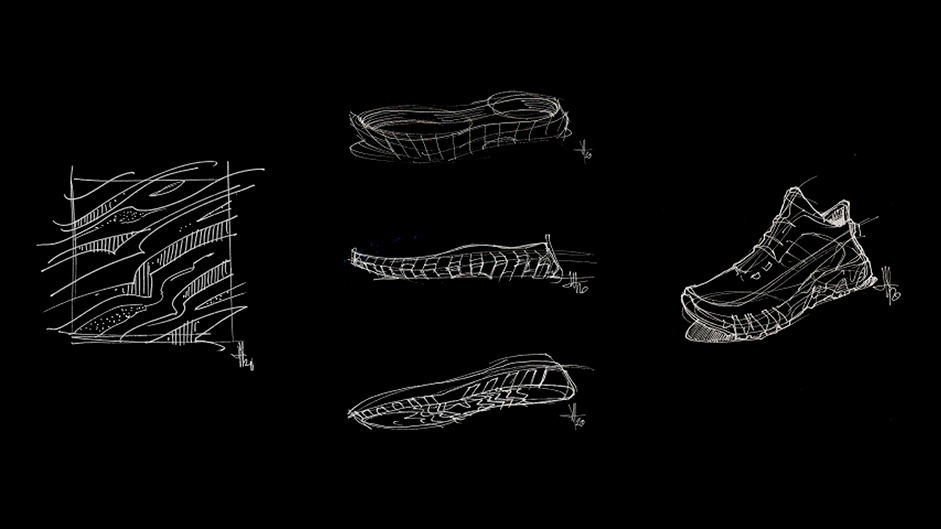
Ingrained in essentialism - the philosophy of buying better not more - the norda 001 is sober yet elegant. The shoe is the first ever to combine a seamless Dyneema® upper with the lightest, most resilient Vibram® sole tech to enhance both the performance and pleasure of trail running.
Working from only a logo and a few visual assets, we knew we had to match norda’s product design flair with a distinctive visual identity. To do so, we juxtaposed the iconic look of a tech product presentation with the raw-action feel of trail running.
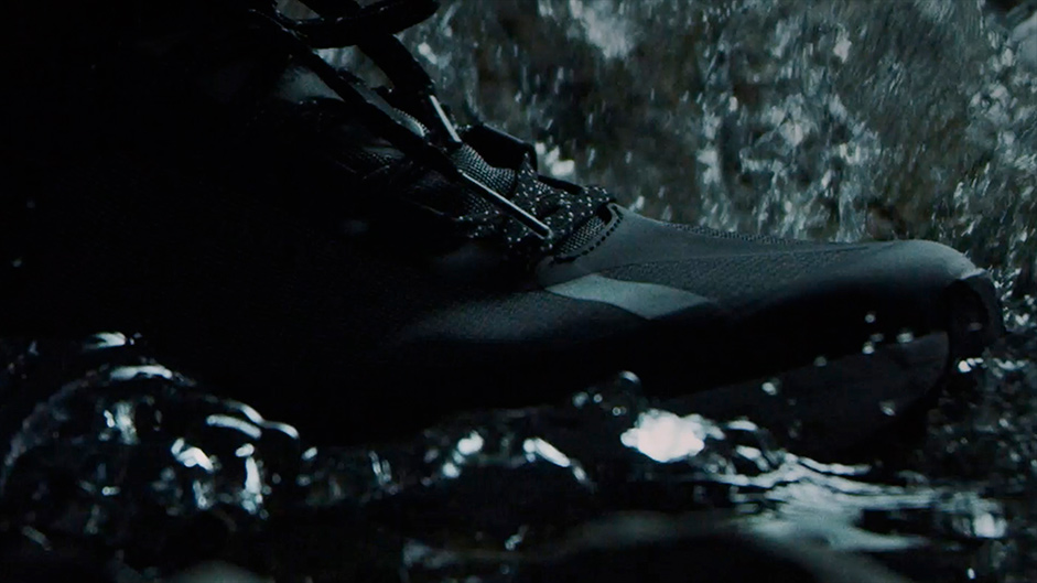
Knowing the stakes were high and the resources limited, the first step was to design the project itself in a way that was both efficient and effective.
- Create a landing page to assist early business development and boost the brand’s credibility.
- Spark and build interest for the brand and its flagship product leading into the launch phase.
- Rally stakeholders, partners and ambassadors together to maximize the impact of launching norda and its new e-commerce platform.
- Keep the community engaged with the brand using a fresh approach to storytelling.
Building the brand’s digital foundations
To find success in this highly competitive category, we knew norda had to tell a different story, a highly compelling one. A story so relatable, meaningful, authentic and fresh, that runners just couldn’t ignore it. With the final product still in development, we were tasked with creating a landing page for the early stages of norda’s launch strategy and to help establish its credibility in the trail-running community.
We had three objectives for the landing page:
- Tell a highly compelling story to engage the toughest runners out there.
- Highlight the technological features of the shoe to show how much norda cares about performance and sustainability.
- Tease the shoe while norda was still hard at work finalizing the product development phase.
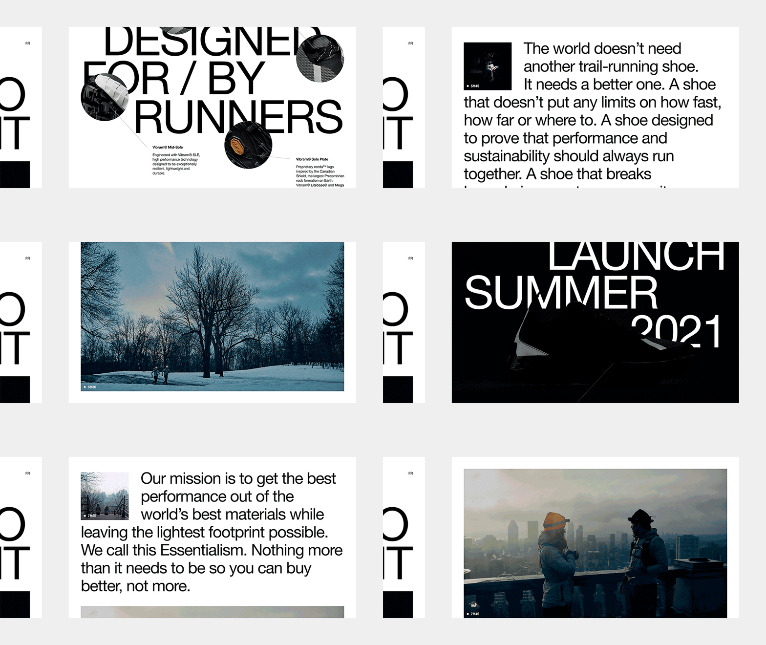
To accomplish these objectives, we also set ourselves a few rules to guide the page design:
- Build a simple and flexible grid to be able to stylize longer form copy.
- Use text hierarchy as a tool to set up a more dynamic flow.
- Add flair and identity to the generic branding and visual assets.
- Use raw-action shots to balance the tech-heavy product feel.
The E-commerce
Just like we hoped, the visual content and the copy for the landing page spoke deeply to runners. To be even more consistent with how runners view running, we challenged ourselves to create an experience that would feel authentic to them. Creating raw-action visuals helped us strike a balance between the essentialism of the shoe design and the e-commerce functionality.
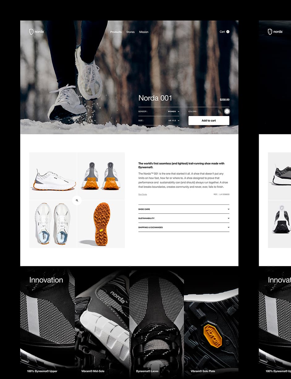
Creating raw-action visuals helped us strike a balance between the essentialism of the shoe design and the e-commerce functionality.
The shoe page is optimized to offer the most human shopping experience possible. The page starts with a live-action shot to show the product in context before going into more detailed product shots. To keep the page functional, we used a classic e-commerce grid, keeping product details easily accessible and the add-to-cart options visible at all times. To continue highlighting the value and innovation of the shoe, we kept the key technological and design features of the product present. At the bottom of the page, the user is presented with a brand block and the founders’ story in order to create a deeper connection with the brand’s roots.
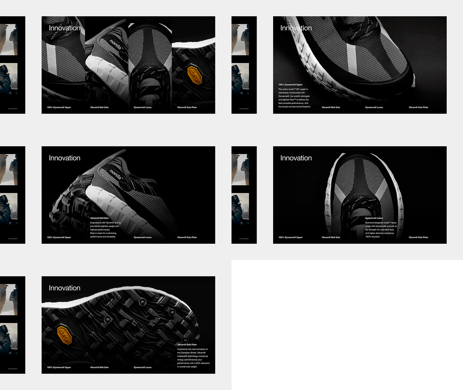
We knew if we compromised on technology, we would be compromising on both performance and sustainability. To make the point that norda is equally uncompromising on both, we designed this section to introduce norda not as a running shoe company, but a tech company.
The Stories
The “Stories” section is our version of a norda journal. Part dev diary, part innovation features, part brand positioning and part community stories, this section is built to become a collection of content to deeply engage runners in stories only runners can relate to. With articles like Surviving Death Valley, a story featuring brand ambassador Ray Zahab’s struggles on an incredibly difficult run, norda engages in a more intimate and more relatable style of content, miles away from the flashy but ultimately empty-hype brands.
Part dev diary, part innovation features, part brand positioning and part community. stories
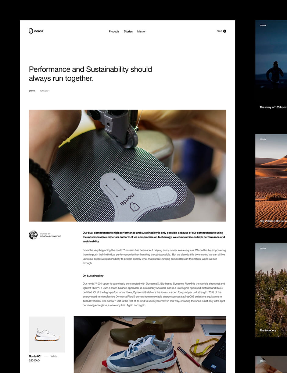
Consistent with norda’s essentialism approach to product development, we took the startup stance and chose to work with Shopify. This choice was fully aligned with our client’s expectations in regards to being both efficient and effective, but also reliable, easily customizable and able to scale or evolve if needed.
The company
The Digital Experience group at lg2 consists of 50+ specialists that influence every step of a consumer’s brand experience, from UX to UI to dev and beyond. Our digital team is the (electric) engine that focuses on creating culturally relevant brand experiences. We strive to redefine when (and how) people engage with brands, online and offline.
Discover more of our work here
❤️ Thanks to Willa, Nick, Gerard and Louis for this amazing opportunity and collaboration.
