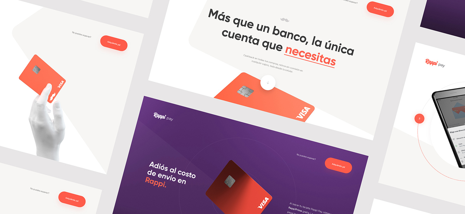
With 6 million active users, Rappi is an on-demand delivery startup that connects users with just about anything. To ride the momentum of its fast-growing user base, Rappi launches RappiPay, the modern solution to institutional bank accounts. Oui Will were approached by Rappi to help expand RappiPay's reach to Mexico.
The Project Brief
The request was a simple landing page to communicate product benefits, encourage downloads of the app and ordering of the RappiPay Card. Of course – simply meeting the requirement is never our style :) We immediately explored what else can be done that went above and beyond a long scrolling landing page with a CTA button at the bottom.
Merging Strategy with Art Direction
As a startup that experienced rapid growth, Rappi didn’t have cohesive brand assets to draw from. After reviewing what was available – sales collateral and photography – we had a few takeaways.
- RappiPay needed to be bright and colorful yet balanced with white space to evoke maturity and credibility
- Typefaces and language had to be bold, direct and casual
- Imagery had to be playful but serve an informative purpose
- User experience had to be different and exciting but with intuitive flow
Our overall objective was to equate yet differentiate RappiPay from a traditional bank. We wanted to convey the energy and vibrancy from having a tool that makes life easier. To capture the joy of having more free time to do what you enjoy, the art direction is full of color and movement.
Using 3D to convey product benefits
Why 3D?
Creating original 3D brand assets enabled us to create a guided and visually stimulating user experience without relying on legacy brand assets. In other words, 3D enabled autonomy in how to interpret their brand which was important in creating a successful digital experience.
Storytelling
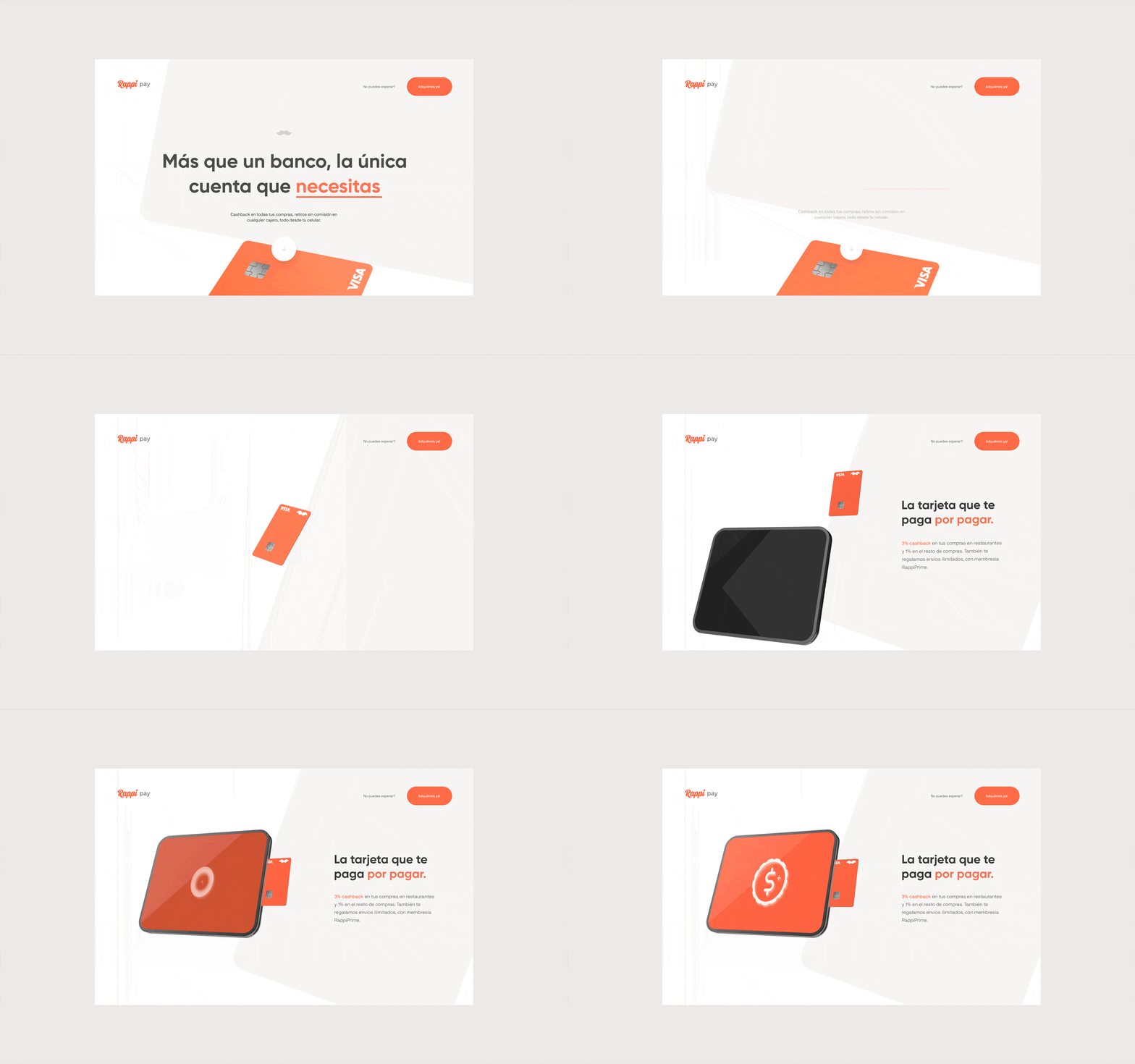
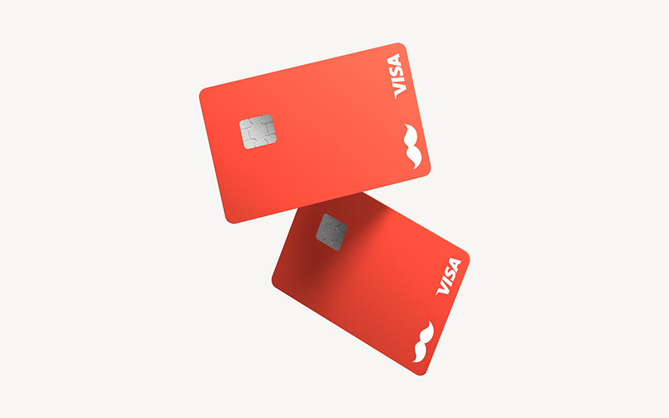
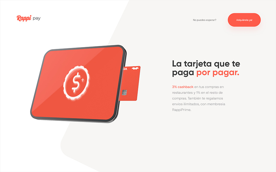
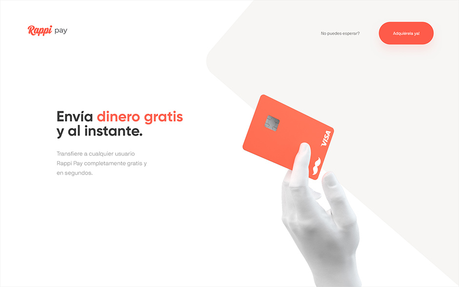
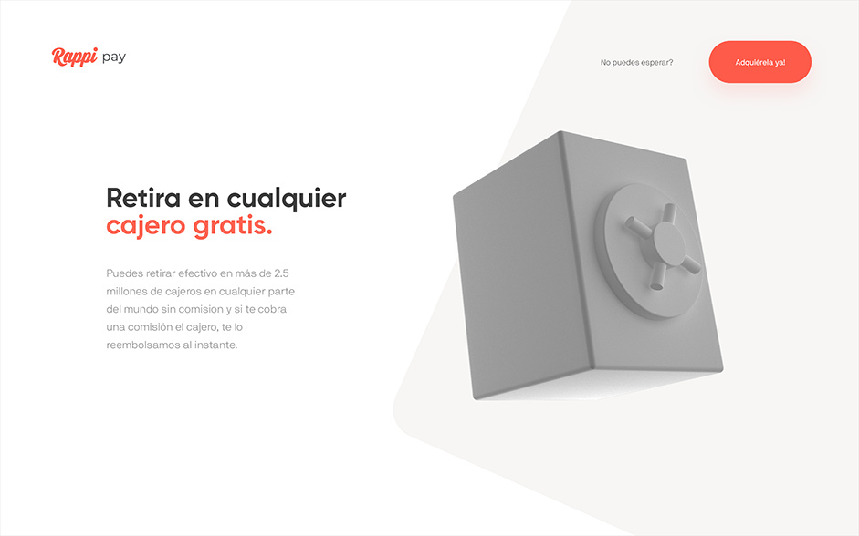
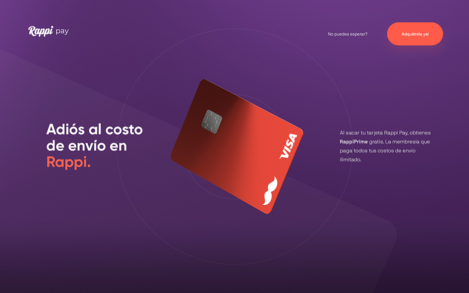
We used 3D animation to convey how RappiPay is simple, fun and free yet powerful and full of benefits. We utilized the loader to immediately convey how RappiPay is replacing traditional banks. A 3D coin with an institution dissolves and becomes a RappiPay Card. Once fully loaded, the landing page is a scroll-triggered experience displaying bold headlines supported by stylized 3D visuals. After communicating RappiPay’s benefits, we created a 4-step call to action leading to the landing page’s ultimate goal – to get users to download the app and sign up for the RappiPay card.
Once fully loaded, the landing page is a scroll-triggered experience displaying bold headlines supported by stylized 3D visuals.
Process
To accomplish this, our 3D Designer collaborated with the Art Director to establish a concept. After settling on a concept, we got to work on 3D modeling, texturing, lighting and rendering. We used white to retain a modern look and feel and focused most of the attention on accuracy in proportions, textures and shading. This is only still frames at this stage.
The biggest challenge was unifying the lighting and shading, each 3D scene had its own lighting and shading, so it took a lot of time, trial and error to make it consistent.
Once approved, our team translated static art direction and web design into motion design. During this phase, the goal is to take every still frame and match them together as one cohesive animation. The biggest challenge was unifying the lighting and shading, each 3D scene had its own lighting and shading, so it took a lot of time, trial and error to make it consistent.
Technologies
Because it was a landing page, everything was built from scratch. Front-end frameworks and back-end technologies would have been overkill on the assignment. The focus on the project was mostly on the technical execution of the 3D assets. After finalizing the 3D, we exported them into videos which were developed to be triggered by scroll.
Company Info
Oui Will builds modern experiences for brands with purpose. We are a passionately curated international team united by the same intention — to create remarkably beautiful things that make an impact, shape culture and connect people.
Our duality is our greatest advantage as we merge European design and engineering with American can-do strategy and speed. We are the agency that never sleeps. With teams split across time zones, we're working around the clock, compressing project timelines without ever compromising on quality.
