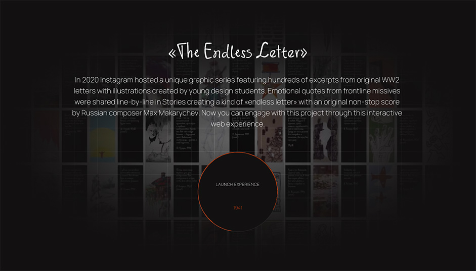
“Endless letter” website became the digital home for the collection of memories found in war times archives. The project represents fragments of authentic letters home written by WW II soldiers, making them available online. The website is a part of #VictoryPages, a project implemented by RT Creative Lab in 2020.

Key idea
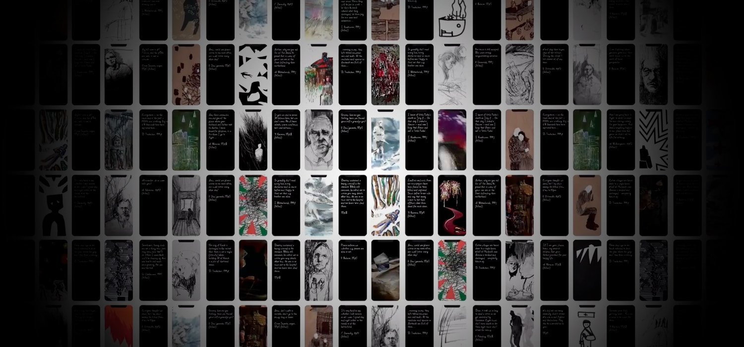
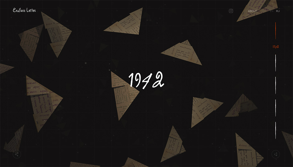
Originally the project was released on social media: quotes from the letters were featured along with illustrations created by students of the RANEPA School of design. The musical arrangement for the project was created by Maksim Makarychev. Our team was responsible for creating the website from scratch, including its design and development. We asked ourselves: how can we indulge the user into the war times atmosphere and show how deep and emotional each letter was? That’s how we came up with an interactive endless flow of 3D letters.
We came up with an interactive endless flow of 3D letters.
Content and navigation
Why do the letters look like triangles? This idea appeared on the front lines due to the lack of envelopes. To reach their loved ones, soldiers folded a piece of paper forming a triangle with the message on one side and the address on the back, and sent it via the military post service.
Over 200 authentic letters are represented in chronological order based on the year they were written in. The history begins in 1941 and by scrolling down the page the user travels through time up to 1945 when the war was finally over. The timeline on the right shows what point the user is at at the moment. It’s also interactive: it can take you to the necessary year via a click.
By clicking on the letter, the user gets to read the fragment and the illustration featured along with it. Some texts have a special mark “died in action” which gives us some detail of the author’s destiny.

How the effects were created
Apart from the letters, the special atmosphere is created with both visual and sound effects: machine-gun bursts, snowflakes and raindrops. The movement of these objects was implemented using the mathematical turbulence algorithms. The correct use of lighting also adds to the realistic look: for example, we used bright backlight for the sparks of flame and flashes of lightning for the rain.
The movement of these objects was implemented using the mathematical turbulence algorithms.
The challenges we faced
The main problem we encountered was “folding” the digital paper and forming the “triangles”. To avoid shadow output difficulties, we designed each angle of the letter as a separate plane, each “acting” like an independent object. All in all, a letter comprises 10 planes.
Some interesting facts
- Actually, the letters don’t form an endless flow. Each page features around 20 letters that move up and reappear from below. The only thing that changes is the content: it’s updated via the scroll.
- Apart from texts and images, we used a particle system with the letters which creates a special atmosphere.
- We used ARIA to make the website accessible: the < button > elements make each letter’s content available for visually impaired users.
Technologies
Frontend Frameworks and Libraries: WebGL, Three.js.
Server Architecture: the website is serverless.
Tools: Web Audio, Accessible Rich Internet Applications (ARIA).
Company Info
Red Collar digital agency was founded in 2011, now the team consists of 100+ experts. Our two main areas of work are design and end-to-end development. We are the best agency in the world according to CSS design awards and have twice won a Webby, the Oscars of the Internet. Among our clients are market leaders in fintech, transport, logistics, e-commerce, and travel.
