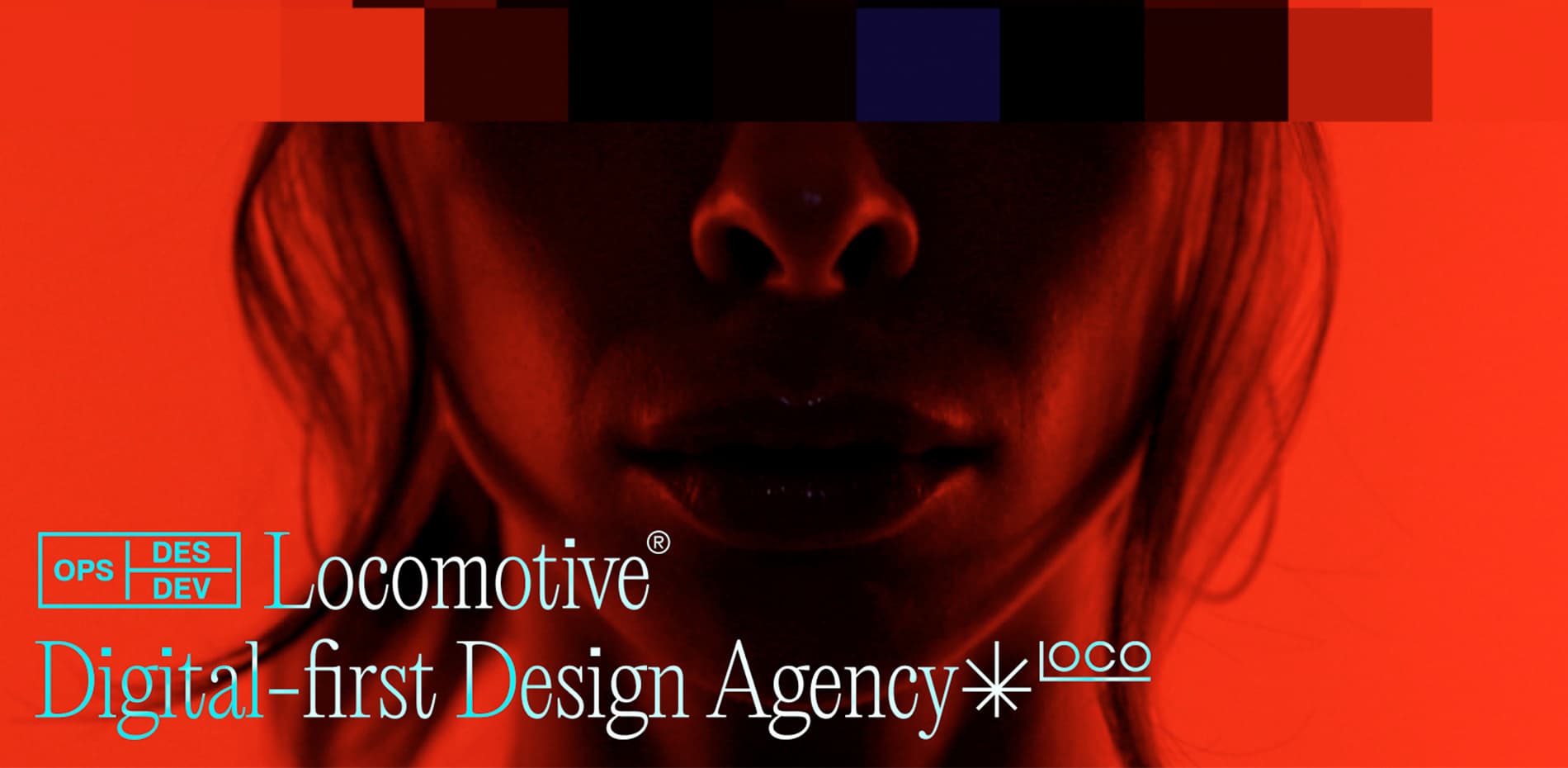
Massive congratulations to Locomotive for winning Site of the Month March with Reinventing Locomotive®, thanks for all the votes and tweets, check the end of the article to see if you've won the free year's Pro Plan
Our journey began with a desire to transform ourselves. We wanted to rebrand and revamp our website to reflect our team’s personality and point of view. The goal was to convey our authenticity and showcase our team’s creativity in a simple yet powerful approach, so we aimed for a concise and straightforward website while still being engaging and unique.
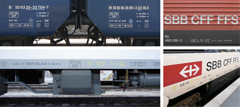
Locomotive also wanted to create a fresh visual identity that didn’t rely on literal connections to trains or locomotives, as our original logo did. Instead, we sought to craft a powerful and subtle graphical representation and visual language with inspiration drawn from the symbols and graphic details printed on the sides of Canadian and European trains across railroads. As design lovers, this solid visual language appealed to us right away.
Logo vs Typeface
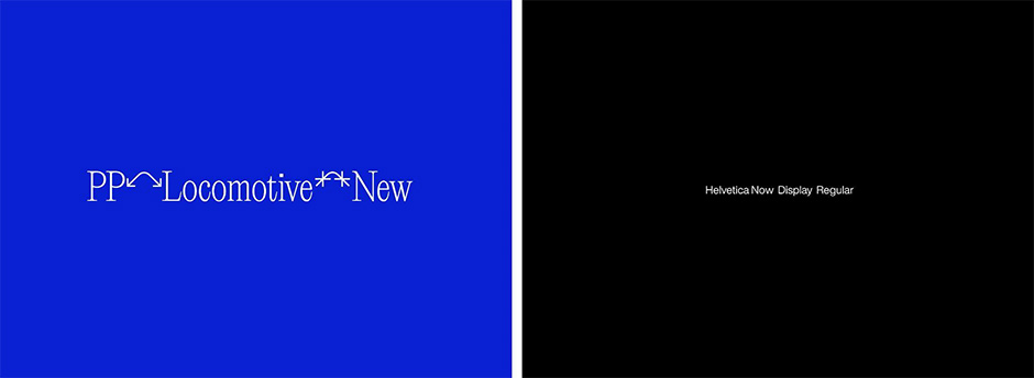
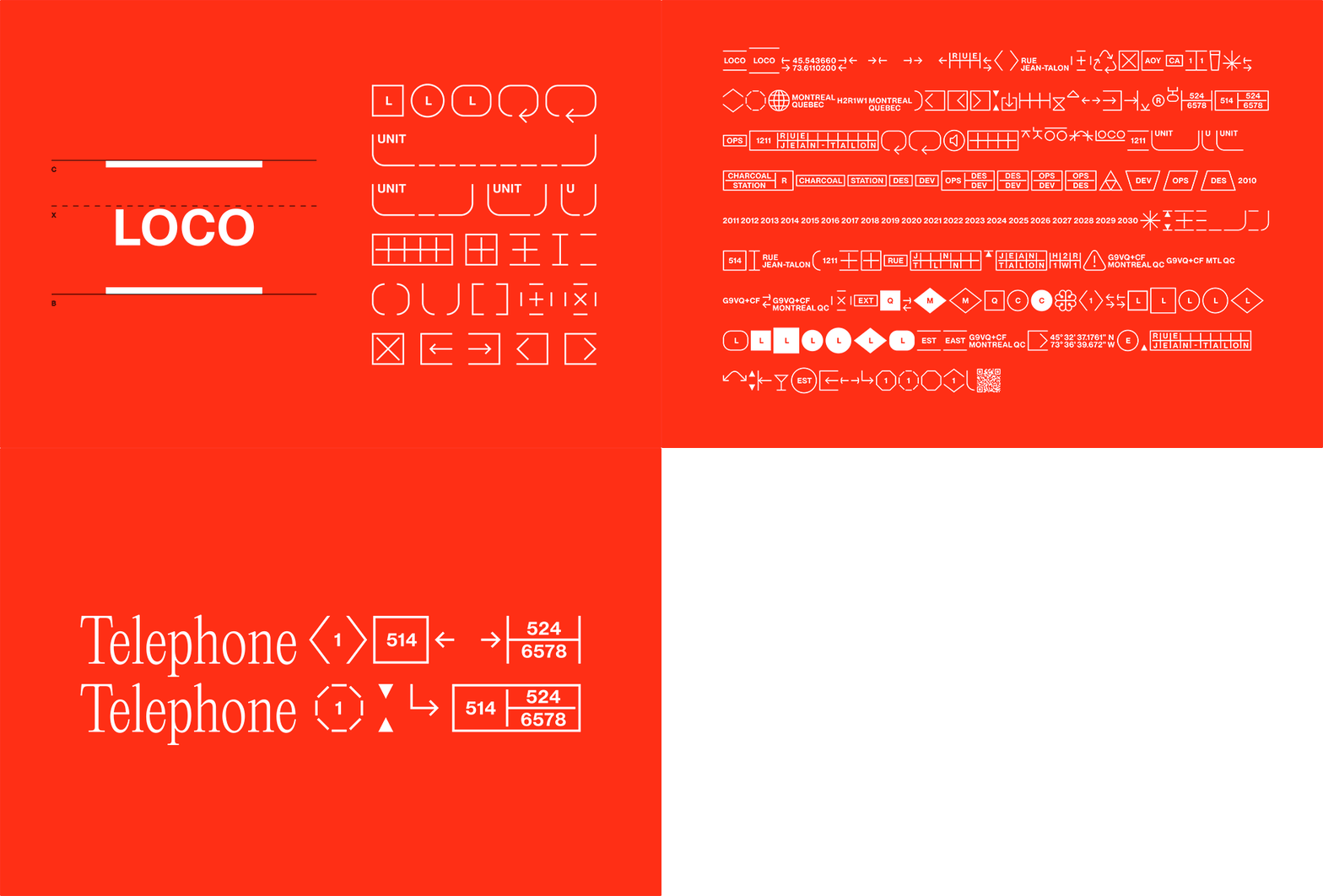
The idea of building a font rather than a logo sparked our interest. Together with Tomorrow Creative Services and Pangram Pangram Foundry, we developed PP Locomotive New, a typeface that serves as the focal point of our visual identity and website. This variant of PP Editorial New includes numerous glyphs (symbols) that express various meanings. The font incorporates inside jokes, data about our agency, and purely abstract and decorative elements, creating an intriguing and almost cryptic aspect. It is used for our word marks and headlines and can be combined with glyphs to create a unique visual effect.
We tried to move beyond the traditional logo concept and develop a versatile tool that can adapt and evolve with us over time. Although we have a primary glyph identifier, our brand is not limited to a static logo. Updates will surely follow and bring more and more glyphs.
Design and Code Are Only Tools
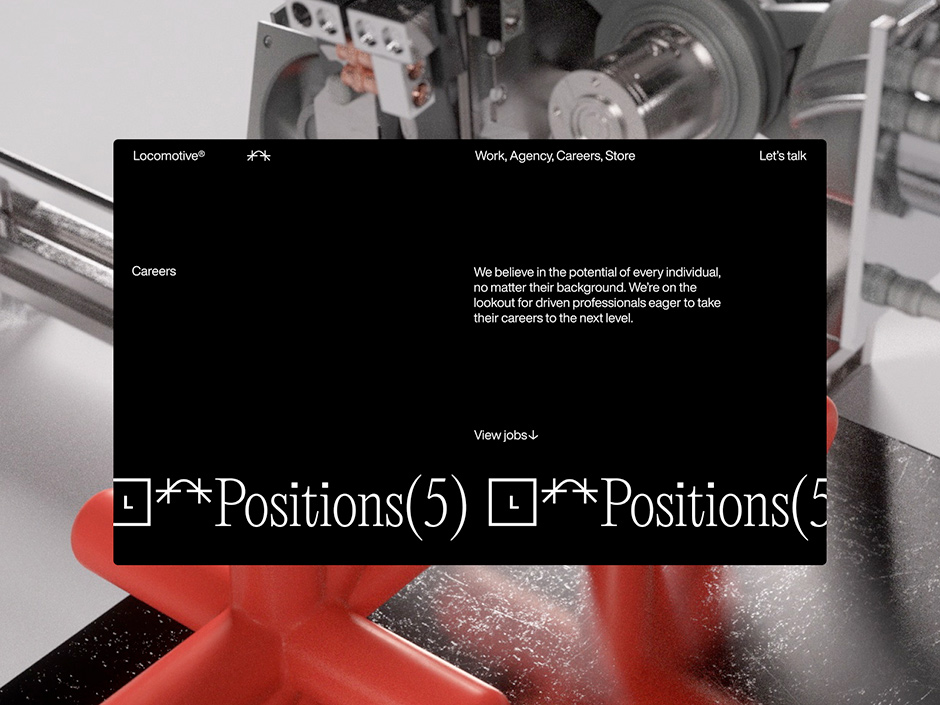
After getting our hands on the typeface, we wanted to turn up the volume on our visual identity and get a bit crazier. So, we teamed up with Baillat Studio to create a short film and other content pieces for the website.
We did many cool things, like projecting our designs onto people, creating inflatable futuristic devices, and even virtually printing 3D glyphs from a crazy machine. The interplay between machines and individuals and the convergence of the physical and digital worlds inspired us. The aim was to be out-of-this-world and show what we believe in as creatives: Design and code are only tools for expressing ourselves.
Making a Big Impact With Minimalistic Design
Our team was determined to create a website that stood out from our previous one by embracing a lighter approach. We avoided excessive animations and gadgets to convey only the essentials while maintaining the fun and playful spirit that Locomotive is known for. We aimed to showcase the agency’s growth and maturity, so we opted for a minimalistic stylesheet with only two typefaces and four styles.
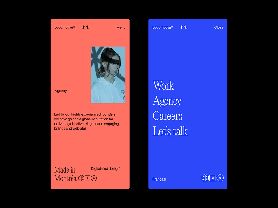
For animation and transition, we wanted something subtle yet impressive to tie everything together, and we found that the “letter shuffle” transition worked well with our pixel lazy loader effect. Even though these details are small, when they are all put together, they create a seamless and cohesive feel to the website. We strived for ease and simplicity, even though it required considerable effort.
Showcasing Who We Are
At Locomotive, having a good time as a team and valuing each other’s company is crucial. Our team consists of individuals with unique and lively personalities, and we have always strived to showcase them inventively on our previous websites. Managing team photos can be challenging, particularly with new team members joining and others leaving the company. We aimed to develop an original and impressive method of capturing our team photos ourselves so that we could manage the website independently without relying on external assistance.
During our brainstorming sessions, we were consistently drawn to a specific idea: using our phone to scan each team member and create a 3D model of them. To bring this idea to fruition, we teamed up with our developers and began exploring apps that could assist us in scanning our team. After several tests, we discovered a process that allowed us to achieve our original idea and incorporate animations and dances into our 3D models. We used Polycam to perform the scans, polished up the models using Blender, and incorporated animations from Mixamo.com into our website using THREE.Js.
We were thrilled with the outcome as we transformed into early GTA-style animated characters. Although the results were somewhat glitchy and unrefined, we fully embraced this appearance and never looked back.
A Powerful Portfolio Tool
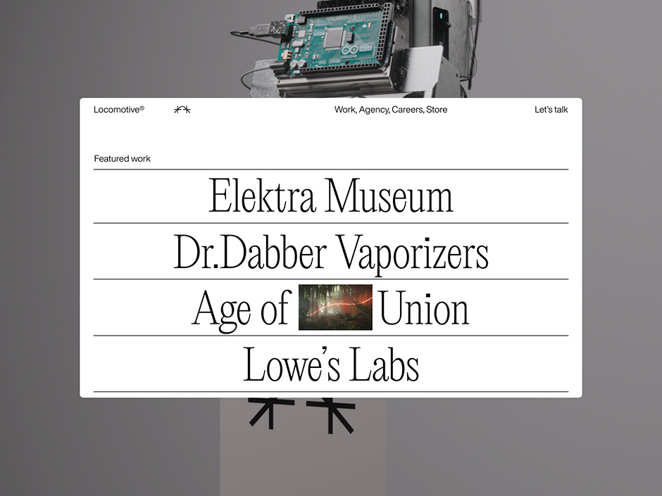
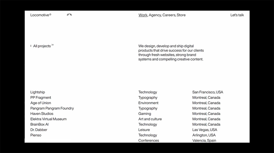
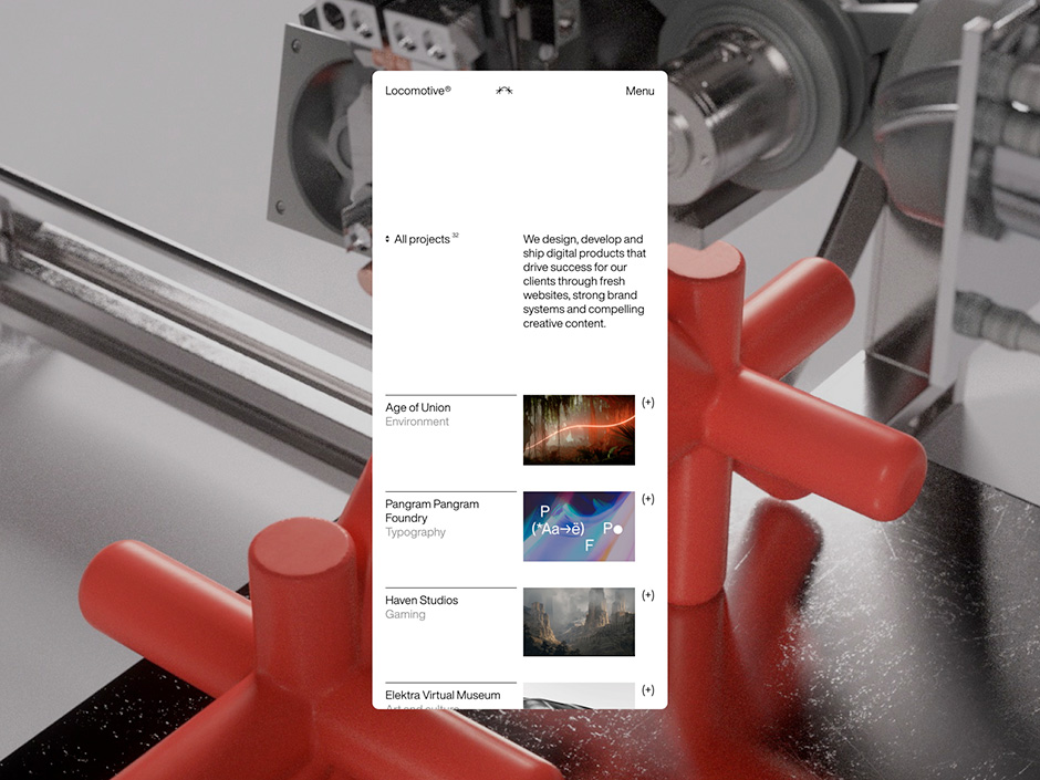
Managing an agency portfolio can be challenging, requiring regular updating and managing new projects. Unfortunately, portfolios are often neglected for long periods. Our goal was to create a new portfolio that allows for easy project uploads, including a brief description, two images, and a URL. This flexible approach enables fast project uploads, even while case studies are being created. (This feature was, of course, praised by our sales team)
To showcase our products, we aimed to exhibit diverse projects while maintaining a curated portfolio. Our minimal filtering system enables users to explore our areas of expertise and search for specific projects. For case studies, we opted for a simpler approach that relies on motion, fewer images, and text to convey the project’s essence.
We believe that users should visit the actual product to explore further. Plus, browsing through all the case studies is a breeze once you land on one, thanks to seamless page transitions.
A Meet L.I.S.A.
Once a potential client falls in love with your work, the crucial step is getting them to request a meeting. However, contact forms can often come across as dull or generic. At Loco, we’re passionate about innovating how people can contact us.
That’s why we’ve developed L.I.S.A. (Locomotive’s Interactive Super Assistant), which pays homage to the AI culture and adds a fun component for potential clients to enjoy our wit and personality.
Although L.I.S.A. is not a real AI, it utilises Google Cloud’s “text to speech” API and some homemade creative copywriting. Keep an eye out for future updates, as L.I.S.A. will likely transform and evolve in the coming years.
An Impactful launch
To date, our recently launched website has received over 30,000 visits in less than 40 days. Additionally, more than 3,000 individuals have interacted with our 3D models of the team, playing for an average of over a minute. We are thrilled that the Awwwards judges recognized the effort and attention to detail that went into this project, and we are proud to have won Site of the Month.
Company Info
Based in Montreal, Quebec, Canada with an international focus, Locomotive does real business in the digital era. With a superstar team of less than 30 humans, this digital-first design agency has been elevating the game of remarkable organisations since 2006, consistently delivering stellar brands and websites while educating and accompanying clients throughout its efficient, transparent process. Celebrating more than 100 awards since 2018—including five consecutive Awwwards Agency of the Year jury votes—Locomotive puts people-first.
Thank you for your vote and tweet @fdrc_o, please DM us to collect your prize!
