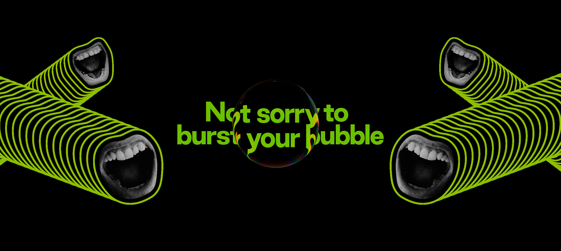
When Rouser engaged ED to make their website, the expectation was that we'd distill their big ideas into a simple, engaging experience. They're an environmental activism agency that experiments with what traditional green groups don't, and succeed where other's communications regularly fail. That makes them a rare client ready for us to create something bold.
We approached the project as artists and storytellers rather than web designers.
We kicked off with a deep exploration of Rouser: poring over their pitch decks and documentation; learning the ropes and tropes of environmental communication and familiarising with their great identity and graphic system designed by Alter.
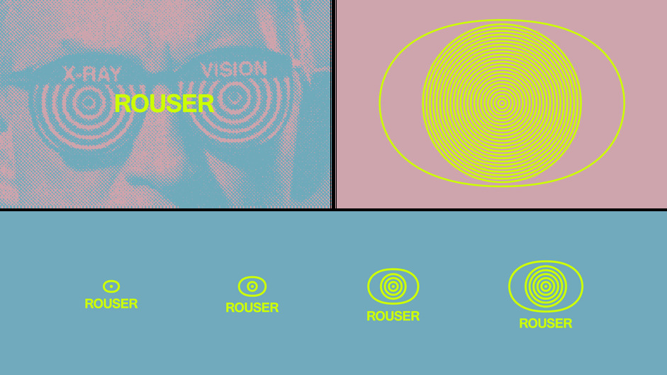
Distilling the idea
Before arriving anywhere near the bubble, we sought to answer a question: what are the reactions or interpretations we want visitors to have? We approached the project as artists and storytellers rather than web designers, looking for inspiration in art, cinema and pop culture instead of websites.
Emotional territories
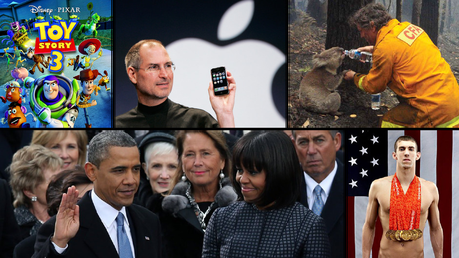
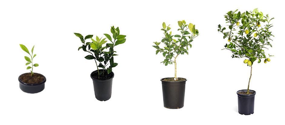
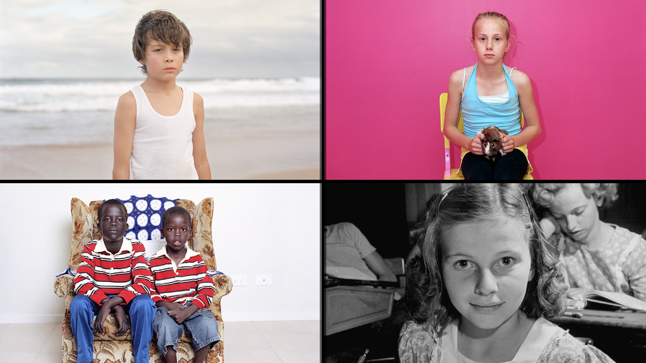
One territory concerned the passage of time - or, with barely a decade to take decisive climate action, what's left of it. We explored imagery of major events from the late 2000s, the growth of a tree over a decade and children, for who ten years, has been their entire lifespan.
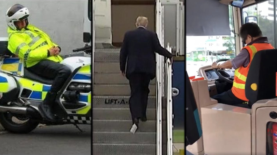
Another territory was inspired by anxiety and frustration: from images of important people 'asleep at the wheel' to experiences that cause deliberate frustration or demand intervention.
[The direction] was inspired by one of their powerful headlines: Not sorry to burst your bubble.
Creative directions
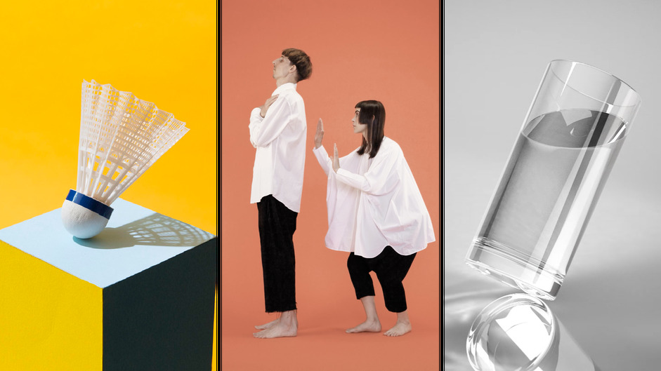
We narrowed our focus to the latter territory to develop three directions, with the caveat that users should experience empowerment and agency, not futility.
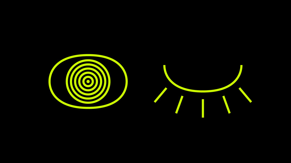
One direction: a blinking 'Rouser eye' that falls asleep without sustained interaction. Another: a series of situational tipping points that only the visitor can stop. Finally: a growing bubble, inspired by one of their powerful headlines: Not sorry to burst your bubble.
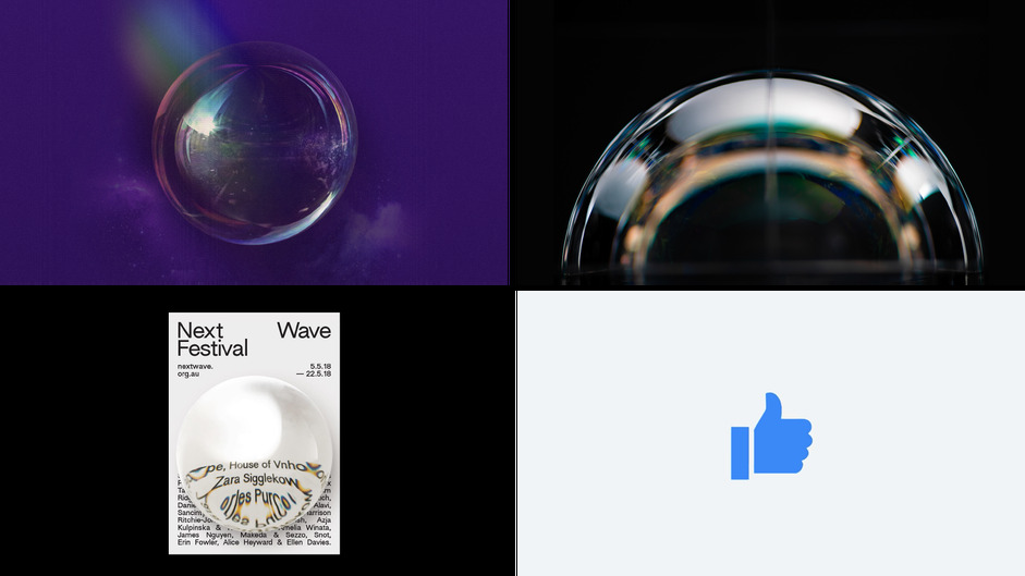
Making the idea a reality
As soon as Rouser set their sights on the bubble, we got to work exploring how this could work. Our team designed preliminary layouts, experimented with language and rendered 3D mockups to affirm the direction. Not long after, we had an interactive (albeit rudimentary) prototype rendering in Chrome, realtime.
The big secret of the Rouser bubble is that it's not actually a sphere.
Figuring out the physics
We approached the bubble as a polygon with any number of sides. Corners are stored as 2D particles, each with their own position and velocity. When the program starts, those points are plotted in a circle.
The physics simulation ended up being surprisingly simple. Rather than manipulating the position of each particle, their velocity is slightly adjusted in every frame, giving them a nice, elastic shape.
There's five distinct forces at work on the particles:
- Radius stabilisation: nudging particles back to a consistent distance from the centre.
- Velocity averaging: smoothing out average velocity based on a particle's neighbours.
- Wall collisions: bouncing particles back to keep within the viewport.
- Slow down: slightly reducing velocity each frame to simulate wind resistance.
- Wind: introduce a few sine waves to get the bubble moving without interaction.
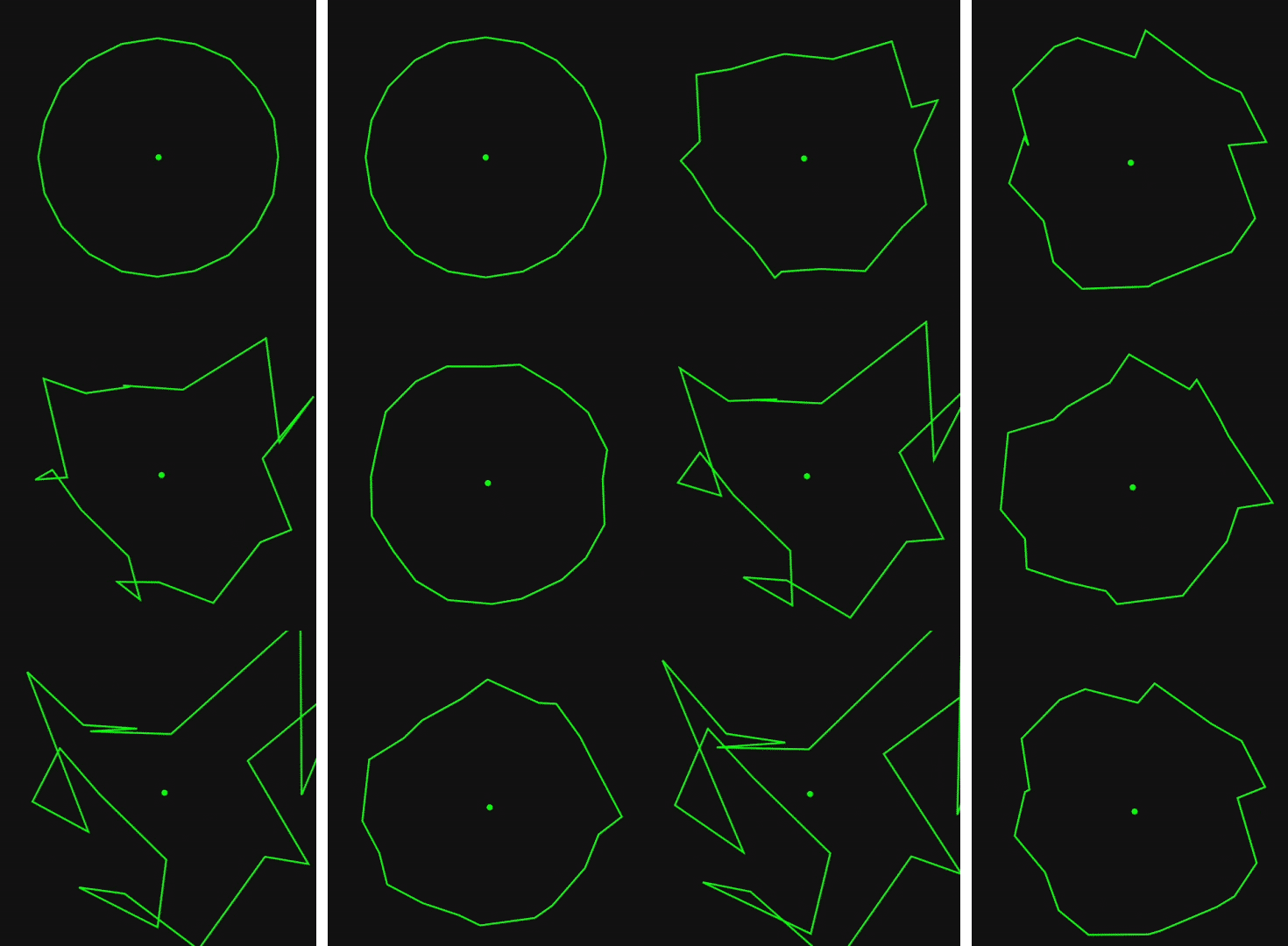
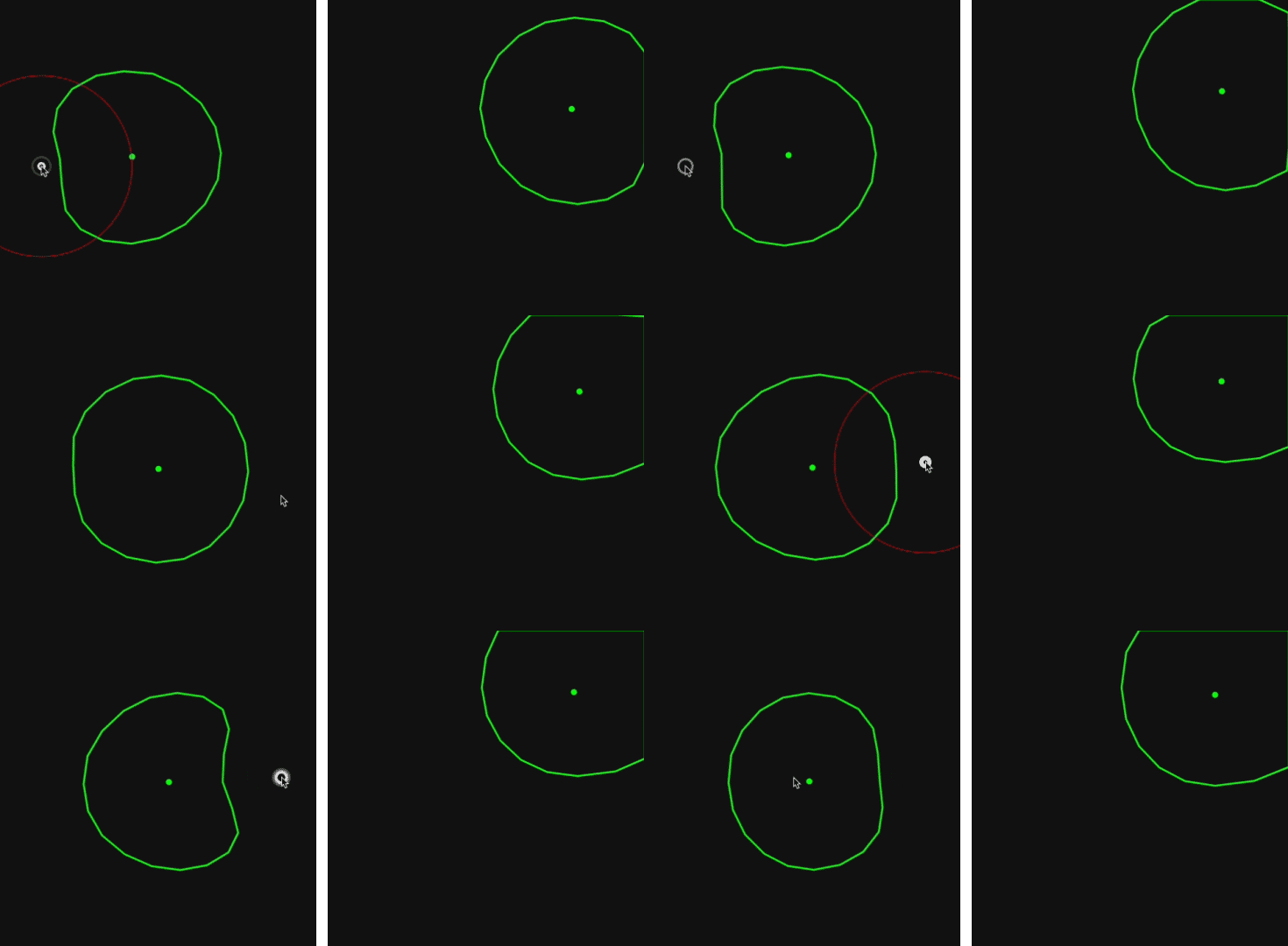
We've made a code sandbox so you can have a play with the physics for yourself: https://codesandbox.io/s/rouser-bubble-physics-tqdqg
Designing the story
As it became clear that the bubble was going to work, we started working more closely with the Rouser team to stay true to their brand's voice, personality and purpose. We adapted their story for a web context, tested applications of their graphic system and built a control panel with over twenty attributes to experiment with and refine the real time rendering. With some of Rouser's team having worked on a past advertisement that made heavy use of bubbles, that familiarity with their aesthetics planted the stakes extra high.
Mixing the DOM with WebGL
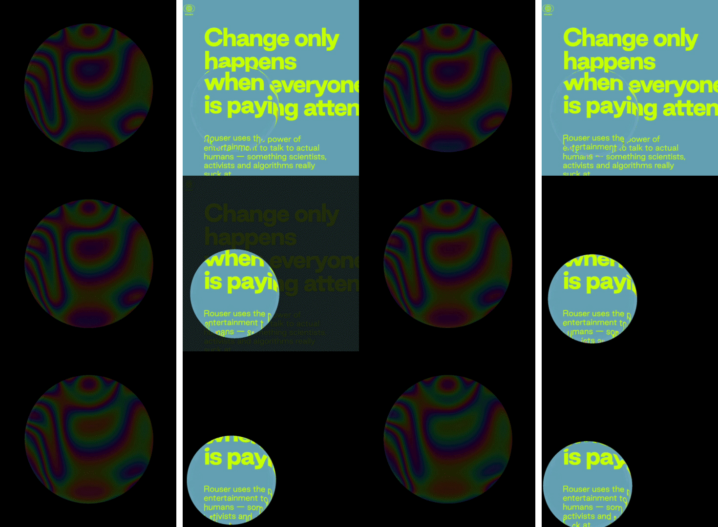
As such, it was essential to pull off refraction, warping and chromatic aberration. Rendering with WebGL made it possible to create those effects however, with the website design constructed in HTML/CSS, the challenge became integrating the DOM into our WebGL scene. That process looked like this:
- Convert DOM elements into images with Canvas 2D
- Convert those images into WebGL textures
- Apply those textures to a 3D plane mesh
- Position the plane to remain in sync with the DOM
We use functions like fillText and drawImage and access text properties with the handy window.getComputedStyle(element). Because fillText doesn't support word wrapping, we built our own function using ctx.measureText() that also compensates for missing lineHeight and letterSpacing support.
With the help of ResizeObserver, the image re-render with every change in content and resize. To keep all the positions aligned, we use getBoundingClientRect offset by the current scroll position.
We assign the resulting texture to a mesh plane, essentially creating a reflection of the DOM in 3D space. Our OGL camera is orthographic and has its position linked to the window scroll. With every frame, this scene is rendered to an off-screen bubble shader for use when rendering.
We often use THREE.js as our library of choice however, with a lighter footprint and more modern implementation, we used OGL for this project. Check it out here!
Rendering the bubble
The big secret of the Rouser bubble is that it's not actually a sphere. Instead, we created a triangle mesh from the bubble particles and centre point.
Because of the complexity of what's going on, we had to build our own custom shader. First, we calculate the normals - the direction every pixel faces relative to the camera - using this shadertoy as a reference. Combined with UV coordinates, we can render a pretty decent reflection map.
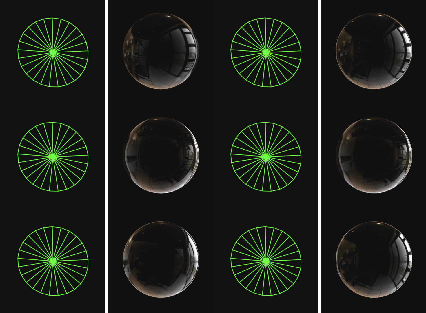
Some sine waves help us introduce a subtle rainbow pattern before we introduce the off-screen texture of our DOM elements, render it to screen and mask it with the bubble's shape.
Finishing touches
[Popping the bubble] triggers an important psychological attachment and buy-in to Rouser's message.
As final touches were made to the layout, design, interactions and cross-compatibility, one important idea came late in the game. As users near the bottom on a desktop browser, they encounter resistance when trying to reach the call to action.
By applying a little extra momentum to their scroll, the bubble is forced to pop. This small action triggers an important psychological attachment and buy-in to Rouser's message.
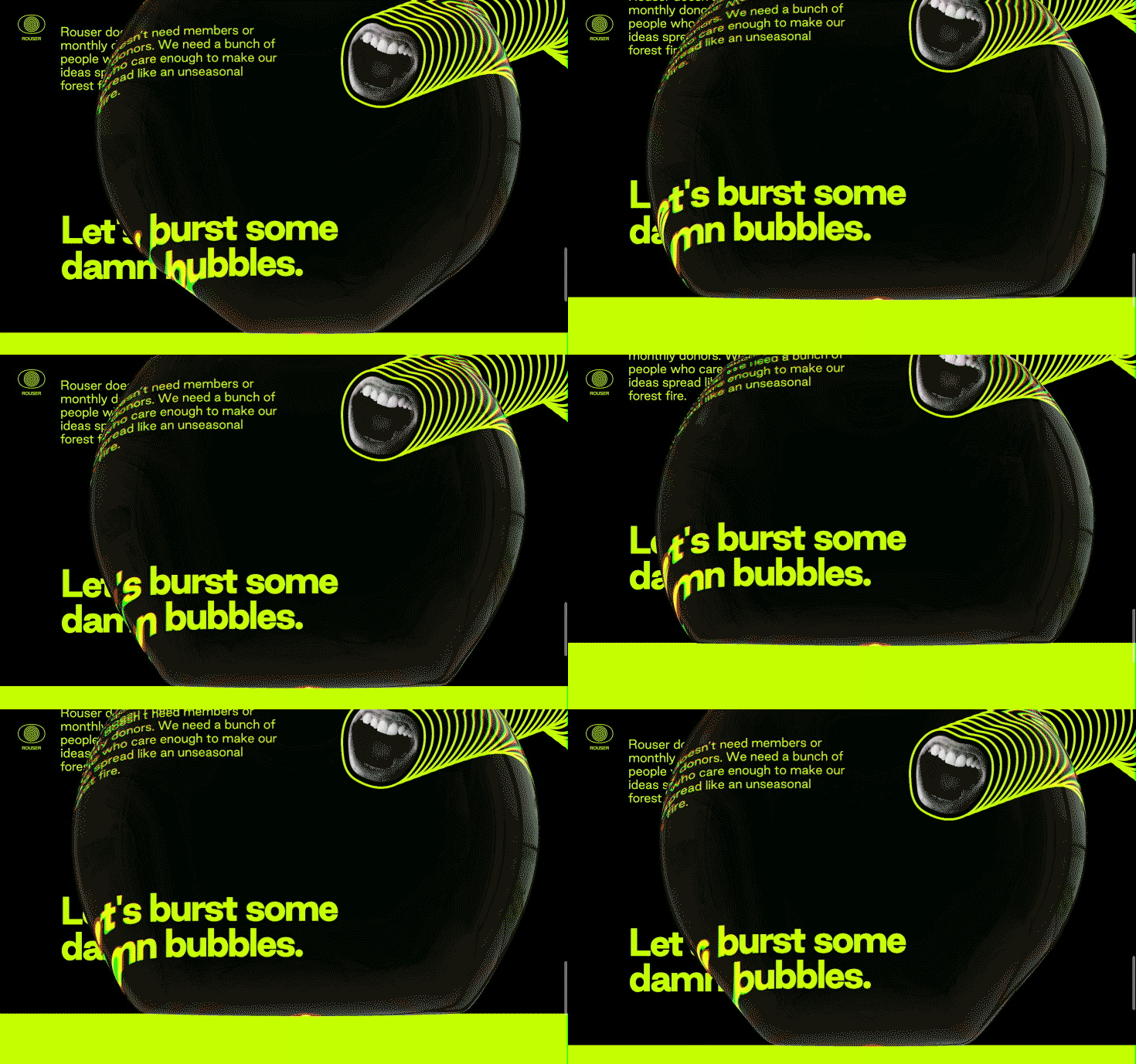
We modified our custom shader to mask out some of the bubble as it pops and used a separate particle system for the splash that erupts during the bubble-splosion.
Despite the resistance obstacle, a whopping 70% of all users reached final call to action in the first three months, indicating a high engagement with the entire storytelling experience. Over that same period, users have popped the bubble over 130,000 times.
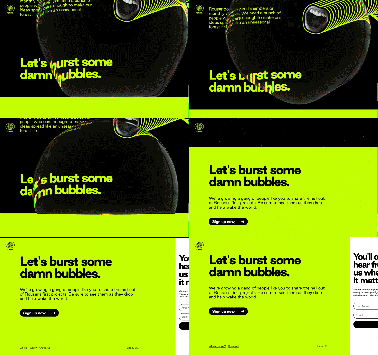
With every burst, we hope that Rouser has engaged a new champion of environmental action.
Technologies
Server: PHP
Frontend technologies: WebGL using OGL library, React
Credits
Client: Rouser
Lead developer: Daniel Lever
Creative director: Elliot Schultz
Lead designer: Cam Tidy
Additional strategy: Hew Sandison
Project manager: Bec Ashmore
Rouser visual identity: Alter
Company Info
ED. is a creative studio of close-knit UX and visual designers, writers, strategists, artists and coders. We explore ideas deep into the woods to create bold, unexpected and curious experiences that people actually love to use.
