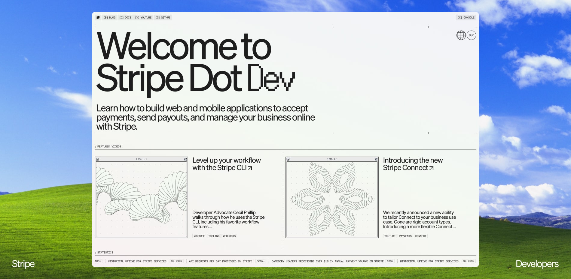
Back when the web was fun and everything was hard to do, Stripe made accepting payments on websites easy for developers.
In recent years, the Internet economy has boomed, while websites have gotten complicated and quite boring. Nobody feels this more than the developers who inspired us to make Stripe Dot Dev.
Don’t Call it an “Easter Egg”
The concept began purely utilitarian with little more than a series of lists of article titles focused on solid typography and readability. As the idea evolved, it developed into an art direction that falls somewhere between the Yale rare book library and the Wellington family. Relatively simple on the outside with more surprising details the longer you explore. What started as a few small details nobody asked for became a dozen or so major features we couldn’t resist. There was the work we had to do because it was a requirement, and the work we “had to” do because it was fun.
“Everything is a creative opportunity.”
Collaborative creative process
Over the last 3 years, the loose crew of designers and engineers who made Stripe Dot Dev have worked on quite a few projects together. We have learned what our teammates care about and developed radical levels of trust. So once we had approval on an initial design direction, it was time to start creating opportunities for each other. For designers this meant finding creative ways to channel the engineers’ obsessions toward improving the experience for users. For engineers, it meant using code to generate variety that transforms static text and UI elements into dynamic pieces of graphic design worthy of printing out and hanging on the wall. The design fed the execution in code, and the output of that code fed back into the design, on repeat.
Theming
A developer spends a not insignificant portion of their lifetime customizing, and personalizing their workspaces. We added theming to Stripe Dot Dev to provide them their own slice of the site to experiment with. Since we didn’t have to pick one color palette and stick with it, we were free to experiment with wild color combinations we wouldn’t normally consider. They range from brutalist white and blue colors inspired by berkshirehathaway.com, to a geocities inspired theme. They’re playful, nostalgic, and each one gives the experience a very different vibe. Developers appreciated being allowed to set their own tone.
Footer
The design comps included the word DEVELOPERS repeated a few dozen times below a traditional footer. The direction for engineering was “We want an endless footer that increases in visual complexity as you scroll. Go as wild as you want.” Have you ever been on a site that uses infinite scroll and found it hard (or impossible) to reach the footer? It’s a UX paradox anybody who has made sites for a number of years will have run into. We thought it was funny to invert it by creating a footer you could never reach the end of.
The result is a canvas that draws the word “DEVELOPERS” on every scroll event (interpolated for smoothness), scaling up and down slightly as a neverending Shepard scale plays. The word appears to be extruding from the bottom of the screen to the top, then looping back to the bottom. If you are a John Hughes fan, you’ll find a Ferris Bueller reference if you scroll long enough to see it.
Math Art
Design Engineers at Stripe have a variety of strange hobbies. One of them is math art. We’re big fans of Computers and Automation, the first computer magazine, started by Edmund C. Berkeley in 1951. In the 1960s, the covers started using art generated by famous algorithms and computer scientists. Since the team writing articles for the site wouldn't always have a designer and art director on hand to create unique visuals for each post, we explored dithering techniques, ascii filters, image degradation, and some more complex creative code techniques. We landed on a clean line approach and built out an initial set of families, attempting to generate artwork based purely on the content within each article. Those lacked a human touch so we built a design instrument to “play” through the possibility space. Once we got the hang of it, we rapidly generated several dozen unique pieces.
The same simple math powers the artwork, cycles the accent colors, and was pulled from our core brand waves across stripe.com and stripesessions.com.
Terminal
Between themes, generative artwork, music, and an infinite footer, we had packed a substantial set of features into the site. Suspecting an audience of developers would appreciate a central interface for interacting with all these parts, we built a terminal with xterm.js and carnesen/cli and a light custom cli on top. By leveraging fully featured terminal emulation tools, we were able to create a really robust terminal environment that felt familiar to developers. Once the environment was working, we created a set of commands to allow curious minds to delve deep into the full set of hidden features. The final touches were making the terminal reactive to theming and adding a replica of the classic game of snake.
Sound design
In response to the over-the-top nature of the early web, the internet collectively decided that the web should not make sound. We think the pendulum has swung too far, and are selectively re-introducing this lost touch of delight. A few tasteful audio queues add a remarkable amount of feedback to clicks and drags, just giving a visceral nod to the user that “Yes, we got your input.” For the more fun parts of the site, we dialed up the sound with shepherd’s tone on the endless footer and a music track we composed that can be accessed through the terminal.
Technologies
The core guiding principle of picking technologies was to streamline development and make content creation as simple as possible, but no simpler. While Next.js is a pretty complex piece of technology, and Vercel is a robust platform, they allowed us to focus on creating a beautiful site quickly. Our authors are developers so authoring in code, with simple Markdown, sidestepped the overhead of integrating a CMS.
Frontend Frameworks and Libraries:
- React / Next.js
- HTML <canvas>
Backend Technologies:
- Vercel
Content:
- Markdown
Tools: Figma
Company Info
Stripe is a financial infrastructure platform for businesses. Millions of companies—from the world’s largest enterprises to the most ambitious startups—use Stripe to accept payments, grow their revenue, and accelerate new business opportunities. Headquartered in San Francisco and Dublin, the company aims to increase the GDP of the internet.