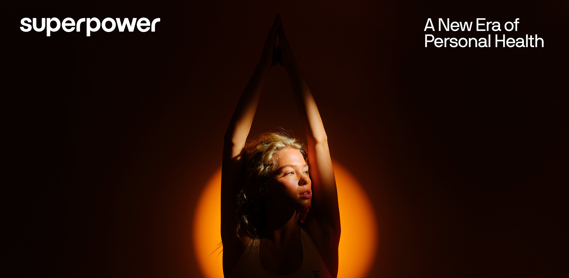
A brand today is defined by the experiences it creates—how people interact with your product, understand your story, and connect with your mission.
At Daybreak Studio, we shape brands that go beyond traditional guidelines, extending identities that thrive in every interaction. Once we define the brand, we bring it to life across the spaces where stories unfold—websites, digital products, and those unsaid moments—mental touchpoints—that linger in the audience's experience, creating an emotional connection with the brand's essence.
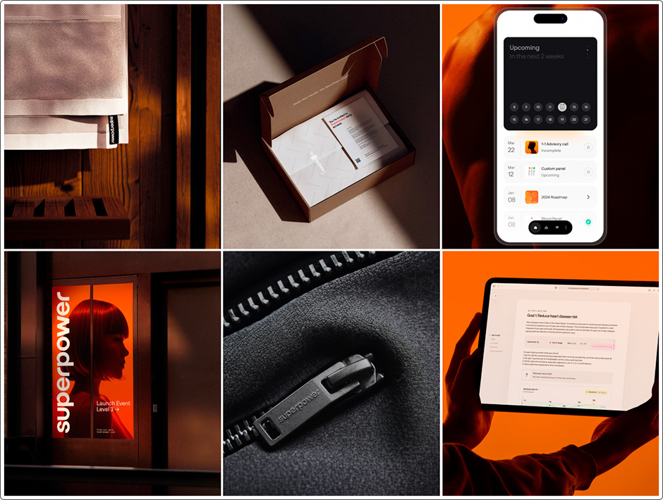
As Superpower emerged from stealth, the goal was clear: create a website experience that carried the weight of its mission. A story of reshaping healthcare, making it more personal and proactive. A story about human potential, framed under the theme: “A New Dawn for Healthcare.”
Art Direction: Representing Human Potential
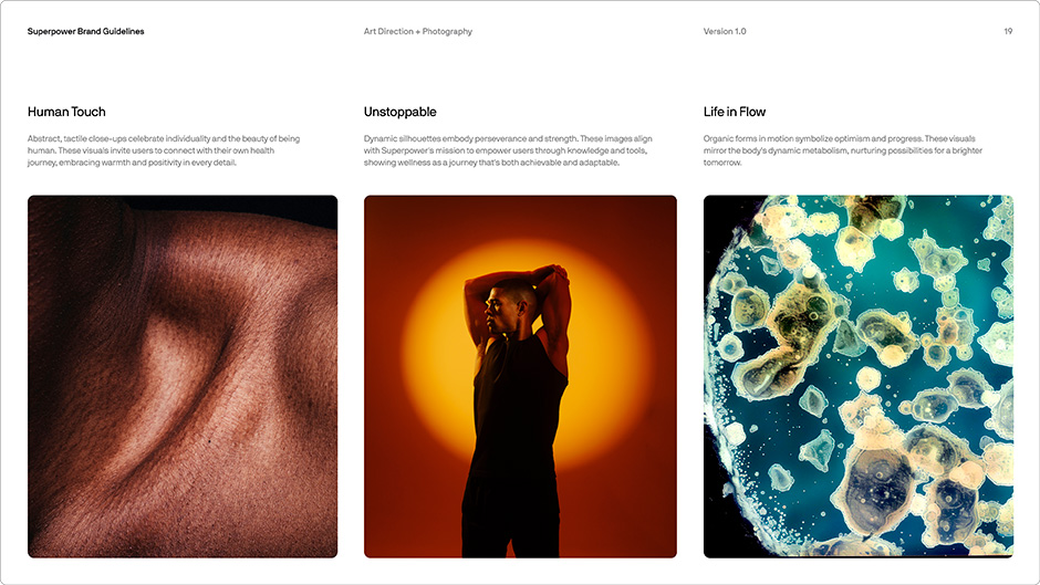
Art direction became the focal point of the Superpower brand experience—a foundational pillar that unifies different aspects of the brand into something recognizable and indicative of its essence. The imagery reflects potential, growth, and transformation by abstracting the human form—moving beyond the literal to evoke a sense of possibility. Through thoughtful and purpose-driven execution, the site becomes a canvas for what people can achieve through Superpower's platform.
Design Language: A Reflection of the Body
Design should be determined by the content it represents. Bento grids, while popular, have become the default lazy solution—often leading to generic and uninspired compositions. Instead, each design choice should be intentional, adapting to highlight the brand's essence. In brand-defining moments, it's crucial that the design doesn’t overshadow the message but instead enhances it, ensuring the brand’s voice remains clear and distinct.
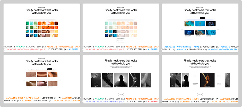
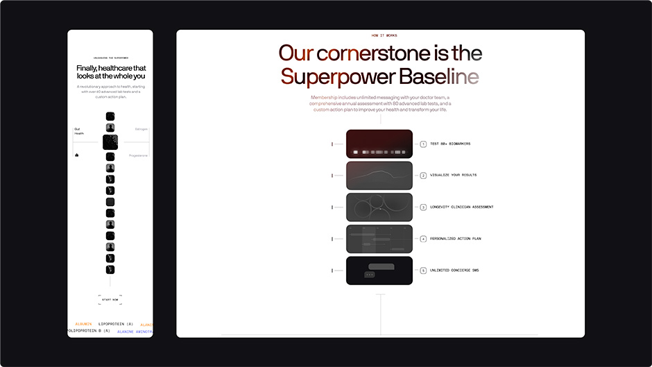
With the human body as our focal point, the spinal cord became a central motif—its role as the core of our physical form and the foundation of movement. This further informed the Superpower ecosystem section, where content breathes and unfolds naturally. On desktop, information expands and pushes like vertebrae in motion. On mobile, the design stacks, echoing the spine’s alignment.
The Wormhole: A Journey in Four Parts
The hero and wormhole section serves as an introduction to the Superpower universe, guiding the audience from feeling to deeper understanding. Through a combination of custom photography, AI workarounds, Blender geometry nodes, and Three.js iPad models, we brought this moment to life.
Building the Visual Foundation
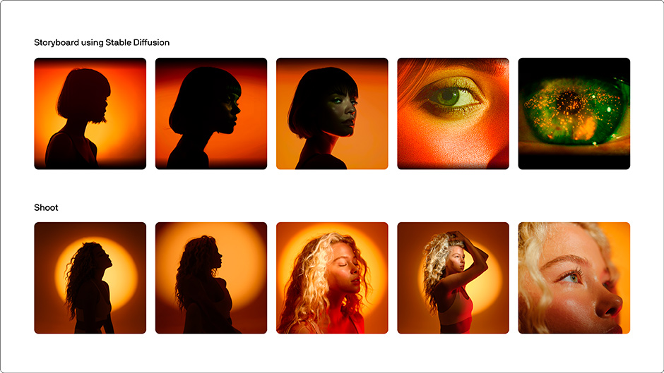
We embraced AI tools early in the studio's journey to create high-fidelity assets for our clients. But with Superpower, our vision exceeded what current tools could handle. This challenge led us to a custom shoot with the Superpower team, allowing us to shape the assets precisely as needed. The shoot became an opportunity for a unique opening video, tailored brand imagery, and team portraits.
Blinks and Breaks
One small but telling detail was the model’s blinking in the sped-up footage. Though a seemingly minor detail, we couldn’t stop thinking about it. We manually removed each blink, frame by frame, then ran it through countless generations with Topaz to stitch it together.
Nodes and Rays
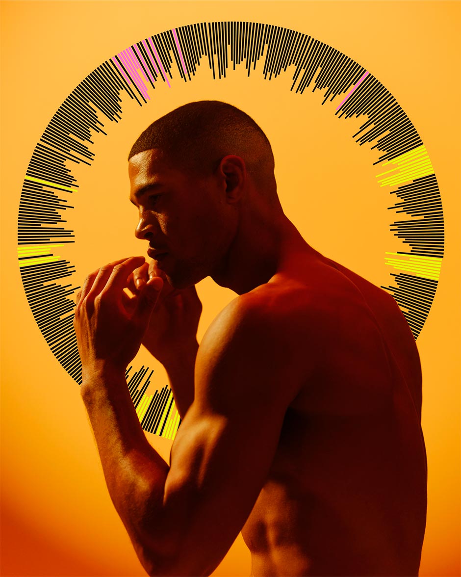
We used Blender geometry nodes to extrude the data visualization into the rays of the wormhole, creating a seamless transition that leads into the iPad. Subtle elements, like a gentle glow before impact and a harmonic balance of colors, captured the energy and fluidity of the movement.
iPads
Initially, we built a fully interactive Three.js environment for the iPad to test different lighting and post-processing effects, but later made the decision to recreate the effect in CSS to replicate the visual fidelity without compromising site performance. For us this stands as an example of where the answer lies in simplifying, even if the seemingly ideal solution might have underway already, particularly if it leads to a more compelling experience.
The Calluses of Creation
Every decision and iteration reflected our dedication and collaboration. These moments, full of challenges and breakthroughs, are what we remember and value most.
Ultimately, whether these meticulous details mattered to the audience is uncertain—but to us, they meant everything. While the recognition is gratifying, it's the journey of creation that drives us, and making something we are proud of makes all the effort worthwhile.
Technologies & Tools
3D and Visual Effects: After Effects, Premiere, Topaz, Blender
Visual Design: Figma, Midjourney, Photoshop
Web Development: Next.JS, Framer Motion, Tailwind CSS, Vercel, React-Three-Fiber
Our approach to new technologies is intentional: we use tools to serve our creative vision, not the other way around.
On Daybreak Studio
We’re a team of craftspeople and optimists who are eternally curious about new tools, big ideas, and what more we can achieve with technology.
It’s right there in the name. We think today could be Earth’s best day yet.
