About the book
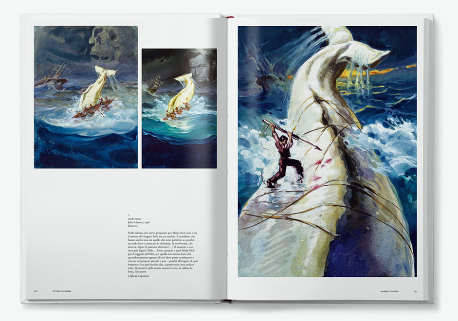
Pittori di cinema is the web showcase of the homonymous book (edited by Lazy Dog Press) crafted with the purpose of giving a face and voice to the authors of the most famous movie posters. The volume is aimed at film-lovers and collectors, but also graphic designers and illustrators as well as students and professionals, as a historical record and an inspiration for future generations of communicators.This book, the first work of its kind, embraces an entire generation of artists dedicated to cinema illustration, from the Forties to the end of the Twentieth century, and includes a great deal of previously-unpublished iconographic material.
With Pittori di Cinema we gathered together all the things we love the most: illustration, graphic design and typography.
In the wake of the Second World War, and above all, from the Sixties on, the Italian film industry began to commission artists to illustrate and promote its films. They were to sum up the entire movie plot in a single image, communicating at a glance all the emotion of a narrative.
Featuring the illustrations the right way
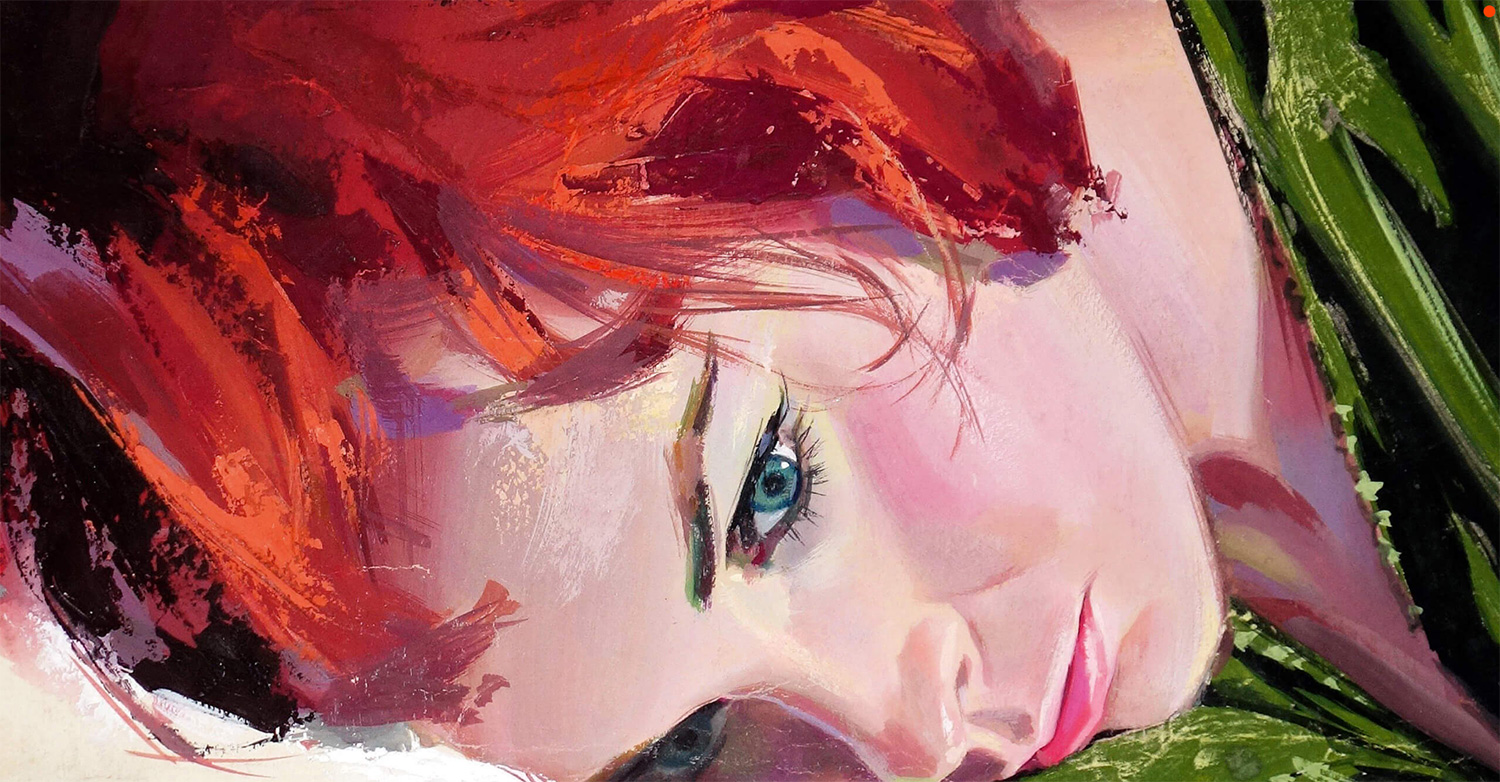
The first problem we faced was how to feature the great illustrations from the book, we thought they were so stunning that we had to highlight them in a creative and impressive way. We ended up making them fullscreen-sized, but that still wasn’t enough, so we decided to think outside the box, using the illustrations as introductions for the website’s sections creating a fixed-scrollfade behavior from scratch. It turned out to look surprisingly good and became one of the biggest added values to the whole project.
Cinema artists’ art was a magical and mysterious one. Since cinema is the art of motion, how could it be synthesized in a single paint? How to transform two-dimensional actors into the gods of Olympus?
Turning a boring list into something nice
Since the core of the book is based on dozens of marvelous illustrations, we felt like we had to give space to the painters themselves; that being said, we wanted to avoid ending up with an infinite boring name-image list. We know that a good typography is always the answer; so we decided to take a typo-driven approach, keeping the artists’ pictures hidden from the listing then showing the single picture as a tooltip on mouseover with a cool easing.
We decided to take a typo-driven approach, keeping the artists’ pictures hidden from the listing then showing the single picture as a tooltip on mouseover with a cool easing.

Keeping animations smooth and consistent
We’re not here to state the obvious, but nowadays providing neat and high quality animations is surely the key to catch users’ attention and encourage them to explore the story you are telling. In order to stick to a solid consistency we defined 3 types of global animations according to the element’s type, making easier for the users to immediately understand what’s going on while scrolling.
A part from the fixed-scrollfade behaviour used for the huge illustrations, we surely didn’t reinvent the wheel for all the remaining elements; we opted for using simple fade-in-up effects for the textual parts, and finally a simple but nice slide-from-side animations for the full ratio illustrations images. To achieve this goal we used a well balanced combination of CSS and GSAP animations.
Wrapping everything up
When we started this project we totally had no idea how to communicate the rich content of an entire book in a single page website; but after going through a tough production phase between content, graphic design and creative development, we are entirely satisfied about how the project turned out in the end.
Technologies
When you are the client yourself and the website has just one page, setting up a back-end could be an overkill for production time, so we decided to write everything in a static html file.
Talking about the front-end, we always rely on the amazing GSAP when it comes to writing mind-blowing animations (triggering them with ScrollMagic); all videos are hosted on YouTube, managed with the Youtube API. In the end we used Gulp to make everything ready for production. From the design side we have been addicted to SketchApp since the very beginning.
Company Info
Bunker is an independent visual design studio that applies a cultural approach to functional technology.
bnkr.it / @bnkr_it
Fabio Carretti is an award-winning Creative Developer based in Italy.
crrtt.com / @FabioCarretti
