This website redesign was a real soul-searching endeavor that took place over a period of several brow-furrowing, debate-filled, endlessly iterative and entirely fascinating months. Relaunching our own website challenged us to think long and hard about our identity - about what it means to be a creative digital studio and what we wanted to say about ourselves to the world. On the one hand, we wanted to let our work to speak for itself, so some of the early designs focused on case studies and photography. On the other hand, this was a chance to articulate our unique perspective and our culture; it was a real balancing act to find a way to explore our creative bounds without distracting from our work.

Starting to take shape
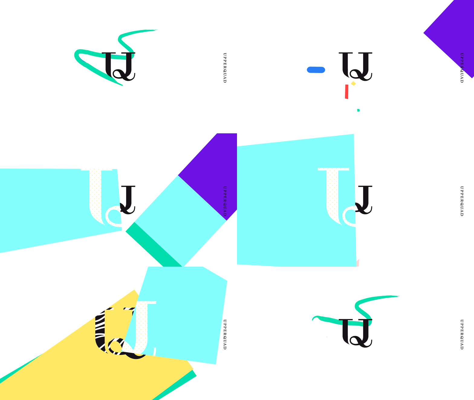
What surfaced from this exploratory balancing process became the first thing that visitors will notice when they land on the site: these always-moving, always-evolving shapes. The shapes are the conceptual building blocks of the site; they're these flexible, energetic elements that spin, slide, bounce and react to what's happening on the page. These shapes transformed over the course of the project, taking on this metaphorical meaning of their own as they come together and interact with one another in ways that are at once complementary yet intentionally unexpected.

Arranged one way they become patterns and another way become canvases. For the user, they serve as both partitions and as portals, through which you can discover new pages within the site. For us, these shapes represent the ideas and creativity that we infuse into our designs everyday - they're what makes our site, and the work we do, uniquely ours.
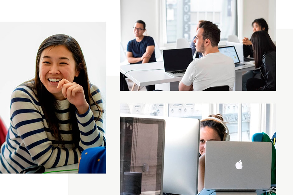
 It’s easy to take photos that feel staged, or forced, or awkward or posed when you have a photographer walking around the office - and that’s exactly what we knew we wanted to avoid.
When visitors land on our site, they should feel like they are really getting to know us, and that starts with authentic photography. Long before we started working on the website, we devised a plan to make sure this would come to fruition: each person in the office would take a week’s worth of photos, capturing one another in our natural state and removing the barriers that typically come up when the camera comes out. Some photos were inevitably better than others - we have folders full of some comically bad shots - but we had a ton of fun doing it and found some hidden photography talent in the office, too. Each week we set aside our favorites and those are the photos you see on the site.
A little 3d weirdness never hurt anybody - Jason Dietrick, Creative Director
Setting things in motion
Bringing everything to life was important for the site, because digital is such a unique medium. Our new site marked an informal transition for us - moving away from an emphasis on form and type, which was how we traditionally visually represented Upperquad, and moving into color and motion as our means of articulation. We started with the understanding that motion would be central to whatever concept we chose, and you’ll see that in every little interaction throughout the site.
Technologies
Dynamic interactions, static content
To implement the rather complex design, we created a custom 24 column grid system using flexbox. This allowed us to position images, text, and other elements very precisely and keep the layout consistent across screen sizes. We used a linear interpolation function in SCSS to continuously adjust the dimensions of various elements, and combined that function with rem units to smoothly scale the font sizes up and down, which also contributed to the responsiveness of the site.
We used Siteleaf as our CMS along with Jekyll as our static site generator. We built the site with HTML, SCSS, and Javascript compiled with gulp and browserify. To implement the scrolling animations, we used ScrollMagic coupled with TweenMax, we used some nicely designed keyframe animations in CSS to create the organic bobbing motions of the polygons.
We are using Amazon S3, which is nicely integrated with Siteleaf, and CloudFront to serve the site.

Company Info
We’re Upperquad, an independent creative studio in San Francisco. We build beautiful brands and digital experiences for clients across industries and around the world.
