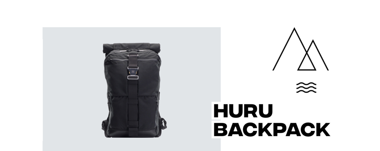
When Oleg Vlasenko (Founder of Huru) came to our office with the backpack and started presenting his product, he shared with us the details and features, the production, materials and how it's sewn, its previous versions and plans for the future. He was so passionate about it that the objective of the website became clear for us. If we managed to showcase the product at least half as good as he did, it would be a success. So we started exploring all the numerous features and tiny details of the backpack, imagining how we could communicate them to the customer. Here we take a closer look at Huru backpack's website.
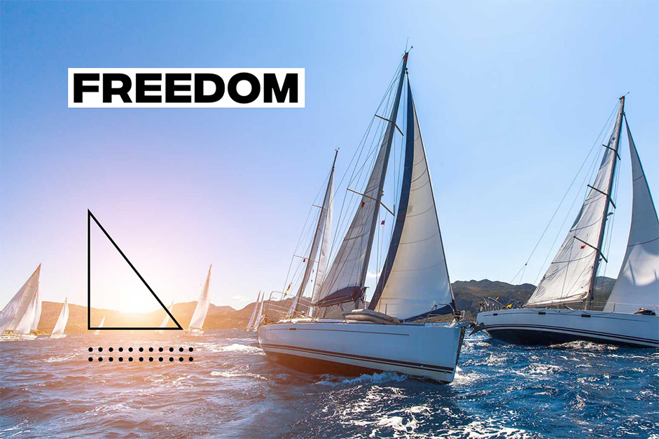
We had already seen photos, but the actual product felt and looked much better than the photos. We organized additional photo and video shooting to show material and details in macro. The Huru backpack has so many features, that it seemed too much to have all of them on one page, so we decided to show core features on the Home page and explore all the other details on the Product page. We used graphics and animations to add up to the story, to give allusions to the ways the backpack can be used: boat, sea, mountains and dynamic city life.
We decided to show core features on the Home page and explore all the other details on the Product page, using graphics and animations to add up to the story.
Homepage
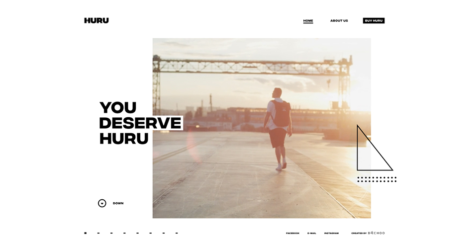
The Homepage gives an overview of the product, mention the main features: water resistance, transformability, compartments for everything. We combined short videos and photos to give this information certain emotional tint. The page ends with a 360 degree view of the product to give the user a profound understanding of how it looks and feels.
Product page
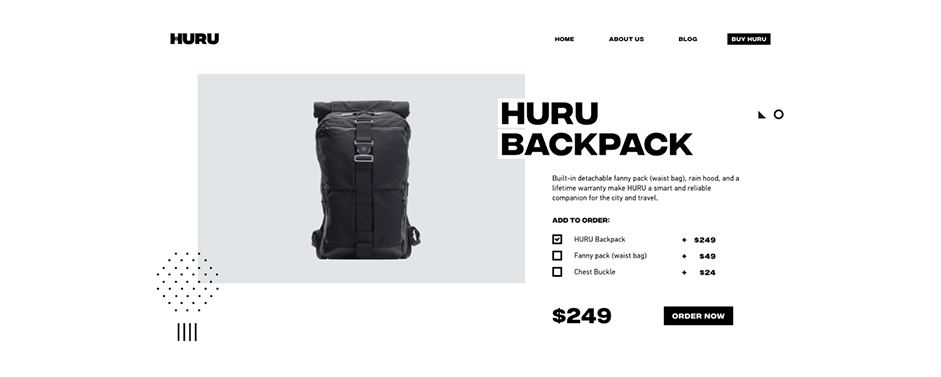
The Product Page with a product card on the top, here we itemized information about exploitation, size, materials, features and complements.
About page
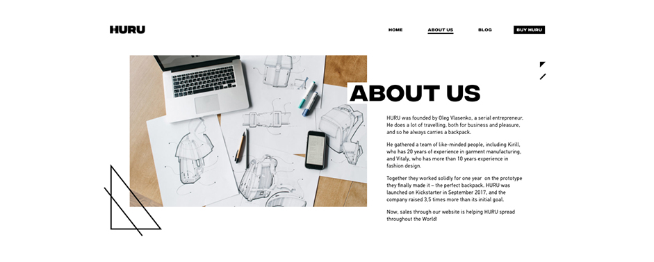
On this page customers or potential partners get to know the origin of the brand and meet the team members. Such a personal touch allows to attract people who share the same values and appreciate the story behind the product.
The Blog
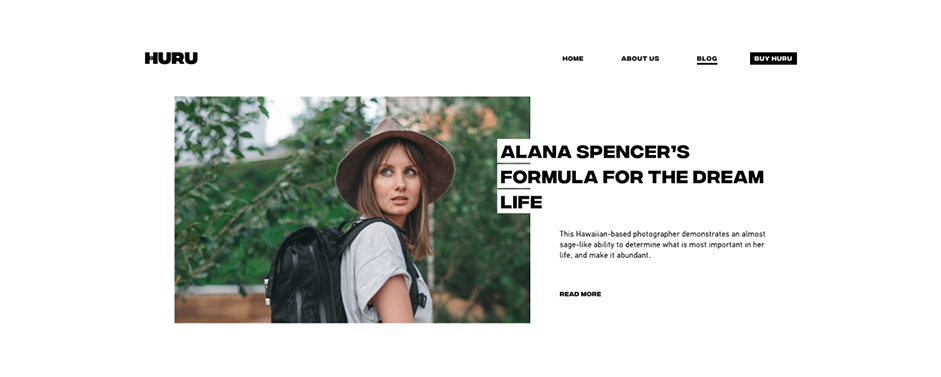
Blog contains short articles about exploration, freedom as a lifestyle, it's a powerful tool to spread Huru's philosophy.
Mobile
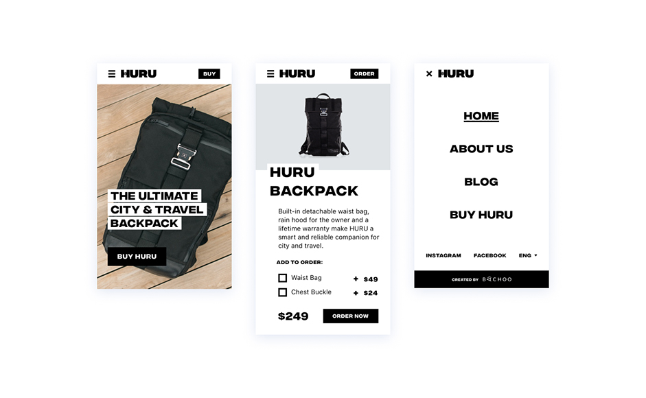
The website is well adapted to all screen sizes and devices. The mobile version maintains full functionality and does not limit the user experience.
Animations
While developing animations we kept in mind associative approach to disclose the product features. The idea behind the animations was to compliment the style of the backpack and the idea behind the brand. Initially we designed the motion in After Effects, and subsequently used Bodymoving and Lottie libraries to create animated svgs.
Marketing materials
We were also responsible for some photo and video production for the website and future marketing campaigns. Even with a limited budget we intended to create something that would make everyone fall in love with the product the way we did. We put a lot of effort in creating this content.
Backstage
We had a lot fun and joy in working with Huru, we were on the same page from the very beginning, which turned out to be very collaborative. We shared the same vision and put our hearts in the project.
Results
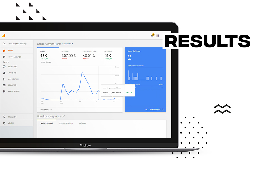
After we launched the website on the very first month it had more than 42 thousand unique visitors and website traffic increased more than 5000%. We received multiple feedback and were able to exceed the expected marketing goals.
Technologies
We used WordPress and WooCommerce for back-end management. Front-end is based on Zurb Foundation framework. Slides transitions were done with Greensock Animation Platform, which gave full control over the animations and created smooth transitions. The animation of the shapes on the front page has been realized with After Effects and then rendered into SVG through the Bodymovin plug-in using JSON files. This technique creates several advantages such as better control over the animations while making it possible to provide one single JSON file containing all the information needed for the proper functioning of the animation (which is perfectly controllable through javascript and the Bodymovin.js framework). This technique also enhances compatibility through devices and the lightness of exported files.
Slides transitions were done with Greensock Animation Platform, which gave full control over the animations and created smooth transitions.
Front-end Frameworks and Libraries: Zurb Foundation, jQuery, GSAP, bodymovin, ScrollMagic
Backend Technologies: WordPress, WooCommerce
Server Architecture: Apache, PHP
Company Info
Bachoo Design Studio is a team of creative professionals who craft digital products from ground up, from user research to elaborated visual design. Our Studio is three years old, and during this time we have implemented more than 80 successful international projects. We were honored to win international awards in brand identity, visual design, mobile application design, best computer character.
