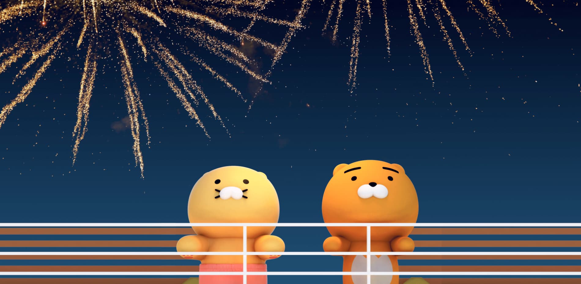
We wanted to create interactive content that everyone can relate to through the theme of 'Monday Blues' featuring the lion character "Ryan" and his cat "Choonsik" from the lifestyle brand; Kakao Friends.
Kakao Friends are the most beloved characters by Koreans and have expanded their universe with various contents since their first appearance as emoticons in Korea's main messenger application called 'Kakaotalk.' Ryan and Choonsik are the most popular characters in Kakao Friends, along with Instagram webtoons. On YouTube and Tiktok, they perform as virtual idols 'Ryan-Choonsik Dance' and have more than 100 million views. They are also being produced as actual products.
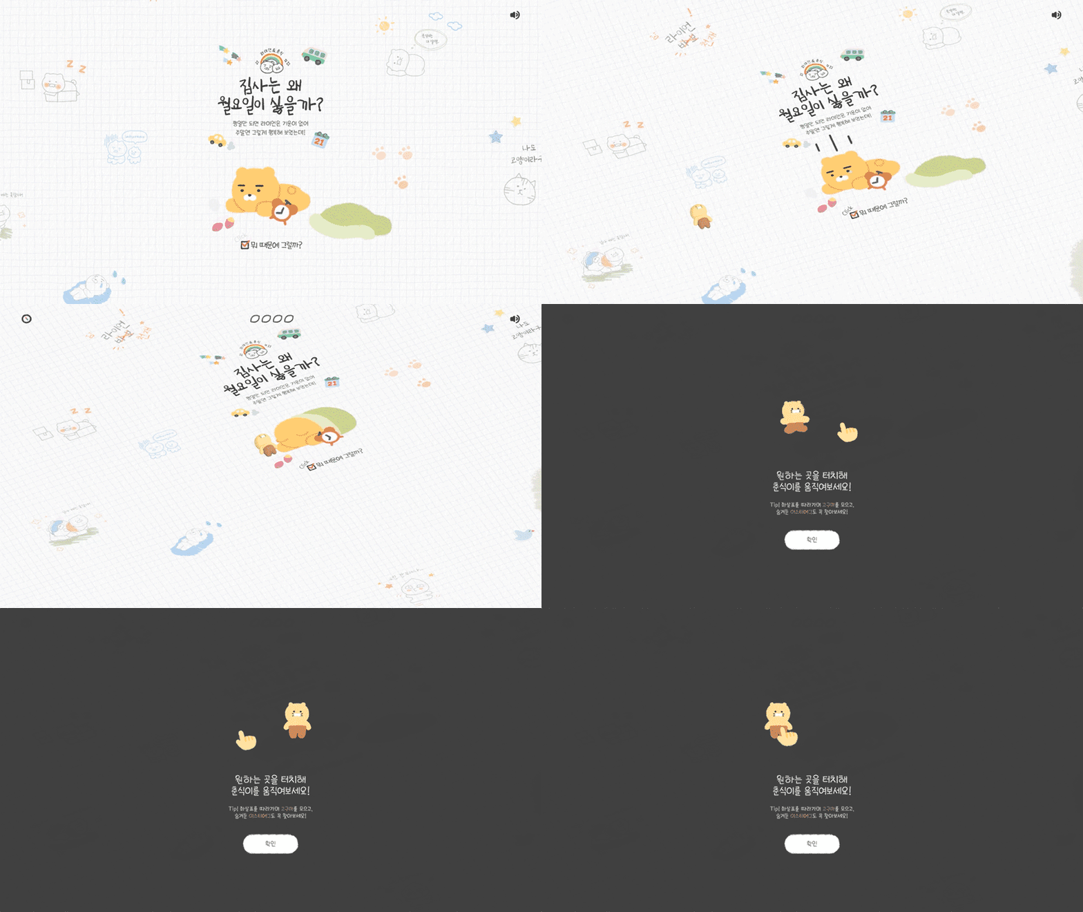
Their story tells us that one day Ryan picks up and raises a stray cat, 'Choonsik,' on his way home from work. 'Choonsik's diary' was developed by using the relationship between a cat and its master. In our experience, you will follow the story from Choonsik's point of view and reinterpret people's busy lives today.
The tech stack
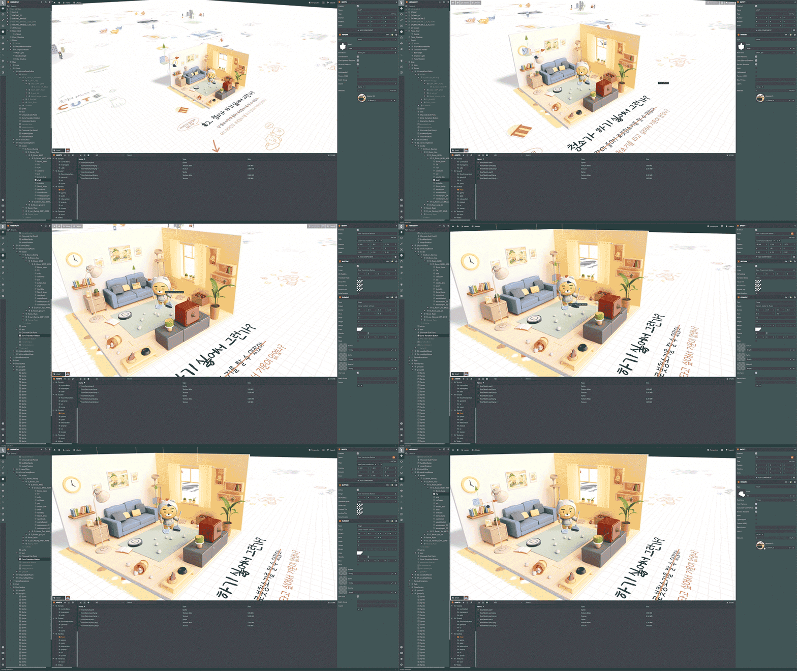
We have had the opportunity to try various WebGL libraries over the years, and we always push ourselves to try new tech stacks to improve our workflow. One of the biggest challenges of any web project is bringing designers and developers together. A healthy collaboration between teams is critical to achieve a good user experience.
In a WebGL project, 3D artists also have to be part of this workflow. It is really important for 3D artists to know what features can be expressed and translated from their 3D software to the WebGL scene.
“It is really important for 3D artists to know what features can be expressed and translated from their 3D software to the WebGL scene.”
We considered a few options for this project, but we ended up trusting the Playcanvas team and their fantastic editor.
Blending 2D and 3D
Interactive contents usually come with organizing the contents either in 2D or 3D. We wanted to show that Choonsik's diary can show different experiences in both 2D and 3D. When the player first enters the page, you will see Choonsik's paintings and letters expressed in flat 2D, but when he enters specific points, paintings will pop out in 3D. Overall, the space is in 2D. However, for some important scenes, we wanted to give an enjoyable experience between 2D and 3D through a pop-up book like 3D configuration.
“We wanted to give an enjoyable experience between 2D and 3D through a pop-up book like 3D configuration.”
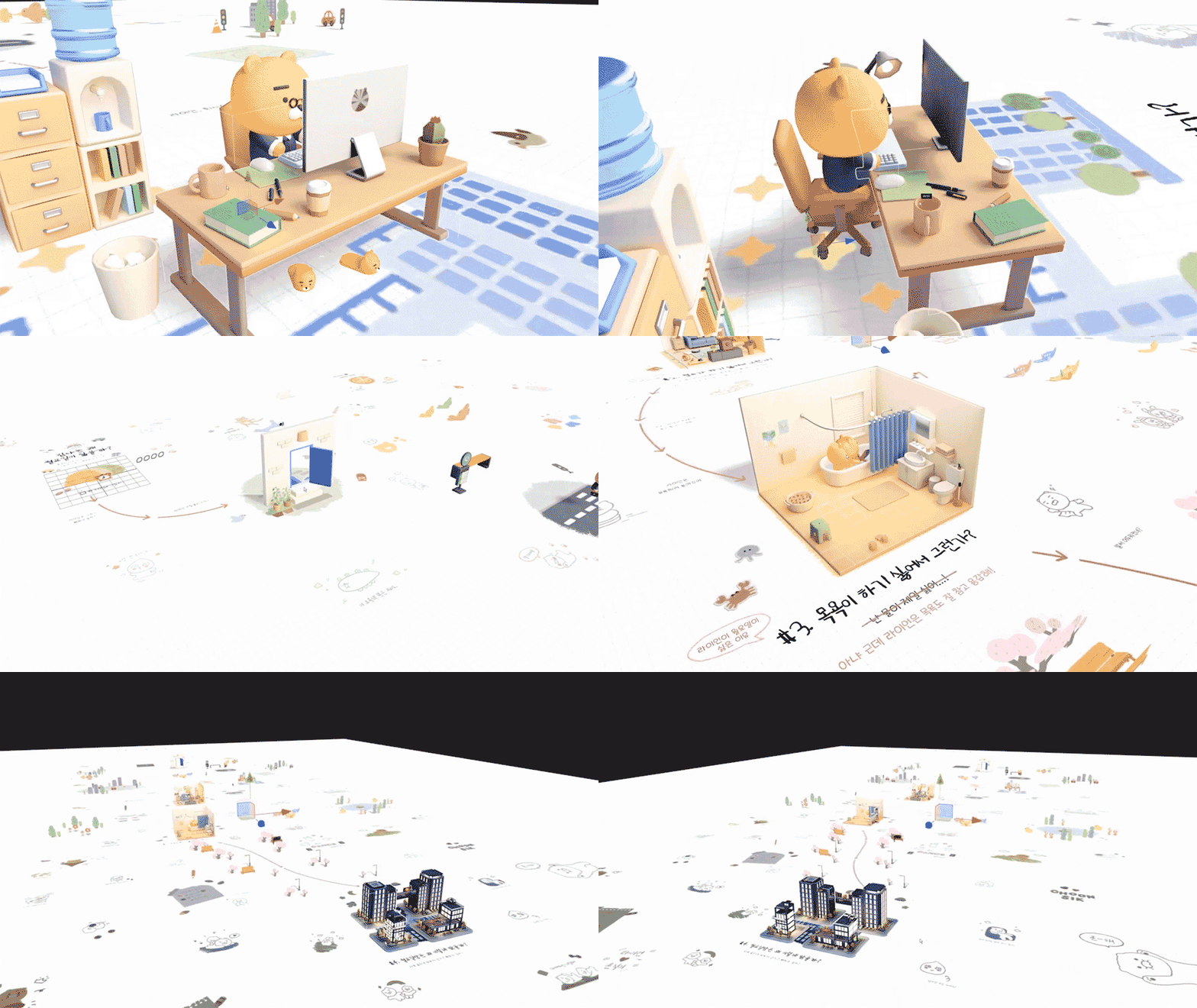
Right from the beginning, we start from a top view of our scene. The user might think it's a traditional website, but when they click the start button, they realize they were in a 3D scene all along. In 3D, we can choose between a perspective or an orthographic camera. We usually go for the perspective one since it's what gives the scene a 3D feeling. But for our case, the orthographic view worked better since we have a lot of 2D elements and text on the floor.
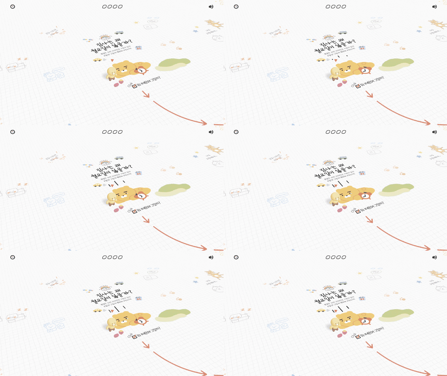
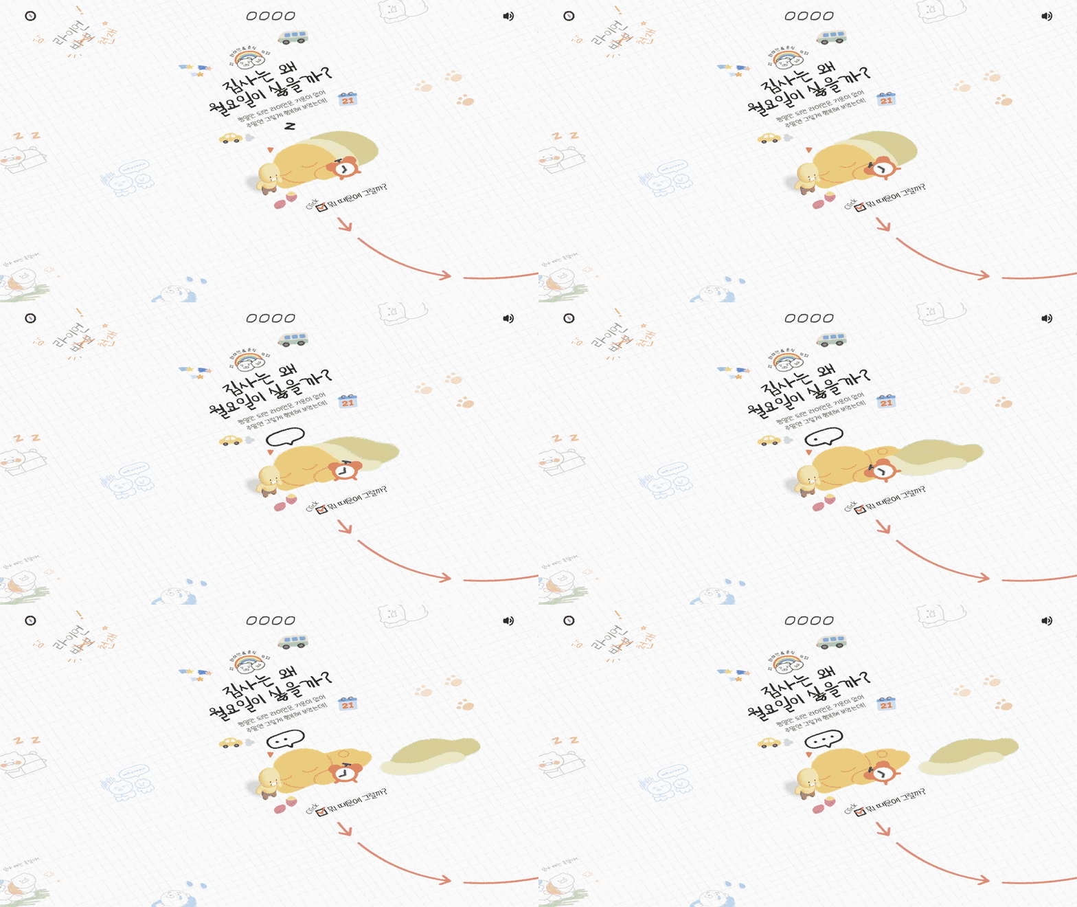
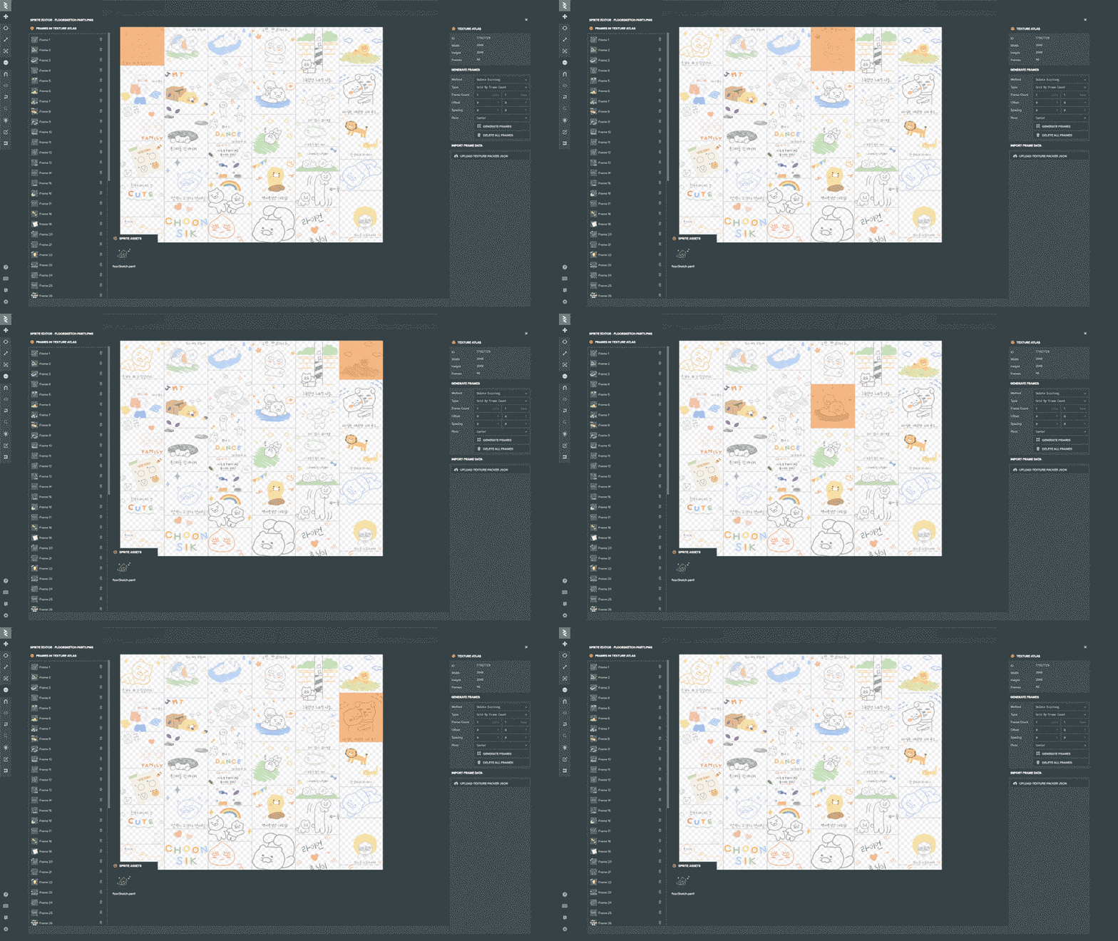
Since we have a lot of 2D elements, we had to optimize the images as much as possible. We ended up using big images segmented in multiple sprites. It's then a game of finding the sweet spot of each graphic's individual dimensions, the image size, and the compression method. Some compression methods don't work well with texts, so it was all about tweaking values to achieve a fast loading time but good visual quality. Playcanvas's built-in sprite editor was really useful for this work.
Gamification
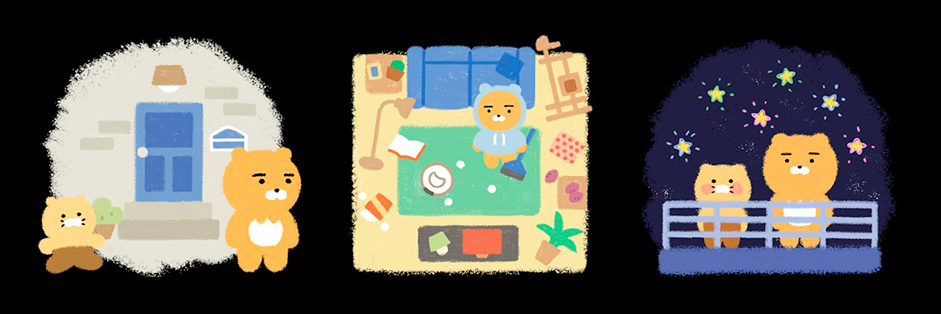
Users can enjoy multiple interactions in the scene. By touching the 3D scenes, the office turns into a paragliding space, the living room into a racing circuit, and the bathroom into a mini-game. The octopus in the bathtub turns out to be the boss of the game, and users can tap the screen to make Ryan battle the octopus.
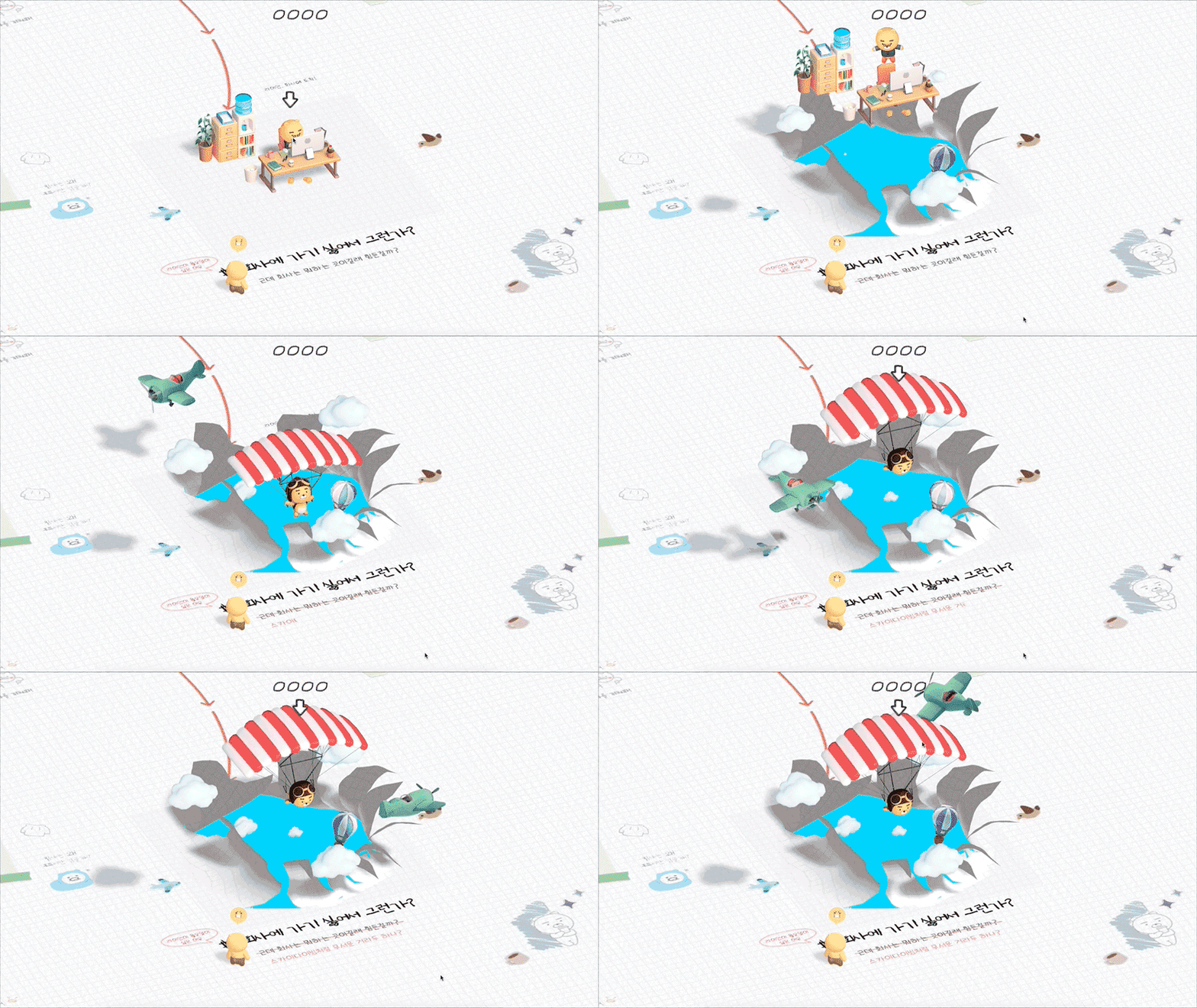
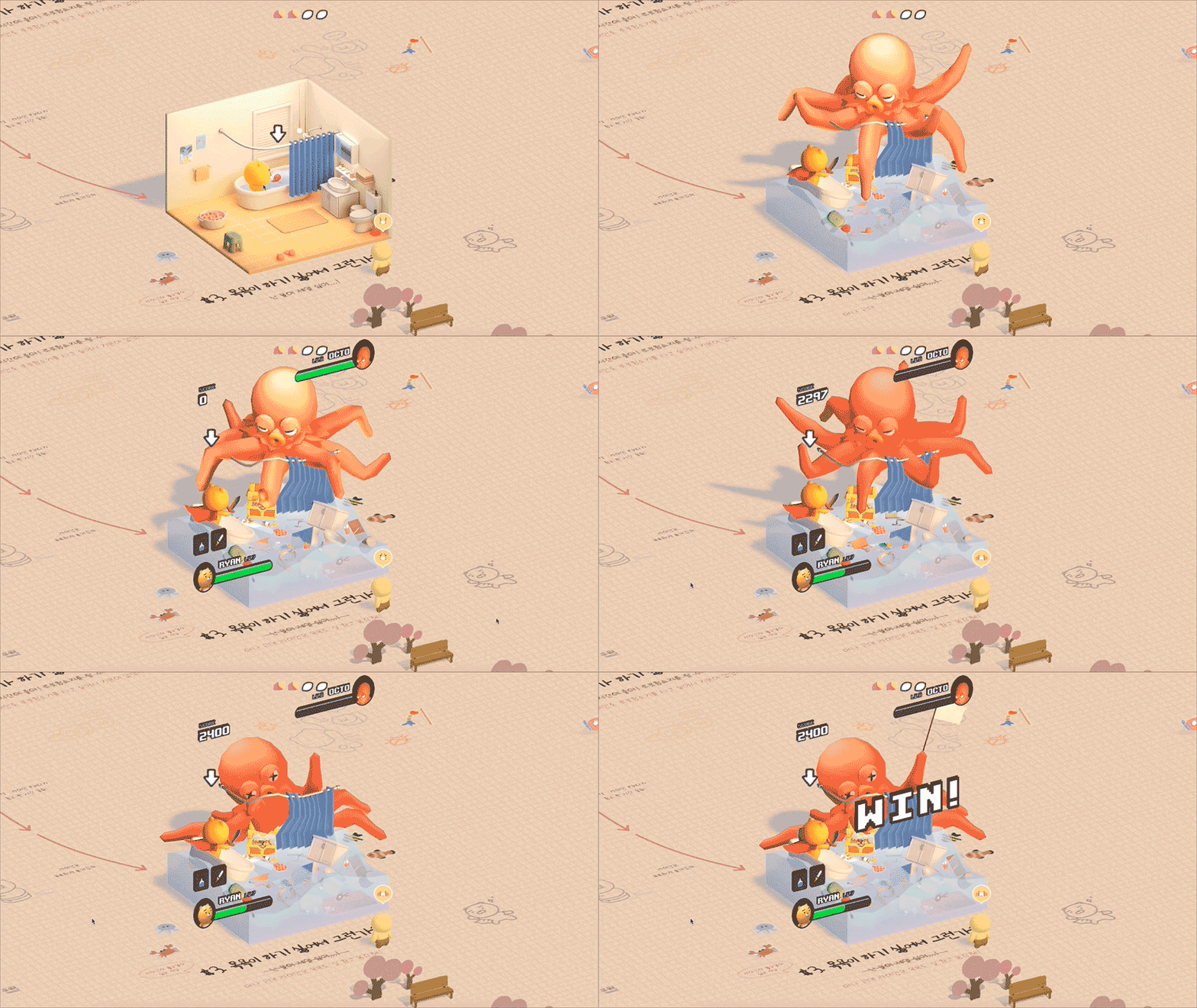
We wanted to make it more engaging for users to enjoy the wild imagination that we saw from the cat's perspective by introducing these game elements.
The Animation
We put a lot of effort in the development of 3D animations so that users can have playful experiences by exploring Choonsik's imagination. We focused on the motion development that expresses Ryan's tiredness in his daily life, while expressing Ryan's bravery in Choonsik's imagination.
We developed their expressions and gestures with different characteristics, as they are entirely different characters.
Since Choonsik is a lovely cat character with rich and cute gestures, we wanted to express different emotions with multiple poses and gestures, even for small interactions. When Choonsik runs, we added a squeaky sound to make it feel like he is busy running around with his short arms and legs.
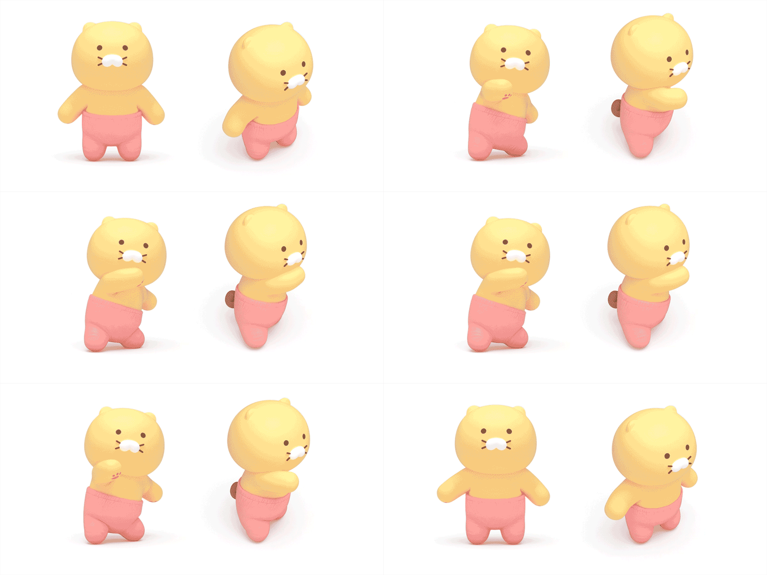
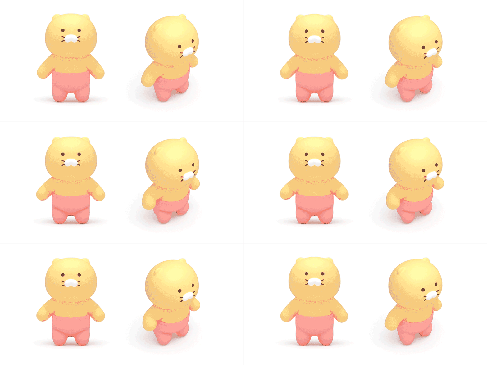
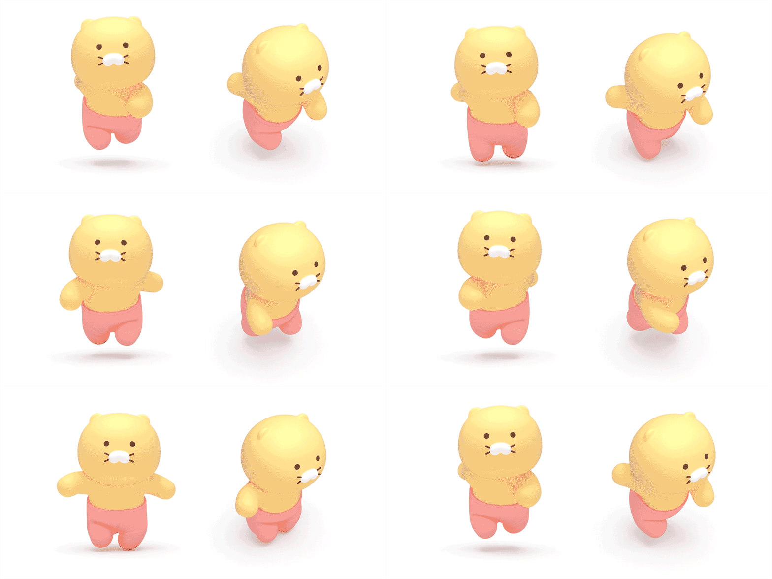
On the other hand, Ryan maintains his calmness and slowness after the wild events, such as the building flying and a monster in the bathroom.
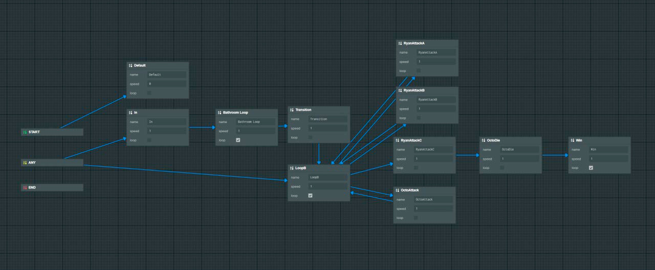
In terms of development, we focused on how to manage the shape of many of these 3D animations. In this project, we use multiple 3D animations for each stage. Anyone who has ever used Three.js knows how cumbersome it can be to manage animation's states. Another area where Playcanvas came in handy. They recently released an animation state visual editor, and it's a breeze connecting different animations together and creating a state graph with nodes.
Easter egg
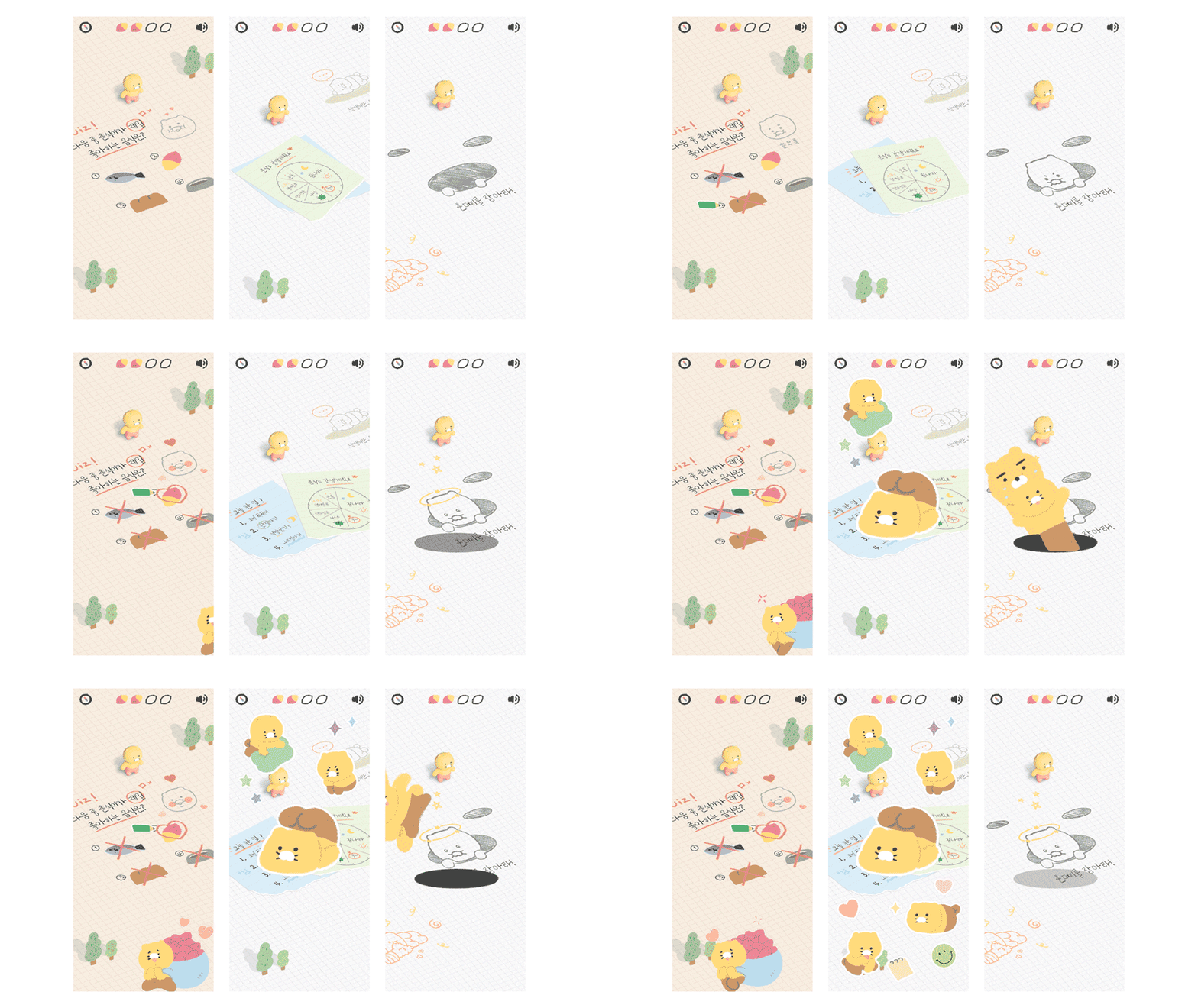
We included multiple Easter eggs throughout the map featuring various characters from the Kakao Friends' universe. We placed flat 2D animation with interactive elements, such as dancing when approaching a specific area, so that you will stay energized when walking around the scene.
Optimizations
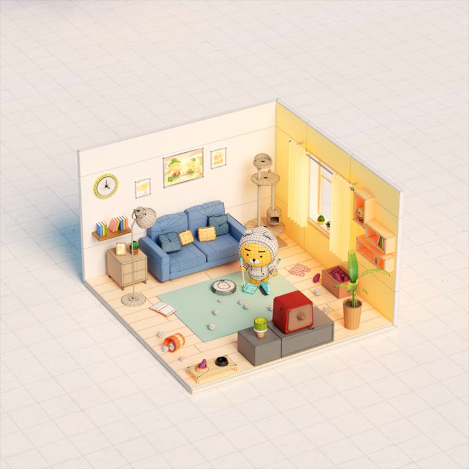
In WebGL, dynamic lighting and shadow are very expensive, and we usually try to avoid them by baking all the textures in 3D software. But what really brings the whole scene alive is the 3D animations of each stage, and we had no choice but to use dynamic lighting. To counterbalance this expensive operation, we paid even more attention to geometries merging and material count. We had to be thoughtful about what we wanted to animate and tried to have similar groups of objects animating together as much as possible. Another big part of a lightweight experience is optimizing the number of triangles for the 3D models.
“In WebGL, dynamic lighting and shadow are very expensive, and we usually try to avoid them by baking all the textures in 3D software”
Conclusion

During the development of 'Choonsik's Diary,' we focused on elements that users enjoy. The interactions, animations, UX, and UI elements are simple yet innovative and entertaining.
Our client, Kakao, not only wanted to create a joyful web experience but also wanted to build a consensus with users through stories that are related to professional workers.
If you want to learn more about Ryan and Choonsik, see more stories through Choonsik's official Twitter and Ryan's official Instagram.
Company Info
Does interactive is a digital creative agency based in Seoul, Korea.
If you have an interest in our work, visit our website.
Contact: project@does.kr
