Cinemagraph Toast Crunch: Part of a Balanced Website
Video content takes too long, flash is long forgotten, and you don't even know how to properly pronounce gif. Animations are all the rage in web design, and you're running short on options already. Apart from all those fancy CSS transitions, what's a designer to do? Not to worry, you've got at least one alluring alternative.
Cinemagraphs are valid, vibrant, and an altogether stress alleviating experience. They're like the online equivalent to a koi pond: soothing, fancy, and immediately impressive. Cinemagraphs are a clever combination of high quality photographs and looping video. An ambient amalgamation that's easy on the eyes, and always adds a touch of style wherever it's featured.
What's all the Hoopla about?
The appeal of the technique lies in its alien nature. The human eye, above all else, is designed to detect movement. Staring at a photo, it’s obvious that you’re looking at a static moment in time. Staring at a cinemagraph, however, immediately throws a monkey wrench into the usual sensory scheme of things.
A cinemagraph contains an isolated area of an otherwise static background, which for some reason is dynamic. A space set aside to flap about without a care for the familiar continuity that the visual palette is accustomed to. It’d be rude, if it weren’t so dang pretty.
In regards to web design, cinemagraphs can have a very diverse impact on user attention. They can be applied to draw interest, soothe tension, or even produce an emotive effect on the viewer. More surreptitious than the video background, less ubiquitous than flat vectors, and often more finely detailed than your run-of-the-mill hero image, a cinemagraph can be put to a multitude of interesting uses.
Of course, seeing is a lot better than reading a description, so give a gander to this inspiring gallery of cinnamon flavored graphs.
1. Trench coats, so hot right now.
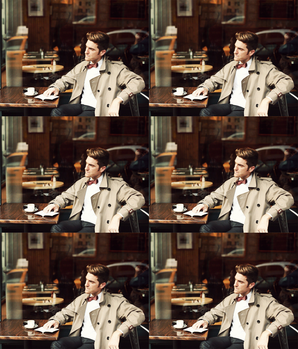
Cinemagraphs make for excellent fashion showcases. The added movement gives a degree of depth to an already striking high quality photo.
2. Reading in the park.
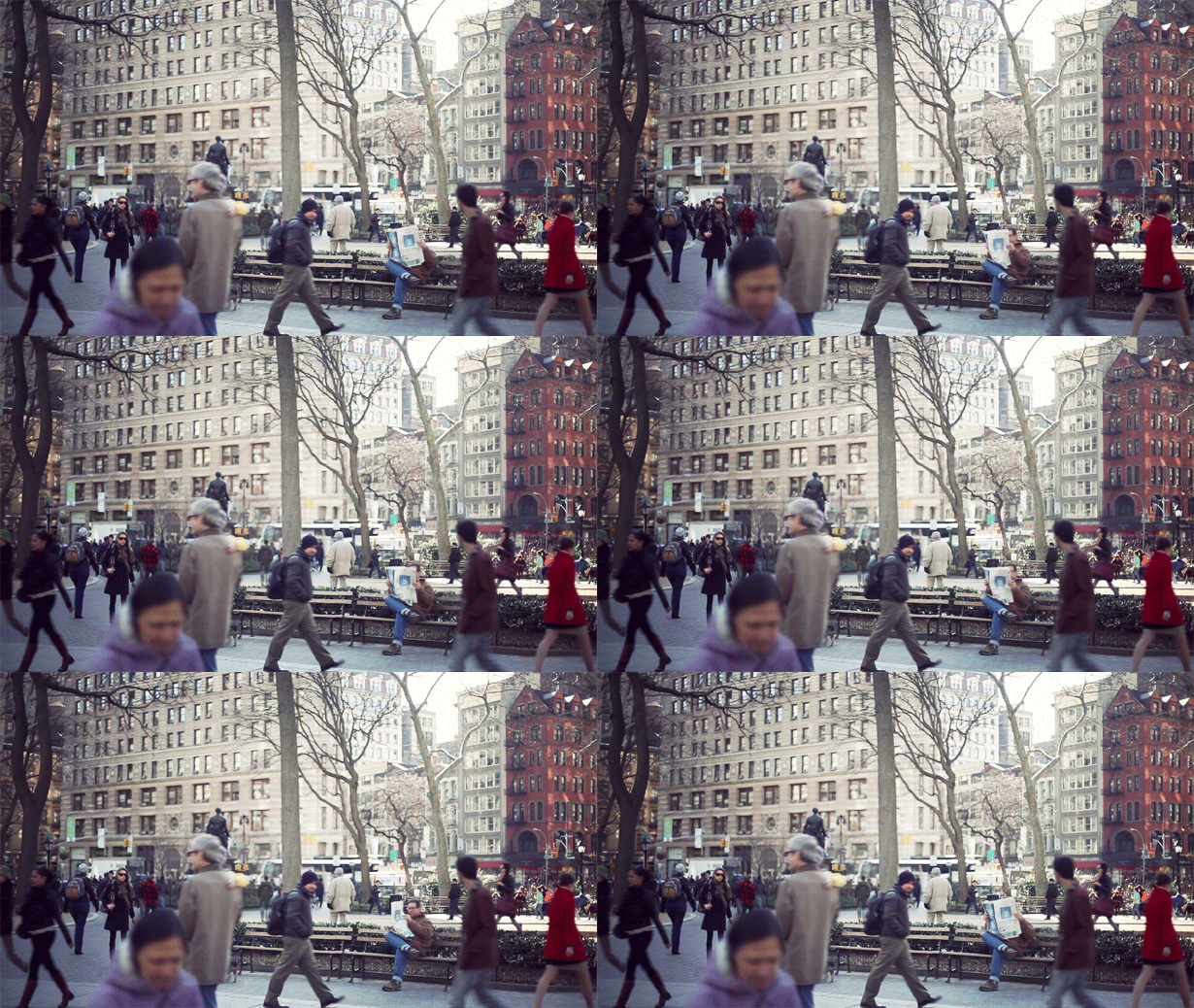
This guy is really speeding through that paper. Maybe he's just looking for the funnies? Either way, this is a beautiful example of juxtaposition. Relaxation in the middle of the daily hustle, and solitude in a crowd. Think of how you can apply this contrast to your own designs.
3. Dat breeze tho.
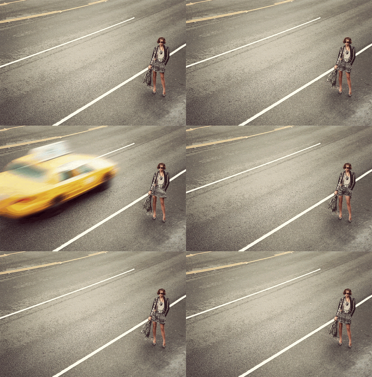
This one is sexy, but ultimately a little confusing. How are all these cabbies driving right by a beautiful woman in a short skirt? That much leg is sure to fetch a ride in most major cities. Even so, still it's a gorgeous bit of imagery.
4. POV.
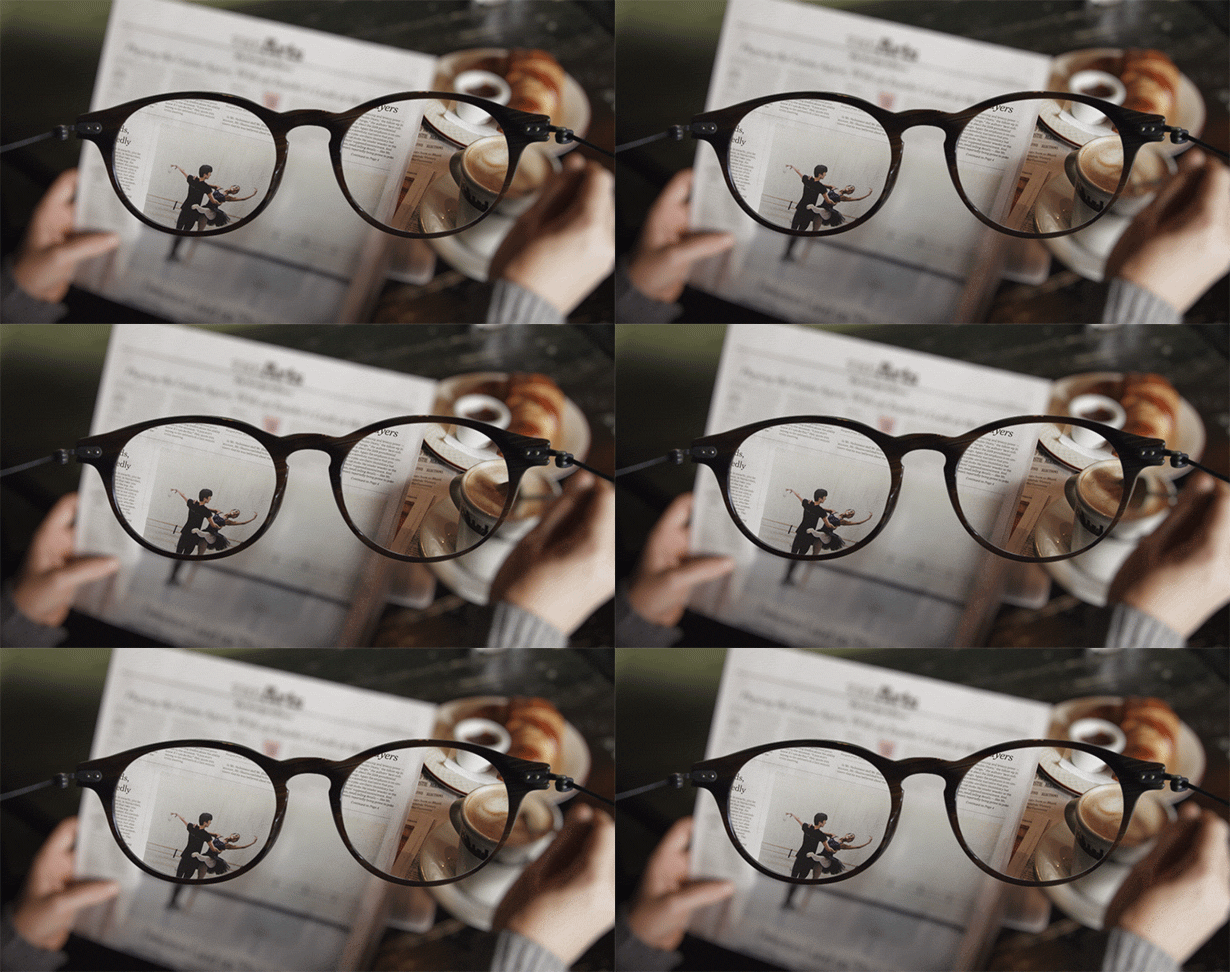
This relaxing entry illustrates the effects of splitting your focus. Try to concentrate on too many things at once, and your coffee gets cold, your glasses fall off, and you never get around to reading that article on the dancing maid. Such is the plight of today's overworked urbanite.
5. Get on this guy's level.
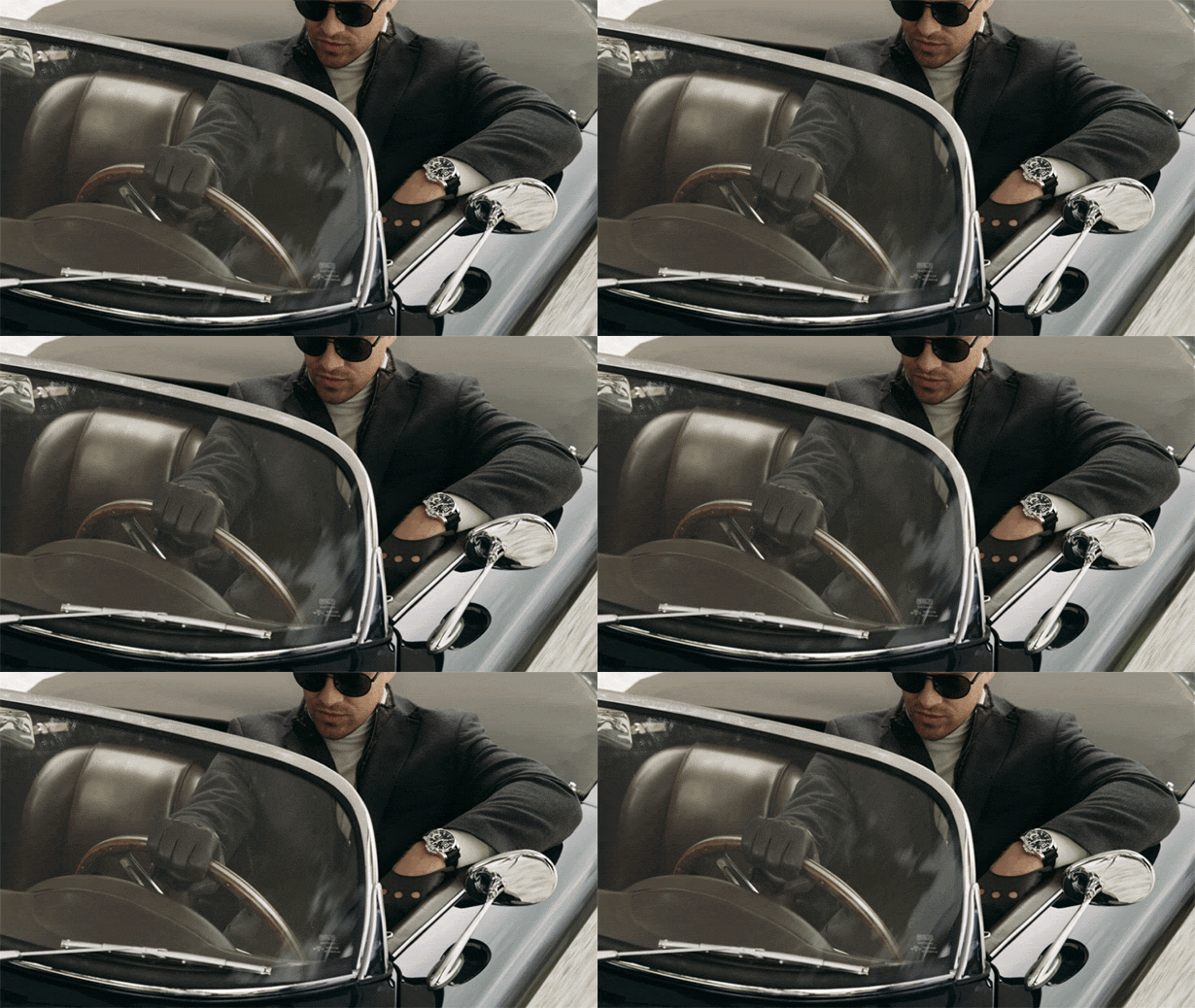
Sure, you're cool, but are you driving-gloves-and-sports-coat-over-a-leather-vest cool? Fictional photo story character, Dirk Janson, is. He's also an international lady killer, racecar driver, and a deadly handsome man. Moreover, this moving pic manages to capture the essence of his joie de vivre. Take note and apply some debonair personality to your designs.
6. Hypnotic advertising.
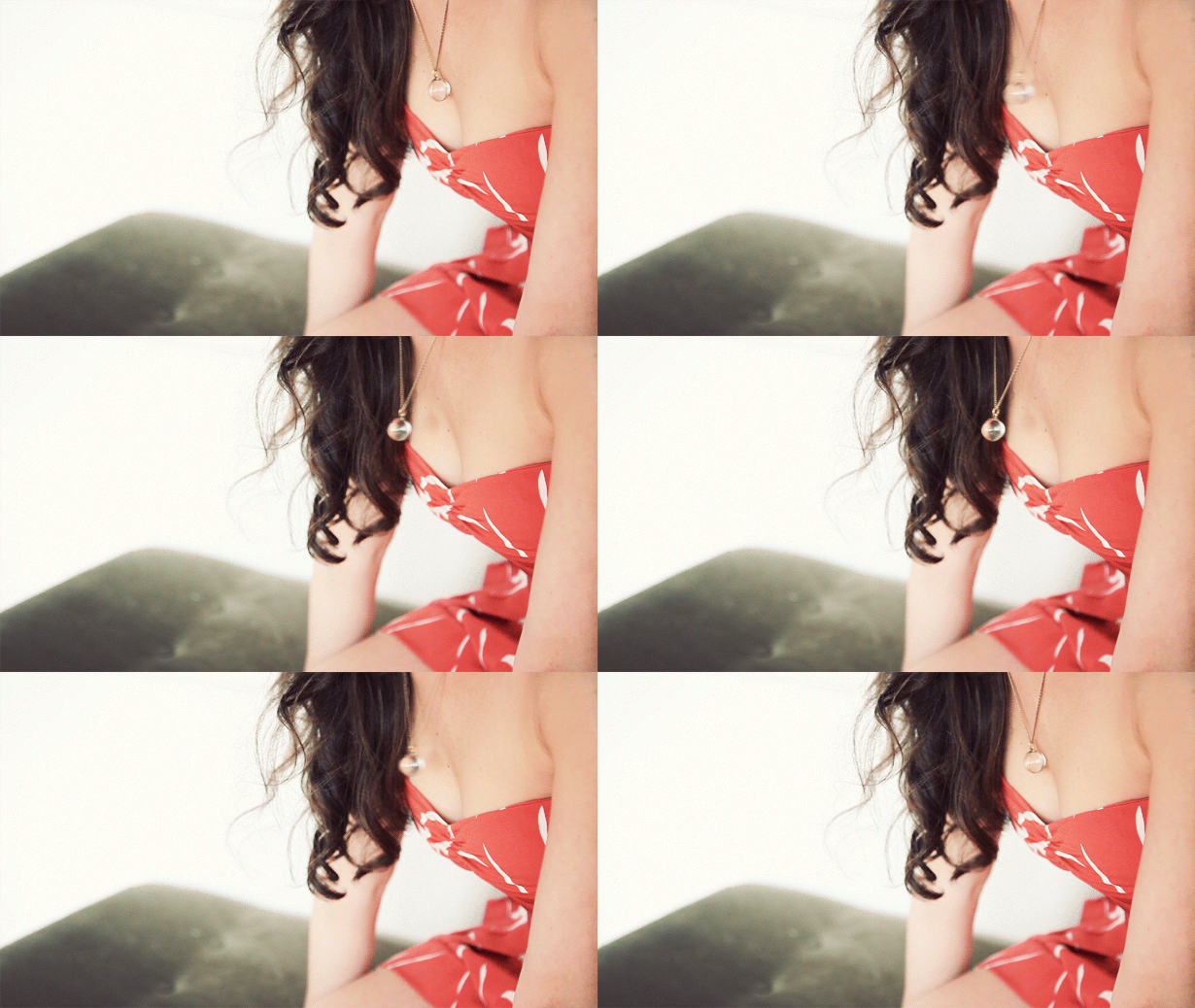
Don't act like you don't want a cute necklace. You know you want this cute necklace. Look at this attractive woman wearing a cute necklace. Now you're getting sleepy. Count backwards from ten and when you reach zerobuy this cute necklace.
7. Vintage cool.
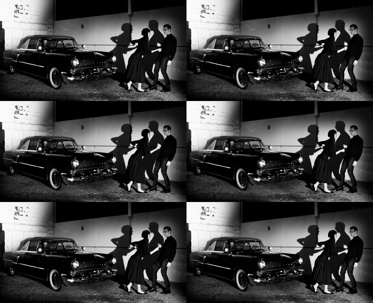
Cinemagraphs, just like cinema, can capture the feel of a time period. In this case, the jazzy seduction of the beat poet fifties. So hip they don't even move when they dance.
8. Is this the same woman from number 6?
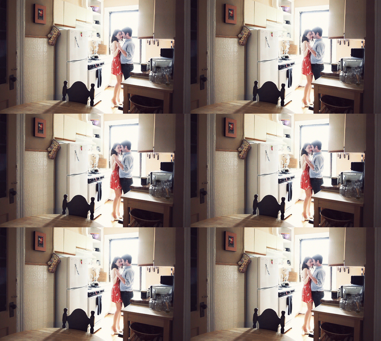
Looks like her. It's a little disappointing to see that she's not single. Does anybody suddenly feel the strange urge to buy a necklace? Jokes aside, this is another emotive example. Only true romance can convince you to keep dancing while your house burns down around you.
9. Please do not feed the models.
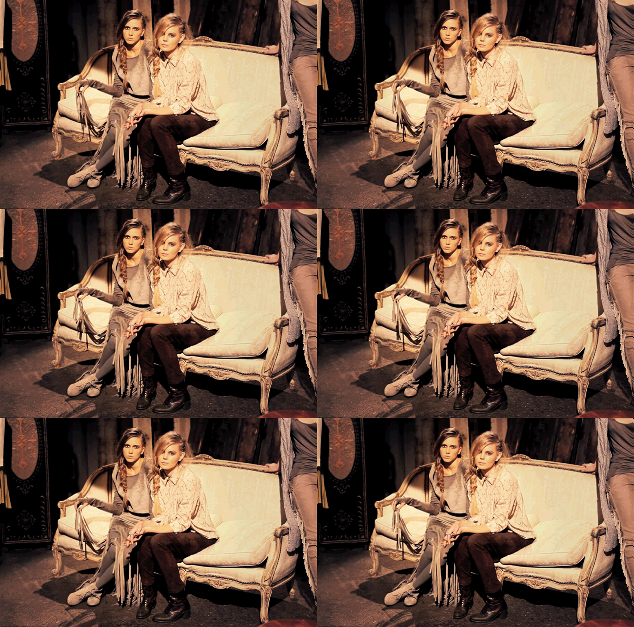
It's hard to see the joy in life when your last meal was two raisins and a grape. As it turns out, you can express boredom (and possibly a hint of disdain) with cinemagraphs too.
10. Want to eat outside? It's not that cold.
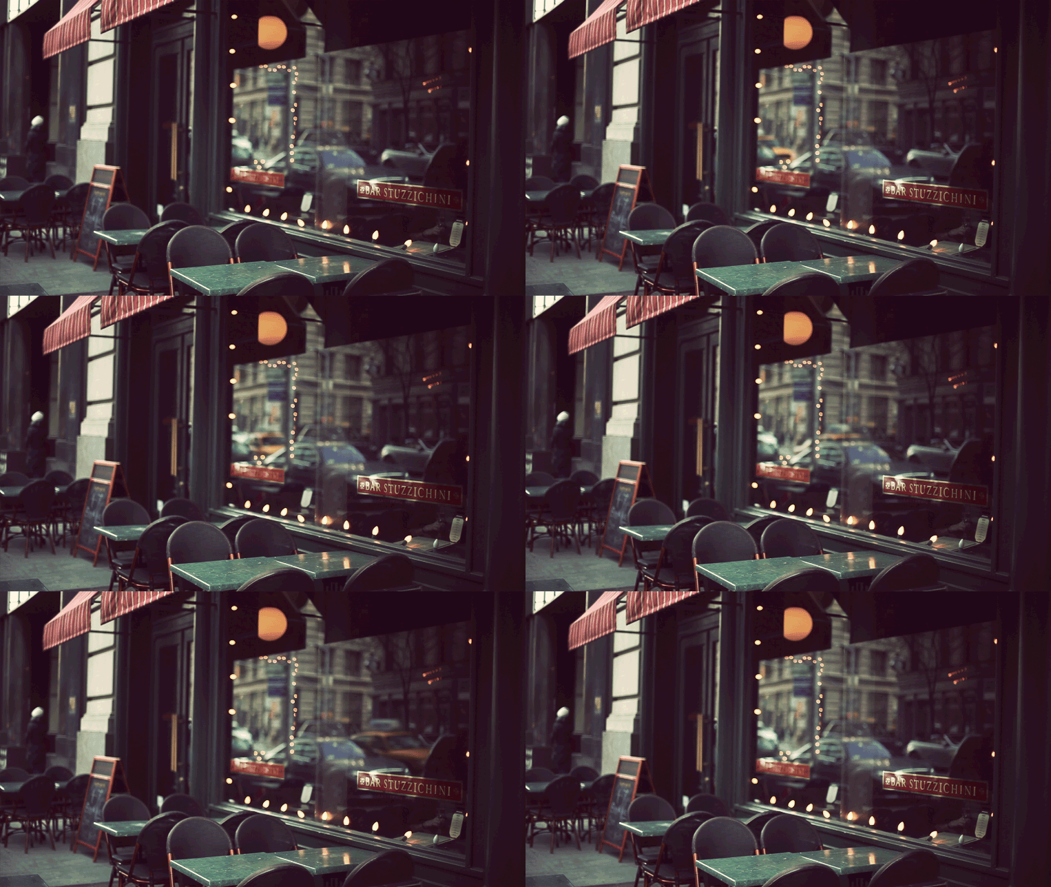
You've got to love the peaceful view at your favorite bar. You've arrived right before happy hour and things are about to go off. The setting gives off a feeling of anticipation, fun times just ahead, foreshadowed by the cab passing through.
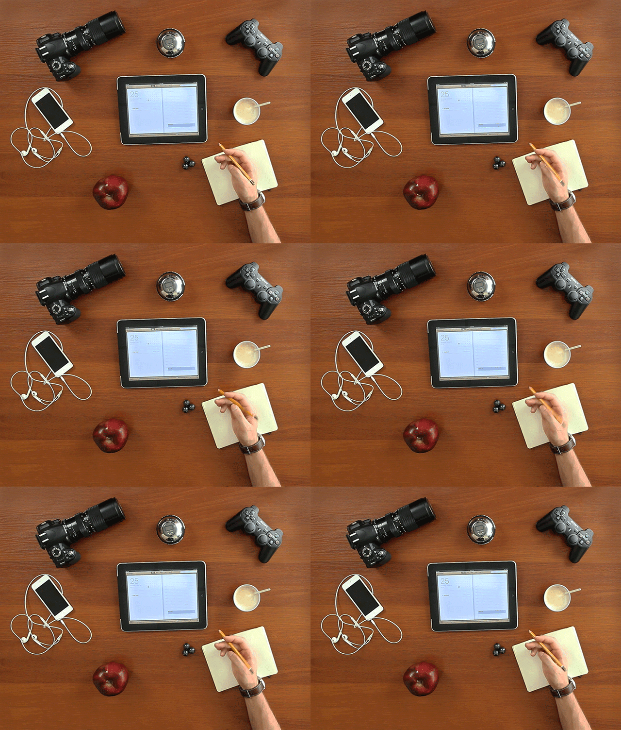
11. Freelancer's workspace.
 Download Cinemagraphs
To do list cued up, and distractions somehow abound in this minimalist space. Do you really want to get started on that big project? Maybe it's time to play Fallout New Vegas for 14 hours straight instead.
Empathize to your audience's problems through illustrations. Good design is about making an emotional connection, after all.
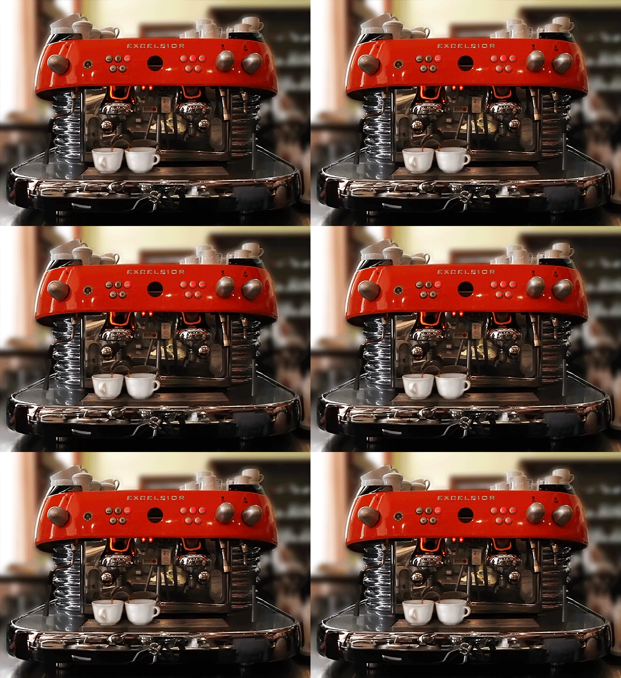
12. Excelsior!
 Download Cinemagraphs
Is there anything more attractive than infinite coffee? Survey says No. There's nothing.
Working with freelancers? This imagery is guaranteed to speak to them in a deep, spirit-animal sort of way.
13. Infinite scroll.
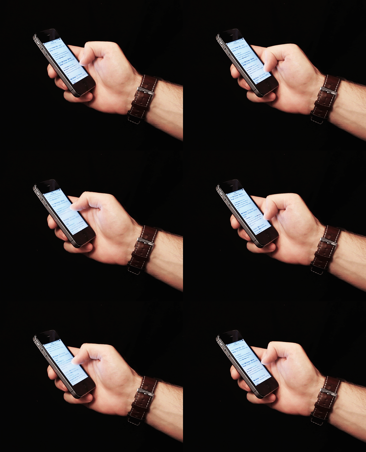 Download Cinemagraphs
A trend depicted within a trend. Very Meta, and particularly relevant in the current RWD obsessed landscape.
Cinemagraphs are yet another innovative iteration of what's rapidly becoming possible in a more dynamic web. As design techniques multiply and improve, it becomes an imperative to stay in tune with the waves of trends, lest you get left alone out at sea. This latest and greatest of subtle animation tricks might just be the key to your next client's accolades.
What are your thoughts on cinemagraphs? Let your voice be known in the comment section.
