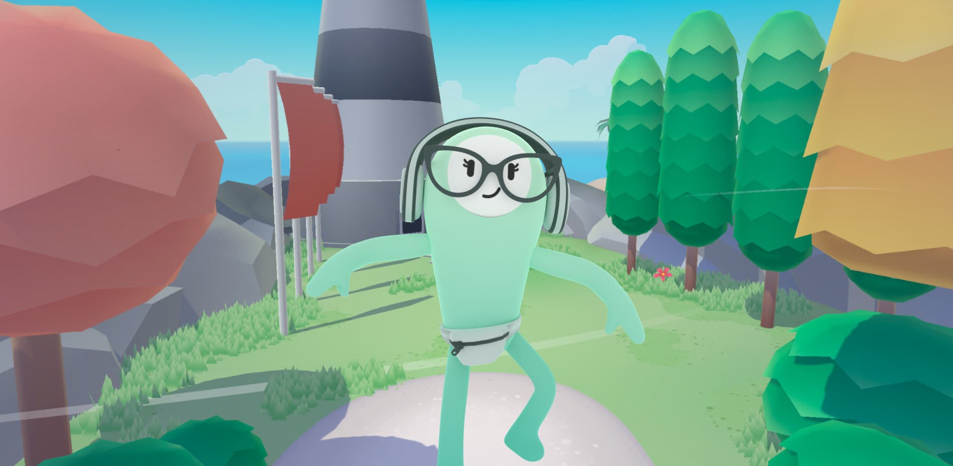
Round of applause for Merci-Michel for winning Site of the Month August 2022 for Coastal World, if you voted - we thank you, and if you tweeted, check the end of the article to see if you’ve won the free Pro Plan in our directory.
What do banking and video games have in common? You'd probably say not much and you may be right… but when Coastal Community Bank came to us to create something that didn’t seem usual, we were intrigued and excited. It was the first time we had new business popping up from a Twitter DM ;). Sometimes great projects can come from anywhere. At this moment, we had no clue we were going for a 6-month journey with them.
Coastal World is a showcase of Coastal Community Bank’s partnerships with fintechs & neo-banks, all powered by Coastal’s BAAS (Bank as a Service) solutions. The main goal of the project is to teach users about digital banking literacy in a cool way and connect consumers with innovative and community-driven financial solutions.
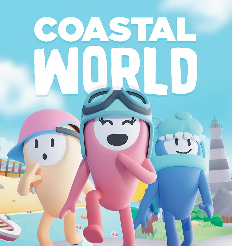
At Merci-Michel, we like to blur the line between web/digital marketing and video games. We believe gamification is a fantastic tool-set to engage users and to communicate all sorts of messages in many different cool ways. This project was a perfect playground for us to apply our vision.
Mechanics & logics of the experience
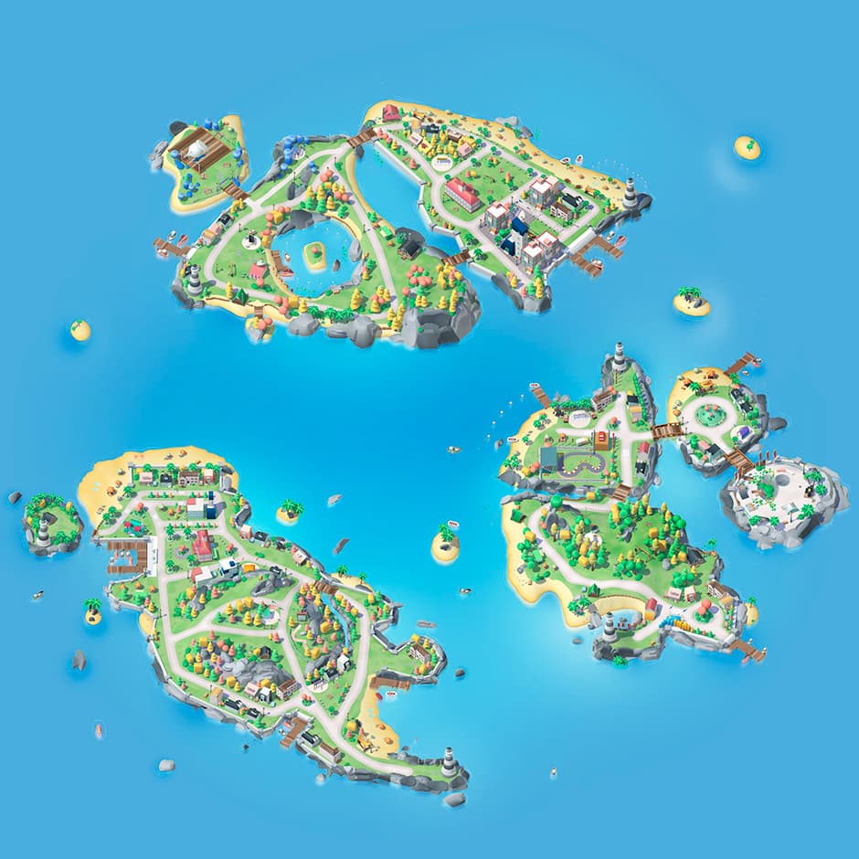
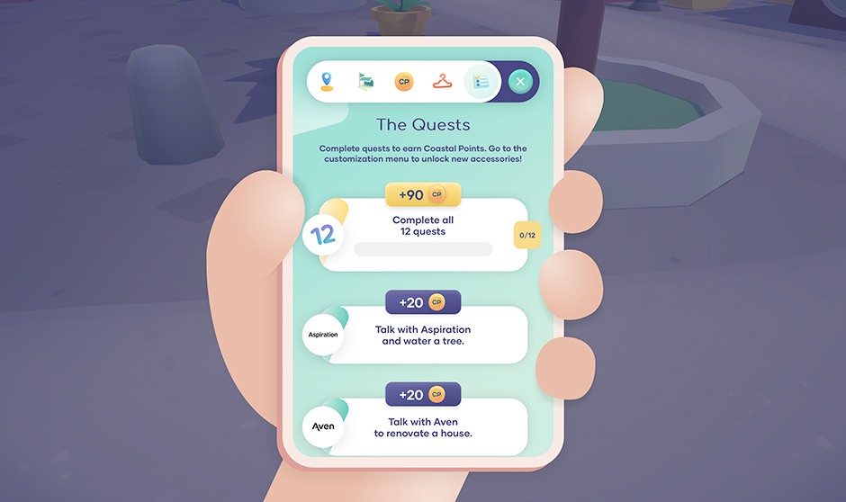
Each fintech partner is represented on the archipelago and offers different quests to be completed and rewarded by coins and a system of collectibles.
You must complete certain missions to progress and unlock accessories such as the jetpack (i.e. flying backpack) or the fire shoes. With those, you’ll look cool and move quicker around the islands.
There are plenty of accessories to unlock to customize your character. Don't forget to wear your jetpack to go faster!
Most of the brand content is delivered by NPCs (Non-Playable Characters) through short dialogs. Way more efficient and fun than having the user read some big text paragraphs.
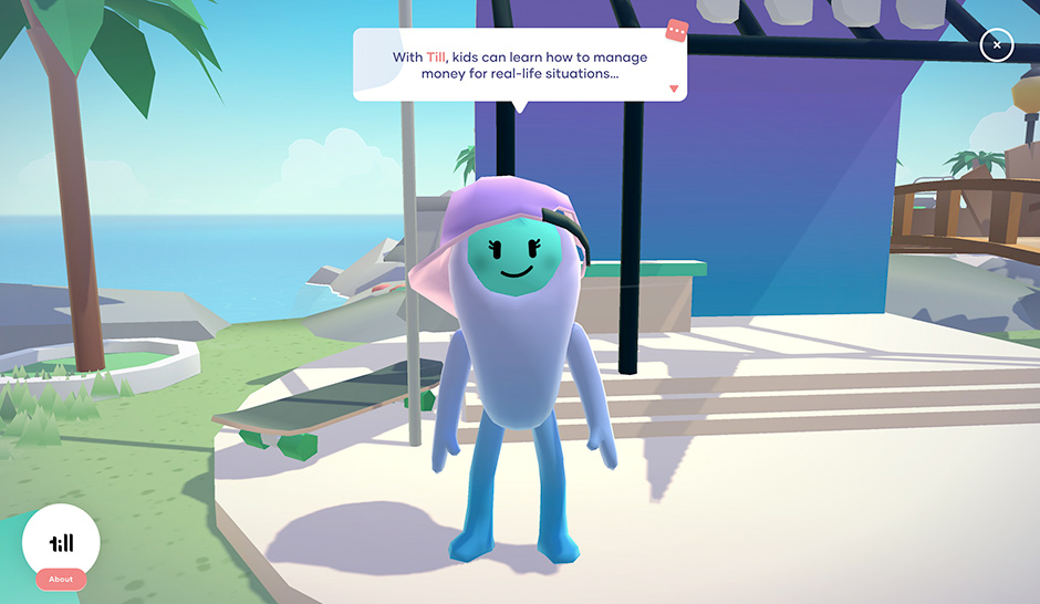
Each user has different needs regarding their finances. For that reason, we built a custom user path to highlight specific content of the experience, according to their interests and values. The user’s progression is always saved in the local storage of the web browser. This way, the user can come back later, at the very same state, no need to start all over again!
We built a custom user path to highlight specific content of the experience, according to their interests and values.
It’s alive!
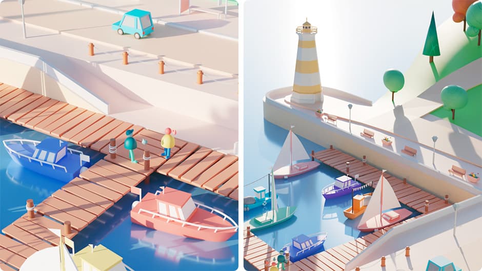
We wanted the player to feel the liveliness of the environment: a lush archipelago, populated by friendly inhabitants, with many places to explore and things to do.
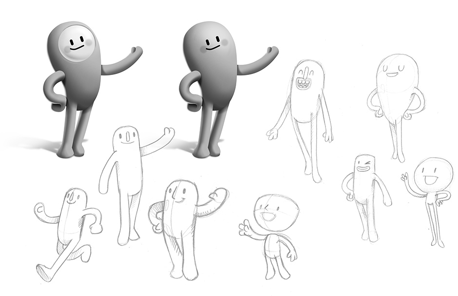
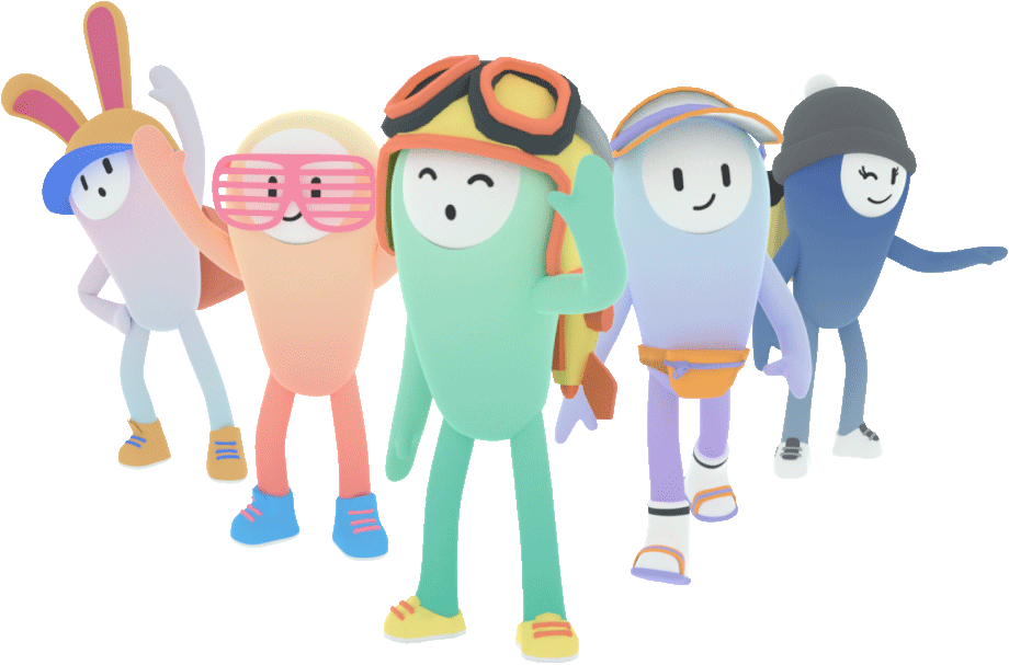
Each character has its own look and personality. We built an NPC customization module to generate their geometry with different colors and accessories, on load time. From the editor, we can also assign navigation parameters to each one of them: they can run, randomly, walk in the park, follow a path on the streets…
Npcs

Chatting with NPCs is a key component of our gameplay. With that in mind, we invented a language spoken by the characters, where each word produces specific “phoneme” sounds, depending on its letters. We also considered punctuation marks, to add pace and realism to the dialogs. Each NPC is different; some have a high-pitched voice and others have a lower-pitched one.
Chatting with NPCs is a key component of our gameplay. With that in mind, we invented a language spoken by the characters
We also added emotes to our dialog system. Each dialog bubble can trigger NPC animations, making the reading experience more fun and engaging.
NPCs remember you! When you speak to them again, they welcome you back
To add even more life to the islands, we added spatialized sound : you can hear the waves near the sea, the birds singing in zones with dense vegetation, or hip-hop beats when you get closer to the speakers!
Ambiances are set directly from blender using our editor plugin
Navigation, controls & camera
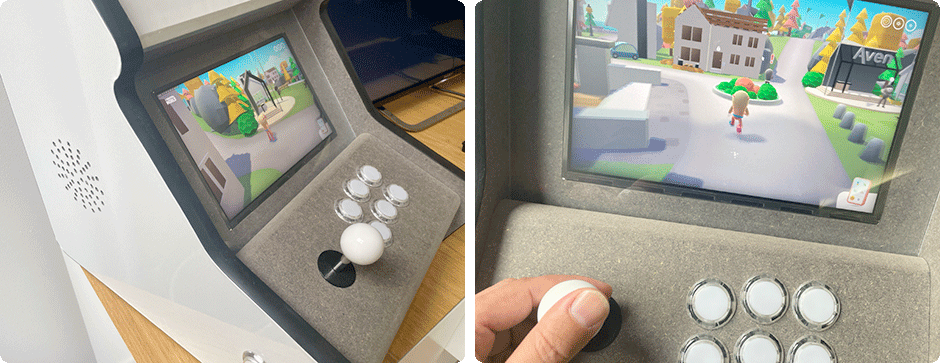
You can use your mouse, trackpad, keyboard, or touch if your device allows it. We've even mapped our custom arcade cabinet, to target as many users as possible!
On mobile, we decided to design a one-button controllable handheld experience. We use portrait mode to make it more natural and avoid “hacks” to solve the in-app web view issue that blocks the device orientation. As the aspect ratio is very different from the desktop version, we adjusted the camera position and the field of view, to offer more comfort to the player.
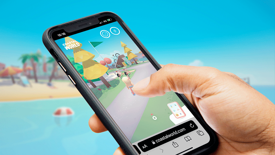
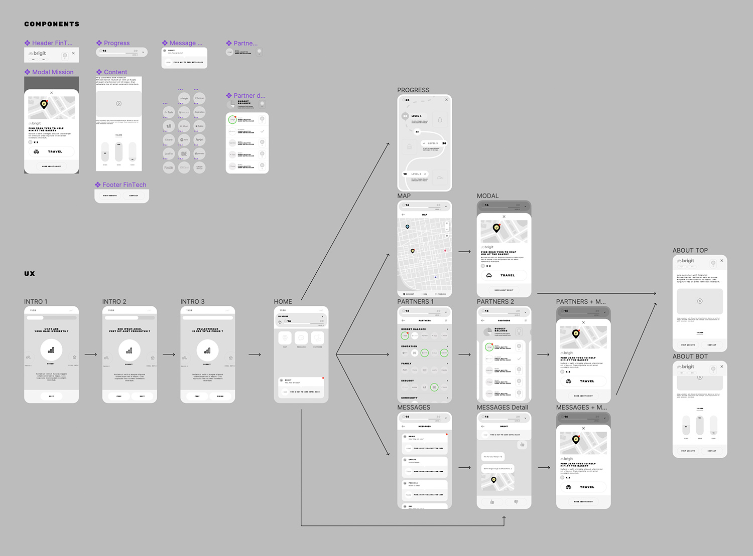
To deal with the corporate content, we imagined a virtual smartphone inside the website, in which you can find all the information you need. It also serves as a second navigation; you can teleport anywhere in the archipelago by clicking POIs from a mini map, you can customize your character, and watch your progress. In fact, it's nearly a website inside the website.
Capturing user’s attention
Wandering into a 3D open world is not always easy for the average user, and we don't have much time to get their attention. To solve this problem, we built a notification system inspired by smartphones’ UX, to guide the user through the world. So, at each step, if the user is a bit lost, we encourage them to access the map or guide them to a specific mission.
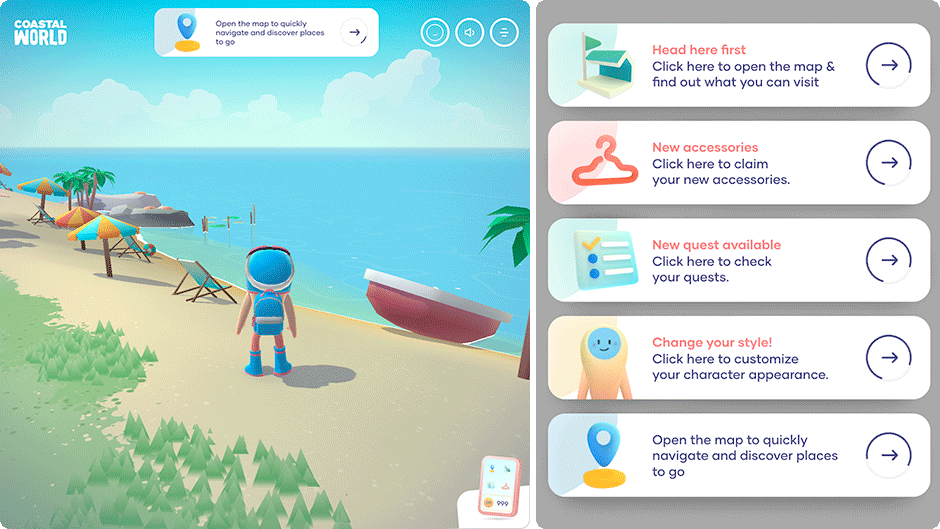
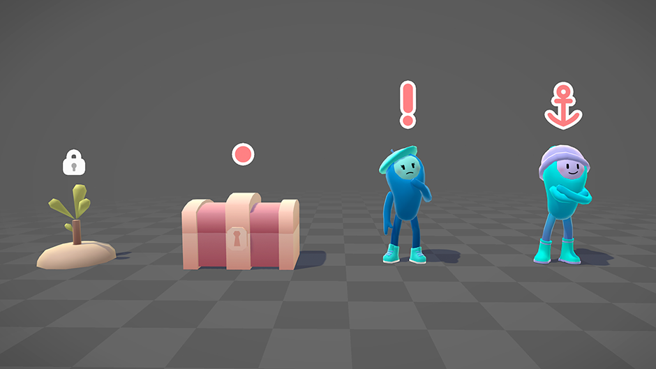
We also created a system of icons, placed above the interactive elements in the 3D. They indicate to the player the available interactions. Important items such as “quests” or “fintechs’ ambassadors” have a more visible icon. Each icon automatically expands when the player is getting close by and can perform the interaction.
DOM optimization
All UI animations are strictly made using CSS (animations & transitions). There is no tween library in the project! The main advantage of using CSS Animations is that they can run off the main JS thread on mobile devices, where every bit of performance improvement matters. Even if WebGL is slowing down the main thread, the user interface always stays fluid. It can even reach 120 Hz on an iPad Pro with pro motion capabilities!
Plus, there's a beneficial effect to this: CSS animations consume less battery power than JS animations.

Blender 3D pipeline
A multi-file workflow
Each scene and group of assets are in separate files to reduce conflicts when multiple designers work on the project at the same time.
All assets are then imported onto scene files using a blender link. Dynamic links allow us to build and iterate on island designs quickly and efficiently: each asset update is automatically reflected on island scenes.

Using Blender as a level editor
All the level design is done directly in Blender. We heavily rely on the new asset browser feature from blender 3 : you can create levels by simply dragging and dropping assets and NPCs onto the island!
We then coded a custom Python UI extension to quickly export all elements and see updates on the development server. By having our talented 3D artists test their designs in the real WebGL project, we're able to quickly iterate on the visual rendering and level design, making sure that our final product looks as good in the browser as it does in our heads.
Our editor can export static props, scripted entities (NPC, interactive buildings), navigation paths, audio area… Depending on object type, it will be exported as a GLTF file or as a plain object in a JSON manifest.
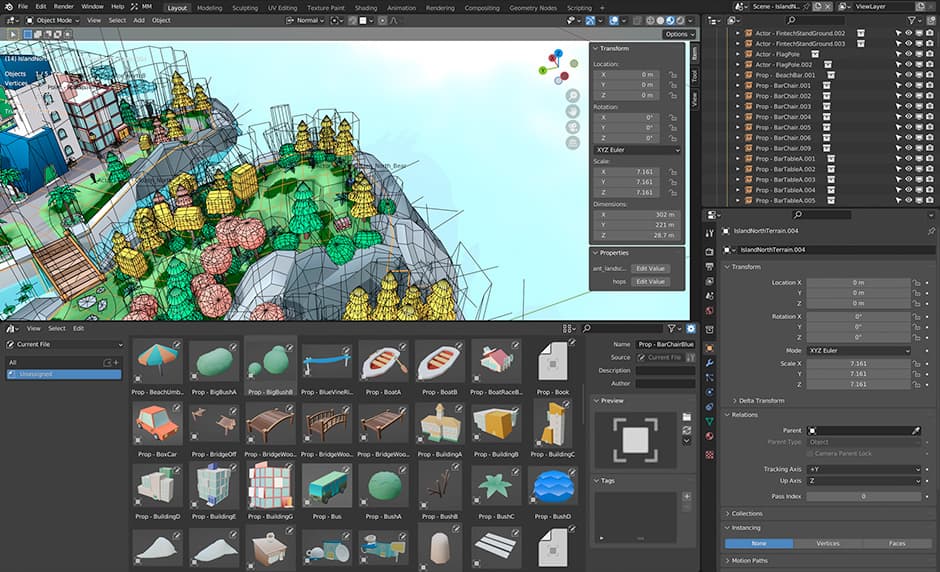
Demo of our Blender editor plugin
Rendering
Terrain Rendering
Because scenes are quite large, it was important to have visually rich island surfaces. Baking a full island texture wasn't an option : it would produce a hard-to-maintain, blurry and heavy texture.
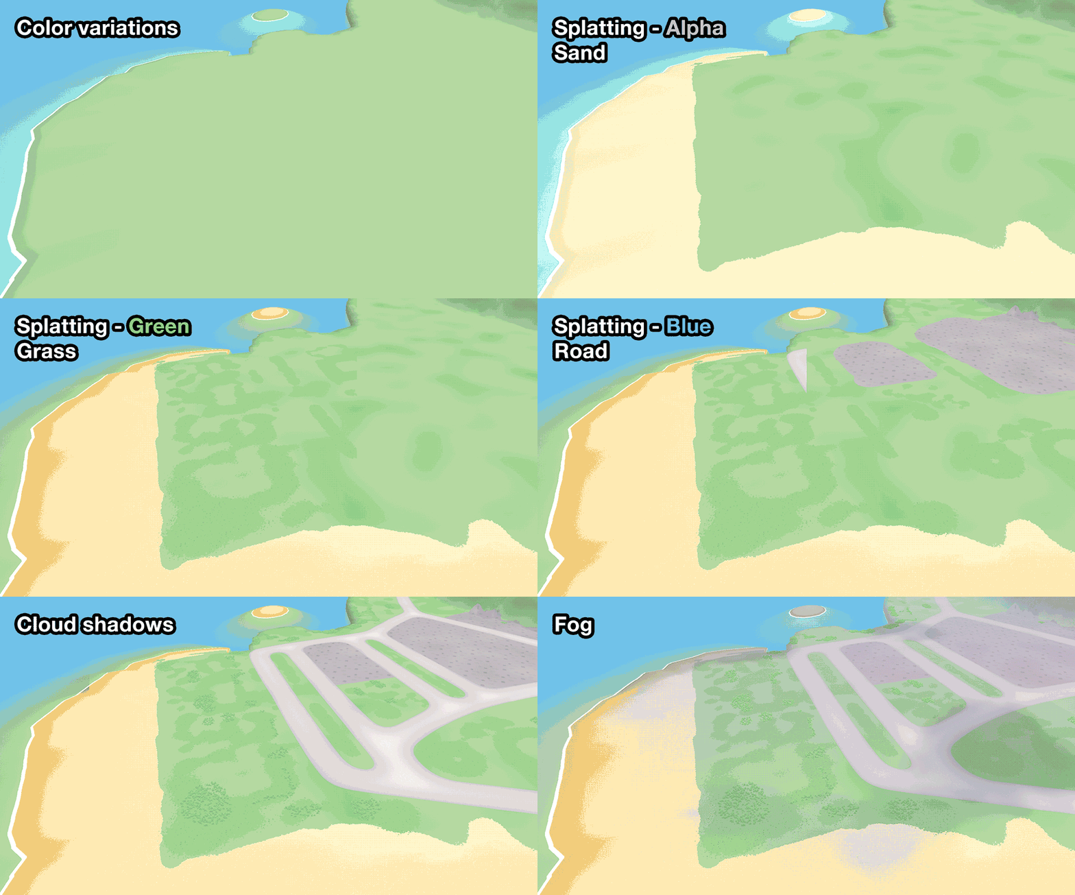
We chose to use a technique called texture splatting. On Blender, we painted a "splat map”, using the red, green, blue and alpha channels. Our terrain shader will then map each color channel to a specific terrain color and tile texture.
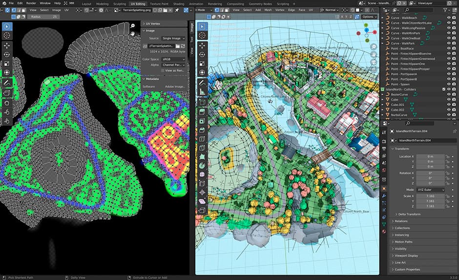
To add even more variety to the terrain, a noise is applied to create small color nuances on the surface. The island's height also influences sand color. Finally, we use another noise texture to create fake projected moving clouds to add a bit of life and movement.
Water Rendering
Coastal World takes place on an archipelago, so good-looking (and optimized) water was very important. We chose to separate the water render into three components.
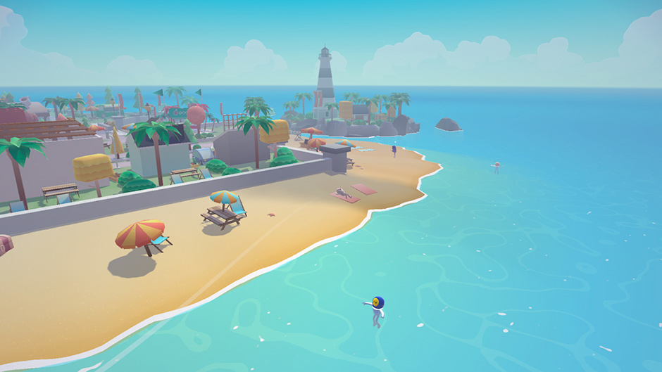
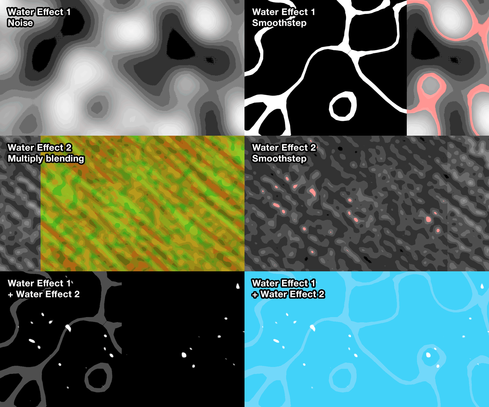
A water surface shader, on a big plane around the island : it's just a set of noise texture samplings and some smooth steps between them to create the two water patterns. Subtle color variations are added to avoid a boring single-color sea on the horizon.
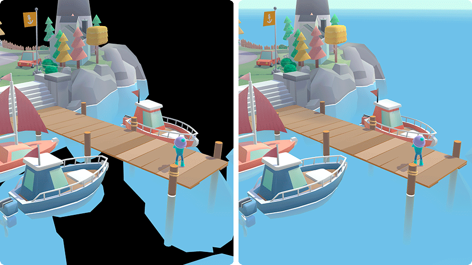
A foam / underwater effect, directly in the props and terrain shader. It’s basically a fog effect: the mesh color fades to the water color the further it is from the surface. Near the surface, a small white band is added to mimic a foam effect. We also added a "wet" effect that follows the water level variations.
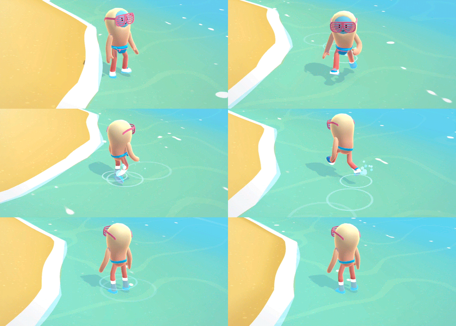
Walking waves and water drops are done using our particle engine.
Grass Rendering
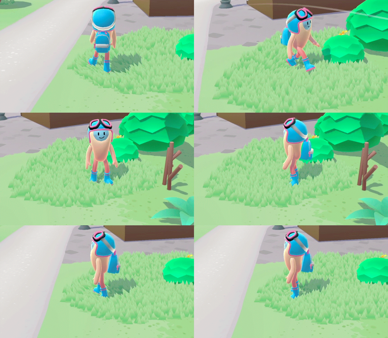
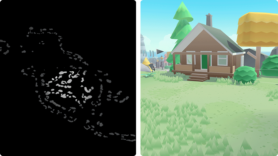
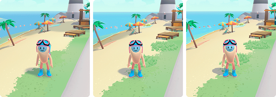
Grass was also an important visual element on the island. It adds movement and passive interaction when the player walks on it. Grass also helps to break up the long vertical lines of the buildings (one of the downsides of the low poly style).
We use the same approach as Bruno Simon’s, so go check out his awesome thread for a full technical breakdown. One of the differences was that we precomputed the island’s elevation in a simple one-channel 8bit texture, since we didn't need the improved height precision. The designers also painted a “grass texture” to choose where the grass would appear.
Optimizations
Heavy use of merging
3D assets like rocks, trees, houses, are reused a lot in the level design. Instead of exporting a huge GLTF containing all assets and island geometry, we can export a GLTF containing only island geometry and coordinates of all assets. We then build the island at load time with our load pipeline :
- Load the island JSON manifest containing the list of needed assets.
- Load in parallel to the island .glb file, the assets coordinates, and the assets .glb files.
- Merge all assets into chunks. Chunks are groups of meshes. They are used to cull parts of the island that are not visible.
- Cache merged islands chunks using the Cache API: further island loads will reuse merged output, leading to a sub-second load time!
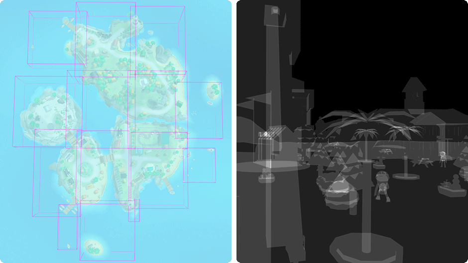
Merging all assets together doesn't mean they have to stay static! We added an “FX Texture map” to the assets shader. Using the same UV set as the gradient atlas one, we can add custom behaviors to specific assets like toon-style glass reflection, wind effect on the vegetation, or floating effect on boats.
fx
Physics engine
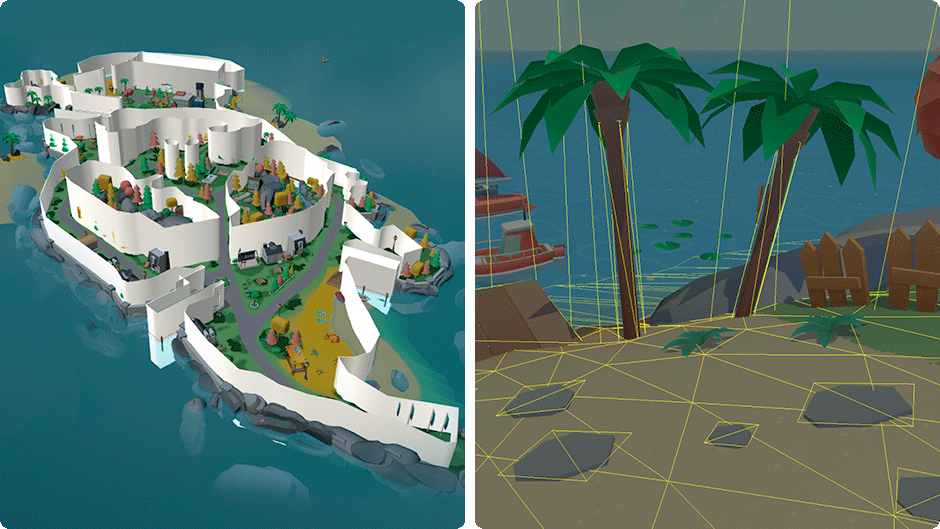
The physics is done using a simple Octree physics for collision and ray casting. All bodies (NPC, player, vehicles) are spheres to simplify collision tests.
To reduce pressure on the main thread, we moved the physics engine on its own worker. The worker contains code for terrain ray casting, NPC movements manager, player / vehicle controls, camera movements, and collision with the ground.
All static colliders are merged at load time. We created a layer system to toggle colliders for interactive objects like the broken bridge or the skatepark, without having to rebuild the Octree graph.
Lights and Shadows
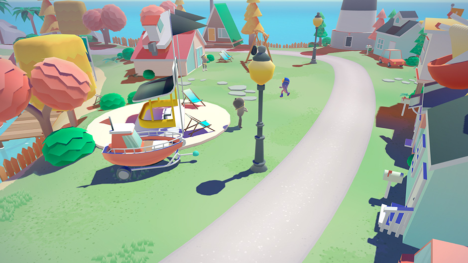
We wanted visible shadows from afar, to increase the sense of depth and keep a visually rich world despite our texture-less low poly assets. We implemented a custom shadow rendering technique based on the Cascaded Shadow Maps. This approach allows casting shadows on a large surface by combining shadow maps of different resolutions, depending on the distance from the camera.
We implemented a custom shadow rendering technique based on the Cascaded Shadow MapsSince most props have only a subtle movement, we can bake a big static shadow map at load time and combine it with a smaller dynamic one for characters and assets that are near the camera. By doing this, we only have one additional render pass for the shadows instead of two.
Post-Processing
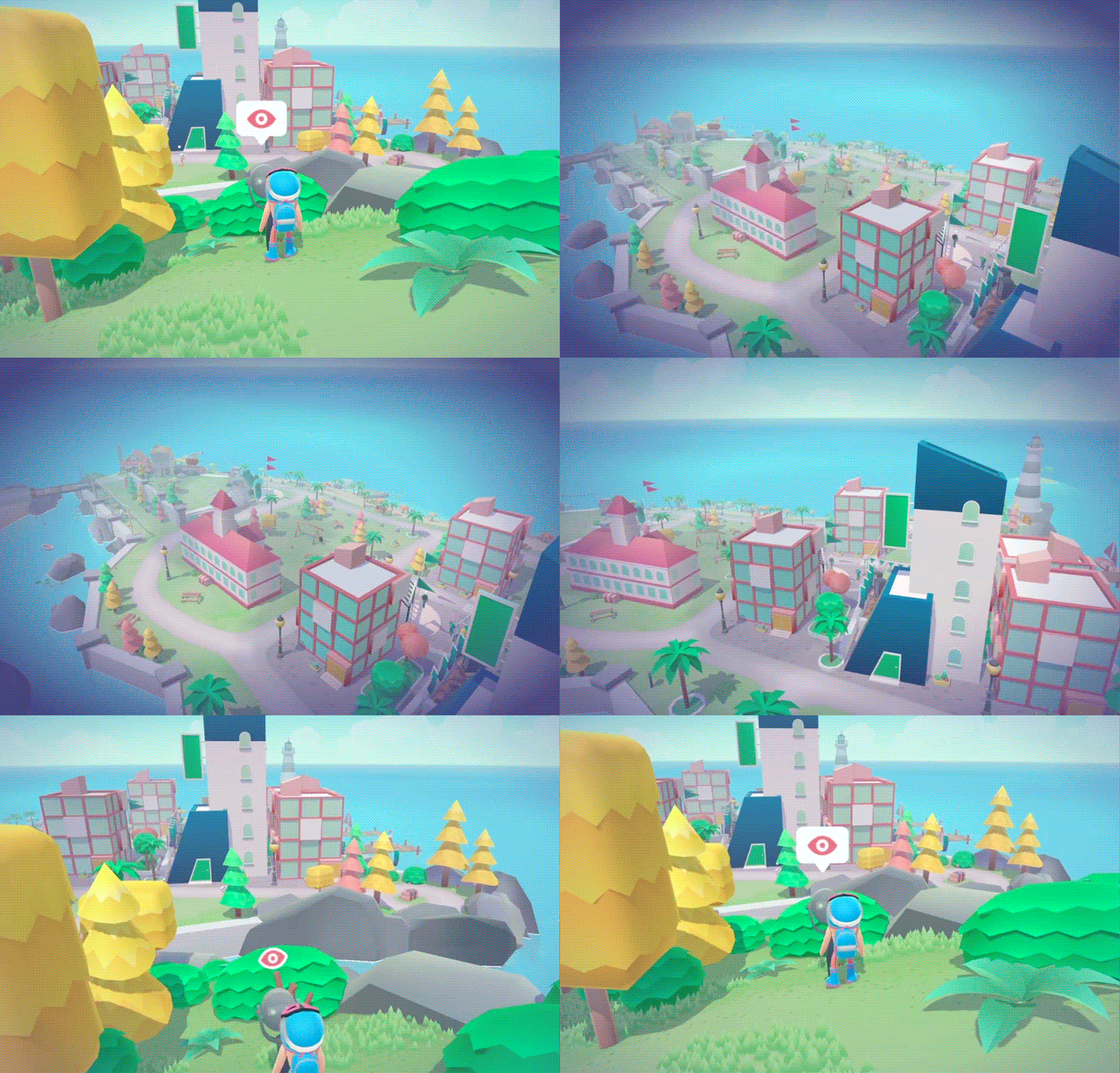
Post-processing often takes a huge part in the frame budget, especially on mobile. Since we didn't need super fancy effects, we chose to remove it completely. The vignette effect is done directly in CSS, so the vignette animation can run off the main thread. The animation of transition in overlay, is also a simple always-on-top scene, only rendered during the transition from one island to another.
Scalable quality at runtime
The experience had to look as good as possible while running smoothly on all devices, so it was important to adjust the quality depending on the user’s hardware. Nowadays, hardware detection is not super accurate because of Apple obfuscating GPU information. We chose a more reliable and future-proof approach by adjusting quality dynamically, depending on the current frame rate. On a regular interval, we downgrade or upgrade the quality preset depending on the average FPS.
Try it on: coastalworld.com (type a “Konami code” to unlock a surprise ;)).
Company info
Merci-Michel is a (french) digital gamification studio.
Visit our website: merci-michel.com
Follow us on Instagram and Twitter for more back stories!
Thanks again to everyone who voted, the winner of the year’s Professional Plan in our Directory is @fred_mazabraud , please DM us to collect your prize!
