Aug 18, 2021
Customize your mouse cursor: inspirational examples & implementation tricks
The mouse cursor is a magic wand that orchestrates visitors’ attention: you can be certain that the pointer won’t go unheeded, as people will certainly drag along the screen. This is why this tiny tool is so marvelous: the more masterful designers use it, the better interaction rates they get.
In this article we’ve gathered several Readymag projects utilizing custom cursors, then explain how to set up one for your project.
Custom cursor examples in use
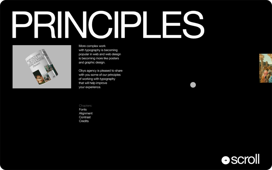
For this thorough research of the history and theory of typography, using a gray circle as a cursor helps it stand out against black and white backgrounds.
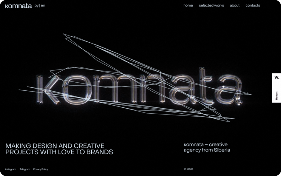
In this project the custom cursor allows visitors to draw with fluorescent lights. Take note, this style requires significantly more coding than the technique described below.
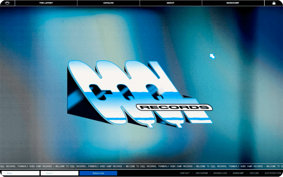
CQQL Records is a “sequel” to the production ethos of the 70s, 80s, and 90s. “We’re continuing the story of disco, boogie, AOR, funk, house, indie-soul, R&B, and more, and further developing the themes we feel are classic and need to live on while making sure that each project fits its own lane and style”, the authors of the project say. The medium-sized pixelated cursor adds a tiny but shiny touch summarizing this analogue aesthetic.
→ Waaarhol
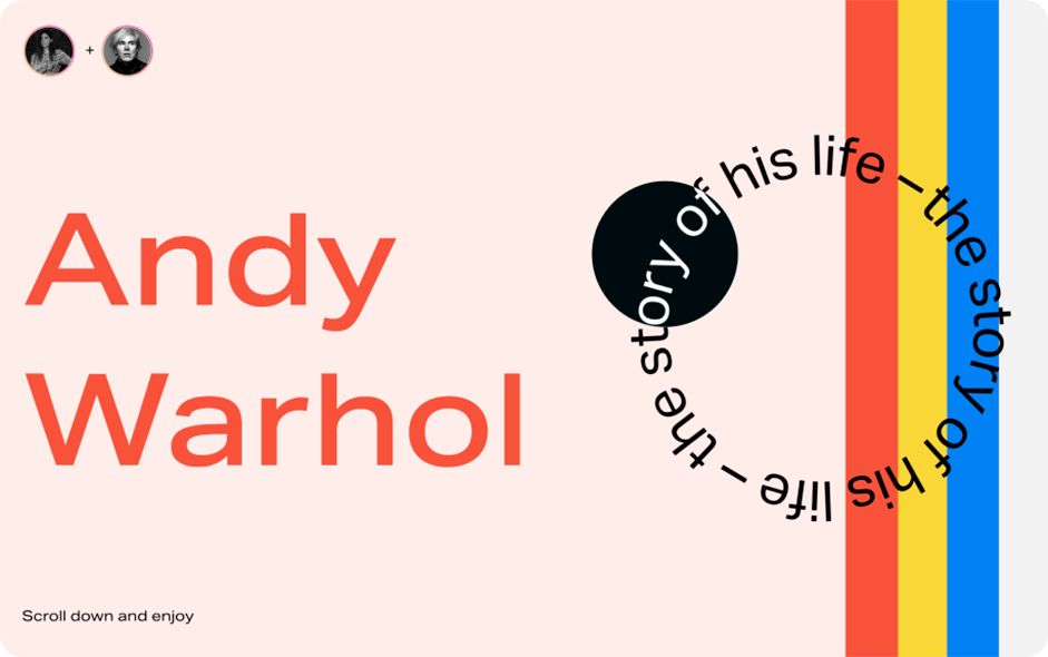
The motto of this editorial is ‘scroll down and enjoy’ — much similar to the playful life credo of the hero it tells about — the great American artist and bohemian Andy Warhol. Explore how the circle-shaped custom cursor boosts this concept — it just makes the content on which it points revert its color, adding a playful and rebellious feel to the whole work.
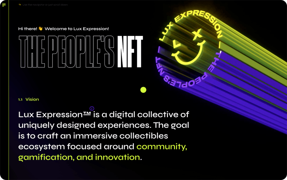
Lux Expression is a digital collective crafting an immersive collectables ecosystem focused around community, gamification, and innovation. They replaced the standard cursor with a small yellow dot that brilliantly rhymes with infographic elements showcased in their website.
Tips for designing custom cursors
Before you start designing custom cursors, remember to think of these points.
- Don’t overdo things: custom cursor is a powerful aesthetic gesture that attracts much attention and deserves respect.
- Turn it off for smaller screens: custom cursors don’t work well on mobile devices.
- Keep in mind that a custom cursor can improve the interaction, not only boost aesthetics.
- Be mindful of the context: custom cursors are a good choice to use it with your portfolio or any kind of artistic websites, but are less appropriate for corporate and e-com projects.
How to implement a custom cursor in a Readymag project
To do so, you will need the Code injection feature, which is available with all Readymag paid plans (also, you can try it out on Free plan in preview mode). We recommend using the CSS cursor property to customize the cursor in your Readymag project. Here’s how:
- Create a Code widget.
- Double-click on the widget and insert the following code into its CSS section, pasting over any previously existing code: body, html { cursor: url(*******************), auto; } The link in parentheses after the URL field should link to any small (about 10x10 pixels) image you want to use as a cursor. The auto keyword denotes a fallback — a cursor shape that will load if the image link isn’t accessible for some reason.
- You can also use in-browser icons with the following syntax: body, html { cursor: move; } The full list of options can be found here. Note that auto from the previous section is also an in-browser icon.
- Finally, you can set the cursor to change only when a user hovers over specific page elements. Every element in Readymag has a data-id property — you can check by inspecting the element via the Browser Dev Tools. Copy the data-id property, add it to the field below, then add the following code to your Code widget > CSS: [data-id=”************”] { cursor: help; } or [data-id=”************”] { cursor: url(********), auto; } depending on your needs (see above).
Check out our landing page explaining the benefits of custom cursor.
