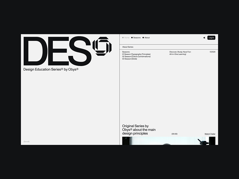
Over the last five years, Obys has launched three successful educational projects: Typography Principles, Colors Combinations, and Grids. Together, these websites have amassed over 1 million visits and are collectively referred to as the Design Education Series.
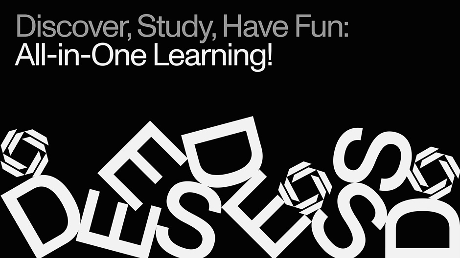
Encouraged by the favorable response and demand for additional content, Obys has made the decision to develop a new educational series dedicated to fundamental design principles. This series targets designers and creative professionals, providing brief, insightful episodes to enhance practical skills and ignite innovative design thinking.
From the logo to the entire site design concept
The core concept behind the design of our logo and brand identity is deeply embedded in our commitment to gathering, organizing, and showcasing knowledge and expertise in the field of design. This idea is vividly brought to life through a series of intentional distortions that eventually merge to form a unified and cohesive whole. For instance, this concept is ingeniously illustrated in our preloader animation. Initially, you see a seemingly chaotic arrangement of disordered letters. As the animation progresses, these letters gradually align and transform into our recognizable logo, symbolizing the process of organizing scattered knowledge into a structured and meaningful identity.
Additionally, the footer of our website features another creative manifestation of this concept. Here, visual glitches and disturbances are seamlessly integrated into the design. These glitches gradually resolve, transitioning into a coherent and polished footer, reflecting the idea of converting fragmented elements into a harmonious and well-defined design.
Through these visual elements, we aim to convey our dedication to the meticulous process of design, where every piece, no matter how disordered or fragmented initially, finds its place in the bigger picture. This approach not only highlights our expertise but also reinforces our philosophy of transforming complexity into clarity and coherence.
“Through these visual elements, we aim to convey our dedication to the meticulous process of design, where every piece, no matter how disordered or fragmented initially, finds its place in the bigger picture."
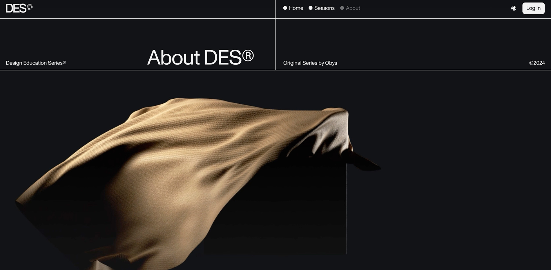
Designing for Easy Navigation and Engagement
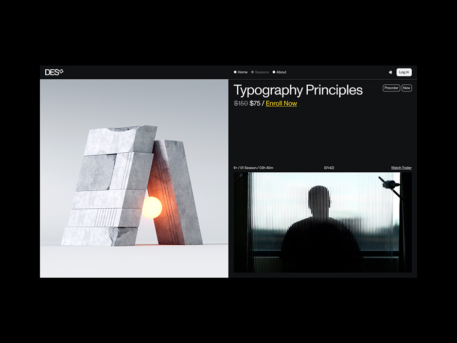
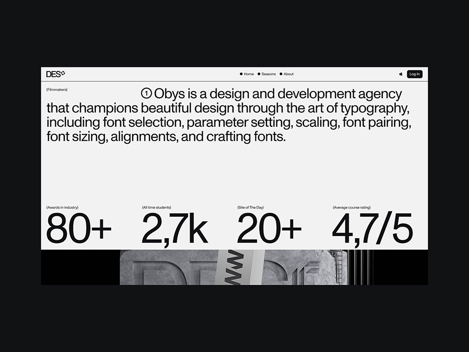
The website navigation of DES is designed to be highly intuitive and user-friendly. To achieve this, we meticulously organized all the information about DES and the first season of TP across three pages: Main, Season Page, and About. Our primary goal was to make the site not only engaging but also exceptionally easy to navigate. To ensure this, we placed great emphasis on logical button placement, ensuring that users can effortlessly find and access the information they need. We also paid close attention to typography, making sure that the text is clear and easy to read, enhancing the overall user experience.
Additionally, we streamlined the purchasing process, making it simple and straightforward. This involved clear calls to action, minimal steps to complete a purchase, and ensuring that each step of the process is transparent and user-friendly.
Overall, the design and structure of the website reflect our commitment to creating a seamless and enjoyable user experience, where information is easily accessible, and the navigation feels natural and intuitive.
The Skeleton Mode on the Site
The Skeleton Mode has an interesting backstory. Initially, when we developed Grids website, one of its standout features was the Grid Mode. It was designed to provide a deeper understanding of the design framework, making it easier for designers and users to appreciate the meticulous planning behind the site’s layout. Building on this concept, we introduced a more advanced version of this feature on the DES website.
Now, with Skeleton Mode, we've taken the idea a step further. When you enable Skeleton Mode, you don't just see the grid layout; you gain insight into the grid and the structural skeletons of all shapes and fonts used throughout the site. This comprehensive view allows you to see the blueprint of our design, showcasing how different elements are arranged and interact with each other.
By allowing users to see the structural foundation of the site, we aim to inspire and educate, demonstrating the importance of thoughtful design in creating a cohesive and aesthetically pleasing user experience.
Technologies
When developing the website, we utilized the default stack which included 11ty static site generator based on PUG, GSAP for animations, and connected to the Strapi CMS. The most interesting and challenging aspect of the website was developing a preloader with physics effects. We faced the task of seamlessly transitioning from the preloader to the intro section of the homepage.
To accomplish this, we employed Cannon.js and Three.js. Essentially, we built a Three.js scene with objects that mimicked the sizes and proportions of SVG objects, managing how they were stacked and fell. By integrating Cannon.js with the scene, we were able to apply real-world physics for the collisions and gravity of these objects.
Finally, we updated HTML elements' transform using GSAP and gsap.ticker(). This resulted in a 3D environment with physics linked to the actual HTML DOM elements, enabling us to manipulate them as needed after the initial animation.
Company Info
Obys is a creative design and development agency based in Ukraine, specializing in creating unique graphic and web experiences for clients around the world.
More about us is here and here.
X: @obys_agency
IG: @obys_agency