Introduction
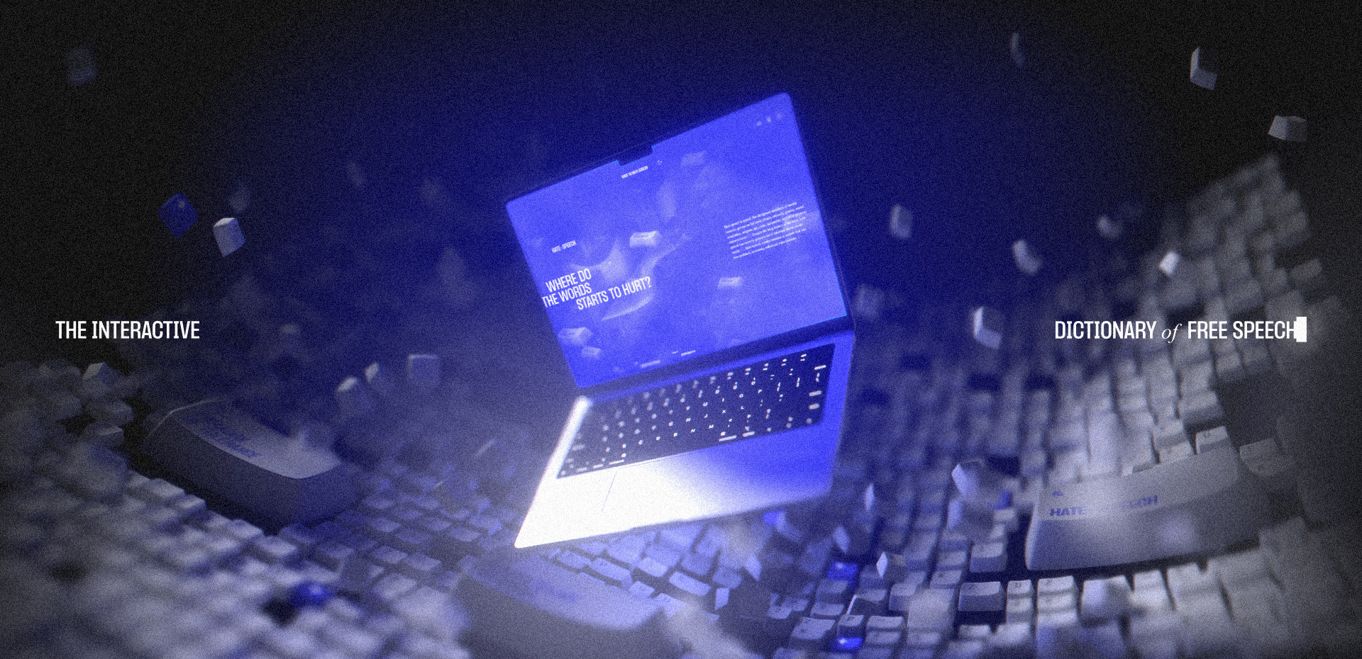
We often take freedom of speech for granted in many democratic countries, while knowing little about its rich history, key figures, and the ideas that shaped it. I wanted to change that by creating The Interactive Dictionary of Free Speech, an immersive web experience featuring all the necessary terms to learn about this important topic, a bunch of smooth interactions and a single low-poly keycap model used for almost everything.
How It All Started
The Interactive Dictionary of Free Speech is my master’s thesis project, developed at the Digital Design department at TBU Zlín in the Czech Republic and a result of my passion for immersive web experiences I developed during my studies.
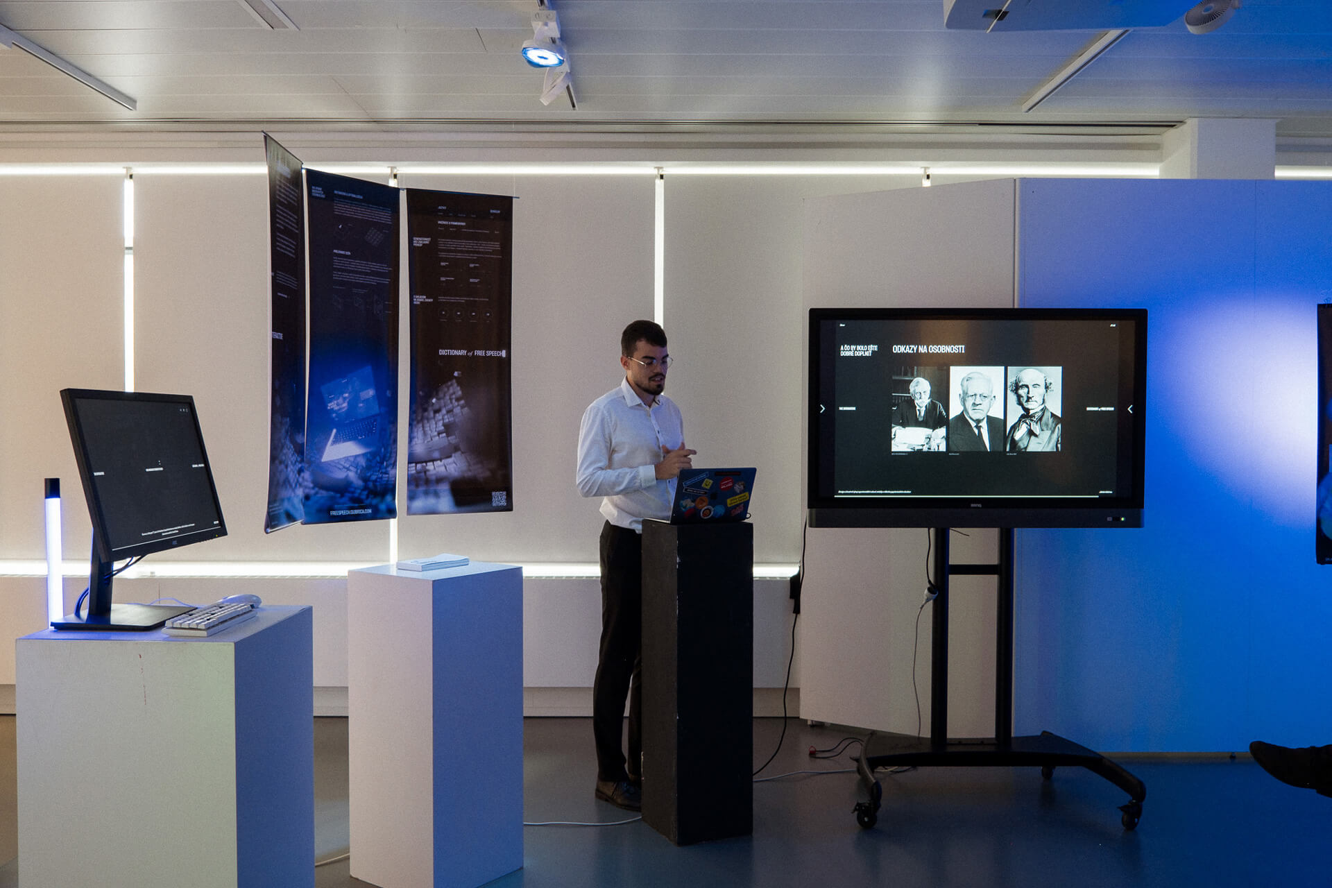
In my previous design projects, I frequently explored social issues, so I decided to focus on freedom of speech this time. My goal was to help bridge the knowledge gap, especially for people in my generation, by offering an immersive yet educational site where they could explore this topic.
The Ideation Process
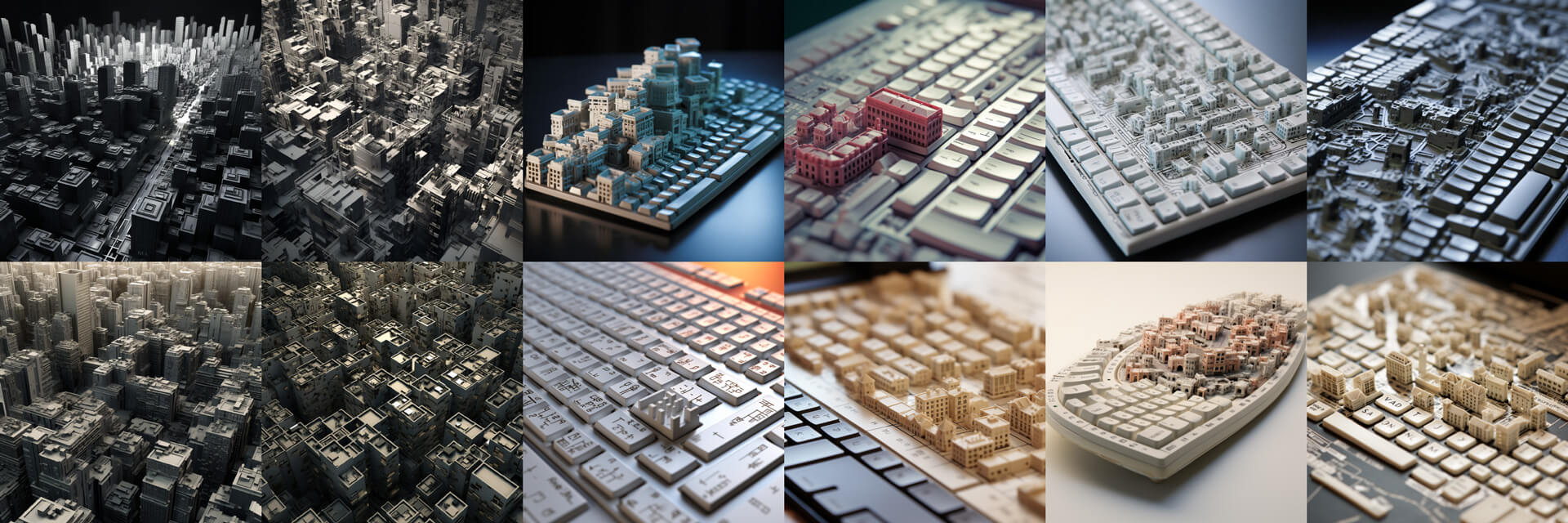
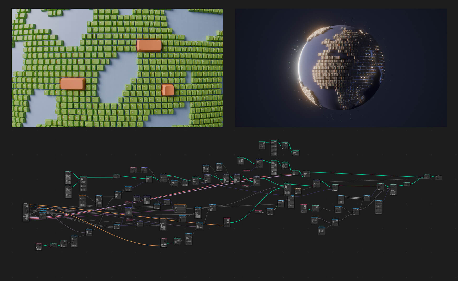
I got multiple variations combining various motives and one of them inspired me to move further with creating a generative keyboard in Blender's Geometry Nodes, allowing me to experiment with different compositions and shapes directly in 3D. And here it clicked – accumulating multiple keycaps with random width settings complemented by a few of them sticking out looked visually super promising. And even more so after I aligned and curved them into a hemisphere — this was exactly what I was looking for.
Going WebGL
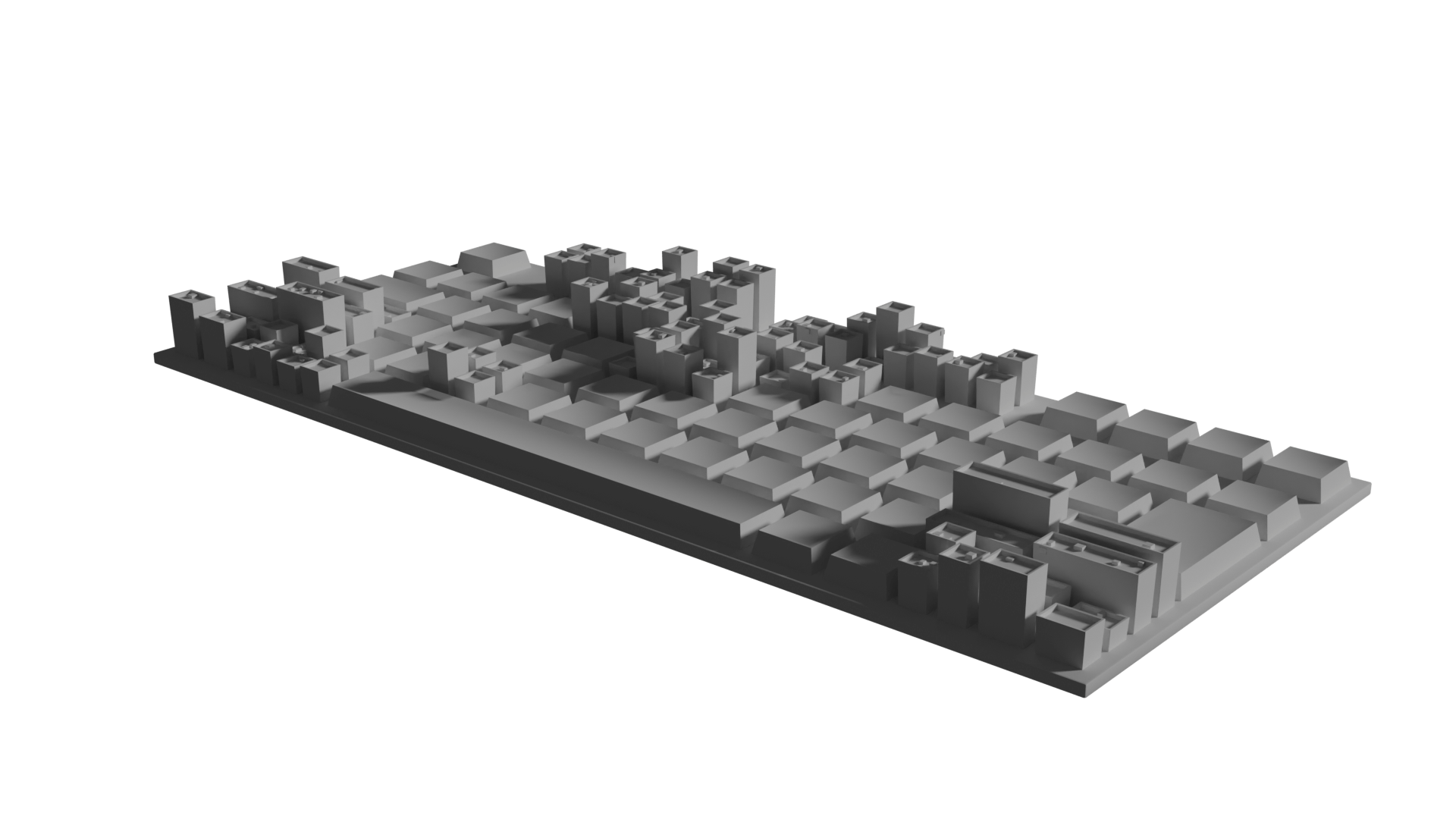
To solve this, I decided to recreate the node setup from Geometry Nodes directly in Three.js using instanced mesh instead, which allowed for all the 1500 keycaps to use the same geometry with minimal performance impact.
Let's Have Fun
The most "aha moment" for me was when I introduced the second render target that allowed me to smoothly translate the user into another, different scene. (You may notice the Tesseract inspiration from Interstellar).
Adjusting Generative Parameters
With the core visuals and interactions in place, I went on to design the intro scene...
The Final Layer on Top
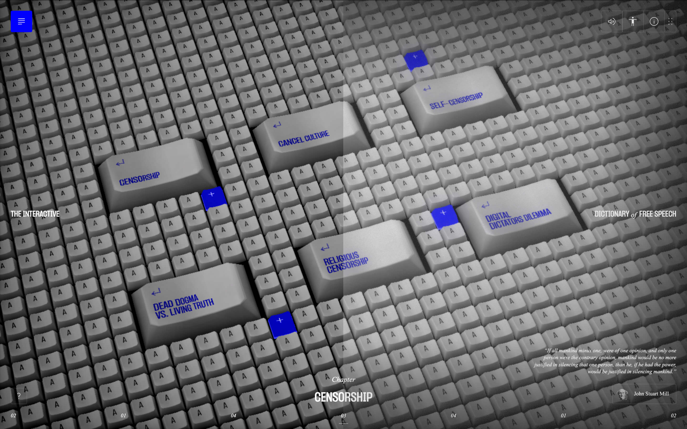
To wrap everything up, I started working on the user interface using React and Zustand for global state management, which simplified updating the DOM and fetching data from the backend I built with Strapi CMS.
Because I was heavily focused on the WebGL aspect and short on time, I skipped much of the prototyping and designed the UI directly in the code. This was contradictory to the standard design workflow I usually follow, but this way I was able to see in real-time how my ideas fit within the scene and the existing interactions. Thanks to that, I even had some happy accidents, discovering options I wouldn’t have tried otherwise, like the horizontal scrolling in the terms detail or the draggable menu in the top right corner.
Lastly, I added post-processing effects, like bloom and cursor-triggered distortion, and used a quirky CSS bug to generate a noise overlay, adding a subtle touch of realism.
Audio
To fully immerse the users, I also wanted to create some kind of audio experience. From all the competences I had in this website, this was definitely the one furthest from my skill set.
I was surprised however how easy it was to create a high-quality voiceover with an AI tool like ElevenLabs. In combination with copyright free sound effects and ambient sounds that I tweaked a little in Adobe Premiere, I significantly expanded the experience in this area as well.
User Testing
Due to the experimental nature of the web and the alternative navigation I implemented, I decided to conduct user testing to ensure the experience was as usable as possible. Through three rounds of testing with a total of 8 participants, I was able to identify most of the usability issues. This experience confirmed to me once again how important user testing is, and how little is enough to make things more usable.
With Accessibility in Mind
As a designer, I believe our work should be accessible to everyone, but achieving this with 3D environments is challenging. Inspired by Sculpting Harmony's (Getty) approach, I created a simplified version of the website with all the accessibility semantics in mind, ensuring that the content could be fully reached by all users.

Wrapping up
Being the sole creator of the content, design, and development was challenging and it took several months for me to finish the whole site. Looking back on the process, I'm glad I live in times where I have so many great tools and educational content available, allowing a student like I was at the time to create an immersive web experience by himself, almost for free, and even help him land his first SOTD.
Technologies
Frontend Frameworks and Libraries: GSAP, React, Three.js, three-instanced-uniforms-mesh, Vite, Zustand
Backend Technologies: Strapi CMS, Digital Ocean
Tools: Midjourney, Blender, Figma, Adobe Creative Cloud, Desmos, ElevenLabs
About the author
Adrián Gubrica is a freelance creative developer currently working for OFF+BRAND. and a Ph. D. student researching immersive web experiences at the Digital Design department at TBU Zlín.
Bohuslav Stránský was the project supervisor.
