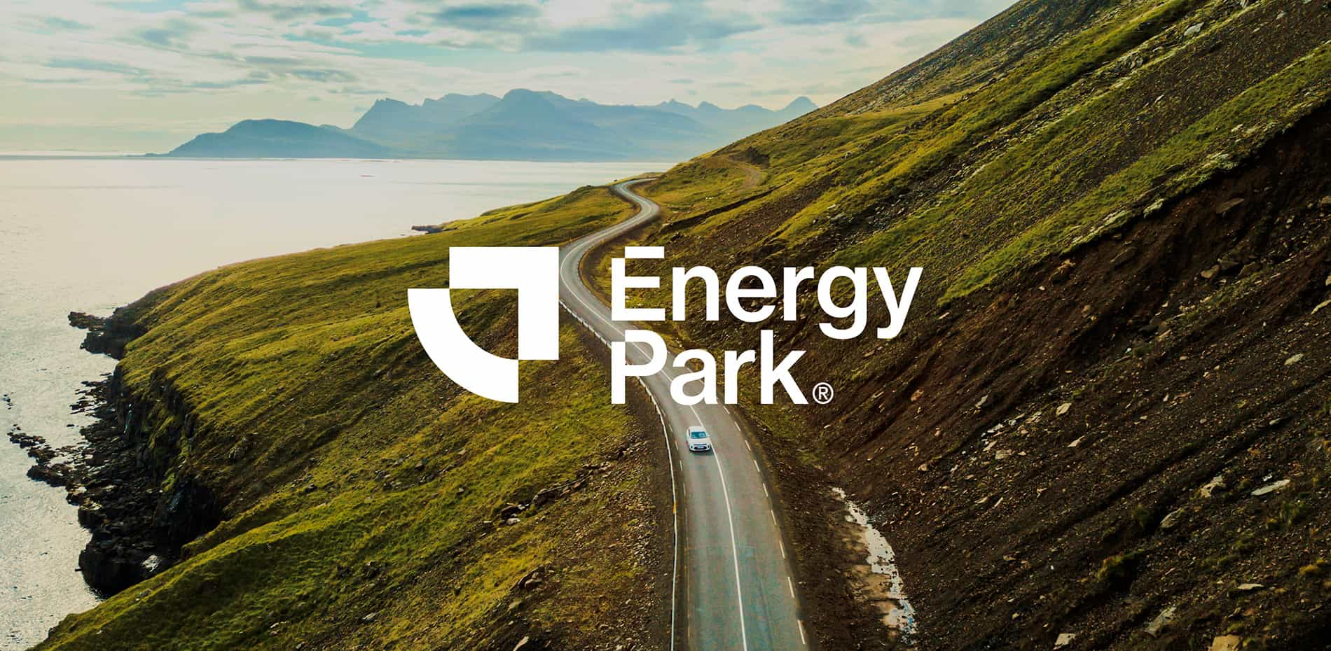
There is so much choice in the EV market for consumers with very little or no support to help guide them down the right path.
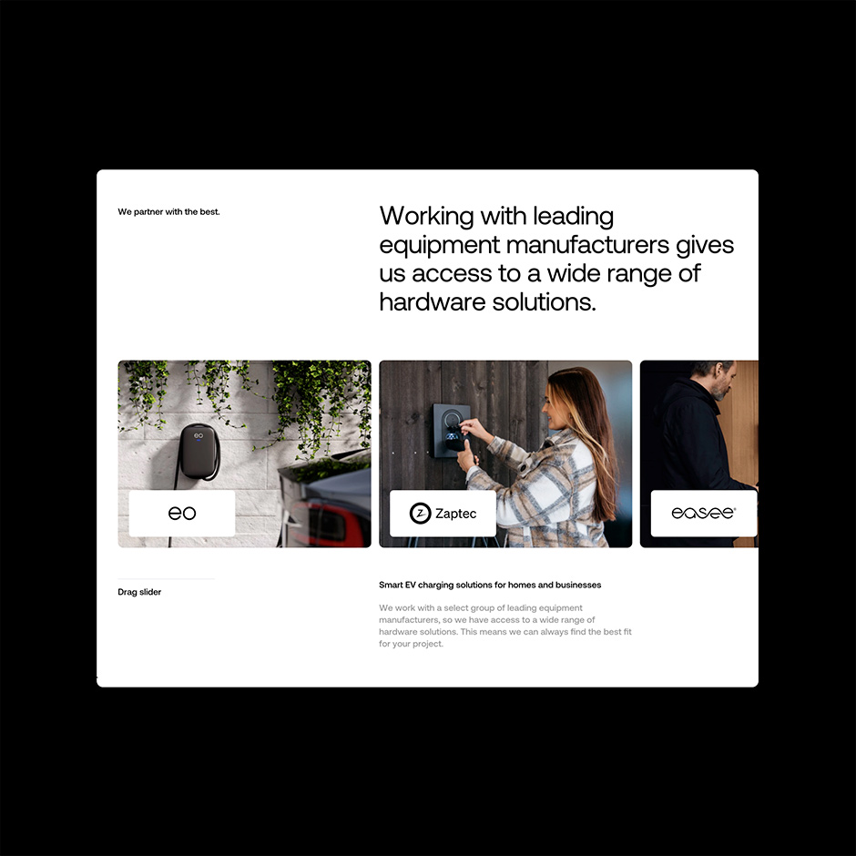
Energy Park creates highly accessible, tailored and affordable smart EV charging solutions for homes and businesses. They work with leading equipment manufacturers giving them access to a wide range of hardware solutions.
They listen to the customers needs, identify the best approach and then create a bespoke smart EV charging solution that’s right for their requirements. From initial consultation to scheme design, installation of hardware and software, commissioning of the charge points, they’ll manage every stage of the process - always pointing the customer in the right direction for the road ahead.
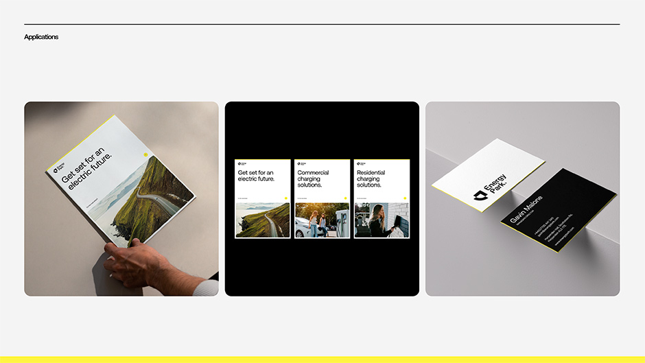
After collaborating with Energy Park to create their brand strategy and identity we were tasked with crafting the digital experience and implementing a technical strategy that would support rapid growth over the next few years.
North Star
During the discovery phase of the project it became clear that Energy Park had a deep belief that the road to electricity should be for everyone. They were the champions for everyone to go electric - our approach was to elevate this rallying call and bring it to life in a clear, simple and engaging experience.
“They were the champions for everyone to go electric - our approach was to elevate this rallying call and bring it to life in a clear, simple and engaging experience”
Design System
While everyone else in the market was focusing on green credentials and sustainability we saw an opportunity to stand out from the crowd by changing the narrative and focus on the journey itself and how that benefited the customer and ultimately how Energy Park guides them along the way.
As Energy Park offered solutions to homes and businesses this meant its audience was extensive and covered anything from a single charger in a residential home to large-scale commercial operations such as holiday parks or business fleets. With this in mind the experience had to perform for all demographics, those new and old to EVs and ensuring it supported the brands growth plans so simplicity, clarity and scalability were key to the success of the project.
“Simplicity, clarity and scalability were key”
Through highly considered design and a robust content strategy we aimed to make the service offering as simple and clear as possible while through the brand language and storytelling we would position EV’s as accessible to everyone yet still aspirational.
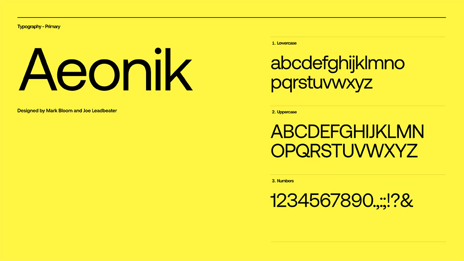
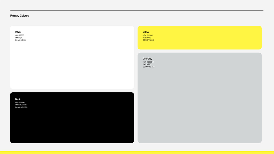
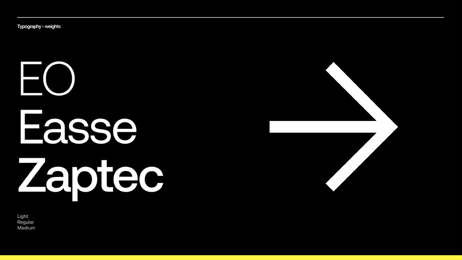
We took a lot of inspiration from iconic transit design systems and industrial design. From the selection of the typefaces, icons, colour palette and ultimately the UI design aimed to capture and convey a timeless sense of simplicity, clarity and functionality which would appeal across the demographics.
Guiding the audience
With the brand's value proposition guiding people to the right EV solution it was vital that the UX embodied this belief. Again with so many audiences to cater for across different markets we ran the risk of over complicating the experience so we worked closely with the client, identifying common themes across audiences to develop concise benefit-driven messaging and optimizing user journey. Along with this we ensured there were clear sign posts guiding users across the experience helping them connect the dots.
“We worked closely with the client, identifying common themes across audiences helping us to develop concise benefit-driven messaging and optimizing the user journey"
Less really is more
Throughout the entire process it was vitally important for us to keep the audience at the core of all storytelling and get right to the key benefits of how Energy Park adds value to their daily lives. Instead of focusing on the endless product features we led with solutions and then supported this with the right products. Staying true to our principles we aimed to constantly strip away the excess that did not support the brand narrative and guide the user across the digital experience.
“We aimed to constantly strip away the excess that did not support the brand narrative”
Optimized for mobile
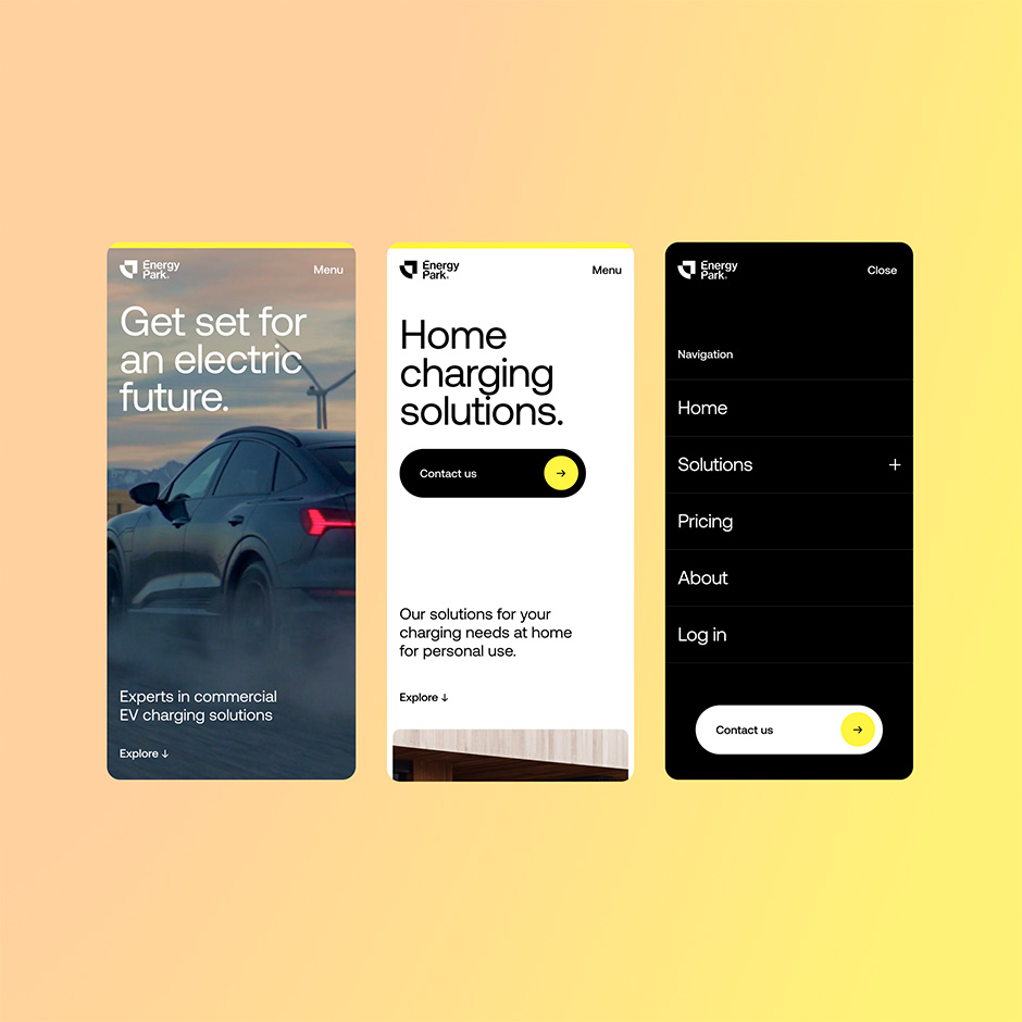
With simplicity at its core the design language was well optimized for mobile ensuring the brand was well expressed on smaller screens while ensuring all functionality was maintained across devices.
Scalability and speed
It was vitally important that the design and the technical infrastructure could support rapid growth in the coming years. With this in mind the design system was built to be highly dynamic and modular. We focused on designing and building a suite of interchangeable modules and components with no particular pages being pre-defined.
“The design system was built to be highly dynamic and modular”
This gave us the ability to build out numerous pages from a relatively small number of modules. To ensure we didn’t fall under the normal ‘cookie cutter’ look and feel that can happen with modular based systems we outlined a set of design systems for particular page designs and brought the brand to life through custom Javascript interactive features and play-ful emotion-led animations.
To ensure maximum performance and scalability we adopted a headless architecture using Dato CMS, with the site being statically generated and hosted on Netlify. To ensure ongoing maintenance of the site by the client is easy and intuitive we also customized the CMS interface based on their requirements.
Technologies
Design
Figma, Principle
Development
Nuxt.js, JavaScript, GSAP, Dato CMS, Netlify
Company Info
Outpost is a digital first design studio established in 2004. We aim to create true expressions of brands that leave a lasting impression. We exist at the intersection of brand and technology using insight, strategy and creativity to drive innovation and brand transformation.
We believe that the most powerful experiences lead with emotions and are then backed-up with insight to drive behaviour such as customer engagement, increased conversions and loyalty.
To achieve this we uncover your brand’s purpose and use this insight to craft powerful emotionally driven experiences that are simple, engaging and resonate with your audience - taking your brand further.
X: outpost_design
IG: outpost.design
W: outpost.design
