Designing a portfolio is always a significant challenge. Every decision about color, design, interaction, etc., seems to be crucial for the project. This spring, we launched the website, but, to be honest, we started working on it last summer. We dedicated ourselves to this portfolio and treated it as our greatest masterpiece. We shared tests, progress, and conversations, which we continue to have, even after completing the portfolio.
We have a special affection for this website because we believed in what we were doing and knew we had something different to say and do. We are immensely proud of this project, and it continues to bring us joy with each recognition. This was our first collaboration, and we already know it will not be the last. I hope you enjoy this retrospective as much as we enjoyed the entire process.
Challenge: Setting the design basis
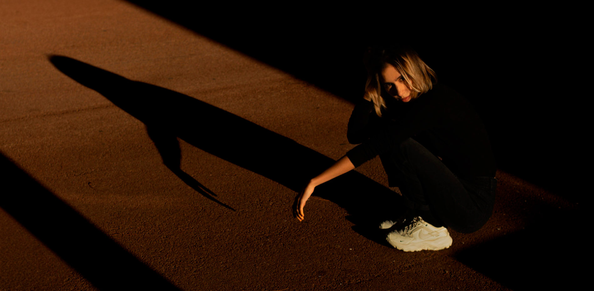
Defining the design was not an easy task, but from the start, there was a clear decision: the typography had to be the focus. An editorial design was proposed, but with a unique twist to avoid being conventional. After identifying the central elements as the concepts of fractal and liquid reflection, we translated this idea into a design that, starting from the familiar, reveals a unique experience. It takes us to a physical experience that can seem unreal. The goal was to create an immersive and cohesive experience in all interface elements: a gallery with fractal deformation, carefully blurred elements, and liquid fonts to interact and play with. Interactions that generate moments of surprise and define the identity of the entire site.
On the technical side, it was clear that the titles would fall short if animated only with CSS; we needed something special to capture the user's attention. We opted for WebGL and shaders, which allowed us to explore with few limits and achieve a more interactive experience from small elements like hovers to transitions, creating a much smoother and more organic experience. We knew the performance would be a challenge, but despite everything, the clean and editorial design approach allowed the ideas to integrate seamlessly, benefiting both the design and the development.
“On the technical side, it was clear that the titles would fall short if animated only with CSS; we needed something special to capture the user's attention. We opted for WebGL and shaders, which allowed us to explore with few limits…”
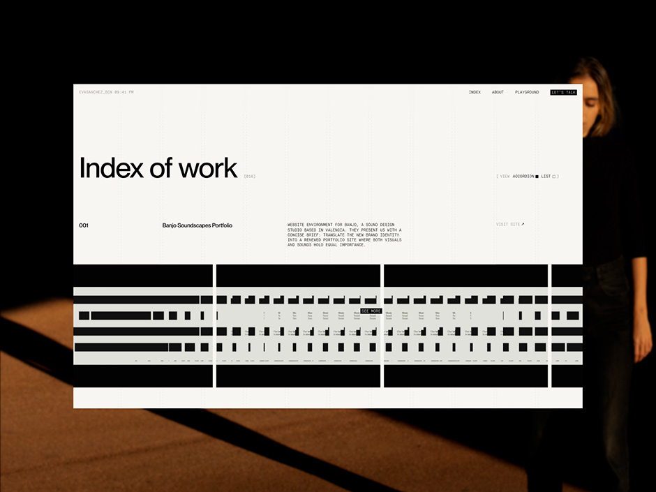
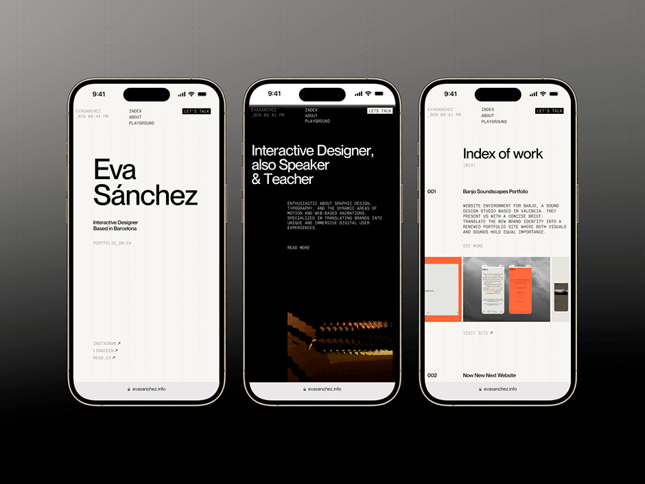
Index and Project page
What is a portfolio without a section to showcase your projects? The most important page of the website couldn't be discreet, but we also didn't want to overload it. The effects had to elevate the presentation of the projects, complementing them without distracting them. Additionally, we wanted to give the user the option of two project views, complemented by a visually appealing transition. In both views, our visual and interaction language adapted to the different designs and needs.
For the project page, we used a clean layout to facilitate updates and maintenance, while also giving more prominence to the videos and images of each project. The gem of this section came with an infinite scroll, which not only allows the user to explore all the projects without needing to return to the index but also provides another space to enhance stylistic resources like blur or text reveal.
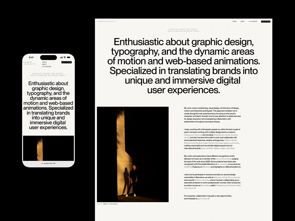
About and Playground
The about, a space where I introduce myself and share my experience and journey as a visual and interactive designer, in a visually strong and dynamic format. We worked with large blocks of information, using the same stylistic and interactive resources throughout the website, not only to maintain visual consistency but also to enliven the large amount of content in all the About sections. The result is a rich page with a layout that lightens and organizes the information.
The playground was the last section we launched, and we were more relaxed, so we wanted to have fun and play not only with the grid but with all the visual resources. This new page was created to reserve a place for those projects that never came to be but still deserved recognition. On this page, the layout varies a bit and, although it maintains the same effects, we used a different and flexible grid. We wanted a space that lived up to its name. Despite the number of images and potential performance issues, we overcame the limitations. By clicking on the images, they not only expanded but also retained the same fractal resource as other images, while the grid adapted and responded. As a result, we achieved a fun and unexpected moment.
Footer
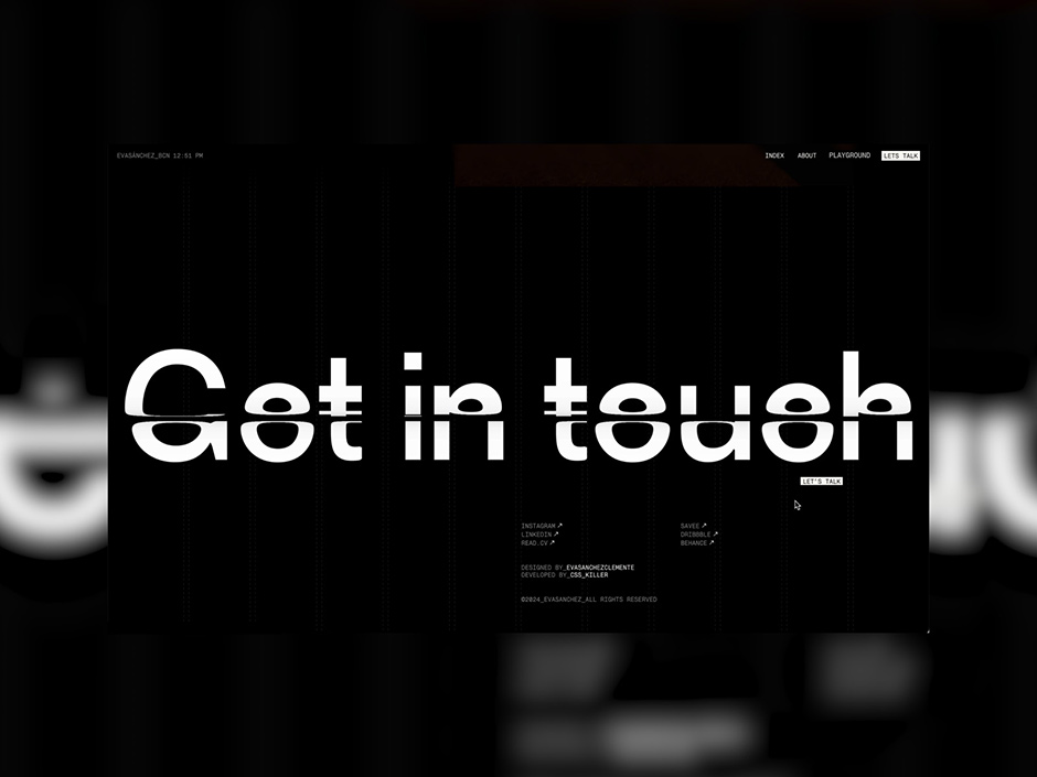
The crown jewel, the parents' favorite child, the cherry on top. Those who know me well are aware that the footer is my favorite piece to design. And any designer knows that this section can be the most striking part of a website. In my portfolio, it couldn't be any less. I wanted the footer to be very typographic, with large text sizes, but it wasn't until the development phase that the fractal effect boosted its visual impact. A call to action spanning the entire width allows for a detailed appreciation of the interaction we took so long to refine, creating the perfect ending on every page of the website.
“A call to action spanning the entire width allows for a detailed appreciation of the interaction we took so long to refine, creating the perfect ending on every page of the website.”
Desktop & Mobile: forever friends
From the start, we understood that the mobile version of the portfolio must mirror the desktop version. The primary objective of this portfolio was to provide a flawless introduction to my profile for potential clients and companies in the industry. Additionally, it often frustrates us to find websites that we love on a desktop but find unsatisfying on mobile. So, we wanted to make the most of the small screen so that users could play with and distort the typography. It wasn't easy, and we had to make many decisions to find the right balance, but we didn't stop until we were happy with the result.
Design & collaborate
This project began with some clear ideas and motion references, but the final interaction decisions were made through conversations and sharing videos and screenshots on WhatsApp and Discord. It felt like a full-time job that lasted several months; you never know when inspiration will arrive, and we were always sharing new ideas. There was a clear vision and intention, but the final result was the product of an artisanal and friendly effort, enriched by many conversations, discussions, and tests. The brief was clear but couldn't be restrictive; the space for a creative developer to experiment couldn't come from strict requirements. As a result, many ideas worked from the first sketch, many were discarded, and most improved after several rounds (sometimes endless; for example, it took us more than a month to decide on the text reveal). The lesson and takeaway is that nothing is more enriching than working hand in hand with someone who shares a vision with you.
Technologies
We knew we wanted a powerful website with personality, good performance, and optimization of all technological and multimedia resources, without compromising usability or design. Both design and development had to take into account the number of elements per screen to avoid affecting performance. The website is filled with animations, including typing text, typography and image reveals, multi-layer blur, smooth scrolling, loading, transitions, and more. Many of these utilize innovative technologies such as WebGL, MSDF, or CPU shaders, while others stick to the basics with basic CSS for the header blur.
Frontend OGL, Lenis scroll
Backend Technologies: PHP
Backend: Wordpress
Tools: Figma
Company Info
We are not a company, but a team composed of Eva Sánchez and Ángel Pérez (CssKiller). Eva is an Independent Interactive Designer from the Canary Islands, currently based in Barcelona. She is also a jury member at Awwwards and teaches at Domestika. With a background in graphic design, she specializes in translating brands into unique and immersive digital user experiences. Ángel is a self-taught Creative Developer based in Málaga with a strong interest in creating interactive and seamless digital experiences. He is also a part of the Awwwards jury. His experience and trajectory have positioned him as one of the Spanish developers with numerous recognitions on this platform and multiple nominations for Independent of the Year.
As a team, we believe in following our instincts and using them as the foundation for our work. We’re proud of our learnings and we’re aiming to keep crafting more digital products together. If you also want to create something different, collaborate or share views, come say hello to us! You can also stay tuned in our socials... great things are coming!
Eva Sánchez Clemente
Instagram / LinkedIn / Website
Ángel Pérez Pedrosa - CssKiller