Massive congratulations to Exo Ape for winning Site of the Month May for Exo Ape. Thanks to everyone who voted, the winner of the Pro Plan is at the end of the article.
Exo Ape is a digital design studio based in the Netherlands. We craft white-glove digital experiences, engaging content and impactful design solutions that inspire, affect and delight. We carefully wrap emotionally rich aesthetics around strategic concepts to deliver award-winning digital design that exceeds expectations.
Exoape.com
We are a team of like-minded design enthusiasts and tech aficionados that explore the digital frontier with grit and dedication.
Approach
Most design studios know that doing creative work for yourself is one of the hardest things to do. Hence, the creation of our portfolio website spanned across a couple of years with most versions landing in the trash bin (we know everyone’s been there).
The main challenge was to find a balance between presenting the work that we do for our clients and creating an identity for the Exo Ape brand.
Early UX concepts for exoape.com
Early UX drafts
For websites with a lot of page transitions, we start exploring motion concepts early in the process. These concepts are low-fidelity and intended to get a better sense of the flow of the final website. These concepts are critical to get UX, design and development on the same page, and tackle problems early on.
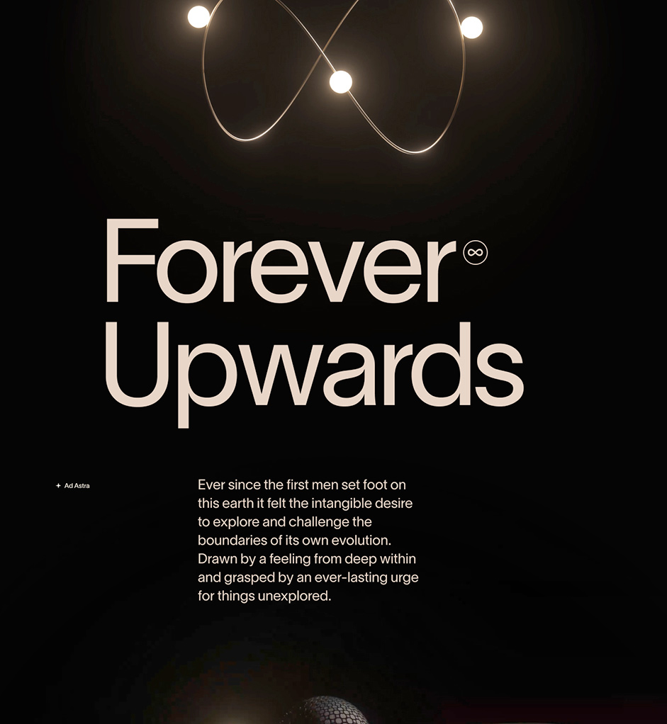
Story concept
The story page tells the narrative behind our name and is part of our new branding. We collaborated with Holographik to create CGI elements that elegantly depict chapters from our story.
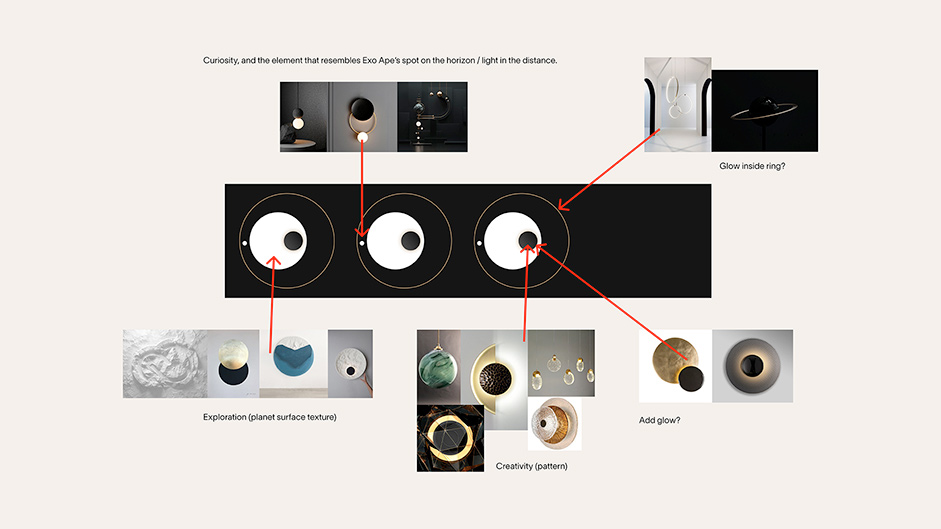
We wanted to create abstract shapes that could represent our values and support the narrative behind our name in an elegant way. Each element depicts a brand value in a subtle way. (curiosity, exploration and creativity) To support the story we wanted the elements to have a relationship to the space theme. Think of orbiting motion, gravity, push-and-pull and radiating glows.
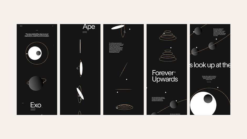
With the initial art direction in mind, we began sketching storyboards using basic shapes to help create a flow for the final page. Through this process, we were able to imagine the final outcome and tackle any problems early on.
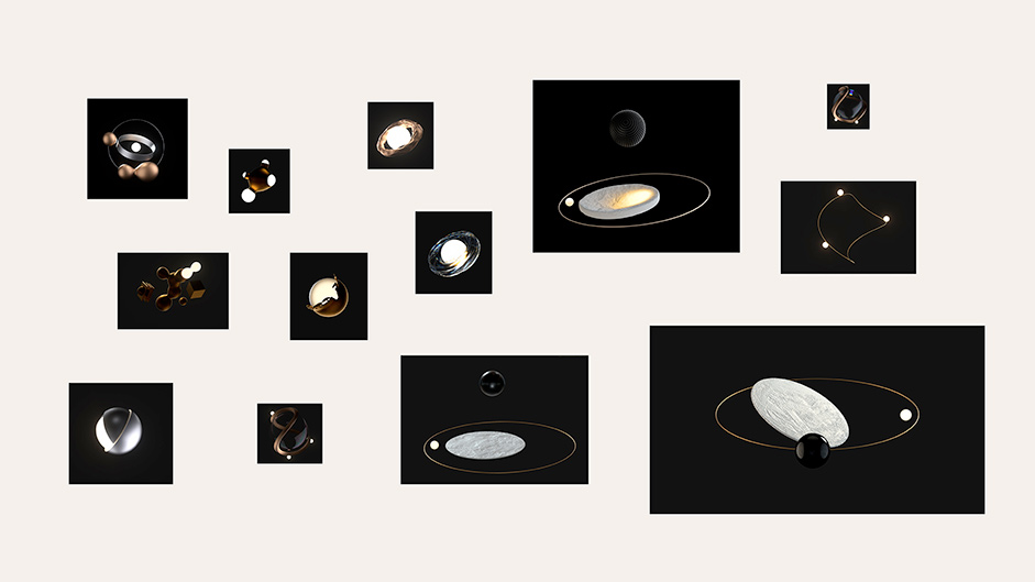
With the storyboards in place, we were ready to start building out the art direction for the 3D assets. Various directions were explored until we were able to narrow down a preferred style.
Various motion explorations
We then tested various concepts in motion to see how certain elements and textures would behave and interact with each other.
Final renders
A final direction was selected and meticulously polished. Details like easing, textures and lightning were tweaked and added to the composition.
Story page in motion
The final page was presented in an immersive way, through video and scrollable image sequences rendered in Canvas. The scroll based animations create an engaging and interactive experience.
Through a combination of video and scrollable image sequences we tell the story behind our name and express our values in an elegant way.
Art Direction
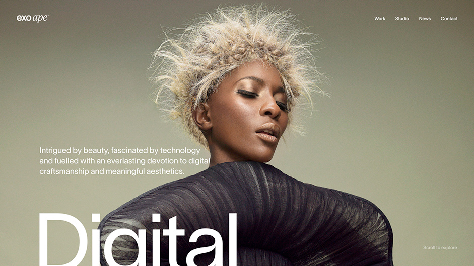
We wanted to create something that felt timeless in design yet contemporary through interactive details. We did this by combining great photography with Lausanne, a sophisticated sans serif font that responds to the historical Helvetica and radiates a classic look and feel. Finally, a layer of subtle microinteractions blends everything together.
Case Studies
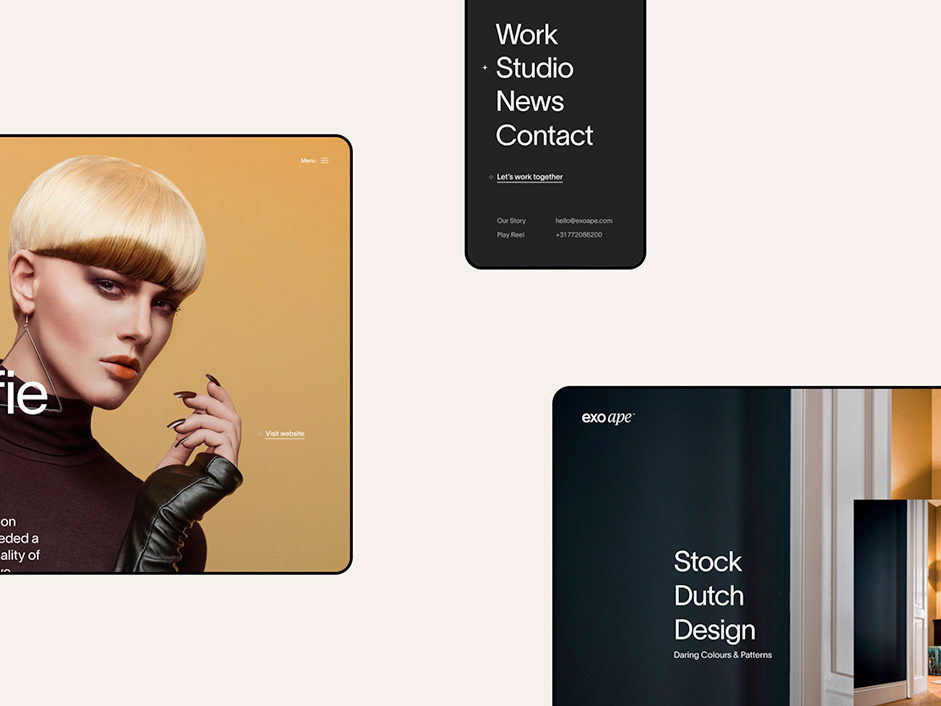
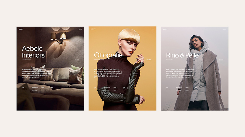
Ultimately, the website is an ode to our clients, their work and the digital products we’ve created for them. Hence, we put a lot of effort into creating elaborate case studies that include custom assets and case-specific animations and transitions.
We strongly believe that every website needs a stand-out feature or element that people will remember. For our own portfolio website, it’s the large header images that are used on the homepage and case studies that have a magazine-like feel to them. In this way, we combine something traditional with a modern presentation.
Motion
Animations stimulate an easier, more natural experience for the user, reduce cognitive load and add a premium touch to the overall look and feel of the website.
Micro-interactions overview
Transitions
We are using subtle transitions to provide a sense of location for the visitor, as well as adding to the premium feeling of the site.
For the work page, we provide a secondary option to browse our work in overview, which is beneficial for the usability of the website. The seamless page transition generates a sense of direction while adding a subtle moment of delight for the user experience.
The seamless page transitions generate a sense of direction while adding a subtle moment of delight for the user experience.
Work page transitions
Technologies
Backend
To manage our content, we use Storyblok, a user-friendly, powerful headless CMS. We created various reusable components that include multiple layout options to flexibly craft unique pages and case studies.
Frontend
For the front end, we used Nuxt to make route-based page transitions possible and make the website feel more like a native app. With a large number of media assets, we had to keep an eye on load times and performance. Therefore, we used a combination of nuxt/image and Storyblok’s Image Service to serve next-gen image formats for all devices and platforms. Storyblok leverages a global content delivery network (CDN) from AWS for both content and assets that securely delivers data with low latency and at high transfer speeds.
Deployments
For the deployment, we used Vercel, which allows us to deploy fast and with almost zero-configuration effort. Publishing a new page automatically triggers a webhook in Storyblok that will generate a new static build, which will then be deployed to our live site.
Animations
For the animations, we used a mix of traditional CSS keyframes and more complex GSAP animation. Each interaction, slider and transition was carefully crafted using motion studies created in After Effects.
Tools
Development
Visual Studio Code, Oh My Zsh, GitHub, BrowserStack
Design
Figma, Photoshop, After Effects
Other
Spotify, Slack, Notion
Company Info
Exo Ape is a digital design studio that plants the flag at the intersection of technology, digital branding and content creation.
For over a decade, our team has had the privilege of working with global brands and inspiring startups to tell brand-led stories and shape digital identities.
Credits
Robbert Schefman, Digital Art Director & Visual Design
Ronald Gijezen, Motion & User Experience Design
Rob Smittenaar, Front-end & Creative Development
Ruud Luijten, Front-end Development
Holographik, 3D
Thanks again to everyone who voted, the winner of the year’s Professional Plan in our Directory is @Azziefuzzie, please DM us to collect your prize!
