Fixed or “sticky” navigation bars are a prevalent trend in some of the most shockingly beautiful sites across the web. These benignly set bars allow for ease of access to a website’s core functionalities, regardless of where a user may be in the midst of a page’s content. Yet there are more than a few critics of the fixed bar model. The most common complaints include words like: “unnecessary” and “distracting” pitched about in regular intervals.
Truthfully there are merits to both sides of the argument, and the proper use of fixed navigation bars remains a contextual and subjective matter. In other words, it’s largely a question of user preference that determines a fixed navigation bar’s effect on usability.
There are, however, distinct advantages and disadvantages to their use. Today we’ll take a gander at both sides of the argument and attempt to decipher the best and worst uses of this particular trend.
PROS
Advantages in usability
The advantages to fixed navigation bars should be obvious. They, quite simply, make browsing a website far easier. Having a main menu of options at your immediate disposal is a major feather in the impatient user’s cap, especially if the website has an exhaustive amount of content contained within.
This is important for several reasons, but chief among them is speed. Quick and easy flow through a website is extremely important. With an ever-present guidepost fixed at the top or side of the screen, a site owner never need worry about his or her user flows being dammed up by confusion or immobility.
This is particularly significant when dealing with copious amounts of content. Famous examples of this concept come in the form of everyone’s favorite social media platforms: Facebook and Twitter. Both sites feature news feeds with nigh infinite information loading up at the bottom of the screen.
A user can easily waste hours digging through the perpetually increasing lines of content, links, thoughts, rants, ideas, and gossip. Thankfully, they don’t have to scroll all the way back up the page to message, chat, or produce content themselves. The fixed navigation bar prevents such a problem from ever manifesting.
Imagine a different experience which would require a user to scroll upward the same distance he or she scrolled downward in order to check their Facebook notifications.
-
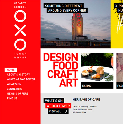
Speed kills
For a less ubiquitous example, take a look at the Singapore Youth Choir website. Though not nearly as expansive as the aforementioned social media giants, SYC.org is positively packed with content. It explains history, schedule, philosophy, musical scores, and performers on staff--each with equal care.
Needless to say, it’s a lot to scroll through. But because of the sticky bar at the top, quick and easy navigation allows a user to find exactly what they would be looking for in no time flat.
The amount of time that this technique saves is nothing to sneeze at. A recent usability study suggests that fixed navigation bars can reduce browsing time by up to 22%. Doesn't sound like much? If you consider the average American internet user spends 3 hours daily on social networking alone, that 22% suddenly becomes a sizable chunk of time.
All the cool kids are doing it
Another unquestionable benefit of the fixed navigation bar is the inescapable fact of its popularity. There are scores of websites with this functionality enabled. What’s more, it works to great effect. According to the selfsame usability study we’ve linked to above, 100% of the surveyed users preferred sticky navigation without realizing it.
Given the choice between two interfaces, one with fixed navigation bars and one without, 34 out of 40 users preferred the latter. The remaining 6 all replied that they had no preference. Though this is by no means a comprehensive study, it is certainly a telling statistic, even if it is told in isolation.
Combine this with the fact that the trend itself is so pervasive, and you have a powerful argument in favor of sticky navigation.
Examples
Take a look at some of these beautifully rendered illustrations of fixed navigation:
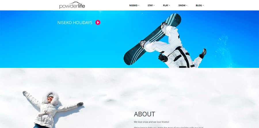
Though, I’m certain most of us are tired of winter weather, this website makes for a little snowfall nostalgia. High quality imagery and a layered foreground combine with the sticky navigation to make an attractive and user friendly browsing experience.

Kaus is a digital marketing firm with a gorgeous website. The fixed navigation is important here because the rest of the page is pretty busy. Yet with interactive elements induced by hovering the cursor, and sticky navigation keeping the page flow at the forefront of your attention span, the UX is more fun than it is confusing.
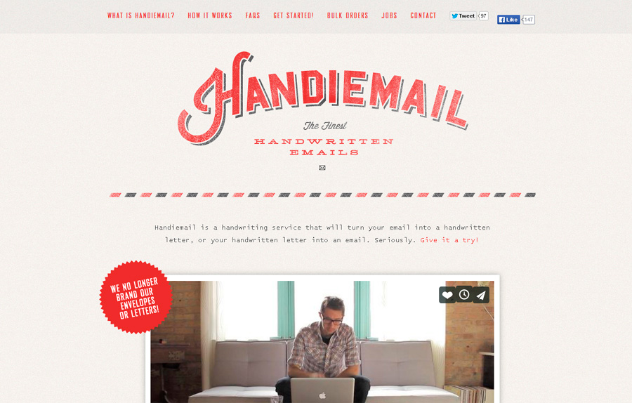
This one’s a lot simpler, but it’s still an effective, attractive, and downright slick example of sticky bar use. The text heavy page can be easily navigated by clicking the heading of your choice. Once you’ve made your selection, the screen scrolls automatically and you’re free to consume the on page content at your leisure.
Cons:
Of course, it can’t all be good news, now can it? Many a cynic will be quick to point out that sticky navigation can be a very superfluous addition to an otherwise perfectly usable website. When a website has a clear flow already, or a dearth of content to scroll through, a fixed navigation bar can often be seen as a waste of space.
Though it can be flashy, it can also be unnecessarily overt. Whereas some might see it as interesting, other might find it distracting. As mentioned at the beginning of this article, it’s largely a matter of personal preference.
Not much elbow room is there?
There certainly is no argument, however, that a navigation bar takes up space. That being the case, if it’s not absolutely necessary that this real estate be occupied, then what is the real advantage? Fortunately, there are some workarounds to this issue.
This problem can be addressed by having the bar shrink once you’ve scrolled past its initial appearance, as exemplified here. Another solution, is to have the options disappear completely and allow access through the clicking of a settings button. Hugeinc.com provides a creative picture of just such a process.
Miscellaneous concerns
Beyond simple space constraints, there are some practical concerns for developers. For example, though the problems aren’t universal, a fixed navigation bar can be difficult to translate into mobile format. A complicated design can also increase page load times, which is always a major cause of concern.
Finally, fixed navigation bars can often just be thrown on a page without rhyme or reason. As if they’re only there for the sake of fitting in with all the other neat websites. This can often end up a bit pointless, and occasionally make for an irritating UX.
Examples:
It’s never fun to pick losers, but for the sake of comprehensive coverage, we must soldier on. Take a look at some of these websites which are not helped by the addition of a fixed navigation bar:

First of all, there’s almost no scrolling to be done on the entire website. If you only have to turn your scrolling wheel once and you’re at the bottom of the page, the navigation bar doesn’t really need to be fixed. The only page that has more than 2 screens worth of scrolling is the blog, which ironically redirects to another site completely.
Second, the text and images obscure the navigation bar, so even when you’re an below the top of the screen, you can’t clearly see all of your navigation options.
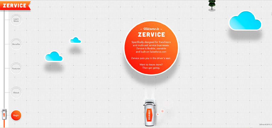
Now don’t get me wrong. This is a very pretty website. It’s got plenty of bells and whistles for you to ooh and ahh over. Unfortunately, it’s intensely irritating to navigate, confusing to move through, and ultimately irritating to experience. There is no scrolling. Only a fixed set of navigation buttons that take you to different points on the page. Not enough control, not enough explanation, and definitely lacking in the area of usability.
Overall, there’s not a lot to complain about with fixed navigation bars. The concerns that get brought up are subjective, but when we’re talking about UX, subjective concerns are certainly legitimate. In the end, it’s up to the developer to determine what the target audience wants and needs from the individual site.
What do you think about sticky navigation? Healthy and useful? Or inane and transient? Let us know your thoughts in the comments.
