Nov 23, 2021
Freedom, flexibility and primary colors: how Readymag communicates its values in social media

Social media platforms, especially Instagram, are the key brand communication vehicle for Readymag. Being a tool for designers, the primary focus in everything that we do—from interfaces to marketing and advertising posts—is design.
In this post we set forth our communication design principles that help us attract new like-minded people—for instance, in 2021, our audience in Instagram has been steadily growing by the average of 4,8% every month.
Integrity across everywhere
The Readymag design team includes three people: Stas Aki is mostly responsible for the interface design and overall design strategy of the company; Tanya Egoshina produces landing pages for all kinds of marketing purposes; Varya Fomicheva sets things in motion and designs most of the social media content. Each of our designers has their own artistic style, yet in Readymag their preferences successfully come along together and melt into one.

“In the center of Readymag is its interface—when working on it, I keep in mind that it should be not only handy and functional but also visually pleasing, so that it inspires users to make good designs,” Stas explains. This approach permeates all other objects made by the Readymag design team—be it a promo post about a new feature, a Facebook ad or a digital editorial. “Every time a user or a viewer interacts with Readymag in any of its facettes we want to surprise and wow them, as if they have received a present,” he sums up.
Instagram post announcing Readymag editorial called The Debris of Attention | → See the post here
Yet we don’t have a brand guide summing up our style. That’s a conscious decision: we don’t want to limit ourselves, because the key values we stand for are freedom, creativity, and versatility. There are only some visual patterns that repeat across the tool and all mediums where it is presented:
we don’t have a brand guide summing up our style. That’s a conscious decision: we don’t want to limit ourselves.
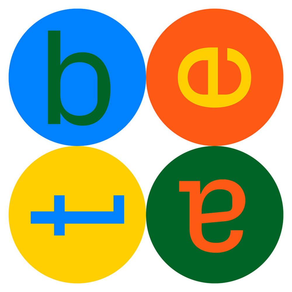
- Quite often we use simple geometric forms: square, triangle, circle, ellipse and romb. They quote the forms of widgets’ icons and at the same time imply pieces of kids' constructors that allow you to make everything you want.
- Even in static images, geometric shapes appear to be in dynamic relations: sometimes their edges touch, sometimes they only strive towards each other but definitely there’s gravity between them. This way we emphasize that they are not lonely planets, but parts of a whole system.
- We aim to make work on the web easy and comfortable for graphic designers and offer familiar instruments like the grid, vast font collection and options to control maximum font parameters. Sometimes we get inspired by these things and give them a central role in our designs.
- We prefer bright, juicy colors. We love to mix primary colors (traditionally associated with Modernist artists) and more compound and deep shades like dark green, tiger orange or magenta.
- We adore good fonts—Avenir, Helvetica, Nobel, Graphik and Px Grotesk—but we do not hesitate to change them from time to time.

It all works as a whole because of the flexible approach and because all members of the design team share similar aesthetic preferences. None of us takes a special effort to fit in—it happens seamlessly
What we do in Instagram
There are five regular types of content in the Instagram account of Readymag:
- #madewithreadymag — screencasts of the best user projects.
- Product updates — videos demonstrating new features in action.
- Announcements — releases of Readymag editorials, promotions and special offers.
- Heads-up about our ongoing user activities—invitations to join the beta-testing team, subscribe to newsletter, etc.
- Checklists and practical tips for web designers.
Usecases and tips traditionally attract the most likes and savings. For instance, our check-list ‘Check your portfolio before sending it to your dream job’ got to be the most saved post in our account.
“Instagram is our biggest social media platform: currently, we have over 53K followers. In 2021 we have been growing by an average of 4.8% percent every month. That’s understandable: Instagram is a heavily-visual platform and we have a very beautiful feed. Plus, we often post user projects #MadeWithReadymag and tag their authors, they make reposts and even more new followers come,” Readymag SMM manager Esenia Assadulina says.“Seems that our subscribers really love our style. A couple of times we got into different collections of “inspirational accounts” and that also brought us new followers,” she adds.
Inverting the physics laws
“I love to mix digital things with something from the real physical world. Also, I love to invert physics laws and force objects to live in an untypical manner,” says Varya. Below she picks some of her favorite works for Readymag’s Instagram account:
This post announced our partnership with .xyz (we grant free domain to all users on paid accounts). I decided to play with how the link looks: it's always long, so you can turn it into a snake and make it wriggle.
I often make screencasts of projects #MadewithReadymag and at some point I got bored—all those videos are done similarly. I decided to show sites in a different way. For example, in this video for our integration with Future London Academy, I turned the screencast scroll inside out and the video looks as if the screen is scanning the project.
This post announces the beginning of Black Friday campaign in Readymag. I used the metaphor of a tear-off calendar in which all days except Friday are white.
If you ever wanted to try out Readymag, now is the time. Take advantage of our Black Friday discounts (up to 30%) from November 22 to November 26, 2021, or experiment with the Free plan to design and launch an outstanding website in hours instead of weeks.
