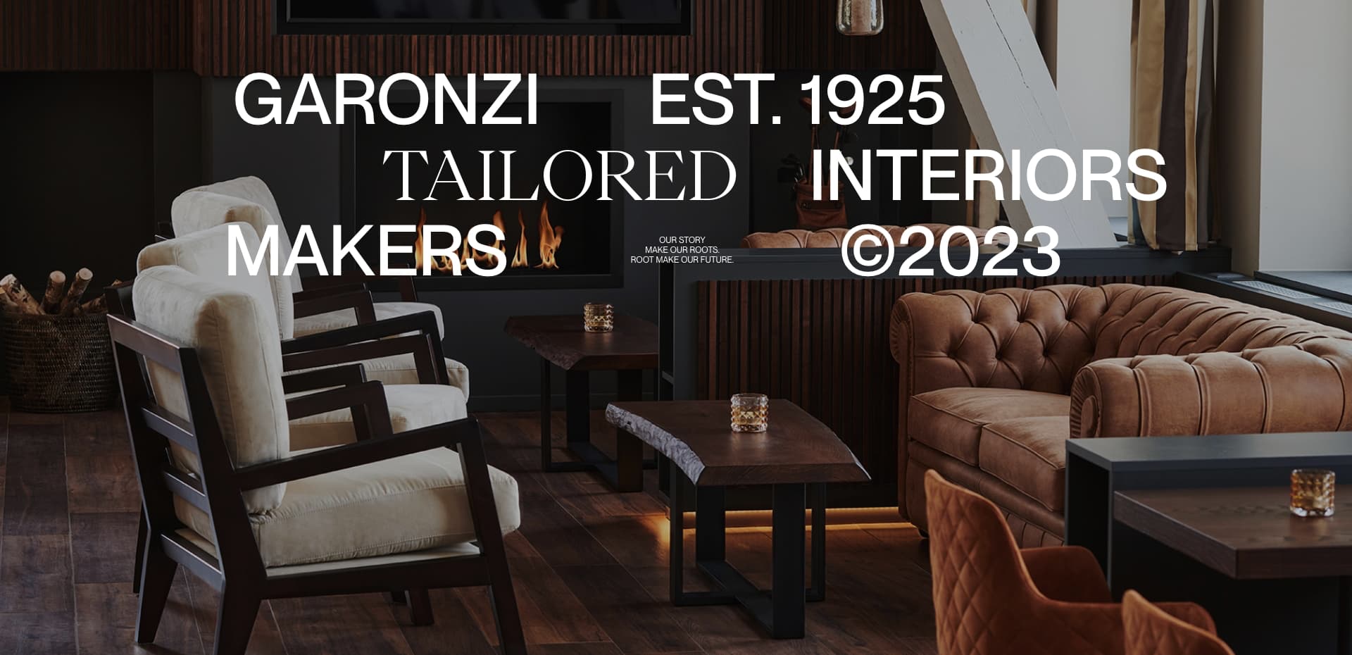
Garonzi designs and creates made-to-measure visions, spaces and furnishing entirely Made in Italy for the Hospitality, and Residential sectors through collaboration with highly qualified craftsmen.
Everything starts with a "why."
Every project begins with a connection of ideas, keywords, and concepts that, in the end, find meaning together.
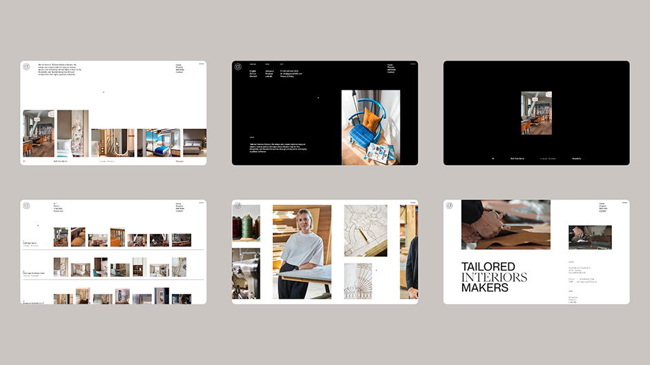
The blank space, understood as empty space, and the elementary geometric shapes reflecting the essential structure of buildings represent the starting point of this project: a minimal framework that has found meaning through the contrast of white and black with the colors that effectively "ignite" the projects.

Move around to discover
“Free, boundless, horizontal, and vertical."
Moving with fluidity is the prerogative of this era, even when it comes to the web. The combination of vertical and horizontal navigation allows the user to quickly see some sections and delve deeper into others based on their interest.
On the homepage, the infinite horizontal scroll allows for a swift visualization of all projects, while on the project list page, for example, we have combined vertical navigation, through which the user gets an overview of the various projects, and horizontal navigation, through which they can view the content of individual projects without necessarily opening the details.
The difference is in the details
Making navigation and UX as smooth and continuous as possible was one of the main objectives.
Animations and microinteractions were precisely employed for this purpose: guide, sometimes automatically, in the discovery of all pages and content. These are always available and revealed gradually, helping the user to orient themselves and understand which part of the site they are navigating.
The use of contrasting colors to black and white also aids in navigation: as one moves from one page to another, the content left behind turns black and white, symbolizing that from the past, the user looks forward to new colorful content.
Reproducing Craftsmanship
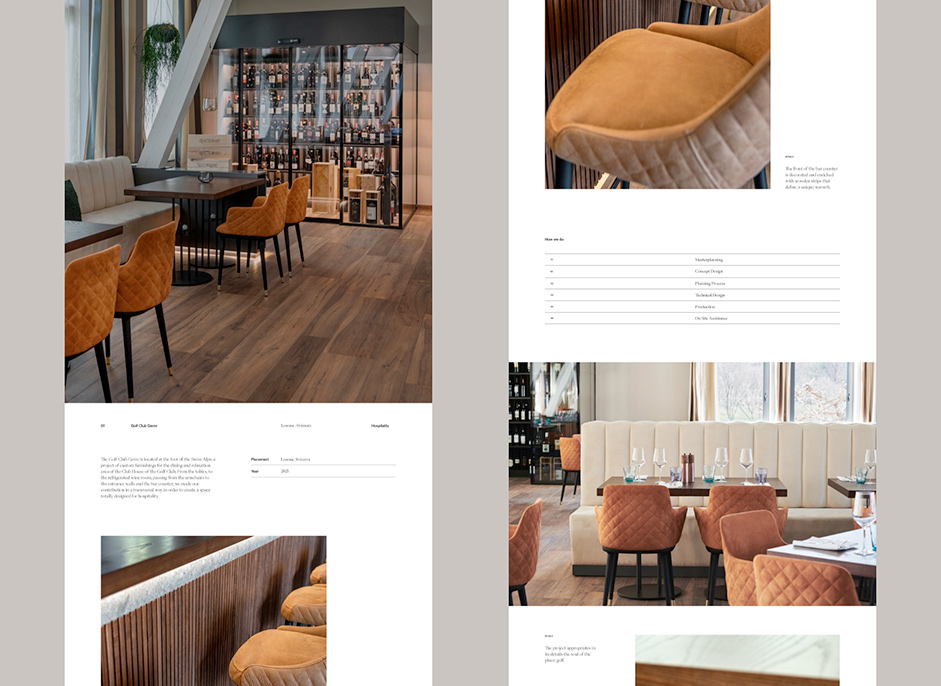
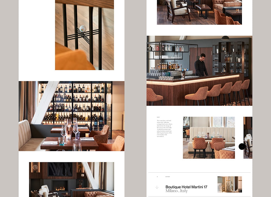
A story, a philosophy, a way of working can also be told through images. That's why we have carefully curated all the content, especially the one related to the working method and collaboration with artisans who help Garonzi create custom-made interiors entirely Made in Italy.
Videos with a slow pace, demonstrate that quality always takes time, and photographs express everything that the craftsmanship entails.
The Site Development
The website was developed using Nuxt, which allowed us to effortlessly integrate internationalization while maintaining flexibility for effective route and transition management.
The remarkably smooth scrolling experience was achieved with Lenis, one of the best scroll libraries out there, developed by Studio Freight.
To bring our ideas to life we used the power of GSAP and CSS animations (written in SCSS). GSAP's versatile ecosystem enabled us to create complex and diverse animations that engage and captivate users. The animations, ranging from page transitions, and loaders, to project filters, were seamlessly executed with the FLIP technique, ensuring fluidity and visual coherence.
Managing the extensive range of content presented its own set of challenges so we used Strapi as CMS, that not only facilitated multi-language content management but also seamlessly handled image compression and conversion.


Company Info - About ET Studio
ET Studio is an Independent Creative Studio that uses its magical powers to create digital products, experiences and art. It has faith in beauty.
Credits
Creative Direction and Graphic Design: ET Studio
Web development: Francesco Prisco
Filmmaking and Photos: Alberto Scorsin
IT Specialist: Lorenzo Dal Dosso
